- Alexey Efimenko is a graphic designer and web designer from Kiev, Ukraine, whose designs make a major impression.
- Efimenko has designed for law groups, for virtual reality conferences, wineries, and many other types of companies.
- By using designs that rely heavily on lines and contrast, Efimenko’s style results in designs his customers are happy to have represented them.
The client’s needs and priorities always take precedence over the designer’s style. Graphic designer Alexey Efimenko knows this, which is why he’s won logo design contests and he’s created logos for a variety of clients in a variety of fields. Efimenko knows how to use color and lines to his advantage. Let’s take a look at his designs to see how he makes it work.
Costamar Travel
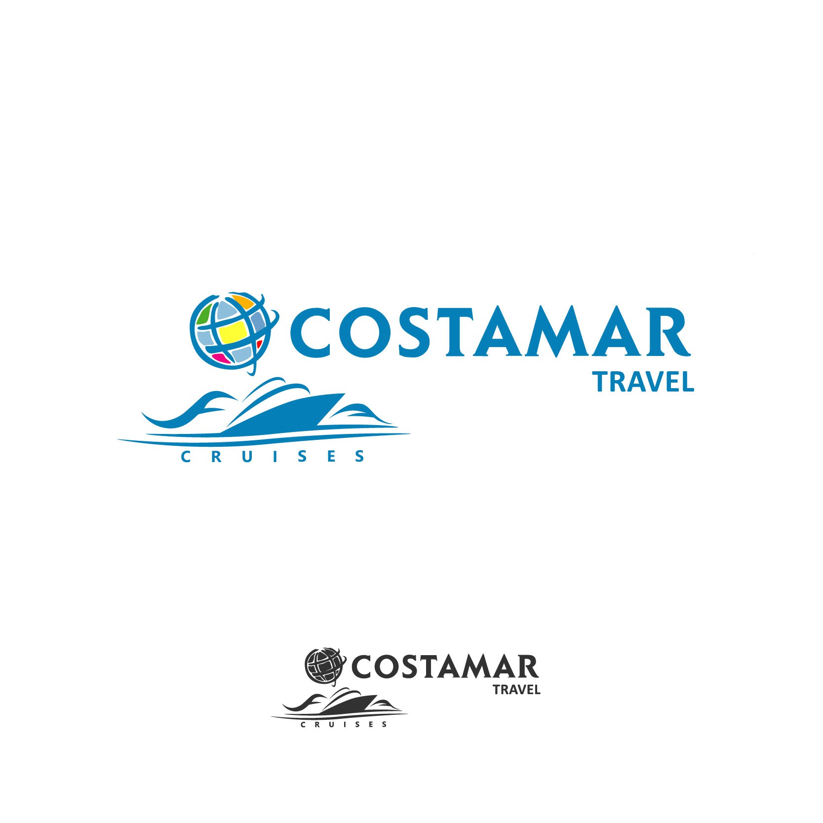
When this Florida travel agency launched a logo design contest, Efimenko delivered. The ocean blue design with its pops of colors features an easily recognizable globe and a less-easily recognizable, deconstructed cruise ship.
We like the subtle cruise ship and the serif font, which sends a message of experience, reliability, and tradition – three qualities we definitely want in a travel agency!
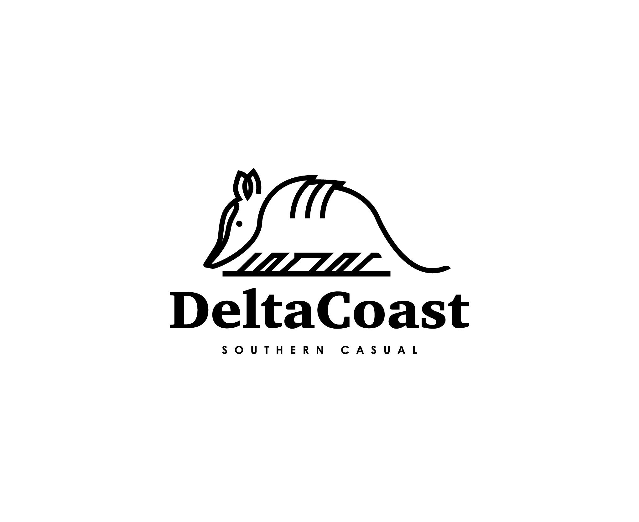
DeltaCoast
Efimenko’s DeltaCoast logo design is a strong representation of his style. The abstract armadillo is recognizable because of its long nose and its shape. The legs are strikingly angular, but the curved line of the armadillo’s back gives the logo an elegant touch.
The contrast of the serif DeltaCoast font and the sans serif “Southern Casual” tagline underneath helps this logo design embrace a modern style. The company doesn’t seem to exist any longer – maybe they would have made it if they had used Efimenko’s modern and playful design!
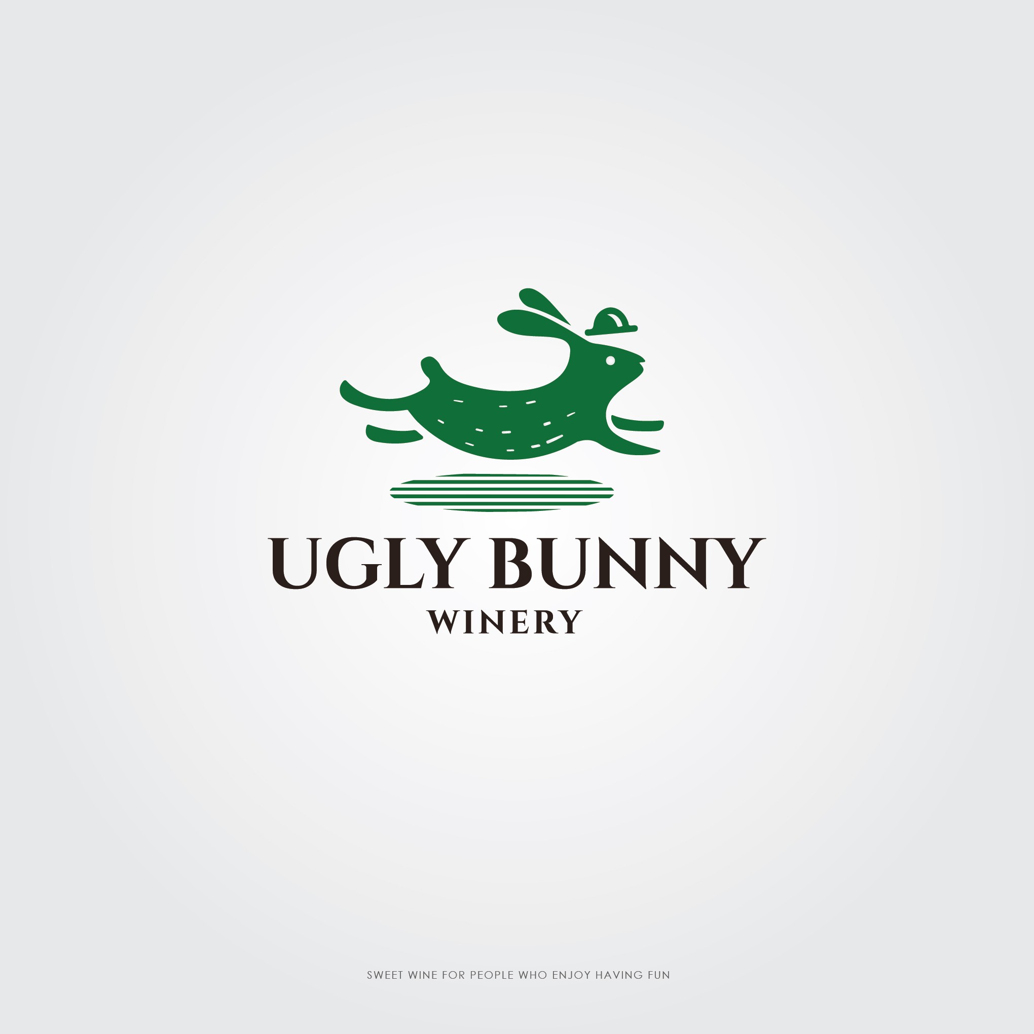
Ugly Bunny Winery
Ugly Bunny Winery is on Ohio businesses that offers an incredible culinary experience. For their logo design contest, Efimenko came up with this striking design. The choice of green reflects the winery’s natural surroundings, which are lush and verdant. The bunny is in mid-run, showing movement, energy, and progress. Efimenko used negative space on the bunny’s coat to add more character.
The bunny’s hat is a nod towards civilization and refinement, which is perfect for a winery! Its shadow, which resembles a barcode, is a modern touch. The wordmark is a strong, traditional serif font choice. We like the contrast between the deep green of the bunny and the black font, and in our book, this one’s a winner!
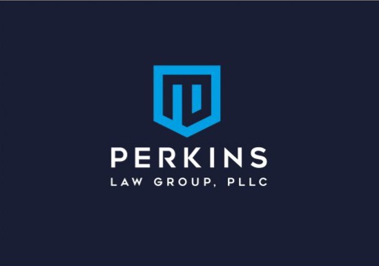
Perkins Law Group, PLLC
Efimenko won another logo design contest with his design for Perkins Law Group, PLLC located in Mississippi. His ultra-modern, ultra-simple design, is a clear brand representation.
While many law groups choose to use serif fonts, Perkins Law Group chose to use Efimenko’s design that features a sans serif font. He balances the modernity and friendliness of the sans serif font by using all capital letters to illustrate the group’s bold professionalism.
The symbol Efimenko designed for the Perkins Law Group logo is also both modern and traditional. It’s in the shape of a shield, which illustrates how lawyers protect their clients, like a shield protects the person behind it.
We love the cool, calming light blue of the shield, which is a great choice for lawyers who might need to reassure their clients. We can see why Efimenko’s design won the contest – it’s modern, simple, and very classy.
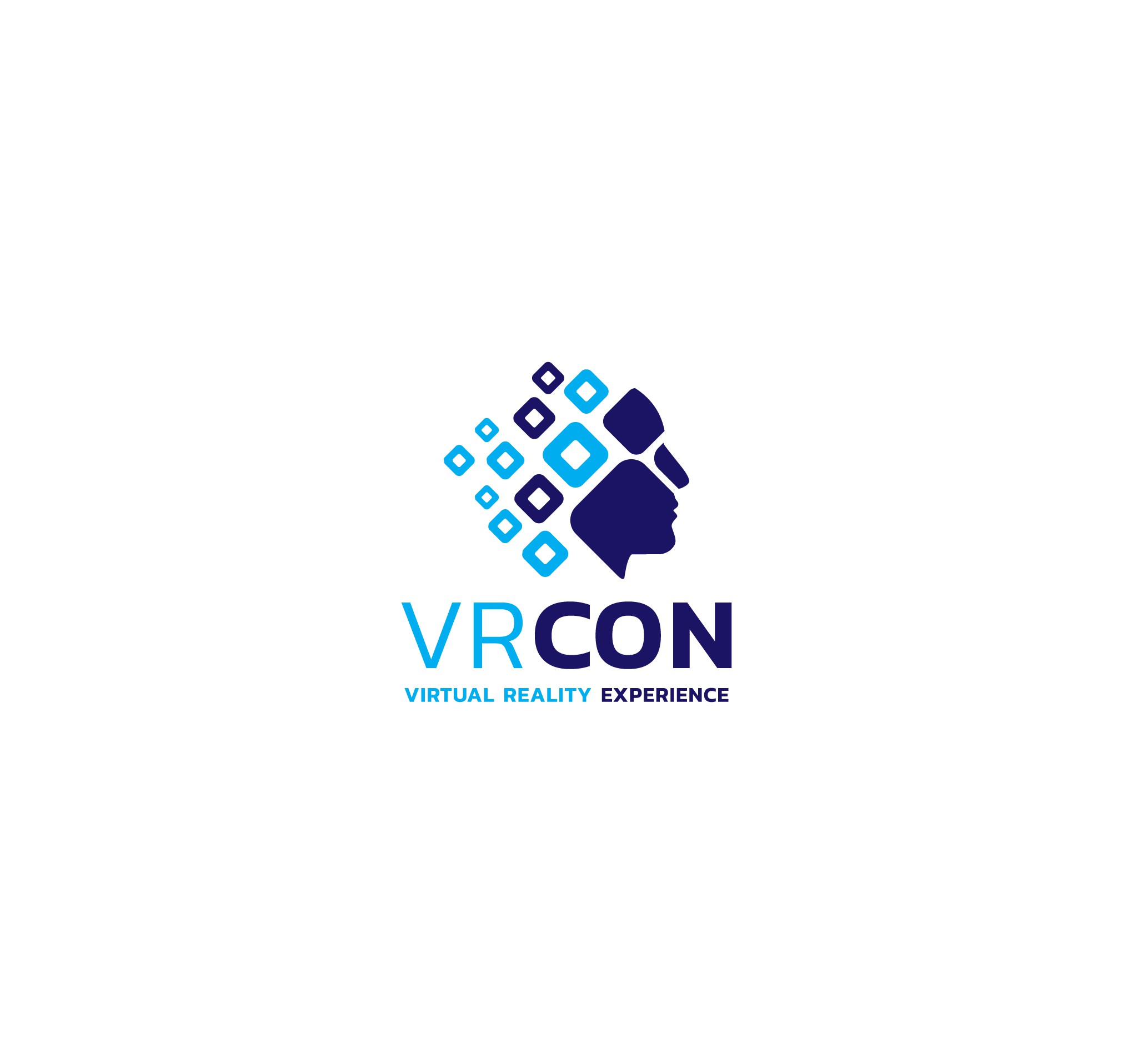
VR Con
Virtual Reality Conference named Efimenko the winner of their logo design contest, and we can see why! This beautiful logo has everything a progressive technology like VR should need, and uses Efimenko’s characteristic contrast to truly make an impression.
The logo features a head, but where the hair would normally be we see squares tilted to look like diamonds. They increase in size, and push the viewer forward. That’s what we call progress!
The face uses negative space to imply the use of VR goggles. The deconstructed head and face are a modern twist on using a silhouette.
We like the contrasting blues and how Efimenko uses the darker shade of blue to keep the viewer looking forward, just like VR technology is moving forward. This logo is both detailed and simple, and we can see why it was the victor!
Contrast, Negative Space, and Clean Lines Win
It’s easy to see why Efimenko has won several logo design contests. His attention to detail and use of striking color combinations, while always keeping it simple, makes him a great logo designer. We’re excited to see if his future designs will continue to win contests!