Before Ted Lasso made London Football Clubs a global phenomenon, was a team that already had the attention of fans across the world.

Arsenal Football Club is like a television show in some ways – it is based in London, it has a loyal following, and the team went through its share of losing streaks over the years. Today though, Arsenal is the team to beat.
Arsenal didn’t start as a team on top and didn’t start as a team that everyone knew. What helped propel them to the elite status they achieved today is dedication, patience, good spirit, and a great logo.
If you aren’t familiar with the team, or if you want to learn more about this iconic football team, then you came to the right blog post.
Throughout the remainder of this post, we’ll walk you through Arsenal’s history, as well as the history of the team’s well-known logo.
Meet Arsenal

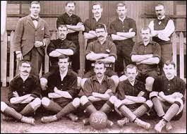
In the London district of Woolwich in 1886, Arsenal was first founded. Its initial logo was inspired by the area in which the Club was first founded.
Woolwich was home to several military hospitals, as well as the Royal Arsenal and Royal Artillery Regiment. When it came time to establish a logo for the team, Arsenal went back to its roots and designed a logo that was influenced by Woolwich.
That logo featured Woolwich’s coat of arms and the logo was so prominent that components of the initial logo are still represented in the logo today.
In the early days of Arsenal, the Football Club changed its name several times. From Dial Square to Royal Arsenal to Woolwich Arsenal to The Arsenal to Arsenal, the Club’s name is also representative of where it was founded. Over the next 130+ years, the Club has established itself as a Premier Football Club winning championship and title after championship and title.
The Evolution of Arsenal
While we could write about the history of the Arsenal Football Club for pages, we’ve opted to simply include the key highlights of the team’s history below. As you’ll see in Arsenal’s history, Arsenal is a team that has a history of coming out on top.
1886: Arsenal is founded
In 1886, Woolwich Arsenal was founded by David Danskin as a London Football Club. Founded in Woolwich, the team decided to include the district’s name in the club’s name.
1913-1919: Woolwich Arsenal becomes Arsenal
After relocating to the Arsenal Stadium in Highbury, North London in 1913, Woolrich Arsenal dropped “Woolwich,” to simply be called “The Arsenal.” Before this move, Arsenal belonged to the Second Division, but in 1919, the team was promoted to the First Division. This promotion was controversial as rivals Tottenham Hotspur were not promoted and because Arsenal finished 6th in their division the year prior. After making it to the First Division, “The Arsenal” became simply “Arsenal.”
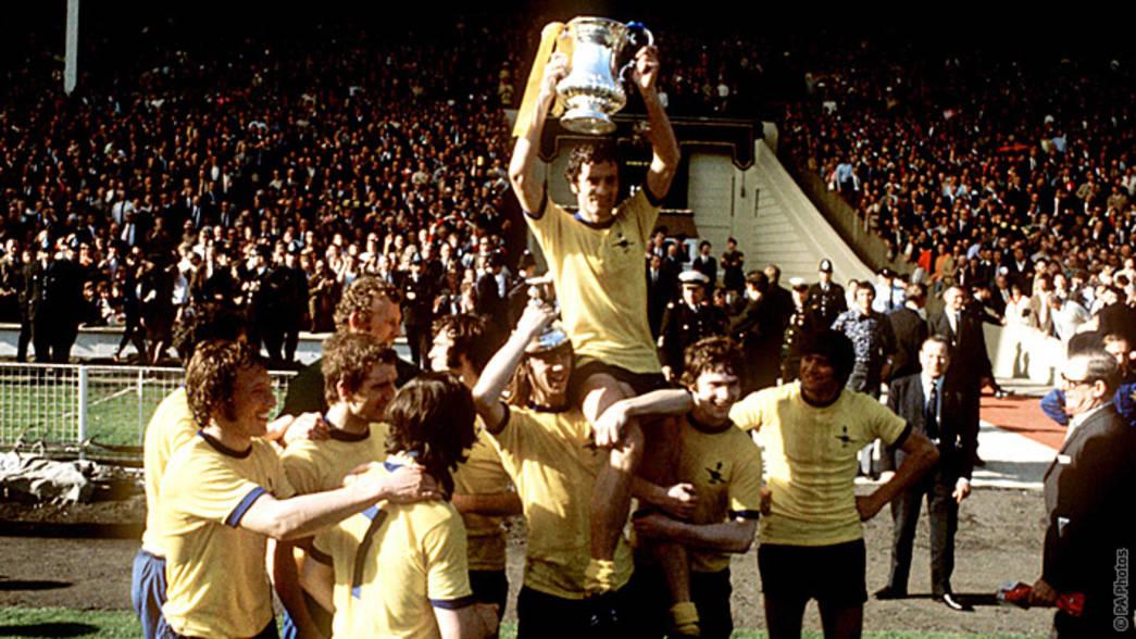
1971: Arsenal wins the FA Cup
While the team wasn’t strong when it first was promoted to the First Division, Arsenal not only won their league title in 1971, but the team went on to beat Liverpool in the FA Cup final.
1996-2002: Arsenal goes on another winning streak
Under the management of Arsène Wenger since 1996, Arsenal implemented a new training regime that worked for the team. This was the era of also key players like Patrick Viera and Thierry Henry on Arsenal’s roster. This leadership, and all-star roster, helped propel the team to win its second league title and second FA Cup during the 1997-1998 season. The team then went on to win their third league title and FA Cup during the 2001-2002 season.
2014: Arsenal breaks a 9-year losing streak

Most teams struggle to remain on top for an extended period and Arsenal was not an exception to this. Following their winning streak, Arsenal struggled to continue winning.
After a 9-year losing streak, Arsenal won another FA Cup in 2014. This winning team had Santi Cazorla, Laurent Koscielny, and Aaron Ramsey on the roster.
2017-Today: Arsenal breaks a FA Cup record (twice)

By 2017, it was clear that the Arsenals were a team to be reckoned with, winning its 13th FA Cup, beating Chelsea in the final minutes.
No other team had won that many FA Cups previously. Aaron Ramsey was still on the roster, this time joined by Alexis Sanchez.
A few years later, in 2020, Arsenal returned to the FA Cup, winning its 14th FA Cup against Chelsea again. Today, the team remains one of England’s premier teams and draws in fans from around the globe.
Roadblocks Along the Way
The roadblocks Arsenal encountered were like the roadblocks other sports teams also encounter. Whenever a team goes through a losing streak, it’s important to keep your fans loyal and to work towards turning that losing streak around.
Arsenal was not only able to do this, but they were able to turn their losing streak into a winning streak and establish themselves as the team to beat. Even during the team’s losing streak, Arsenal was able to use its brand and well-known logo to ensure that not a single fan would forget about them.
The Meaning of Arsenal’s Logo and Arsenal’s Logo History
Like Arsenal’s evolution as a Club, its logo design tells a similar story of staying true to itself.
While the logo developed over the years, the design always tied back to when the team was founded in Woolwich.
Arsenal has had a total of 10 versions of its logo over the years, each of which is highlighted below.
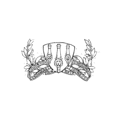
1888-1922: The first version of the Arsenal logo
The first official Arsenal logo was unveiled two years after the Football Club was founded. This logo represented the town of Woolwich where the team was started. The logo featured the Woolwich coat of arms, as well as other intricate design elements that tied back to the Royal Arsenal and Royal Artillery Regiment in Woolwich. This first logo lasted for more than 30 years.
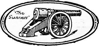
1922-1925: The second version of the Arsenal logo
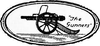
This second iteration is a much simpler logo design than the initial logo. The intricate features that dominated the past logo made it difficult to be replicated when promoting the team. This logo update was timely, as the team was officially named “Arsenal” in 1913. While this design was far simpler than the prior iteration, this logo still tied back to the Royal Arsenal, displaying a single cannon. Included in this design was the team’s nickname at the time, The Gunners.”
1929-1930: The third version of the Arsenal logo
For this logo version, Arsenal only made subtle updates.
The cannon was redesigned, and this logo simply swapped its cannon to face the left and placed the team’s nickname on the right.
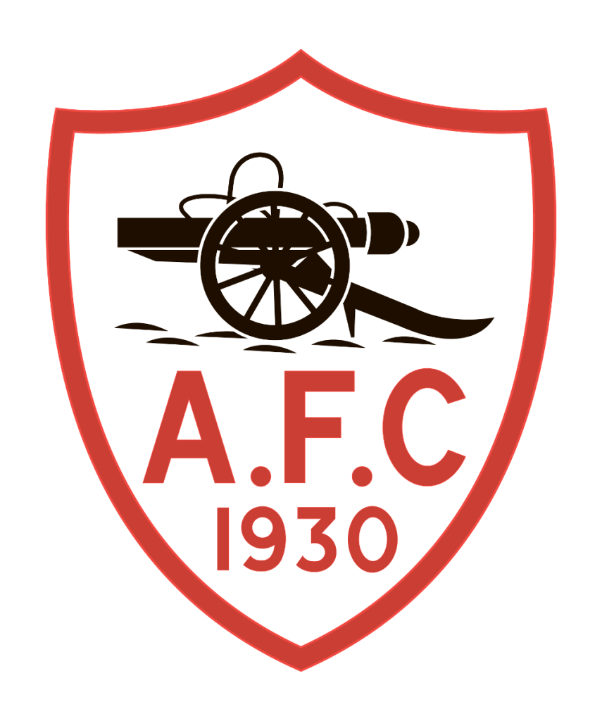
1930-1936: The fourth version of the Arsenal logo
In this fourth iteration, Arsenal made the logo more stylized. The past iterations looked hand drawn, whereas this one looked more professionally designed. Instead of the oval shape, this logo sat inside a shield. This is the logo’s first introduction to color, choosing to incorporate the color red. This design also ditched the team’s nickname and instead included “A.F.C.” and “1930.” This represents when Arsenal Football Club debuted this design.

1936-1949: The fifth version of the Arsenal logo
In 1936, Arsenal decided to go in an entirely new direction with its logo design. This design was modern and featured a hexagon shape with two letters, “A” and “C” intersecting. In the center of the letters sat a soccer ball. This logo design featured sharp edges and angular lines, all in Arsenal’s signature color, red.
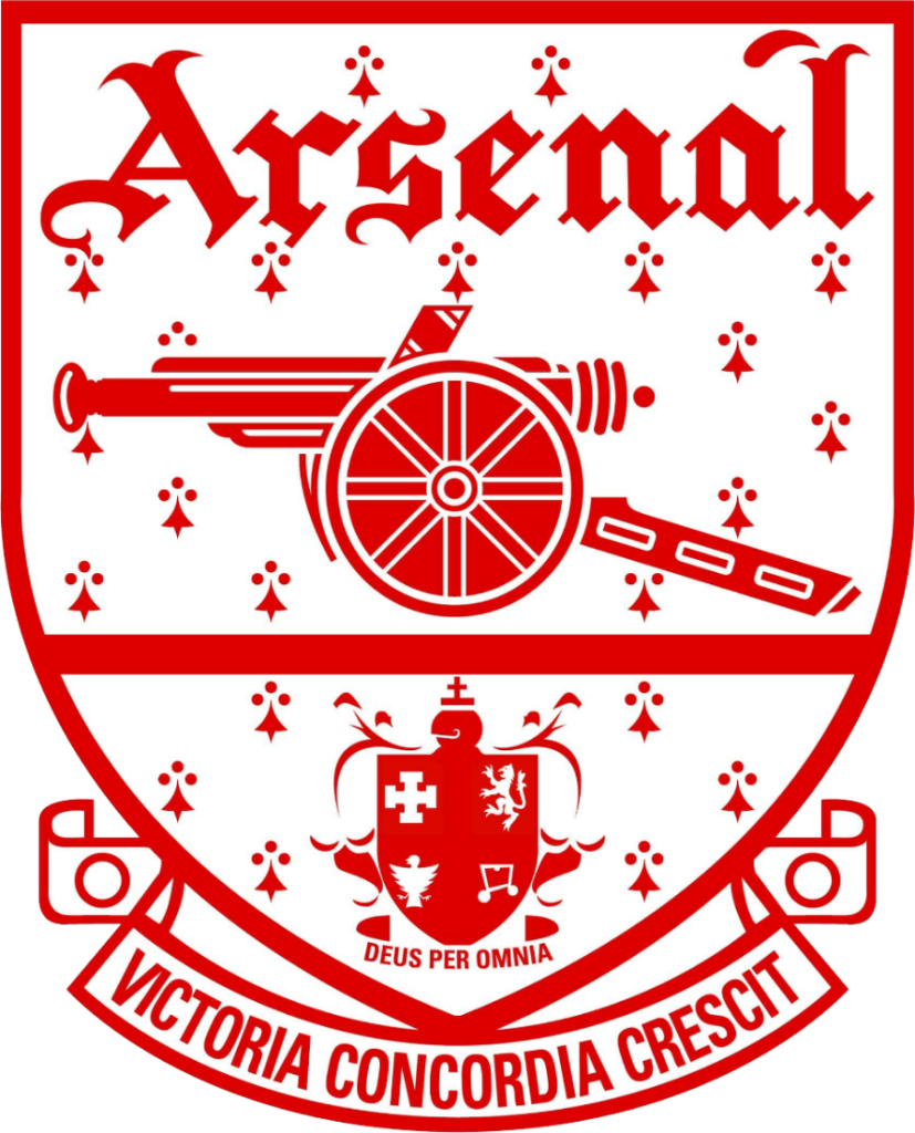
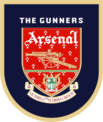
1949-1994: The sixth version of the Arsenal logo
This next logo iteration stayed with the team for almost 50 years. The shape of the logo resembled a shield again, and the team went back to incorporating several intricate elements. The cannon was reintroduced to the design and the inscription was a formal, royal-looking font. Included in the design were the Latin phrases “Deus Per Omnia” and “Victoria Concordia Crescit.” In the background of the shield were maller symbols, adding to the intricacy of this design. To stay consistent with logos prior, Arsenal stuck to using red as the primary logo color.
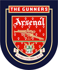
1994-1996: The seventh version of the Arsenal logo
This design included the past logo iteration in its entirety; however, the past logo was placed inside another shield. This shield introduced a new color, navy blue, and reintroduced the team’s nickname, “The Gunners.”
1996-2001: The eighth version of the Arsenal logo
The updates to this logo were so minimal that they were easy to miss. The frame outlining the inner shield was removed and replaced with a gold border on the outer shield.
2001-2002: The ninth version of the Arsenal logo
This ninth iteration brought back the shield from 1949. The colors were updated slightly from that version but overall, this iteration is reminiscent and an ode to that past logo design.
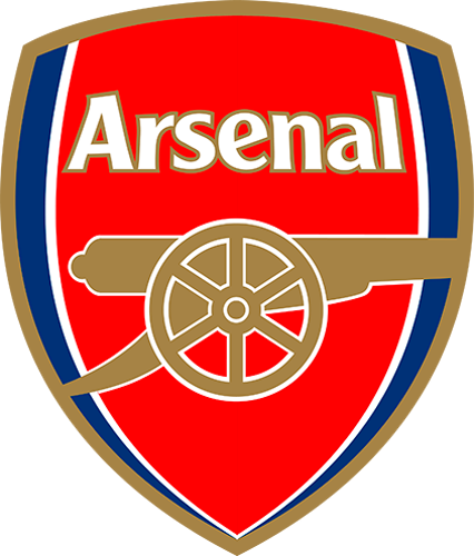
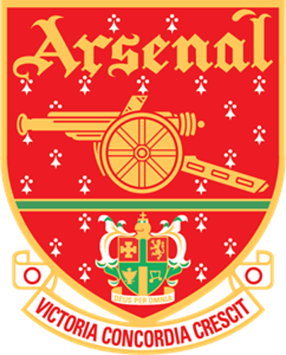
2002-Today: The tenth version of the Arsenal logo
After paying tribute to Arsenal’s logo from 1949, the logo was yet again updated in 2002 and this is the logo you’ll see today. This iteration has all the team’s favorite design elements over the years. It includes the team’s name in bold, block lettering. It includes the team colors of red, blue, gold, and white. And it pays homage to the team’s early roots by displaying a cannon again.
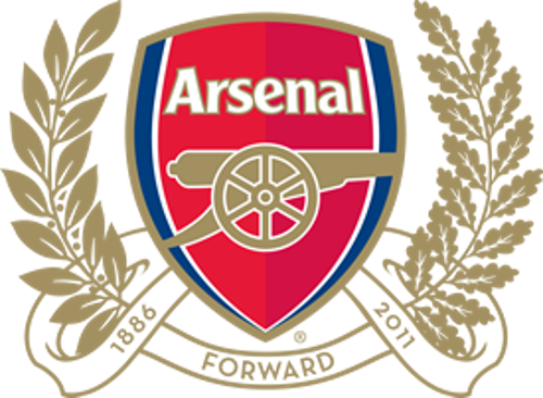
During this period, the team introduced a new version of this design to celebrate its 125th anniversary of the Club. The team kept the updated shield but added oak leaves to surround the logo shield. The logo featured the year of the Club’s founding, as well as the anniversary year. Included at the bottom of the design was the word “Forward,” symbolizing the team’s continued path forward.
Arsenal’s logo font:
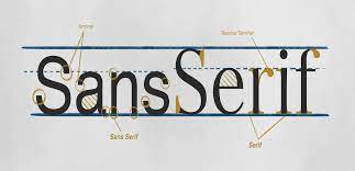
In choosing a font for the Arsenal logo, the team elected a sans-serif font that is representative of its history.
Founded more than 125 years ago, the font is a bold font that resembles the Roman/Gothic fonts we commonly see and use. The font takes up space and boldly stands out in the shield, clearly stating what team the logo represents.
This specific font was developed exclusively for the team back in 1984 by Morris Fuller Benton.
Arsenal’s logo color:
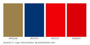
The colors for the Arsenal logo have remained consistent with the team over the years.
These colors of gold, red, blue, and white are used across the shield, wording, and other design elements. These colors are representative of the brand and if someone is wearing these colors around London, it’s safe to say they support the Arsenal Football Club.
The emphasis on these colors has helped the logo be universally recognized across not only England but the world.
Arsenal’s logo symbols:
The symbols the Arsenal logo used in its logo design were symbols that highlight where the Club was founded. Looking at the recent logo design, the logo includes a cannon, which represents the Royal Arsenal and Royal Artillery Regiment that was next to the Club when it was founded in Woolwich.
Another symbol on the logo is the shield shape. This represents the earlier versions of the team’s logo that displayed the Woolwich coat of arms. While the coat of arms is not included in the current logo version, the shield represents this.
Arsenal Today
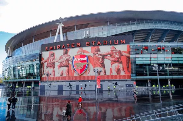
The Arsenal Football Club today is a team with a winning reputation. When it comes to Football Clubs in England, it’s hard to find a Club with as loyal of a following as Arsenal. Arsenal’s home stadium is Emirates Stadium in Islington, London.
Today, Arsenal is owned by Kroenke Sports & Entertainment and lead by head coach, Mikel Arteta. The team’s captains are some of Arsenal’s most beloved players, Granit Xhaka, Peter Cech, Laurant Koscielny, and Aaron Ramsay.
Lessons Learned from Arsenal
Looking at Arsenal Football Club’s logo teaches us a few things about logo design. The Club always chose to design and use a logo that represented where the Club was founded. By doing this, Arsenal is creating a fan base that understands the mission of the club and what it was founded on.
Additionally, even when the logo was updated over the years, the Club always included the team’s signature color, red. This shows us that with our logo designs, we can tell a message through the logo, and by telling a message, we can establish a loyal customer base.
As you think through the direction you want to take your company’s logo in, read other stories about different brand logos for inspiration at Logo Design Magazine. Beyond the lessons we can take away from Arsenal, you’ll find countless other articles to guide you on your design journey.