- We’re considering the old and new logo designs for a housing organization, an organic ice cream company, and a national museum.
- Shelter, Coconut Bliss, and the National Gallery of Art all launched their new logos in late spring 2021.
- We’ll take a look at font, shape, and color to determine which logo is stronger – the new or the old?
What makes a logo designer decide to totally change a logo? When there’s a drastic decision involved, like removing a central and classic image, it’s probably because the client directly requested it. Sometimes the opposite occurs and designers are asked to create a new symbol or image to represent their client’s business.
In this blog post, we’ll look at both of these scenarios: no symbol and new symbol. Then we’ll consider a third where the client asked for a complete color palette change. When it comes to big-picture changes like this, logo designers have their work cut out for them!
Shelter
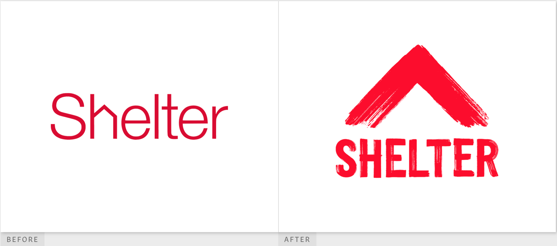
Shelter is a housing organization in the UK dedicated to making sure every person has a safe home. This important organization helps to fight homelessness and inadequate housing. An organization with such an urgent mission chose an urgent color, red, for both their old and new logos.
The previous Shelter logo used a muted red color and a thin-line, serif font. The most unique feature of the old Shelter logo is the “h,” which had been altered to form the outline of a house. The issue with this, however, is that if the viewer just takes a quick glance, the house-shaped “h” isn’t clear. It can look like a mistake rather than a feature.
That’s certainly part of the reason why the organization decided it was time for a new logo, and wow, do we love it! The word is now all-caps, set in a bolder font, and in a style that’s textured like paint strokes. We love this allusion to how paint helps with home improvement. The roof outline above the word is also in this same painted style. It’s a much bolder (and better!) way to tie the organization to its purpose. The new Shelter logo is a major win in our books!
Coconut Bliss
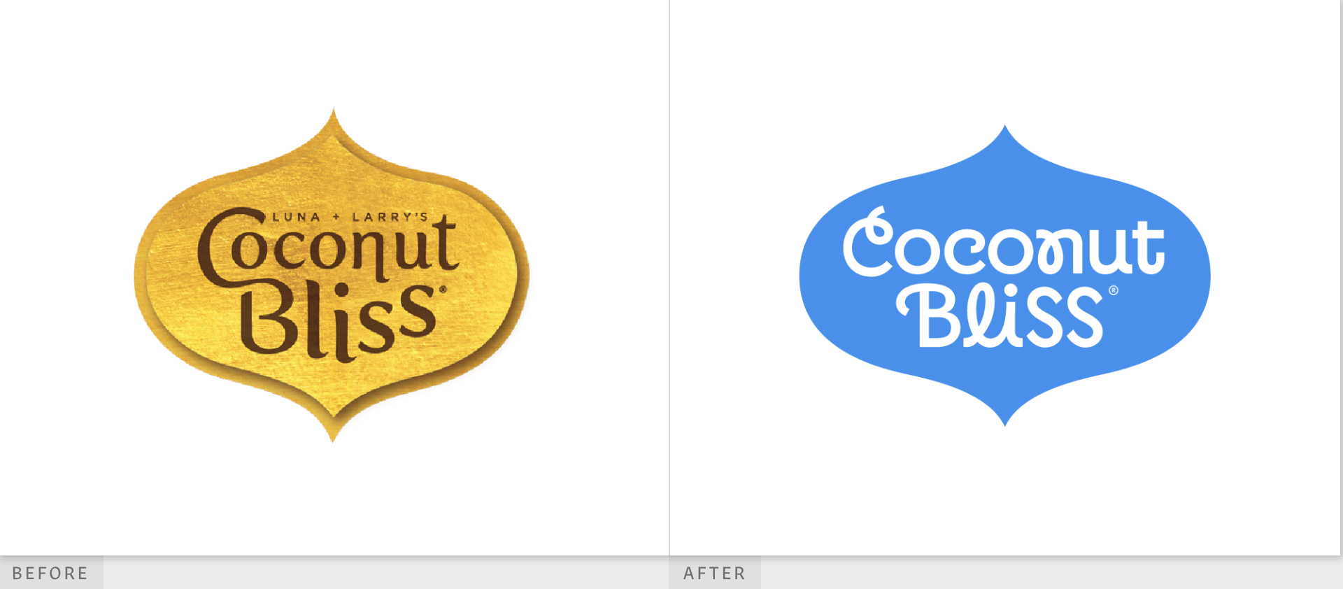
Coconut Bliss is an organic ice cream brand that’s also completely plant-based. The company’s website is full of beautiful, modern graphic design. It’s clear that they need a logo that fits their ultra-modern style!
The previous Coconut Bliss logo featured a great color palette. The textured gold-foil bindi shape contained the company name, which was set in a simple font. However, the first letters of each word were connected unnecessarily. The edge of the logo is a darker gold, without the foil texture, adding an extra layer of interest. Above the company is something extra – the names of the original founders, Luna and Larry.
The new design removes two of these elements: the names of the founders and the foil texture. It also changes the color from gold to blue and incorporates a new font. The muted blue is a common color we see everywhere, and we wish the company had gone with a more original shade of this standard. But we absolutely love the new font, with its quirky curlicues and near-cursive, yet totally legible letters. While we miss the beautiful gold color of the previous logo, we love the font of the new design!
National Gallery of Art
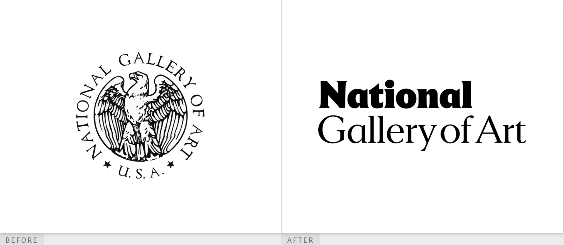
The National Gallery of Art is a center of visual art, education, and culture located in Washington, D.C. With a mission to serve the people of the United States and visitors to our country, this museum features many beautiful works of art – and so it needs a beautiful logo to represent it.
The previous National Gallery of Art logo featured a very traditional design. The focal point of the logo is a detailed line drawing of the official national bird, the bald eagle. The drawing is textured and the eagle’s wings are shaped so that the image is almost a perfect circle. The eagle’s beak is tilted up proudly and its eyes are narrowed. It almost looks like a military symbol. Surrounding the image in all capital, serif letters is both the organization name and a slightly smaller “U.S.A.,” which is separated from the organization name by two black stars.
For the redesign, the organization went a dramatically different direction. The bald eagle, stars, and “U.S.A.,” have all completely disappeared. While we wish some image or graphic element had been retained in the redesign, we do love the new logo. The extra-bold emphasis on “National” alerts us to the fact that the gallery is here to serve the nation. The new font is easily readable but still a traditional serif, which is important for a national institution to convey. Ultimately, we think this new logo is a winner, too!
New Logos Win This Round!
Font, shape, and color all play essential roles in the new logo designs for Shelter, Coconut Bliss, and the National Gallery of Art. We love changes that help tie the logo closer to the organization’s purpose, which we think the Shelter logo redesign did the best. Overall, each of these designs featured big changes – and we think the new logos are all major wins!