Certain people tend to consider that the attractive design of pocket folders involves exclusively intricate design patterns, innovative fonts, and layouts or striking contrasts between the text and the background.
I am not going to argue with that, in fact, I think it’s great that you’re trying to break the habit of printing those boring pocket folders with largely similar templates. But, before you go out of your way and reinvent the wheel, my suggestion is to ensure that you don’t neglect the basic design rules and guidelines.
Designing and printing folders for presentations, marketing, or commercial purposes require artistic vision as well as geometry notions or basic psychological know-how regarding perception. This is why I have decided to compile a list of the most frequently encountered errors which I hope will come in handy on your next project.
Since this article addresses mostly those of you who enjoy customizing and personalizing the folders, I’m going to skip the part where I advise you to never ever leave its surface blank. But given the immense potential for a remarkable visual impact on the audience, who would?
Frequently encountered layout errors
The elements that you will need to combine in the printing of the pocket folder comprise of:
- Logo (for companies and organizations)
- Text (typically present, briefly describes the contents of the pocket folder)
- Contact details
Simple enough, right? How could you possibly get the layout wrong when there are so few elements that need to be integrated?
Let’s take the logo for example!
The logo is a crucial aspect in folders with marketing and commercial purposes but is no less important on folders utilized during scientific conferences or conventions. The reason why the logo’s visibility is paramount resides in the fact that its role is to raise brand awareness and familiarize the audience with your company’s symbol.
Now, the worst possible thing you can do is place it on the leftmost 1/3 section of the cover, because its visibility is going to be obstructed by the hand holding the folder. Considering that most people hold the folders in this manner, all the work that went into designing and tweaking the logo will go to waste.
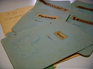
Photo credits: JD Hancock
Speaking of logo design, irrespective of how attractive it is, you need to ensure that the other visual elements comprising the layout are not in conflict with it. An additional aspect to be mindful of is allocating sufficient space in the proximity of the logo in order to avoid the overcrowded appearance. This is in fact an excellent way to avoid the previously mentioned conflict between various design elements: making the blank space work in your favor.
How about the text?
The primary error I’ve seen over and over again arises when the designers are requested to imbed large chunks of text on the cover of the folder. But wait, isn’t this what the contents of the pocket folder are designed for? In my humble opinion, the cover of the folders should have as little written text as possible, because its main role is offering a glimpse of what’s inside. Two, maybe three phrases should be more than enough for the cover in the vast majority of cases, providing the information is synthesized effectively.
Okay, let’s assume that you cannot summarize the whole content utilizing only three phrases because that would imply leaving out significant details. There is a way to supersede the issue without making the cover of the folder appear crowded and unappealing. All you need to do is print the other phrases on the inside pockets, leaving only the most important bits on the cover. In fact, splitting the summarized message into different section may work in your favor, because it makes the points easier to read.
Oh, and don’t forget that it is crucial to match the colors and fonts chosen for the text on the cover of the folder with the ones of the logo in order to attain a consistent, harmonized appearance.
I love the design, but where are the contact details?
Photo credits: ASurroca
Don’t forget to include this little piece of information in the rush to optimize the design, because otherwise, you are significantly downgrading the usefulness of the pocket folder. After all, its goal is to capture the attention of the audience and determine them to contact you with further questions and/or business proposal. In most cases, people are accustomed to finding the contact details on the lower section of the back cover, so in my opinion, you should stick with this rule.


