- Although we’ve seen some pretty crazy logo redesigns in the past and especially this year, this one is one of the most surprising
- Paramount released a new logo at the beginning of the year and instantly the public caught what appears to be an error
- This could either have been an accidental mistake or intentional, but either way graphic designers have given their input
There have been some pretty amazing and surprising logo redesigns in the past, but one that had people turning their heads was the Paramount redesign that was launched recently. It’s not uncommon for there to be a few logos every year that don’t exactly live up to what they should, but it’s unusual for there to be what appears as huge errors with redesigns. For larger companies, in particular, it requires quite a few signatures before a new logo will be signed off on and go public. Usually, these companies have entire teams pouring over every inch of the design to make sure that it’s nothing but flawless.
This is why, when the new Paramount logo was revealed, viewers were so surprised to see what could potentially be a huge mistake in the design. When the new logo was launched to viewers early this year, designers quickly took to Reddit and Twitter to point out what they thought was a massive mistake and overlook from the company. Although the new logo itself isn’t that much different than the original, keeping the same traditional mountain peak and stars that so many identify with Paramount, the ‘mistake’ stands out.
Does The New Paramount Logo Have A Mistake?

Mistake Spotted In The New Logo Design
Designers were quick to point out that a line in the center of the mountain on the logo looks oddly out of place. This lead to most of the internet wondering if this is a mistake or was left on purpose for the sake of the logo. It seems that this one detail of the logo is distracting for all viewers, whether famous graphic designers or not, and it’s all that they can see when they look at the logo. They claim that this one seems more like a straight vector line compared to the other lines in the design.
The logo is very similar to the original one, having all the same elements of the mountain peak and the company name on the logo. The first logo was created in 1916, with swirly letters and stars enclosing the mountain peak. As any company does, this logo has changed over time and evolved into what we now know today with many redesigns. Some edits were merely minor tweaks made to the logo to get it perfect, while others were full-on redesigns that made a huge difference.
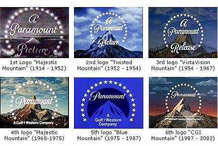
The Paramount Logo Through The Years
Although there have been different levels of redesigns, the basics of the logo have continually been the same throughout the years. It’s always been memorable and always been recognizable to users throughout the years. In 1987 to celebrate their 75th anniversary, Paramount released a more realistic image for the mountain peak in the logo. Although we’ve seen quite a few spectacular logo redesigns this year, Paramount was a bit of a shock for viewers.
It wouldn’t have been as unusual if it wasn’t for viewers analyzing what they think is a mistake in the logo. Many graphic designers are speaking up, claiming that having a mistake like this one is the worst fear of any graphic designer in the industry. Although nearly all viewers are speaking up about the logo, graphic designers, in particular, seemed to be resonating with the logo. We saw graphic designers offering explanations for the line in the logo, some thinking that maybe there was an error with files being uploaded.

The Greatest Fear For Creatives In The Design Field
“This is my fear as a designer,” a user on Reddit commented, “that the internet is gonna see a mistake on my design.” Other users on the platform were quick to give their input as well, just about all Redditors convinced that the vector line in the logo was a mistake. One graphic designer even went as far as to share the ‘correct’ version of the logo, entirely removing the line from the logo.
Moral Of The Story
Although it could just have been a mistake on the graphic designer’s part (we’ve all been there before), it could be intentional as well. With the number of people that have to sign off before these big company logos go public and the effort that’s put into them, it would be unlikely to miss a mistake. But, with that said, nothing is impossible and accidents do happen, so it could have been intentional! The moral of the story; always double-check your work, kids.