
The Pittsburgh Steelers are a celebrated national football team. With six Superbowl rings, 24 division titles, and eight conference championships, they have a lot to celebrate. Their logo is just as popular. Let’s take a look at this logo of champions. What’s the history behind it and this dynamic team?
The Pittsburgh Steelers weren’t always the Pittsburgh Steelers, which means the current logo was not always the team logo. In essence, the Pittsburgh Steelers have had eight different logos over their lifespan. These logos have come a long way. As you will see, where it started looks nothing like what it is today.
History Of The Steelers Logo and The Team
1933-1939
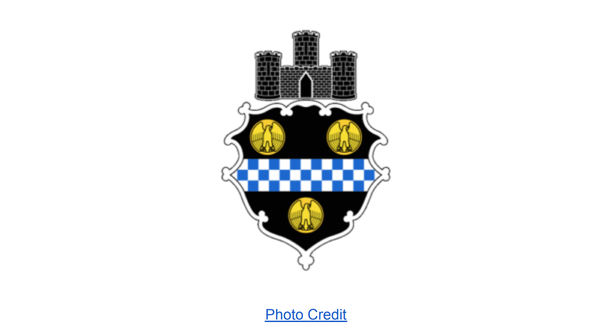
Pittsburgh Pirates. The logo was a coat of arms consisting of three golden eagles and white and blue checkers on a shield. The shield had a bold, framed white outline. A three-towered castle sat above the shield to represent the city of Pittsburgh. That was the team logo for six years.

1940 – 1942
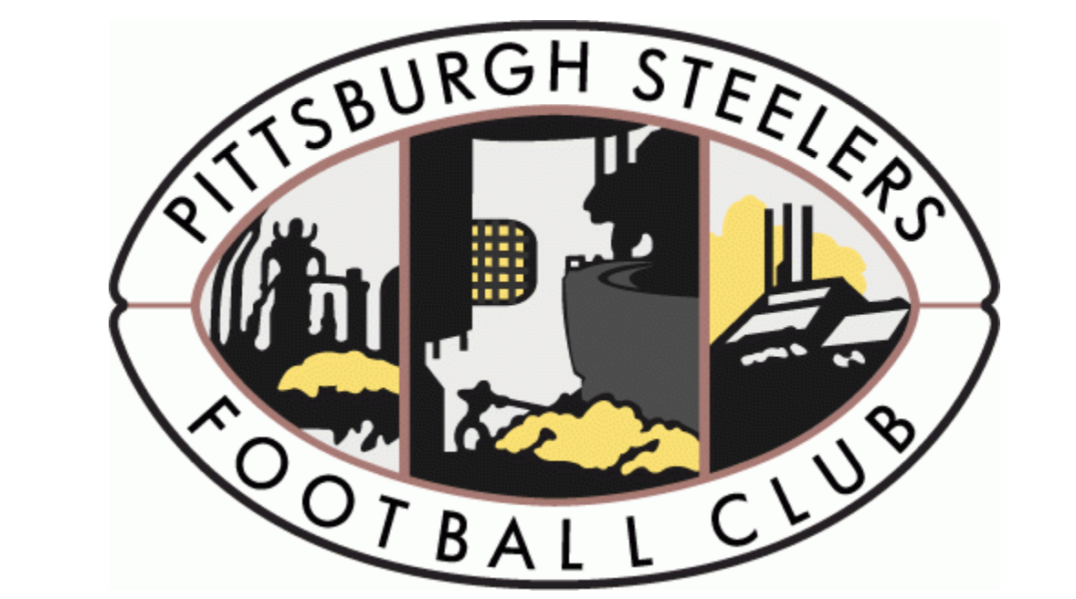
It wasn’t until 1940 that the team became known as the Pittsburgh Steelers. The name was changed, and this meant changing the logo. This time, the logo was an oval emblem that featured a wordmark, a steel plant with smoking pipes, a casting house, and a steelworker. Whew! Of course, the oval shape represented a football. This logo was the expression for the team for the next two years.
1943
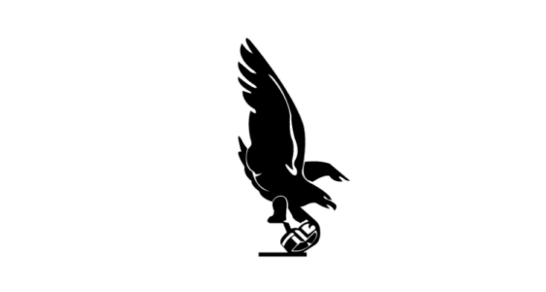
In 1943, the Pittsburgh Steelers merged with the renowned Philadelphia Eagles. After the merge, they called themselves the Phil-Pitt Steagles, which led to the need for a new logo. This logo featured none other than a black and white eagle. The eagle was perched on a football helmet, of course, with its wings flapping. This logo would not last very long and was only with the team for a year.
1944
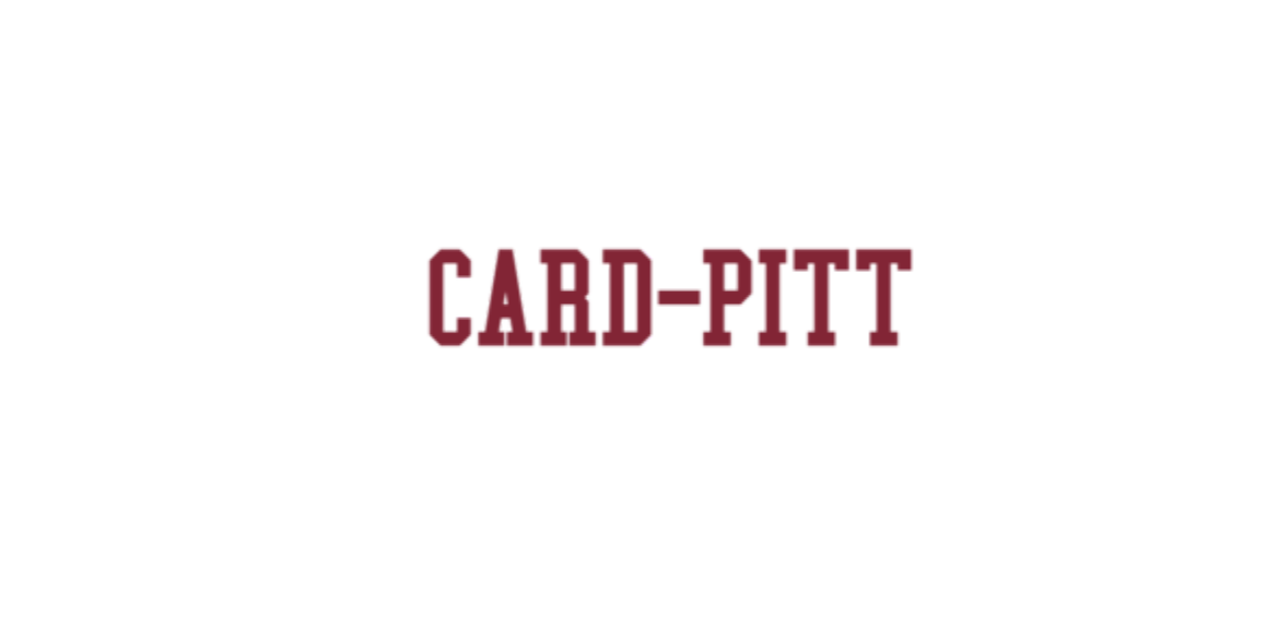
1944 sparked another one-year logo use, as the theme left the Eagles camp and merged with the Chicago Cardinals, earning the name Card-Pitt. This creative name thinking sparked the idea of another logo that only contained the name CARD-PITT in dark red capital letters.
1945 – 1961
Again, that merger didn’t last long, only a year. So the Steelers decided to go back to their second logo, the football (oval-shaped) emblem that featured a wordmark, a steel plant with smoking pipes, a casting house, and a steelworker. Whew! Again! Be it as it may, this logo would have substantial use, as they would use for 16 years, the longest consistency of a logo thus far.

1962 – 1968
The Steelers decided to take another go at their logo, seemingly unhappy with their current one. This new logo consisted of a uniform steelworker punting a ball. The cartoon-style worker was a smiling fan who wore a helmet, shirt, jumpsuit, and boots to protect himself, as any steelworker would. He also stood on a balancing I-beam with one leg, while stretching the other leg forward to punt the ball. He was dressed in all black and gold, paving the way for what was to come. This logo held up for six years before it was time for yet another logo change in the Steelers
1969 – 2001
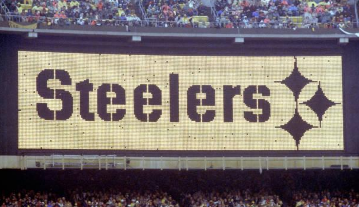
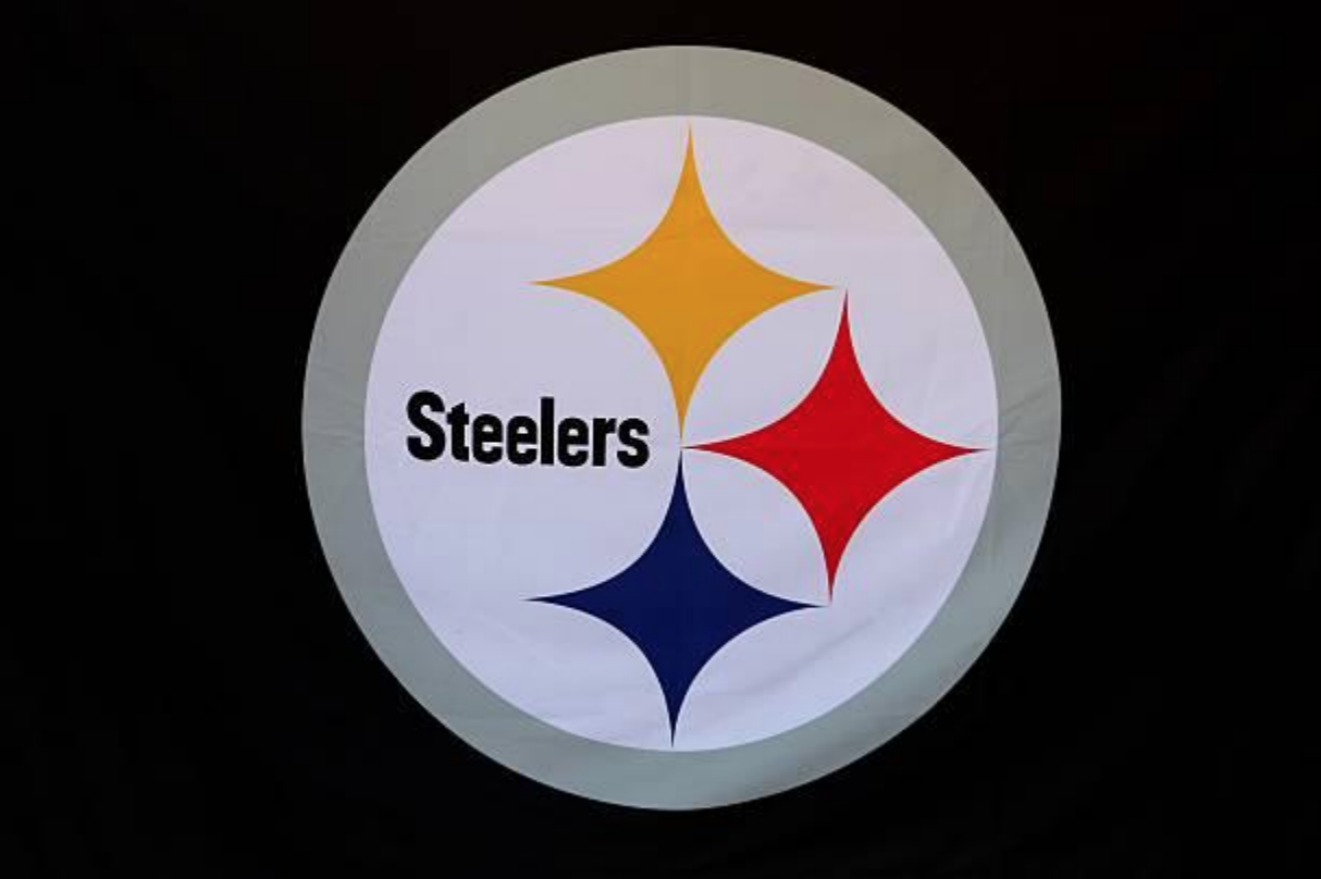
In 1969, the Steelers made a bold move and came up with a logo adopting a bold design — the U.S. Steel Company. The Steelers logo design featured a wordmark with the name Steelers in black, and three colorful four-pointed stars in the colors of blue, red, and yellow in the middle of a gray circular frame. This logo was eye-catching and brought a new surge of confidence to what the team would go on to represent.
2002 – Present
The circular Steelers logo reigned for more than 30 years, making it the longest-running logo yet for the team. However, in 2002, they upgraded that logo. The upgrade was minor, and some would barely notice the change. Yet, this enhancement seemed to give the team the edge it needed to have a superior logo. The wordmark was made a little bolder so the name stood out a little better, and a black outline was added to the circular frame, all to seemingly spark the boldness and confidence the team has displayed over the years. The new logo, which is still used to this current day, is elegant and inviting.
The Evolution of The Pittsburgh Steelers
The Pittsburgh Steelers were founded by Arthur J. Rooney on July 8, 1933. Although now one of the toughest and most respected teams in the National Football League (NFL), it wasn’t always this way. The Steelers got off to a depressing start. The first 40 years of the team’s history is known as one of the struggling Steelers just trying to find their way. They didn’t win any championships until 1972, which would be about 40 years after their birth. Wow! By this time, Chuck Noll was their head coach, and he would be with the team for 23 seasons until 1991.
Maybe that big AFC Central Division title championship had something to do with their illustrious logo. Before this time, the Steelers had been trying to find their way and even merged with other teams a couple of times. In the early 1940s, they merged with the Philadelphia Eagles, which seemingly didn’t go well. That relationship only lasted a year. The following year, they merged with the Chicago Cardinals for another one-year relationship. It’s as if the Steelers were trying to team up with other teams to become their own team. But apparently, football rosters were depleted due to a shortage of players with World War II looming. That was the initial reason for the mergers. Whether there was thought for them to be more than just temporary still remains to be seen. What we know is that each time they merged, a new logo evolved. Two strikes and they were out. No more mergers for the Steelers.
It was in 1947 when the mergers were no more, that the Steelers made the playoffs for the first time in the team’s history. From there, it only got better. In 1975, they won their first Super Bowl title (Super Bowl IX) against the Minnesota Vikings, with a score of 16 to 6. Of course, by this time, they were wearing the logo design that featured the wordmark with the name Steelers in black, and three colorful four-pointed stars in the colors of blue, red, and yellow in the middle of a gray circular frame. This logo (and the enhanced version) defined the team that would eventually earn the name, the Steel Curtain.
The 1970s was truly an era where the Pittsburgh Steelers reigned. They earned eight consecutive playoff berths, seven AFC Central titles, and four AFC championships from 1972 to 1979. They were the first team to win four Super Bowls and the only team to win back-to-back Super Bowls twice. Some of the notables from the 70s who would go on to become Hall of Famers included:
- Joe Greene (1979)
- Terry Bradshaw and Mel Blount (1970)
- Jack Ham (1971)
- Franco Harris (1972)
- Lynn Swann, Jack Lambert, John Stallworth, Mike Webster (1974)
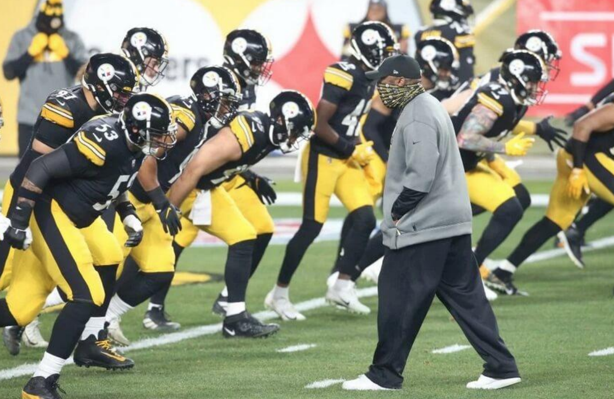
From 1933 to 1968, the Steelers had 13 different head coaches. From the reign of Chuck Noll, which started in 1969 to the present day, the organization has only had three coaches: Chuck Noll, Bill Cowher, and the current coach, Mike Tomlin.
Logo Design Elements
Over the 80 decades of Steelers history, its logo has been a symbol of the steel industry, royal families, and American football. For the most part, their logos have resonated and been relevant. Let’s take a closer look at the current logo.
The Stars
The current logo of the Steelers has the infamous three four-pointed stars. These shapes represent diamonds, a raw material in the steel industry, and they come in three bright colors:
- Yellow signifies coal
- Red signifies iron ore
- Blue signifies steel scrap
In general, stars have several symbolisms, including divinity, hope, and fame. They can also signify faith, motivation, and good luck.
The Circle
Everything in the current logo is within the bold circle. This shape signifies community, friendship, and unity. The symbol of evolution represents wholeness, eternity, and totality.
The Colors
There are five colors to note in the current logo: yellow, blue, red, black, and gray.
- Yellow: Yellow has been prominent in six of the eight Steelers logos. That must mean something of significance to the organization. Officially, yellow represents coal, one of the raw materials for making steel. Yellow also represents happiness, hope, and energy. Yellow can also be used to convey honor, loyalty, and intellect.
- Blue: In addition to signifying steel scrap, the color blue denotes trust. It signifies loyalty, confidence, and freedom. It can also represent stability, serenity, and imagination.
- Red: Most people associate the color red with blood and fire. And rightly so. Red first appeared in the circular logo in 1969, and it hasn’t gone away. Neither has the fire of the team. Red is the most energizing color on the planet. It symbolizes vigor, willpower, and passion. The Pittsburgh Steelers seemed to convey all of that not long after acquiring this 1969 logo. It seemed to be the turning point in the team’s competitive history. The red also signified iron ore used in the steel industry.
- Black: Black marks the face of the bold wordmark and the outline of the circular frame. Black has been prominent in most of the Steelers’ logos. Some associate black with fear, mystery, and death. But it can also foster positive emotions like authority, formality, power and strength. The boldness of its color is certainly displayed in the team’s performance.
- Gray: The color gray exhibits the shade of black and white. It’s regarded as the color of intellect and compromise. Gray is calm, elegant, and neutral. It paints the personality of the frame’s outline on the logo.
Logo Name
The Steelers logo is representative of the American Iron and Steel Institute trademark. It’s the official emblem used to promote the steel industry in the U.S. Officially, the logo has earned the name the Steelmark, because of the connection to the steel industry. However, some have named it the Astroids logo. Some fans have even gone as far as calling it the Diamond logo. What do you think?
Logo Designer
You could say that the U.S. Steel industry designed the Steelers logo. Back in the early 60s, the Steelers had to petition the American Iron and Steel Institute (AISI) to change the word “Steel” inside the Steelmark to “Steelers” before the logo was complete. They certainly gave the organization permission to use the logo with changes as needed. It seemed that the only necessary change was to add three letters: E- R- S.
The Steelers Today
The Pittsburgh Steelers’ famed three-star logo is one of the most familiar symbols in sports. The trademarked logo brings worldwide recognition and appreciation for the strengths representative of the steel industry. Close to 90 decades after Art Rooney purchased the NFL franchise and five Super Bowl victories later, it has come to symbolize the strength of the team and the steel city it represents.
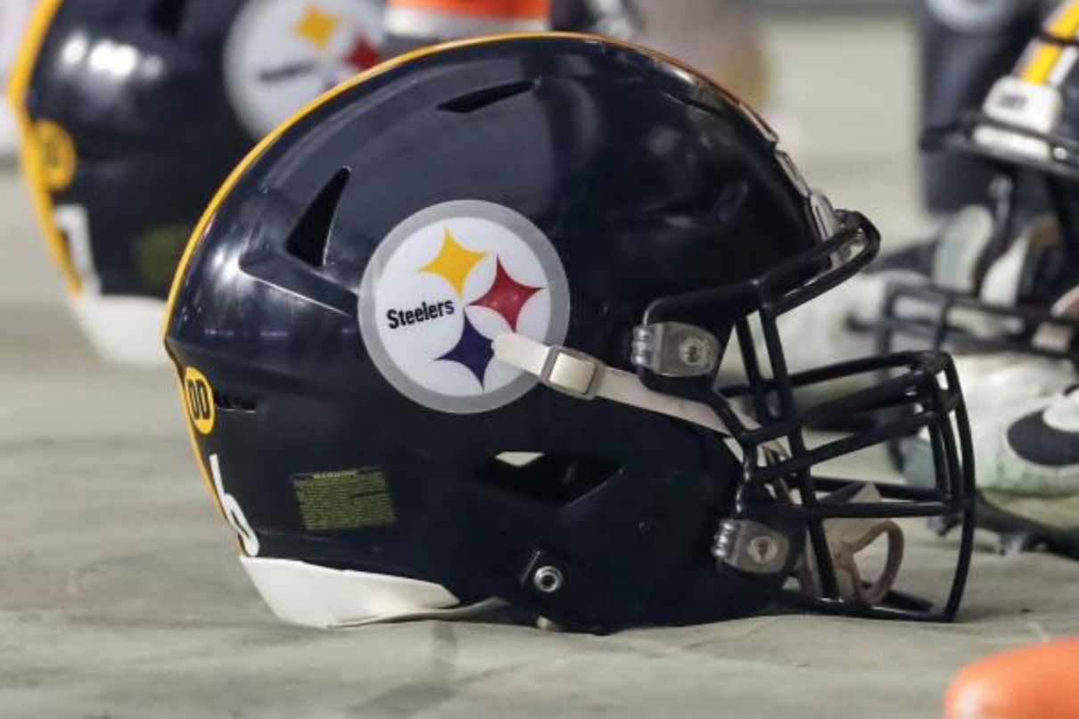
The Steelers are the only NFL team that places their logo on only one side (the right side) of their helmet. At first, this was a temporary measure because the Steelers weren’t sure they would like the look of the logo on an all-gold helmet. They wanted to test them before going all-out. The then 1962 Steelers finished the year with nine wins and only five losses, which was good compared to previous seasons. At that time, it was noted as the most wins in the teams’ history. They finished second in the Eastern Conference and qualified for the Playoff Bowl. This success sparked the team to do something special to celebrate, so they changed the color of their helmets from gold to black. That only made their new logo look even better. So, after all that success, the organization decided to sport the logo exactly as they had it. It’s still only sported on one side of the helmet.
Today’s helmet reflects the way the logo was originally applied, and it has never been changed.


