
- Choosing the right font for your logo design can be difficult. Before you start, you’ll want to know a little background information about typography.
- There are five typeface families: serif, sans serif, blackletter, script, and decorative. Each of these typeface families contains many specific fonts.
- The best font to use in your logo design will depend on several factors, but should be chosen based on contrast, color, and creativity.
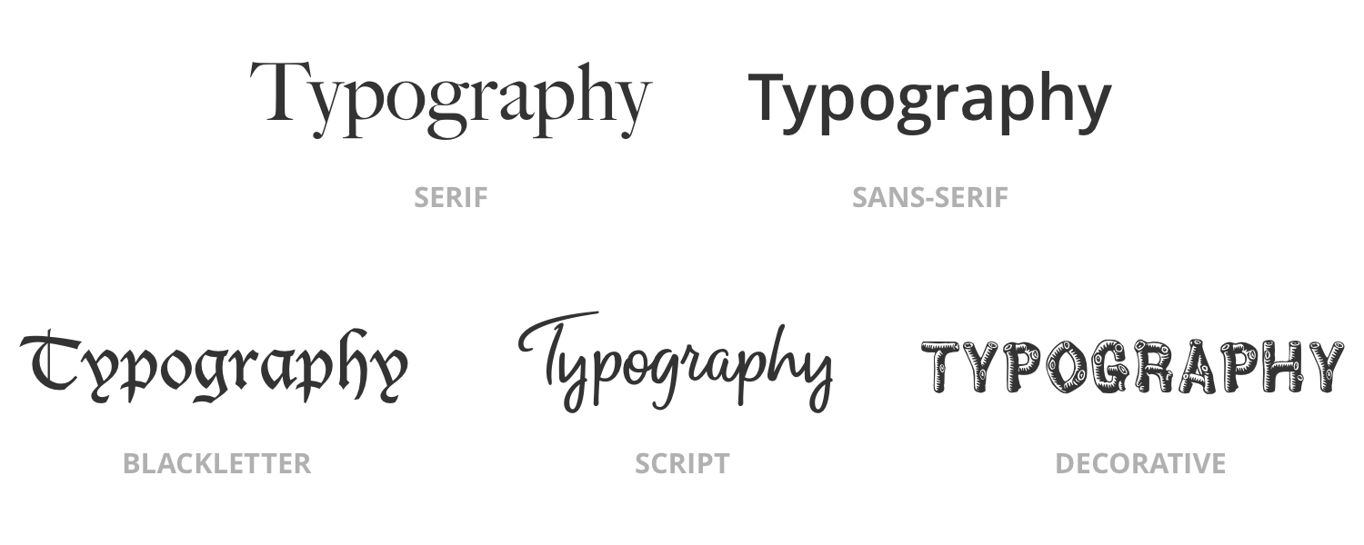
A logo design is only as good as all of its parts. One of the most important elements is the font you choose for the name of the company. Although there are five different “families” of fonts, there are thousands of fonts available to choose from online. Before you make your final decision, think about how your font will work with contrast, colors, and the creativity of the logo.

Contrast
Contrast is a key element of logo design. By definition, contrast is the juxtaposition of dissimilar elements (such as color, tone, or emotion) in a work of art. You can use a font that’s starkly different from the icon, artwork, or graphics in the logo for contrast. Using two contrasting fonts is a great way to draw the viewer’s eye toward one part of the logo or wordmark first.
In general, it’s a good practice to use a sans serif font as the dominant font and a serif font as the secondary font, or vice versa. The contrast between the two is subtle but not invisible, and it doesn’t distract the viewer from any graphical elements or drawings the logo might include.
It’s also a great idea to use a script font when the wordmark is short or simple. You can use a script font with a sans serif font for a stark contrast, or you can use a serif font for subtlety.
While it’s a smart idea to avoid decorative typefaces in logos, some clients might disagree. If you have a client who wants a decorative font in their logo, make sure that the tagline font you choose is an ultra-simple sans serif font. It’s all about a balanced contrast that highlights the most important elements of the logo.

Color
While some companies might not choose to use color in their logo, many do. Color choices make so many different statements. They can communicate a message about a company’s values, aesthetics, or their approach to business.
The color(s) used for the font in the logo design are extremely important choices. Wisely, most companies will choose a dark, easily readable color for their font. This makes a lot of sense because the brand’s name is so important. We also like it when companies use other dark and easily readable colors, like navy or dark purple, to stand out and flaunt their brand identity.
When it comes to font choice and font size, it’s important to test out several different shades of a dark color. Use a variety of combinations and see what works best. While we typically recommend standard black, that might not be the right choice for all companies. Experiment with different colors and shades to find the best fit.

Creativity
How do you tie the right font and the graphic design features together? Creatively is the answer. To finalize a logo design, you’ll need to flex your creative muscles and experiment with many different fonts. There’s no better way to find out if a font is the right one than to try it out in the design!
As you tinker with the logo design, you’ll want to ask yourself several questions. What font combinations provide the right amount of contrast? Is there enough color to make the logo interesting? Do the font and color choices complement each other? Have you balanced words with graphic elements?
As a logo designer, you bring your unique perspective to the work and put it into action. Your work will reflect your client’s needs, but sometimes, you know what the logo needs better than your client does themselves.
Creativity means freedom to try and fail. Make sure you leave plenty of time to submit the design before your deadline. Greatness rarely happens on the first try!
Choosing A Font Is All About Message
When you decide on a font for your logo design, you’ll need to pay attention to the big picture. That’s where contrast and color need to be creatively tied together with the graphical elements (like an icon or drawing) in the logo. Experiment with several different fonts from the five typeface “families” before you submit your final design. Make sure you try out several combinations so you can be confident you’ve chosen the best font for the logo!


