With the New Year came a fresh batch of companies giving their company a rebrand or updating their logo. Kia was one of those companies that decided that 2021 was the year that their logo would get a refresh and feelings from their audience were mixed on the new logo. Not only did the company announce a new logo, but they announced it with a boom. The logo came with a new brand slogan and a firework display to announce it.
It’s not news to anyone that Kia has been killing it lately in just about every aspect of their company. Over the past few years, the company has seen win after win from taking home the gold calipers for SUV of The Year award back in 2019 to recently launching stunning new vehicles and talk about Kia’s Global CEO, Ho Sung Song’s, “Plan S”.
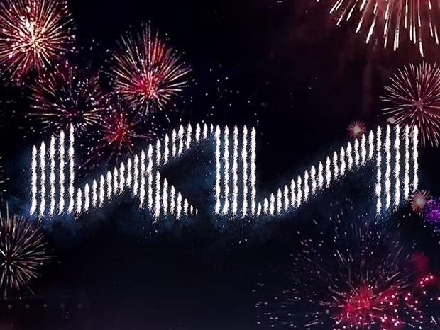
In light of these recent developments, Kia decided to keep the ball moving and test their luck with yet another win by announcing their new logo and brand slogan in the skies of Incheon, Korea. This was done with a display of fireworks on January 6th, 2021, and amazed viewers with the announcement.

Although the occasion was memorable, Kia’s new logo itself has created a buzz around the media. There’s been talk about Kia’s new brand relaunch for years, but now that the company has officially launched its new logo the public can’t stop commenting on it. As is the trend now with logos, Kia’s new logo is modern and slick. The new logo is said to inspire confidence and appears in what is supposed to appear as a handwritten stamp of approval.
“Kia’s new logo represents the company’s commitment to becoming an icon for change and innovation”, said Ho Sung Song, President and CEO of Kia. “The automotive industry is experiencing a period of rapid transformation, and Kia is proactively shaping and adapting to these changes. Our new logo represents our desire to inspire customers as their mobility needs evolve, and for our employees to rise to the challenges we face in a fast-changing industry.”

Although Kia’s new logo was supposed to be inspiring and endearing to customers, the logo has faced mixing feelings from its audience. Some claim that the logo is unrecognizable, with all three letters connecting in what appears as the handwritten stamp of approval. If you don’t look closely there’s a chance that you can mistake the words ‘KIA’ for merely a ‘K’ and ‘A’ or even a backward ‘N’’. Many think that, if you have a logo with your company name in it, you should be able to make out the letters. Only time will tell if the new logo comes to endear itself to customers as it starts to launch on new vehicles and marketing material.
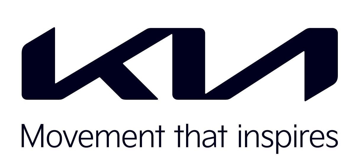
In addition to Kia’s new logo, they also announced their new global brand tagline that you’ll soon see making its way across new Kia marketing material, “Movement that inspires”. The new tagline goes hand in hand with their new logo, both attempting to inspire customers and inspire confidence. Feelings from the customers were mixed about the new logo and tagline, but we’ll have to wait and see if customers come to accept it over time.