The 2020 Olympics have come and gone, but our memories from the Games won’t fade anytime soon. Along with the competitions, athletes, and theatrics, a great amount of detail has been poured into the designs for Olympic-associated events throughout the years.
The 2020 Olympics were obviously a Games like no other – held in 2021, without spectators, and with masks – but there was one fun highlight of this year’s game that designers will love: UK diver Tom Daley designed and knitted a beautiful sweater during the Games.
While we love Tom’s sweater, we’re not here to critique fashion. Let’s take a look at some of the logo redesigns for the organizations, sites, and events that are connected to the Olympics.
- An Olympic Park in Montreal, Québec, embraced new branding that has both its pros and cons.
- The Olympic Museum’s special Heritage Exhibit was much more than just a simple alteration of the museum’s main logo.
- The 2028 Olympic Games in LA features perhaps the most remarkable logo branding we’ve seen in the history of the Olympics.
Take a closer look at these three logo designs.

Parc Olympique
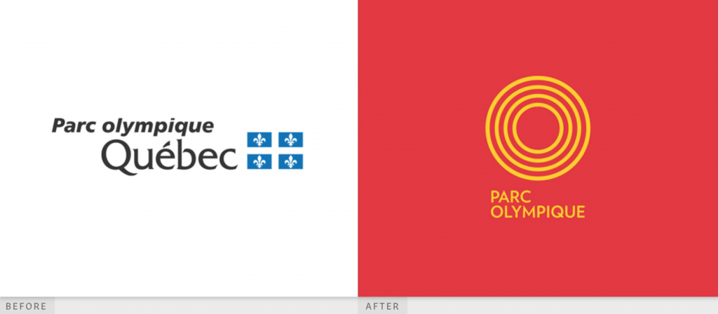
Parc Olympique Québec went through a rebranding in 2013 when the organization changed its name to Parc Olympique and completely transformed its look. The former logo is traditional but somewhat overcomplicated. There is no need for two different fonts, even if the font styling for “Québec” was that of the city’s styling, at the time.
The new logo is modern, simple, and bold. The sans serif, all-capital font clearly communicates the brand. The word “Québec” has been dropped – a decision that we’re not sure was necessary. It could have been made smaller and kept, and then the viewer would immediately know that the logo meant the Canadian Olympic Park, and even more specifically, the one located in Quebec.
We’re also not certain that we approve of the color scheme change. The blue-and-white Québec flag was the only color in the old logo, while the new shouts at the viewer with its bright red and yellow, reminiscent of the McDonald’s color scheme.
That said, we absolutely love the new logo itself. The four yellow rings both evoke the Olympic rings and the shape of a park. The visual is stunning!

Olympic Museum
Celebrating the glory of the past Olympic Games is one of the main purposes of the Olympic Museum. Located in Lausanne, Switzerland is a tribute to the champions of the Olympic past and features both permanent and temporary exhibitions.
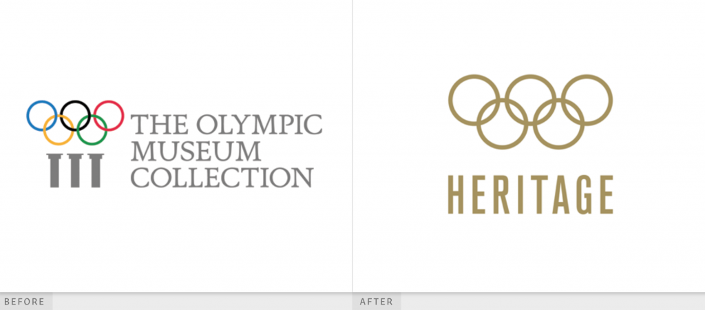
The museum’s current branding looks very similar to the version of the logo in the image on the left, with the coloring removed. The Heritage logo on the right was adopted for a special exhibition.
The Museum’s overall logo pays homage to the origins of the Olympics with its Greek columns. The interlocking rings floating above the three columns are iconic and the view immediately knows what this logo is all about. The font used for the wording is a traditional serif font, and since the letters are the same color as the gray columns, there’s a further connection to tradition implied there.
The logo for the Heritage collection is both similar and remarkably different. Of course, the primary difference is the color: the Heritage logo is all Gold and even has a metallic hue. The word “Heritage” is styled in an ultra-narrow, sans serif font. It makes an impressive statement, and we can see why the Museum adopted this logo!

LA 28
The 2028 summer Olympic Games will be held in Los Angeles, a city home to iconic entertainers. Although the Games are still years away, the logo is making waves, not in the least because it’s been co-designed by celebrities. A visit to the Games’ site shows a constantly-changing logo, with almost 10 animated versions of the letter A.
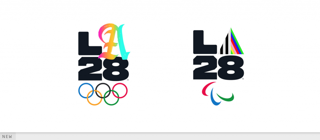
We could take a look at all of them, but let’s focus on the two in the above image: the scripted letter A for the Olympics logo, and the triangle A for the Paralympics logo.
Script A is interesting because it’s both a very traditional style. Without looking at the colors, it could almost be a drop cap in a medieval book. However, you can’t ignore the colors or the texture of this A. The gradient ranges from pink to orange, to a sliver of green, and then an aqua blue. The texture is of a paintbrush, evoking graffiti, which LA has embraced throughout the years. We love this mix of the old and new!
The Paralympics logo is also very interesting. While the L and 28 are identical to the Olympics logo, the A in this image is simple in shape: a triangle, evoking a prism. Perhaps the messaging is that Paralympic athletes don’t fit into one specific mold, but can embrace this abstract shape. The colors within the triangle-A are high contrast, but the right side features bright, cheerful rainbow shades.
Olympic Logos Deserve the Gold
The Olympic Games have taken many different formations over the years, creating the need for many different logos. The three we’ve looked at here all feature their own strong points. As long as the Olympic rings are involved in some way, we think the rest of the messaging will be clear. We’re excited to see what future Olympic branding will look like!


