Brands in a range of industries include the eagle in their logo and branding. Eagles carry rich symbolism and are associated with positive qualities like honor, loyalty, bravery, intelligence, and leadership. These birds are swift flyers and skillful hunters, so they’re popular among brands that want to develop similar connotations.
Eagles have an elegant, streamlined appearance that translates well to graphic elements like logos. Also, since many governments feature eagles in their national symbolism, brands can appear patriotic by using eagle imagery. Explore some of the most famous logos featuring an eagle to see how brands represent themselves using the eagle’s various qualities.
American Airlines

The American Airlines company logo features an abstract, stylized logo in the brand’s red, white, and blue color palette. The logo is a diagonal oblong shape that fittingly resembles the wing of an airplane.
A streamlined white element represents the head of an eagle and breaks up the red and blue fields. This logo is easily recognizable from a distance, making it a good fit for an aviation company. The design capitalizes on an eagle’s reputation as a fast flyer to build a similar connotation among passengers.
Anheuser-Busch
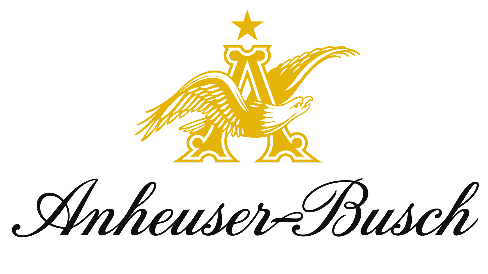
The Anheuser-Busch beer company’s logo features a classical design with traditional Americana elements. The logo includes a golden eagle flying through an ornate letter A.
The bird serves as the character’s crossbar, making it an integral part of the design. A single star is centered above the A.
Below, the company’s name is displayed in a black script. This design makes the most of the eagle’s elegant, classical reputation. The eagle’s spread wings also bring to mind powerful symbols like the United States seal.
Barclays
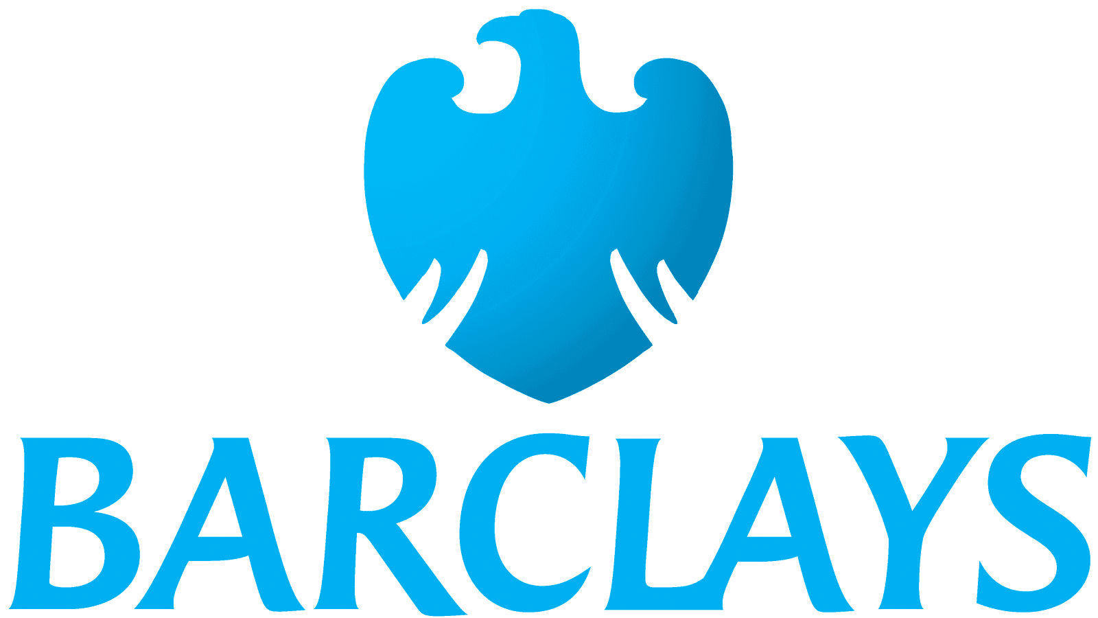
The Barclays bank logo features a bold, blue eagle silhouette alongside its wordmark. Barclays uses a stylized, minimal bird image that shows the entire body at once.
The eagle is shaped like a badge or a shield, giving the immediate impression of safety and security –valuable qualities for a bank to cultivate. The eagle’s wings are extended to each side, the tail is fully spread at the bottom of the design, and the head faces to the left.
The graphic precedes the wordmark in the full logo so the eagle appears to be looking ahead. This further emphasizes Barclays’ safety focus to customers.
U.S. Department of Homeland Security
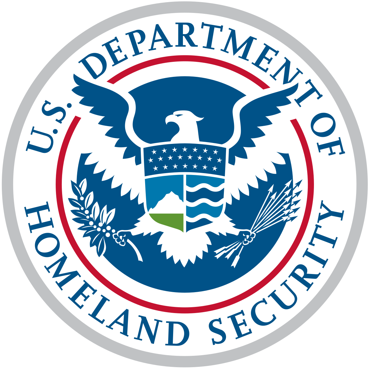
The United States Department of Homeland Security is one of many federal agencies that uses an eagle in its branding.
The seal features a silver border surrounding the department’s name, which is rendered in a blue serif font. The center of the seal showcases a white and blue eagle with outstretched wings on a blue background.
One foot clutches a brace of arrows and the other, an olive branch. A shield with stars, mountains, and waves covers the eagle’s chest. The eagle’s wings are illustrated with white space which gives the design a more modern feel than other federal agencies.
Colorado Eagles
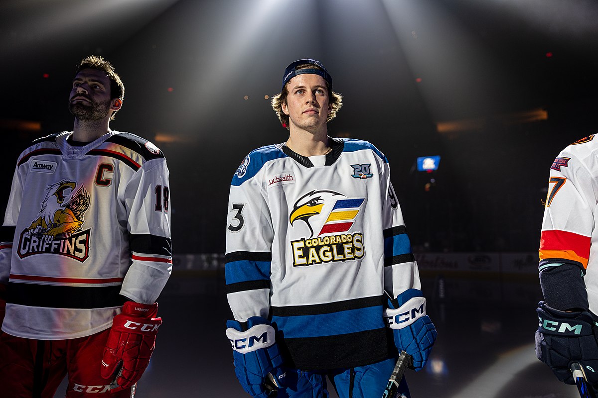
The Colorado Eagles hockey team uses a bright logo that combines a stylized eagle face, tricolored flag, and the team wordmark.
The bird has a white face, golden beak, and fiercely determined expression. Blue, gold, and red banners can be interpreted as a team flag or as the letter E for the team name.
Below, the wordmark uses a bold serif font with thick gold and black outlines. The design makes a strong impression on a hockey jersey since the eagle’s face adds to the player’s intensity.
Gulf Air
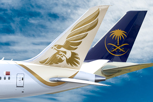
Gulf Air is another airline with an eagle logo. The company, headquartered in Bahrain, combines a flying eagle with a dual wordmark of the company name in both English and Arabic. The eagle is seen from below, mimicking the angle at which people see airplanes from the land.
Individual feathers can be seen thanks to white space throughout the wings. This version of an eagle is more graceful than that used by many other brands. It gives the logo an elegant aura that helps distinguish the company from its competitors.
Hogwarts (Harry Potter)
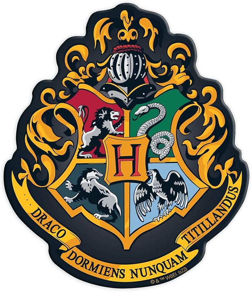
Hogwarts, the magical school featured in the Harry Potter series, uses a crest with an eagle and three other animals (a snake, a badger, and a lion). Each animal represents a house within the school, standing for the characteristics of the students in the house.
The eagle is the mascot of Ravenclaw House and explicitly represents intelligence within the story. Ravenclaw students are known for being smart, wise, and academic-minded.
Even though the house is named after a raven and not an eagle, the eagle’s classic characteristics are still being referenced.
The Independent

The Independent is one of the world’s largest and most respected news outlet. Its logo depicts a white eagle with wings outstretched as if coming in for a landing. The eagle is carrying a rolled-up newspaper and the graphic is shown on a red circle.
The newspaper’s name is shown next to the graphic as an all-caps, serif-font wordmark. This logo capitalizes on the eagle’s symbolism as an intelligent, authoritative animal. This symbolism imbues the newspaper with respected, respectable imagery that enhances its role in the world.
Mexico
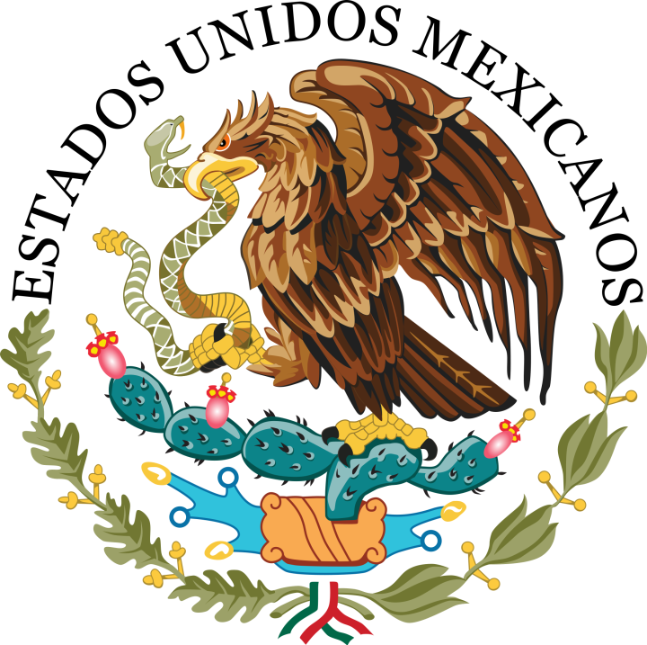
The Mexican government is one of many countries that use an eagle as a national symbol. The Mexican national shield, or coat of arms, features traditional symbolism that’s several centuries old. The design centers around a Mexican golden eagle which is standing on a cactus while eating a snake.
These elements are all indigenous to Mexico and represent an ancient Aztec myth, which foretold Tenochtitlan would be built where people saw an eagle devouring a snake.
The modern design features bold colors. It’s also available in a striking black-and-white version.
Nationwide Insurance
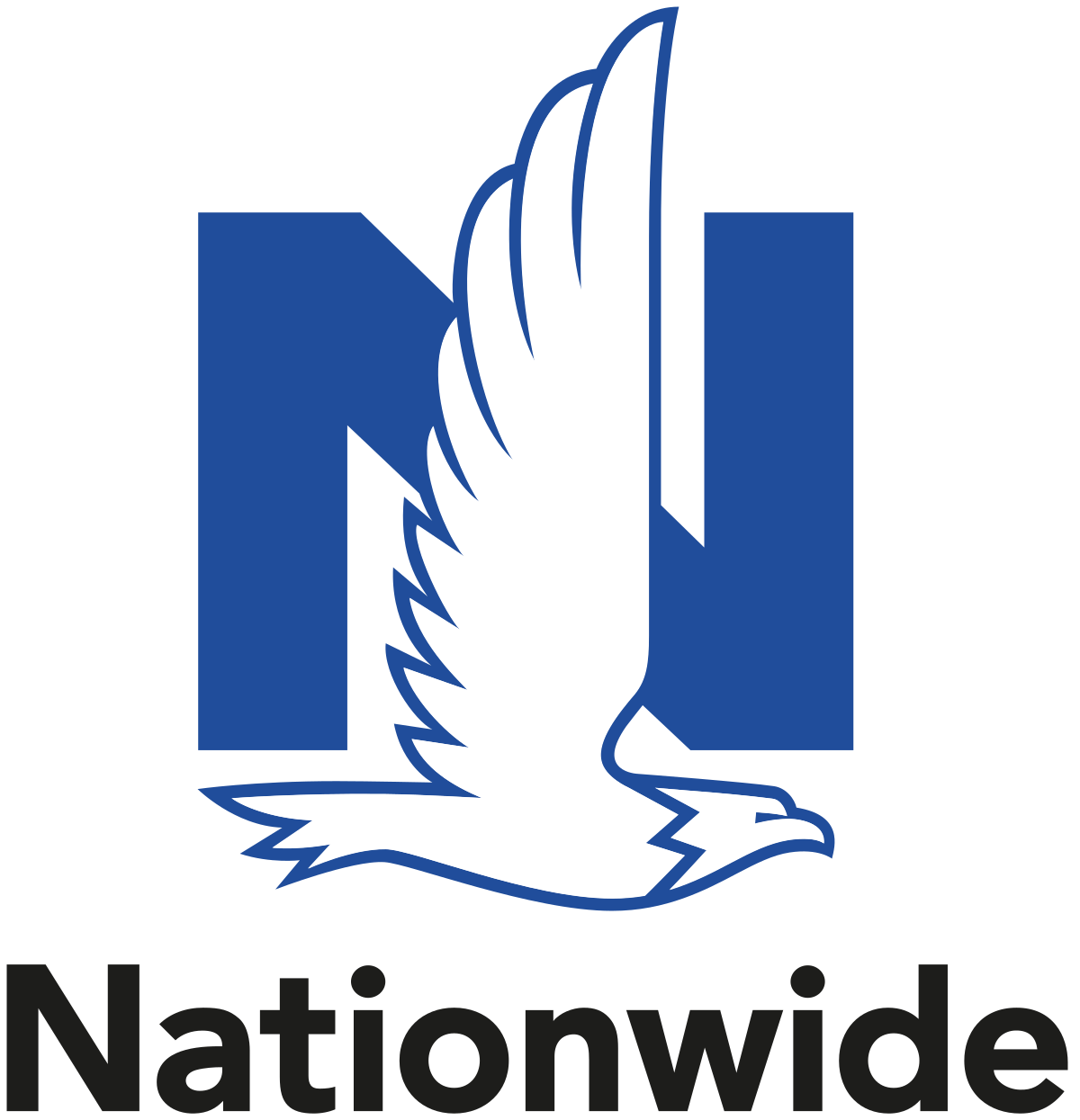
The Nationwide Insurance company logo features a flying eagle in profile over a blue sans serif N.
From beak to tail, the bird’s body is perfectly aligned with the character. This creates a sense of well-balanced symmetry.
Unlike many other eagle logos where the bird faces left, the Nationwide logo is flying to the right. This unique design element helps the Nationwide brand stand out among its competitors.
Queen
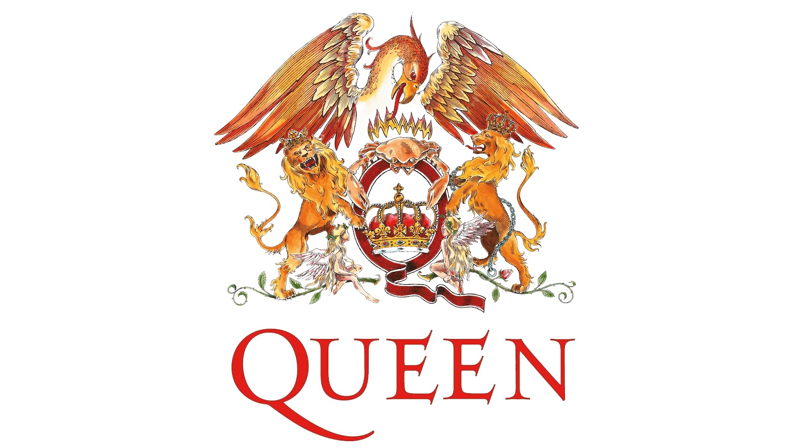
The glam rock band Queen used a logo that specifically references the symbolism of the British royal family.
The logo uses classic design elements seen in state seals such as crowns, banners, and mythical creatures. A large golden eagle stretches its wings above two lions, a crab, fairies, greenery, ribbons, and more.
The band’s name is displayed in a dramatic red serif font below the graphic. Upward-leaning serifs and the tail on the Q give the logo a sense of motion and drama that exemplifies the band’s orchestral, impressive sound.
The United States
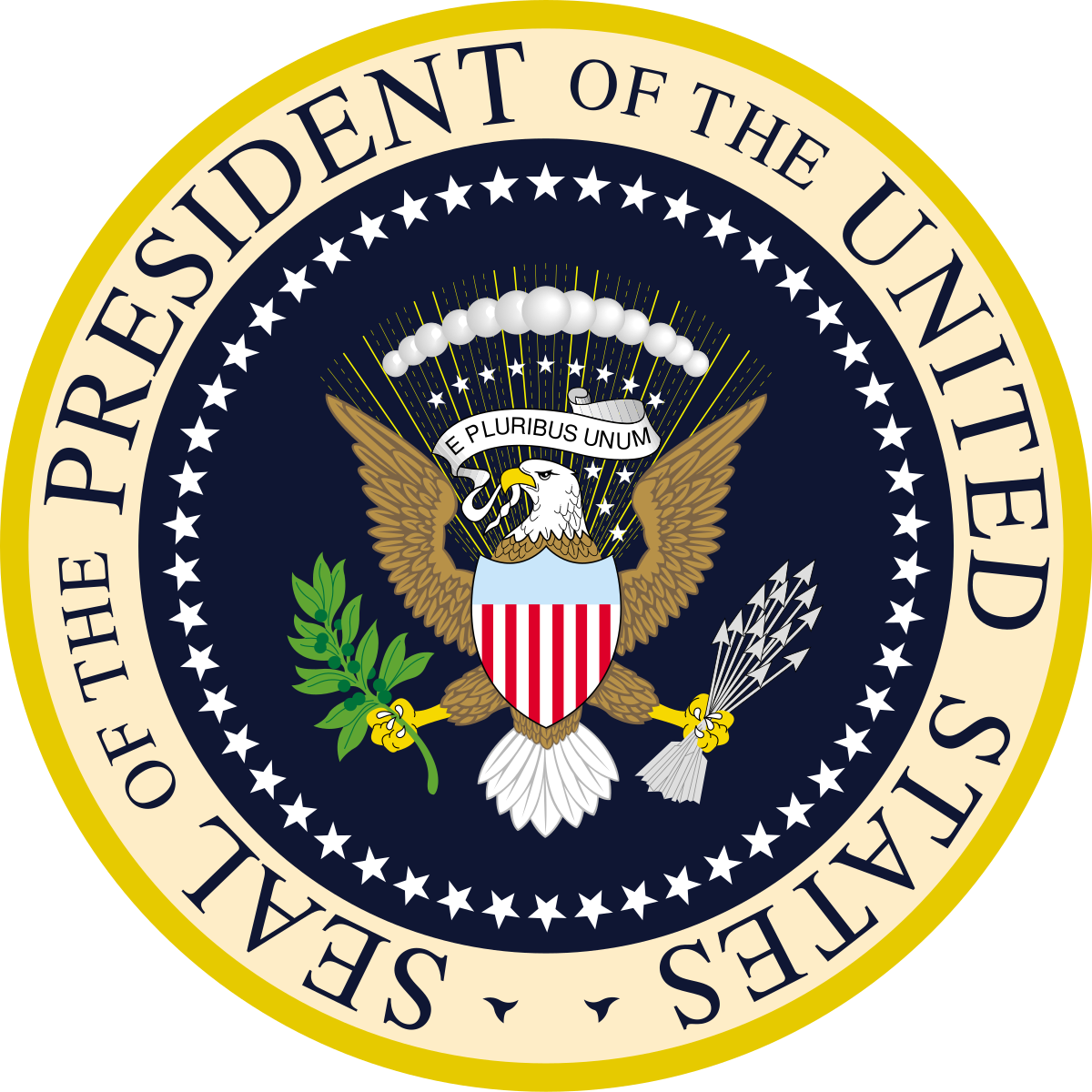
The Great Seal of the United States, also known as the Presidential Seal, prominently features an eagle. The navy-colored center of the seal is surrounded by a golden border. A brown and white bald eagle is displayed with wings extended on the center of the seal. With its head pointed to the left, one foot clutching an olive branch, and the other holding a bundle of arrows, the eagle gives off traditional, official, authoritative vibes.
The seal features other details referencing American history. Thirteen stars, representing the original thirteen colonies, surround the eagle’s head. A banner in its mouth reads E Pluribus Unum, the country’s motto. The seal itself is surrounded by one star for each state. Many other graphics reference this seal because it’s an iconic design. Similar ideas can be found across government agencies as well as brands in many different industries.
The Ramones
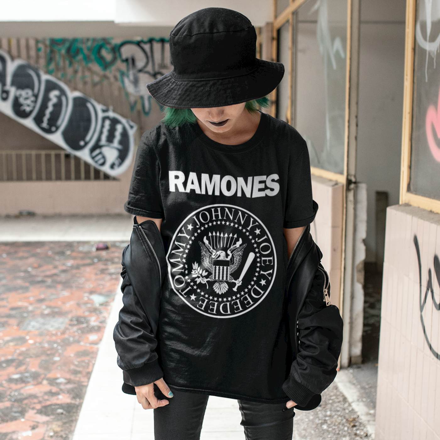
The seminal punk band the Ramones used a logo very similar to the Great Seal of the United States. The round logo is designed as a seal which features an eagle in the center. At first glance, the bird looks identical to that in the United States’ seal. However, the Ramones eagle is carrying a baseball bat instead of a clutch of arrows.
The logo also features all four band members’ names instead of the name of the country. The band name is displayed in a sans-serif font above the graphic. This iconic design is usually rendered in stark tones on a contrasting background: for example, a white logo on a black shirt.
Smirnoff
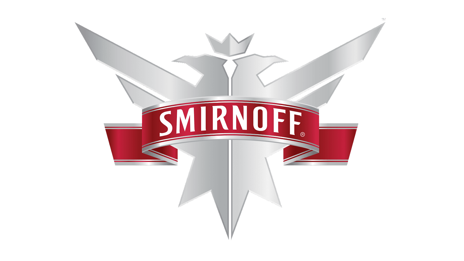
The Russian vodka brand Smirnoff uses a double-eagle logo that reflects its history while also looking to the future. Smirnoff was founded in the 1860s and was soon recognized by the Czar as a Purveyor of the Imperial Court.
The Russian coat of arms at that time featured a double-headed black eagle that was covered in crests, wearing a triple crown, and holding a royal orb and scepter. The Smirnoff logo features a streamlined, modern interpretation of this classical design.
The current Smirnoff logo is a silver double-headed eagle behind a red banner carrying the brand’s wordmark in a Cyrillic-inspired sans serif font. While the current logo only wears one crown, it clearly references the brand’s history.
Philadelphia Eagles
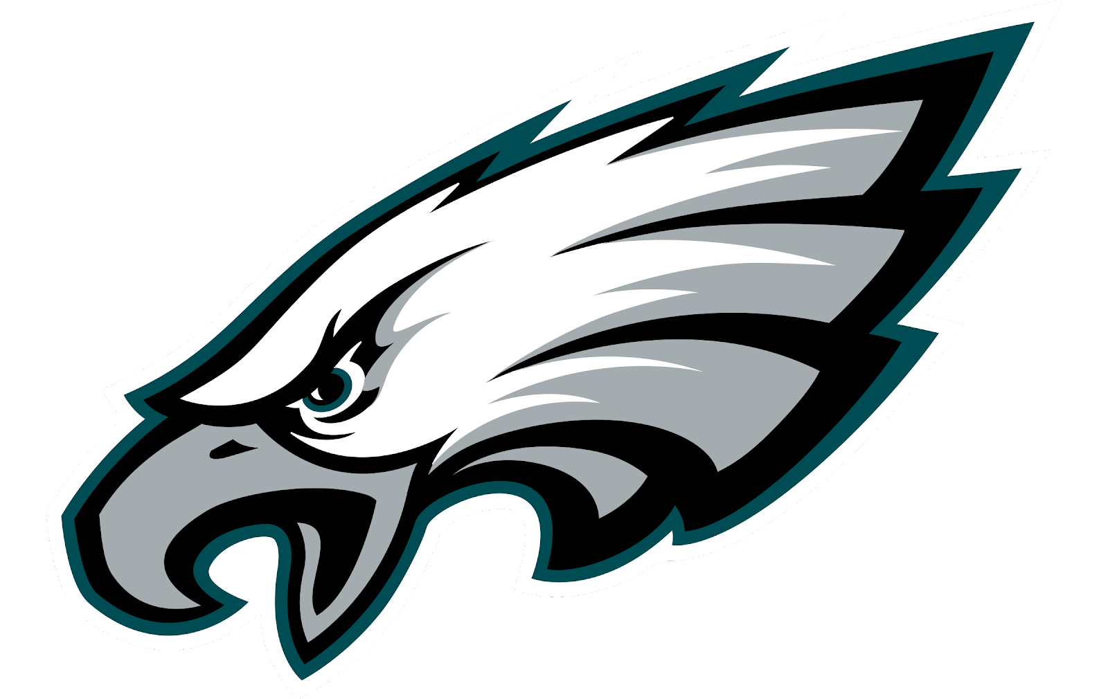
An eagle logo is an obvious choice for the Philadelphia Eagles football team to use. Since the team is named after the eagle, it makes sense for its branding to prominently feature the bird.
The Eagles logo is a diagonally angled eagle head shown with its beak open and eyes emphasized. At this angle, the logo resembles a bird diving while it hunts.
Additionally, the logo is shaped like an oval, resembling a football. The logo features a white, grey, and black color scheme that stands out against any solid color. It’s a striking combination against the Eagles’ forest green jerseys.
United States Air Force
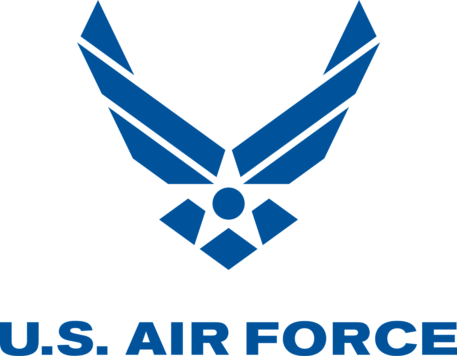
The United States Air Force (USAF) uses a very stylized design that references an eagle as well as other military elements. The navy design makes clever use of white space to imply folds in a ribbon, such as might be seen in a service medal, with two ends pointed upwards.
Below, white space triangles create a five-pointed star. Taken together, these elements also resemble a flying eagle seen from the front. These designs represent the Air Force’s flying expertise as well as its celebrated military history.
Finally, the abstract design gives this military branding a more modern look and feel than previous logos.
United States Postal Service
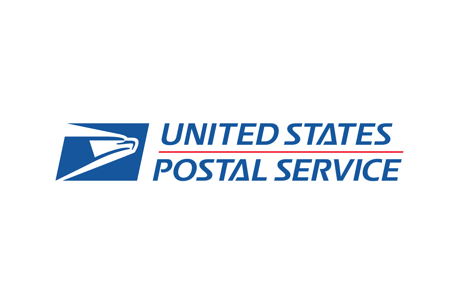
The United States Postal Service (USPS) is another government agency with an eagle in its branding. The USPS logo features a blue parallelogram with a stylized white space eagle design reaching from the left side towards the right. The bird is drawn with bold navy lines and surrounded by curvy white space.
Combined with the right-leaning angle of the parallelogram, this design creates a sense of motion that’s appropriate for the mail. The graphic is combined with the agency name as a wordmark. The wordmark uses a navy, italicized, sans-serif font that adds to the design’s sense of forward motion. A horizontal red bar separates the text into two lines while also creating a patriotic red, white, and blue color scheme.
Wilson Combat
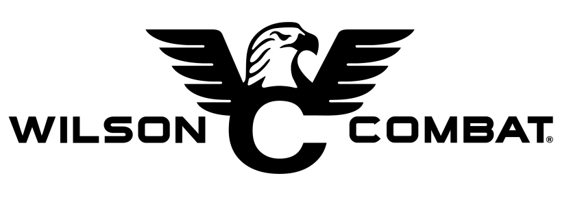
The Wilson Combat weapons company’s logo includes an eagle’s wings and head over the letter C. The graphic black and white design showcases five spread feathers on each wing, plus a fierce expression on its face in the center. These elements resemble the letter W. Combined with the C, the logo includes both initials of the brand’s name.
The eagle features bold strokes that give the design an authoritative feeling. The logo also includes the brand’s full name as a wordmark. One word is featured on each side of the design in a tactical sans-serif font. The entire design is rendered in black which adds to the logo’s serious look and feel.