
Our daily lives would look drastically different if Microsoft was never founded. Would we still work on computers every day? Would social media still exist?
Would Apple have been able to create the iPhone? Microsoft’s revolutionary products and developments have changed the way we work, live, and play.
Along with other tech giants like Apple and Samsung, Microsoft has created a huge brand with global reach. One of the facets of that brand is its logo. We all recognize it, but how did it start, and has it changed over the years?
If you’ve ever wondered how the Microsoft logo came to be, this article will break down the history of the brand and its icon symbol from its inception. Before diving into Microsoft’s logo though, first we’ll highlight how the Microsoft brand came to be and how it paved the way for future technology brands.
About Microsoft
Microsoft spreads far and wide. You can find its ecosystem of technological advancement on Windows computers, the Xbox game console, Skype video calling, the LinkedIn business social platform, and even the cube-tastic Minecraft game.
But like pretty much every company, it has small beginnings.
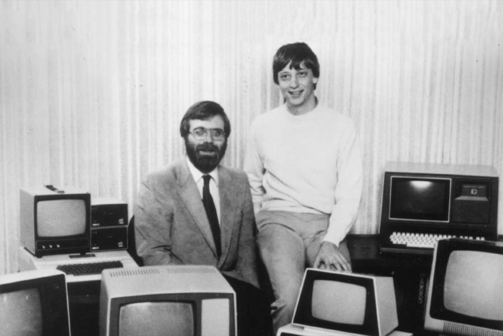
Many know that Microsoft started as just a couple of nerds experimenting in their California garage. The founders, Bill Gates and Paul Allen created the company that now employs roughly 170,000 people worldwide. From that garage, the two grew a business that today has a 17% market share in the SaaS segment.
Like a later tech company, Facebook, Microsoft also got its inspiration at Harvard University. In 1975, Gates and Allen uncovered their shared dreams which aligned – they both dreamed big about changing the world through technology. This was a dream so big that Gates couldn’t wait to graduate to get started. Instead, he left Harvard prematurely to get right down to work.
While it may seem unwise, they and the rest of the world are glad he did. With any new business, it’s important to look at your strengths as a founder and identify the gaps you need covered. This is exactly what Gates did. While he had the big idea and extensive knowledge about PCs, he wasn’t a skilled programmer. Once he added a programmer to his team, the rest of history. His first product that he worked on with his programmer, was an operating system. At the time, IBM dominated the computer space, so he knew that they had to create a system hat IBM would adapt. Sure enough, his plan (and big idea) worked and IMB signed a deal with Gates for his operating system. The whole premise this system was built on was the need for an easier way that people could use computers, on a greater scale than simply in the office.
If you look at Microsoft today, you’ll still find a company that paves the way for other companies in this space. Microsoft’s reported annual revenue for 2022 was $198.27 billion, a 17.96% increase from the year prior. What has led to this steady growth is Microsoft’s diversified product base today. More than just computers, Microsoft also owns (and generates revenue from) Xbox, LinkedIn, Skype, and more. The list of accolades and recognition the company has received is extensive. From one of the best places to work, to corporate responsibility awards, to becoming the 3rd company to top a trillion-dollar market cap, Microsoft continues to be a company others aspire to be like.
The company’s success is seen in its founder. Before there was Steve Jobs and other tech giants, Gates became the youngest billionaire in the world. When he reached this accomplishment in 1987, Gates was only 31 years old! Gates has made it a mission to also give back to the world. Even before establishing the Bill and Melinda Gates Foundation, Gates has always made philanthropy a top priority.
Over the years, the company’s design team has developed a series of logos to capture the brand and communicate its values and services in just a single icon. While it’s gone through several updates, the Microsoft logo has always been a modern representation of the current times and the push toward the future.
The logo has come to encompass all its various subsidiaries and core offerings. So, let’s take a peek at everything the logo has been through and how it got to be what it is today.
The Evolution of Microsoft’s Logo
Without even looking at Microsoft’s logo, you can probably state what it looks like. Between that symbol and the ubiquitous boot-up chime, it’s the first thing that comes to mind when you think of Windows. But the logo hasn’t always been so streamlined and the ideal of modern design.
Below we walk you through how Microsoft’s logo has evolved over the years.
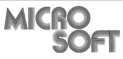
The First Version of the Microsoft Logo (1975 to 1980)
The company launched on April 4, 1975, with a logo created by Simon Daniels. This first logo iteration resembles the decade that it was introduced, the 70s. The font is a disco-like font and the “Micro” and “Soft” are separated onto two separate lines. When Microsoft was first founded, Gates and Allen played around with making these two separate words. Going back to the font, the disco-like typography directly relates back to that decade, conveying feelings of movement, just like how if you were at a disco, you would want to be dancing.
Nowadays, this logo is practically unrecognizable and a complete departure from the current iteration. It was a perfect representation of the times, however.
The typeface was especially era-centric, similar to the Aki Lines font, and came across as youthful and progressive. The rounded letters with their big, open O’s were in keeping with the rebellious nature of 1970s California.
The Second Version of Microsoft’s Logo (1980 to 1982)
The laidback nature of the 70s changed, however, and quickly gave rise to an excited, fast-paced 1980s. The graphics of the era were bold, sharp, and much more aggressively dynamic than those of the generation’s predecessor. And the Microsoft logo continued to provide that the company was good at following current trends.
So, gone was the soft, rounded contours saw before, and in its place was a completely different font style. Still paying homage to how music makes you want to move, this logo seems like it was inspired by heavy metal bands with its sharp, pointy lines.
This second design by Simon was not subtle in the slightest, and the new Microsoft logo was based on the New Zelek font, which embraced piercing diagonals.
In many ways, it evokes the same edgy vibe of the hair metal bands of the time. In fact, the way the M, R, and F extend past other letters’ outlines is similar to the Metallica logo.
With this iteration, they also made the important choice to put the company’s name on a single line as opposed to breaking the Micro and Soft into two different words as they did before. This change would last until the current day.
This logo came across much more confidently than the previous logo, perhaps as a result of the confident style of the 80s, but it was clear the brand was beginning to find its feet.
Of course, this Microsoft logo change wouldn’t last. While some fans of the logo were sad that the “rock star logo” only lasted two years, modern logo aficionados understand why it went the way of the dodo. This logo actually perfectly illustrates a philosophy of modern logo design- timeless over trendy. While the 80s logo did encapsulate the style of the time, it didn’t stand up to the following eras’ many style trends and changes. It was trendy, but it wasn’t timeless, so it had to go.
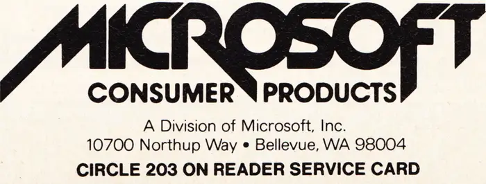
The Third Version of Microsoft’s Logo (1982 to 1987)
Simon Daniels and his team decided it was time for a change. Learning from their previous trendy take, they redesigned the Microsoft logo in 1982 to tone down the rock star logo for something more subtle.
This version that Daniels created echoed the original Microsoft logo from the 70s, using a similar font but in a cleaner, simpler format and was nicknaming this logo the “Blibbet” logo. It created a softer, rounder logo with an ultra-simple sans-serif font.
The “O” at the center was the main focal point and provided the most significant stylized feature, which showcased stacked lines to emulate those on a CD- a large part of computer functioning at the time. another logo that only lasted five years, this one played around with another font yet again.
In fact, they loved it so much that they created petitions asking corporate to keep the design instead of changing it for 1987.
This version of the Microsoft logo also fully separated the company from its disco origins and the two-year stint with the rock-and-roll, rebellious imagining. It illustrated how the brand was steering toward a greater focus on the technology itself.
Microsoft, and by extension, its logo, wanted to portray itself as a grown-up version of the startup company. This brand face was more adult, more put together, and more authoritative as it came to face the computer and business landscape of the late 1980s and 1990s.
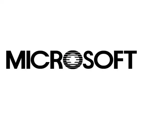
The Fourth Version of the Microsoft Logo (1987 to 2011)
This logo iteration stuck with the brand for nearly 25 years. Microsoft’s design team again played around with the “O,” this time making it resemble the Pac-Man that we know and love.
Baker would say when asked about his design that the slash or Pac-Man mouth created between the “O” and the “S” in the word Microsoft was designed to deliver a sense of motion and speed, emphasizing the “Soft” half of the word.
The angled lettering pushed the eye forward, and the bold Helvetica Italic Black font created a stylish compromise between the old Microsoft logos. It was more assertive than the Blibbet but not quite as aggressive as the 80s rocker logo.
This confident, fearless logo matched the brand’s persistent growth and dominance of the software landscape during the 90s and early 2000s.
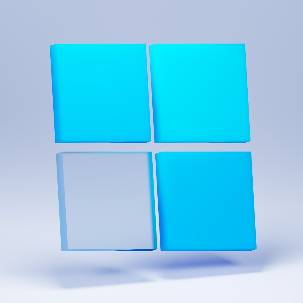
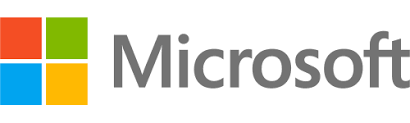
The Fifth (and Current) Version of the Microsoft Logo (2011 to today)
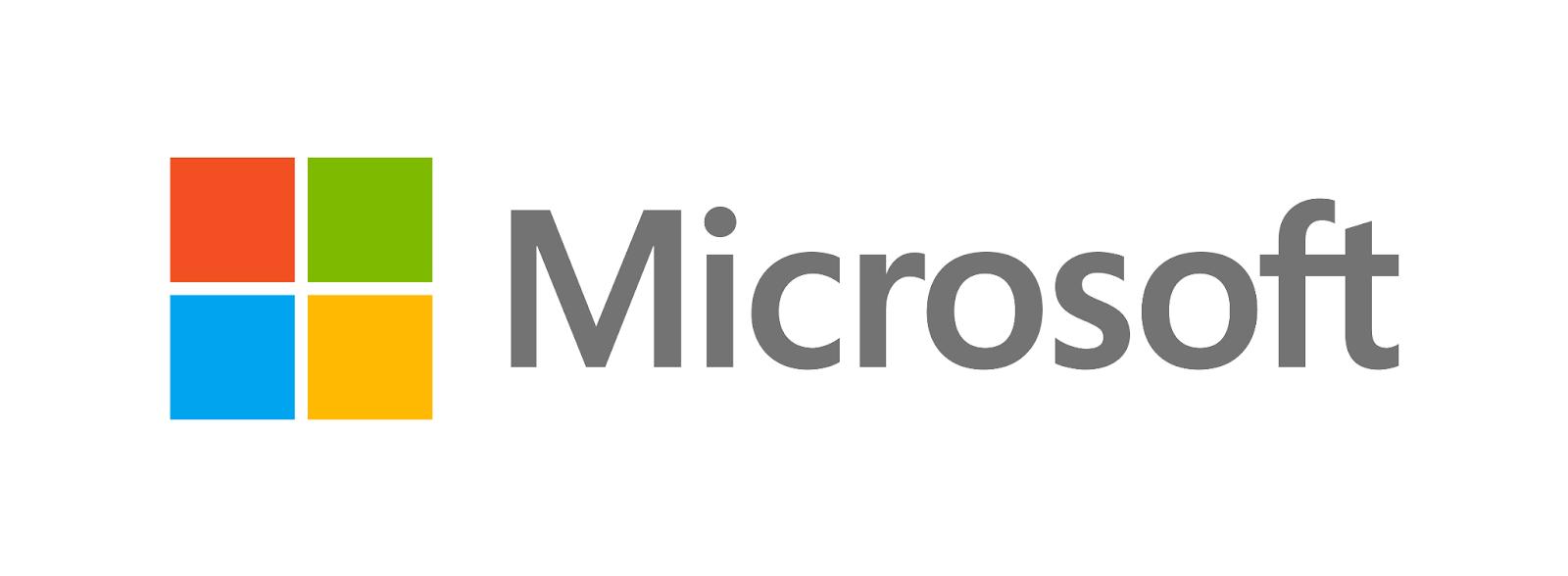
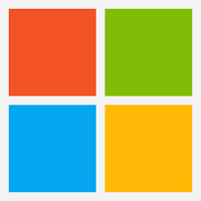
Lastly, the final iteration of the Microsoft logo came during the second decade of the 21st century and showcases the now very familiar four-color symbol next to the word Microsoft, which used the Segoe UI font.
This logo is so commonplace today, it can become hard to even remember the prior iterations! This version uses four different colors to represent four different software products and the font is drastically slimmer than the prior versions. This logo design, designed by Jason Wells, helped to refresh the brand.
The bright, colored windowpane was completely different from the old Microsoft logos. The font became the rounded Segoe UI, dropping the sharp elements of previous designs. And what’s more, the window icon showed the change to include a separate design element that wasn’t just a part of the name itself. The four-color panes harkened back to the company’s flagship software product, Windows, and the window symbol itself symbolizes looking out to innovation and into the future.
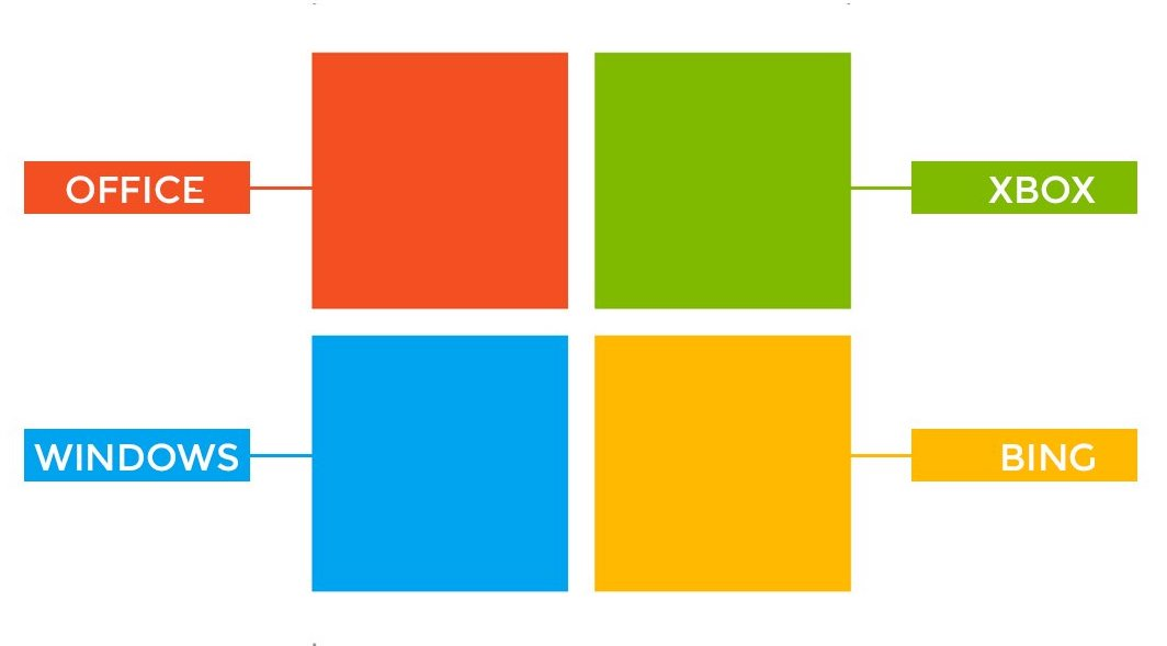
There are several rumors about what the four colors represent, and many believe them to be the specific software products the brand is most known for- blue is for the Windows OS, green is potentially for Xbox, red is for Office, and yellow is for Bing.
Regardless of whether that’s true, this logo seems to have true staying power.
Microsoft Logo Key Elements
With just its name and four simple panes of color, the Microsoft logo demonstrates the brand’s mission, product suite, and corporate identity.
- The Wordmark: No matter what version you look at, Microsoft always included its name in the logo.
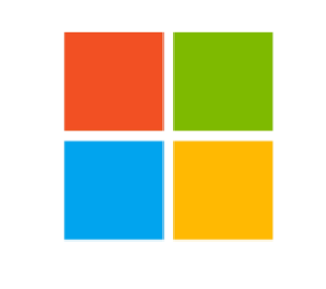
2. Window Pane: The new window pane is now the icon used across nearly every product and service the brand offers.
But there’s more to the design than just an aesthetically pleasing image. Let’s break it down.
Breaking Down the Window
Let’s tackle each of the four-color panes and determine what each one represents about this impressive software company.
1. The Red Square: The red square seen on the pane has two different meanings – it represents both Microsoft’s Office Suite, as well as PowerPoint (a component in the suite). This is not only the color of the PowerPoint icon, but it is also a color that helps to show the wide range of products Microsoft has under its digital belt.. Red evokes the high energy and passion behind the work created in the suite. It inspires viewers to get fired up and do good work.
2. The Blue Square: A second color in the pane is blue, a color meant to highlight the Microsoft Windows suite. This color is the most commonly associated color with Microsoft, so it was crucial to include this in the four-color pane. Blue evokes stability, calm, and a peaceful sky that reassures you that Windows can handle all your needs easily and conveniently.
3. The Green Square: Outside of computer software, Microsoft also founded Xbox. The official color of Xbox is green, so making green represent this was a no brainer. Xbox conveys a youthfulness to the brand by offering gaming products full of excitement and wonder.
4. The Yellow Square: The final color in the pane is yellow. This can be dually tied to Outlook and Bing. Yellow is no longer the official color of either application, yet Microsoft wanted to include yellow because of what this color represents. Yellow evokes positivity and creative thinking, which have been pivotal to Microsoft since its inception.
Since Bing has gone through a redesign, and no longer has yellow in its design, let’s take a closer look at this specific Microsoft logo.
Bing’s Logo
In 2016, Microsoft moved toward simplicity and speed as the Bing search engine worked to provide people with a better search experience no matter which device they used.
While it’s no match for Google, the Bing logo update did help push the platform into today’s modern style sensibilities.
Bottom Line
The 2021 logo has been around for more than a decade now, showing its staying power. While the logo has changed quite a bit over the years, it has always been a strong face of the brand and reminds us that dreaming big can pay off.
If the logo does get another facelift, you can be sure that it’ll continue to evoke the modern, technologically advanced industry it’s a part of.


