
Pizza is one of the quintessential American foods. What goes hand in hand with pizza are the pizza companies we know and love, especially Pizza Hut. Pizza Hut has been around since we were children and our parents were children, and has been a staple on the American, and abroad, pizza scene. It has had several changes over the years before finally settling on the one we know today.
Since its inception in 1958, Pizza Hut has grown beyond simply offering pizzas, but also including breadsticks, chicken tenders and wings, and desserts on its menu. With Pizza Hut, you can get a full suite of comfort food all at one spot.
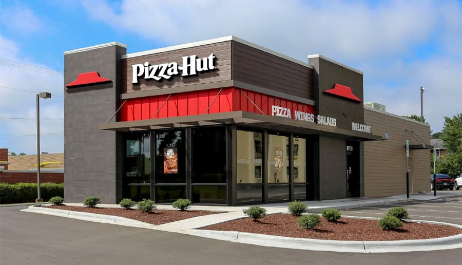
Pizza Hut’s logo ties back to the brand and the storefront that we all are familiar with. Both the storefronts and logos include the red roof pizza shop. It was a smart move to make the logo look like the 18,000 locations across the globe because it helped to build brand loyalty and a following.
Now that you know the basics of the Pizza Hut brand, let’s look closer at how the brand and the logo evolved over the years.
Meet Pizza Hut
Much like many businesses, Pizza Hut has humble beginnings. Pizza Hut was the brainchild of two children, Dan and Frank Carney, and started much smaller than the full-fledged pizza shop we know today. Founded in 1958, they had an entrepreneurial spirit, and the idea to franchise by selling locations to hopeful business owners. This idea came to them when they were just simply college students trying to make ends meet.
Instead of opening a pizza parlor like a friend suggested, Dan and Frank decided to take this idea and build upon it to open Pizza Hut. Since this was 1958, to start Pizza Hut the brothers only needed $600 from their mother. The Pizza Hut name was crafted due to the limited signage space the brothers could afford. The Pizza Hut name accurately depicted what the brand was about, and it was a name that stuck. When the store opened, the brothers generated buzz by giving away pizza to residents in the area.
As anyone low on cash or who’s been to college will tell you, nothing attracts an audience quite like free food, especially pizza.
As you can guess, the restaurant quickly picked up steam and became a local favorite. As we mentioned earlier, the brothers had a franchise idea and they brought this idea into conception with its first location in Topeka, Kansas six months later. This new restaurant opened the door to what would be generations of successful franchise expansion. Though the Carney Brothers lacked experience, they learned fast and could think on their feet, which helped them to pivot when needed. Soon, they expanded more across North America, opening six more storefronts.
After Pizza Hut began to expand slowly across North America, the Carney brothers decided to give up their ownership. In 1977, PepsiCo acquired the Pizza Hut brand and as a result, Pizza Hut was able to benefit from PepsiCo’s established customer base and marketing strategy. With this acquisition, PepsiCo. helped Pizza Hut to grow even more across the States and beyond.
Some locations attracted new customers with the option to either dine in, pick up, or have their pizza delivered. Other locations put their efforts towards marketing to the lunch crowds with buffets. Today, Pizza Hut has a global presence with unique menu items based on the location, and country, you are dining in.
Pizza Hut’s Logo Evolution
As you’ll notice below, Pizza Hut has gone through several redesigns before ultimately ending where the logo started, with the iconic Pizza Hut logo symbol.
Even during the logos’ evolution and redesigns, you’ll pick up on the fact that some design elements remained consistent with the brand.
The First Pizza Hut Logo (1958-1973)
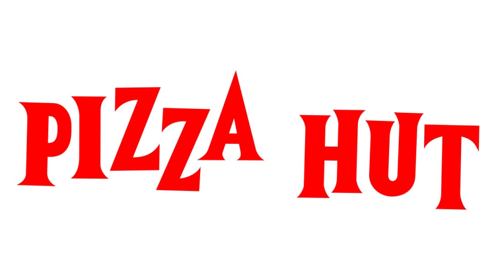
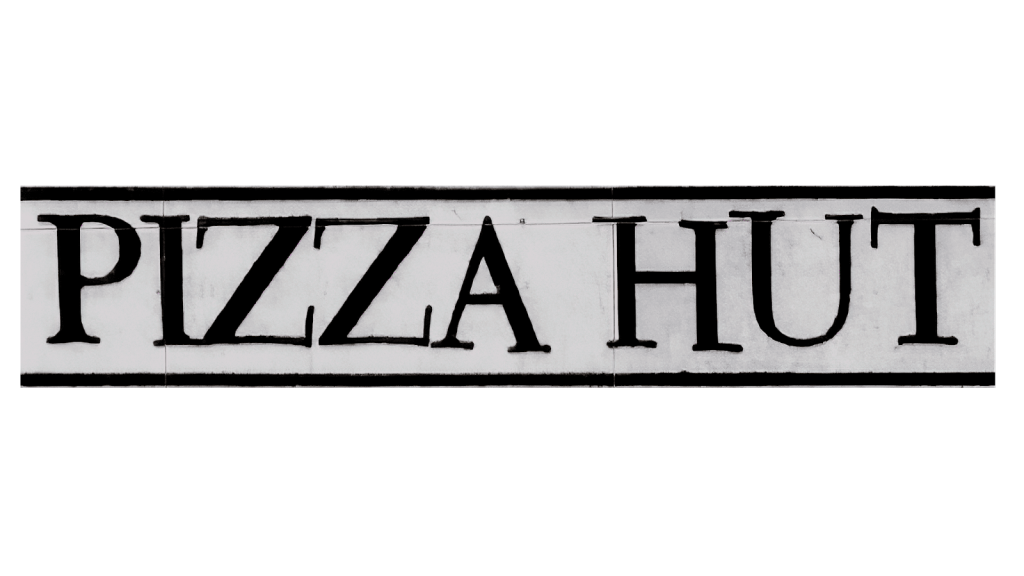
With the company’s founding in 1958, Pizza Hut unveiled the first iteration of its logo alongside it. This logo looks drastically different from the logo we associate with the brand today. This iteration is simple, only featuring the “Pizza Hut” name in bold, red letters. The lettering was not aligned, each a different height, which was the brand’s attempt at making the logo more fun and creative. The red coloring made the logo boldly stand out, while also tying back to the red pizza sauce color.
The second version of the Pizza Hut logo (1973 to 1974)
It wasn’t until nearly twenty years after the initial logo was released that the brand decided to unveil a new logo design. However, it wasn’t a drastic redesign. For this version, Pizza Hut altered the color palette, while keeping the lettering the same. Rather than using red, the colors of the logo were now black and white, with the words stacked on top of each other, rather than horizontally placed.Although the letters still tilted to showcase a bit of personality and fun, it was undoubtedly less bold than its predecessor. This second iteration did not last as long as the first version, with this logo design only staying as the face of the brand for one year.
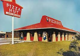
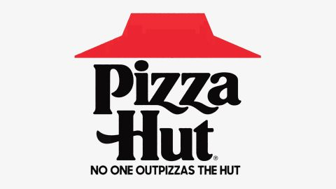
The third version of the Pizza Hut Logo (1974 to 1999)
As we just mentioned, the second iteration only lasted a year. When it came time to create a new logo design, San Moyers, made a drastic update. Rather than keeping the wordmark as the focal point, Moyers opted to create a red roof that mimicked a red hut. This directly translated to what Pizza Hut was, a “hut” or “roof” you could go under to grab pizza and more. While this design introduced a new emblem, the Pizza Hut name still was incorporated. So, just a year later, San Moyers took on the task of redesigning the Pizza Hut logo. The Pizza Hut wordmark was strategically placed below the red roof, in bold, black lettering.
1999 – 2008 A Time of Fast-Paced Fun
Pizza Hut had a new idea. The previous logo was incredibly popular when it launched, so they decided that embellishing it could make it even better. Pizza Hut’s iconic red roof symbol stayed the face of the brand for quite some time. Since this red roof was something that loyal customers have continued to associate with the brand, Pizza Hut didn’t want to remove this symbol. Instead, for this version, Pizza Hut’s design team played around with the lettering to make them appear more creative and youthful. Another update was with the addition of two new colors, yellow and green. The credit for this new design belongs to a new designer, Landor Associates.
Notably, the dot above the ‘i’ in the Pizza Hut logo was a specific choice from branding consulting firm Landor Associates. Most reports state that it symbolized a basil leaf – a component of Margherita pizza and brought out the Italian tricolor pattern that is popular among many Italian restaurants and pizza joints. The red, white, and green combination, along with a little yellow, are also supposedly the best colors for food branding, making the viewer hungry. Whether that’s actually true is still up for debate.
Another version of the Pizza Hut logo (2008 to 2017)
The last version of the Pizza Hut logo was the face of the brand for almost 10 years. When 2008 hit, Pizza Hut was designed to refresh its logo again. For this iteration, Pizza Hut’s design team played around with red and white shading and background colors. These choices were intentional and helped to make the logo pop. These updates were only made to the coloring and shading, rather than the font choice. This logo breathed a new personality into the brand, but another change was around the corner.

A New & Glossy Change from 2010 to 2014
When 2010 hit, Pizza Hut returned to its earlier roots, inspired by the 1999 logo design. However, they didn’t totally change their logo back to its original design from that era. Instead, the brand chose to create a new, glossy version of that traditional design. This update created a modern look, with the contours and the roof looking more vivid, evoking a sense of movement and speed. Here, the name sat below the icon in white letters with red accents. It also had a small black background and a white underline. The roof was extended a little and sat at a bit of an angle. The lettering was also much more blocky and straight, with the first letters of each word extended below the others.
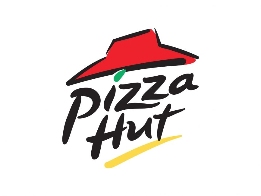
The Red & White Logo (2014 – 2019)
That logo stayed with Pizza Hut for four years before changing again. This time it was simplified, and the red and white color palette returned to a monochromatic, modern look. A solid red circle sat behind the text with swirling edges. The roof and letters returned to the slanted, playful lettering and were in a bold white. The circle symbol was an intentional choice. Since Pizza Hut is (as the name suggests), a company that makes pizza, the circle resembles the shape of that. While this logo iteration was more stylized than other versions, this one still allowed for certain elements, like the Pizza Hut name, to boldly stand out, without overcomplicating the design.
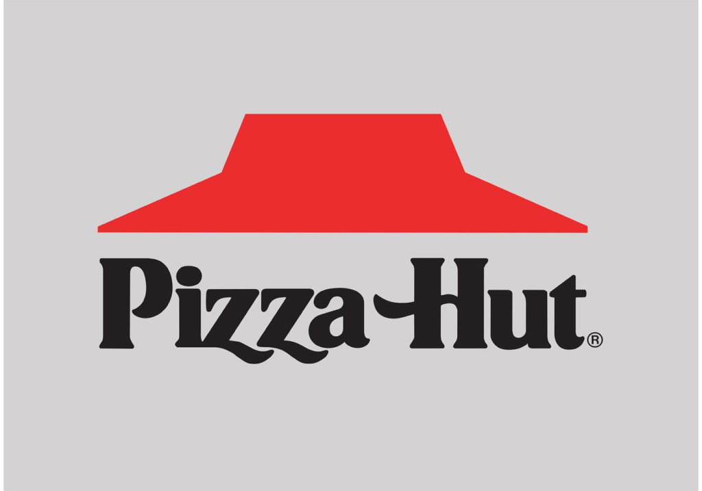
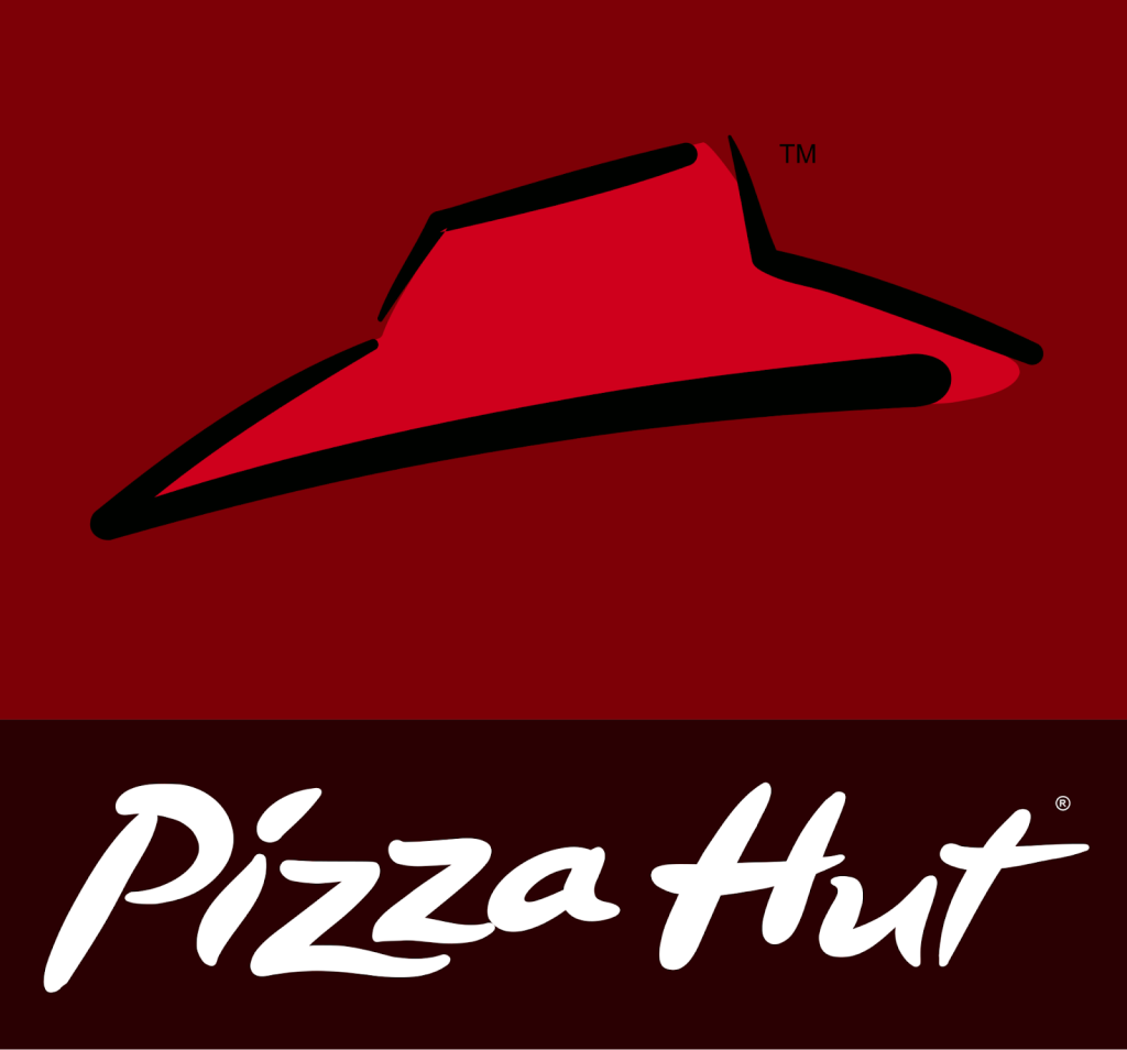
Pizza Hut’s Logo today (2019 – Today)
The logo we associate with the brand today is this logo, first introduced in 2019. While this logo iteration is the current face of the brand, sometimes you may see prior logo iterations used for different occasions. This version includes elements from an earlier version, even earlier than 1999. You’ll see similarities between this design and the one from 1974, specifically the black wordmark and the iconic red “hut.”
This traditional symbol of Pizza Hut is still instantly recognized by audiences and reminds viewers of the numerous places it was used in movies and TV in the 80s and 90s. The only update to this logo is that the red is a darker shade. Today this is the most common logo used in marketing and promotional material.
The different components of the Pizza Hut logo
As we break down the components of this logo, you’ll likely notice that some of what we highlight below has remained consistent with the brand. While it’s definitely had a varied history, you’ll usually always see the following features in the brand’s logo.
1. The Color Red
Since Pizza Hut’s first logo, the brand always elected to use the color red. Over the years, other colors were introduced but red was always the prominent color and the color of the brand. This ties back not only to the red roof, but also the color of pizza sauce, pepperoni, and other menu items.

2. Pizza Hut’s Roof
This creative design element was meant to replicate what the Pizza Hut roofs looked like across the country. This design element was created by Richard D. Burke and beyond looking like the storefronts, this roof represented the protection and safety of the Pizza Hut brand. When you step inside of a Pizza Hut, you are part of the family. Also seen as a red hat, it channels the warmth and love the brand offers its diners as a family, community-centric chain.
3. Pizza Hut’s Youthful Font Choice:
Pizza Hut’s font has always been boldly written, but it also has been youthful. This font is unique to the brand and sometimes are displayed on an angle, other times they are extra curvy, and other times they are even more boldly written than you thought possible.
The Logo in Action
Pizza Hut has never been shy about trying out new and innovative strategies or shying away from product placement in a plethora of movies and TV shows.
It wasn’t until 1965 when Pizza Hut first tried out mass media as a marketing tool. This year the brand filmed its first commercial called, “Putt Putt to the Pizza Hut.” The name of this commercial tied back to the brand’s slogan Since then, they’ve tried out several slogans including “Makin’ it amazing!” during the brand’s earlier days to their slogan today, “No one out pizzas the hut.”
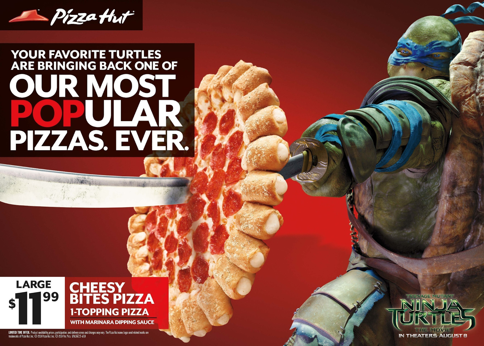
We talked about Pizza Hut’s sponsorship and TMNT partnership opportunities earlier, but this doesn’t fully capture all that Pizza Hut did. Pizza Hut was also featured in Back to the Future Part II.
They’re also in TMNT. In the original TMNT film, Domino’s was the pizza company that was featured, but later in 1990, the film highlighted a different pizza brand, Pizza Hut. After the film’s release, TMNT went on a concert tour called “Coming Out of Their Shells.” Pizza Hut used this tour strategically to promote the brand, spending approximately $20M on marketing. Pizza Hut continued this partnership in 2014 with the latest TMNT film.
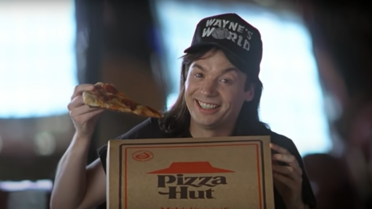
Their classic logo, which Pizza Hut is using again, can also be spotted in Wayne’s World in a not-so-subtle joke about product placement. Subtle or not, we all remember Wayne opening that box of pizza and giving the camera a big smile.
In fact, Pizza Hut loves sponsorships. One of their most substantial partnerships came with the Major League Soccer stadium. This stadium in Dallas became renamed the FC Dallas Pizza Hut Park. After this sponsorship partnership in Dallas, Pizza Hut went on to partner with the Dallas Stars and Dallas Mavericks, before becoming the official sponsor of the NFL and NCAA in 2018. Outside of the sports industry, Pizza Hut has also sponsored with American Airlines and other brands.
The Bottom Line
Pizza Hut’s success shows you that anything is possible with a small investment of $600. With $600 in their pockets, two brothers were able to establish one of the largest pizza establishments we know and love today.
Because of that, there are lessons we can all take away from this iconic pizza brand.
Experimentation and risk can play off. They’ve never allowed their brand to stay stuck in the past and have embraced every type of marketing and advertising avenue around. The company continues to succeed and reaches new hungry pizza fans every day.
While there may be talk of locations closing, Pizza Hut remains strong thanks to globalization and online ordering options. Many businesses were hit hard during the pandemic, but Pizza Hut adapted yet again
and continues to do so, securing its success for many years to come.


