The Shell logo has been a symbol of the company’s commitment to quality and reliability since its inception. Over time, the logo has been adapted to reflect the changing times and the company’s growth.
Now, the Shell logo is known worldwide, representing the company’s global presence and dedication to excellence and innovation, and it’s a powerful symbol that has stood the test of time. The Shell logo has come a long way since its first rough sketches in the 1900s.
Over the years, small and significant changes have been made to the design, leading to the iconic emblem we associate with the company today. Shell has become a legend among gas stations, and its logo is a big part of that. It is now recognized worldwide, and its design has become an iconic symbol of the company.
This article covers all details of the iconic logo, from its history to the company name and the logo’s changes over the years. We will explore all this and more, so keep reading to find out more!
The Origin Of The Name

The name for the Shell gas station comes from the company’s roots in the oil industry. The company was founded in 1907 by the Royal Dutch Shell Group, formed by the merger of two rival Dutch petroleum companies.
The name “Shell” was chosen to represent the two companies’ shell logos. Shell gas stations are now a well-known brand in the United States and around the world, offering a variety of fuel and automotive services.
The Shell gas station logo is one of the most recognizable symbols in the world. It was first introduced in 1900 by Marcus Samuel, the founder of the Shell Oil Company, and inspired by a seashell found on a beach in the Philippines.
It has since become a symbol of reliability and convenience, with the name being a significant part of the company reaching great success.
The Start Of Shell
The Shell gas station began in the early 1900s when Marcus Samuel Jr., the son of a London-based antique dealer, decided to expand his family’s business. He began importing oil from the Russian Empire and selling it to customers in the United Kingdom.
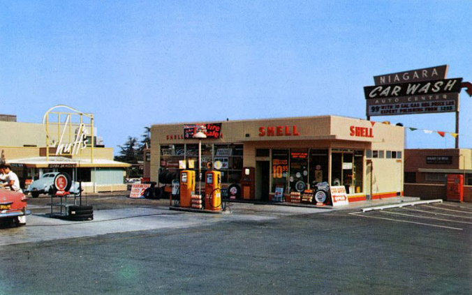
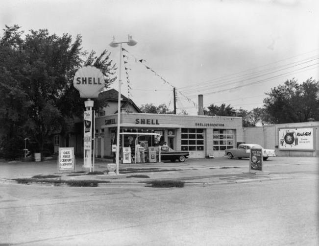
This marked the beginning of Shell’s journey to becoming one of the world’s leading oil and gas companies. In 1907, Shell opened its first gas station in the United States. The station was located in Seattle, Washington, providing customers with gasoline, kerosene, and other petroleum products.
Since then, Shell has grown to become one of the most recognizable brands in the world, with gas stations located in over 70 countries.
The Shell Logo Throughout The Years
The shell logo has been running since the early 1900s when it was first used to represent the Shell Oil Company. Over the years, the logo has undergone several changes, but the basic design has remained the same.
The most recognizable version of the logo is the red and yellow “Pecten,” which was introduced in 1971. This version of the logo was designed to represent the company’s commitment to innovation and progress.
The logo has since been used to represent the Shell brand globally and is now one of the most recognizable corporate logos in the world.
Below we look at each logo change throughout the years and what changes were made to reach the iconic symbol we associate with the company today.

1900––1904: The First Logo
The first Shell logo was created in 1900 and was a simple black-and-white design of a mussel shell. The logo designers opted to keep the design basic, clean and straightforward for the times, avoiding the temptation to overdo it with too many aspects and making the design cluttered. The design was a transparent white background with a black and white shell and was kept that way for many years.

1904––1909: The First Change
Four years after the iconic logo debuted, the designers decided it was time to make a change. They removed the oval shape and instead opted for a scallop shape. The design is fan-shaped and more realistic, with alternating dark and light lines. The stripes on the design stand out against the clean white background, making the dark lines even more noticeable. This new logo is just as iconic as the first.

1909––1930: Darker Shading
The company had used the same logo for five years before deciding it needed some changes. These changes were minor but effective; more black was added to the design, and the fan shape was made more prominent. This was done by adding shading so that there was less white, and the shape was more evident to viewers. The shape remained the same, but the shading meant that it stood out more.

1930––1948: A Bolder Look
In 1939, the logo was redesigned, making it bolder. This redesign removed the clutter of the previous design, making it appear cleaner, sleeker, and more minimalistic. Adding white helped to bring the design together and make it look classy. The distinct lines and thick black edges made the design stand out from the rest.

1948––1955: The Iconic Colors Are Introduced
This was a symbolic moment in the Shell gas station’s history and a significant moment in the history of the logo. For the first time, the company decided to introduce color into the logo. The chosen colors were yellow and red––yellow appearing on the main part of the shell and red appearing on the outer edges. The company name was written in white letters in the center of the design against a white background. This was a bold move for the company as they had used traditional black and white for the logo since its creation. The decision to include color in the logo showed progress and the company’s willingness to keep up with modern trends.
The colors chosen for the design of the company logo were dark and rich and were used to show what the company was truly about––extracting and processing fuels. The red and yellow added a warm and soft touch to the design, which had previously been simple and minimalist. The designers opted to make the lines in the shell only appear at the top and bottom of the design so that the company name could fit in the center. At the top of the design, the lines were thicker and more spaced apart, while at the bottom, the lines were thinner and closer together.
1955––1971: The Logo Is Simplified
In 1955, the company decided to simplify and minimize its logo design. The contours and accents of the design were minimized, and the name changed to red. The prominent colors and shape of the logo remained the same, but the rounded and random lines were replaced with straight stripes.
1961––1971: A New Background
In 1961 the logo changed again, and the background changed to red to match the lines in the logo. This gave the logo the appearance of the lines blending in with the background and helped the yellow color to stand out. In addition, this drew attention to the icon and created harmony with the lines and background.

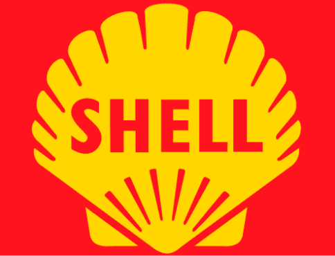
1971––1995: Another Change
The company decided it was time for a change in the early seventies, and the red rectangle was replaced with a border. This new design featured a thick outline around the circle and a darker red that stood against the yellow. The lines were reminiscent of sunbeams, radiating out from the center and connecting to the thicker exterior of the shell. The lines had an end with the rectangle removed, creating a more dynamic and modern logo.
1971––Now: The Logo Today
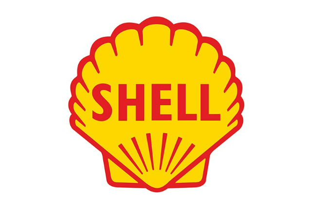
The Shell logo that visitors are familiar with today vastly differs from the first logo used to represent the company. The modern logo is a bright yellow and red scallop shell shape on a crisp white background. The outer border of the logo is thick, and the lines blend into it, creating a symbolic appearance. This logo does an excellent job of representing the company while adding character and giving it a meaningful definition. It is a solid and recognizable symbol of the Shell brand that stands out and is easily identifiable.
Why The Logo Is Important

The shell logo is a powerful symbol associated with the Shell Oil Company. It is a recognizable and iconic logo that helps to create an identity for the company and to differentiate it from its competitors.
The logo also represents the company’s values, mission, and goals. It conveys a sense of trustworthiness, reliability, and stability––all important qualities that customers look for in a company.
Additionally, the logo is a strong visual representation of the company’s commitment to providing quality products and services to its customers.
Overall, the shell logo is an essential part of the company’s branding and helps create a positive image.
The Colors Of The Shell Logo
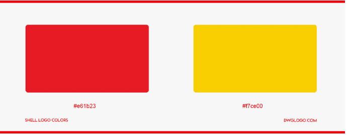
The Shell gas station logo is iconic and instantly recognizable, featuring a bright yellow and red color scheme. The yellow color is associated with energy and optimism, while the red is associated with power and strength.
This combination of colors is important for customers looking for reliable and trustworthy gas stations. The bright colors of the Shell logo also help to make it stand out in a crowd, making it easier for customers to find and remember.
The Impact Of The History Of The Logo

The Shell gas station logo has changed significantly throughout the years, from the original pecten logo to the current simplified design. The original scallop-shaped logo, used from the 1930s to the 1970s, featured a pecten––a type of scallop shell––in red, yellow, and white.
This logo was replaced in 1971 with a yellow and red logo featuring a stylized shell with a more modern look. In 1999, the logo was simplified further, with the shell becoming more abstract and the colors being reduced to yellow and red.
This stylish logo has become iconic and is recognized by millions of people around the world. The evolution of the Shell logo has significantly impacted the brand, as it has helped solidify its identity and create a strong visual representation of the company.