The Complete History Of The Target Logo


Target is known widely as one of the United States’ largest retailers for a good reason. The retailer is known for providing customers with cost-effective pricing and quality products, a feature that the company prides itself on. Since it was first created, the company has quickly warmed its way to many hearts with an adoring and loyal customer base.
But the company isn’t only known for its high-quality and affordable products; it’s known for its exceptional branding and intelligent designs that stand out in the vast retail world.
Companies can learn a lot by looking at the iconic Target symbol that has made its mark with simple yet signature designs. Although the iconic logo appears to have stayed the same for many years, it has undergone a few changes to receive today’s magnificent result.
Many shoppers agree that the signature Target bullseye logo is one of the most recognizable and memorable logos ever.
But the question of where this logo originated and how it evolved to the iconic symbol we see today is one that many people have.
How did the famous retailer create an image that has become so iconic and associated with the brand to the level we see today? Let’s look at the history of the Target logo and how it has evolved into the memorable bullseye used.
1962––1968: The First Concept
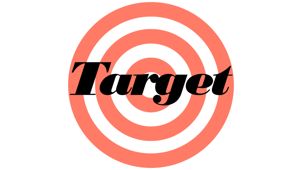
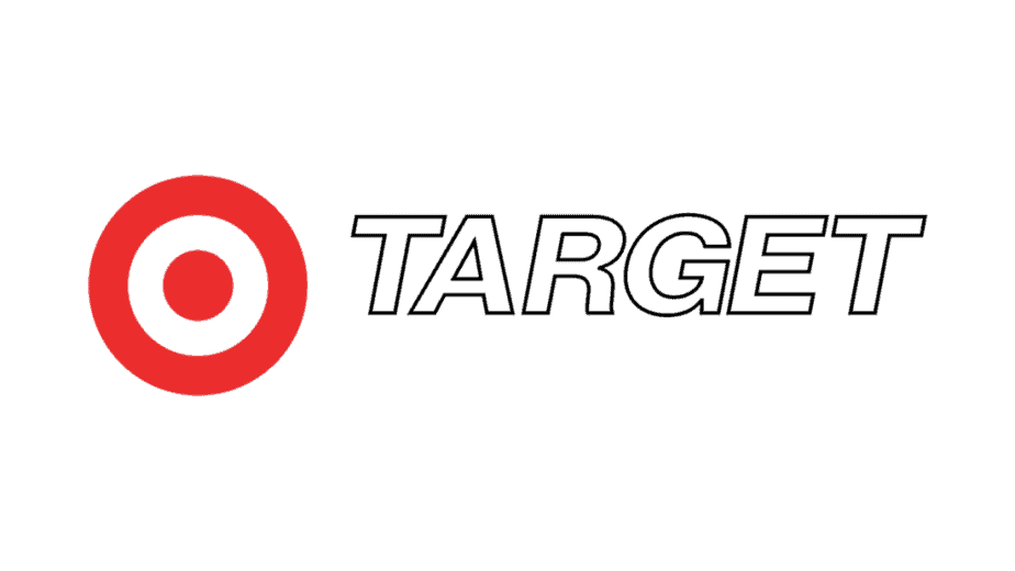
The original logo that the company used was created in 1962 and stayed with the company for six years. The first concept used showed three concentric rings with the company name in black letters in a fancy font. This was to mimic the bullseye that marksmen use when shooting. The name was written in italics and stood out, making the name and the message clear. The colors were white, a light red, and the letters in black. Although this logo made a mark, the quality wasn’t the standard it could be, so the company ultimately decided to change it.
1968––1974: The Bullseye Makes An Appearance
The following logo introduced the famous bullseye that we see today. Although the first logo introduced the idea of the bullseye, the second logo showed the actual bullseye that we see today with a more precise direction and bolder colors. This new version of the logo showed the company name to the right of the bullseye in a black outline and a white background that helped the red and black stand out. The design was shown to the name’s left, separating the two elements somewhat. The version of this logo that most people see is the bullseye on its own, while others show just the name. These two design elements were used separately on branding promotions as necessary.

1974––2004: A New Font
The previous logo stayed with the company as it was for six years before they opted for a small change. In 1974 they decided to change the font that was used. Instead of the thin outline used for the name, they used a different, thicker typeface. This one showed the letters bolder, straighter, and wider. This new design brought the most attention to the company name since it now stood out and was easily read.
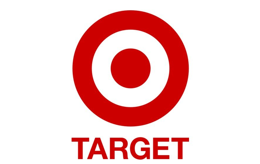
2004––2018: All One Color
Two decades later, the brand opted for a more significant change to the design. This one showed the bullseye above the company name, this time with the bullseye and the company name in red. The font, as was the bullseye, was kept the same, except for the change in color to the title. This change simplified the design by making everything in one color which appeared cleaner and more minimalistic. The name was more minor now, with the bullseye the center of attention, and then name seen smaller underneath it.
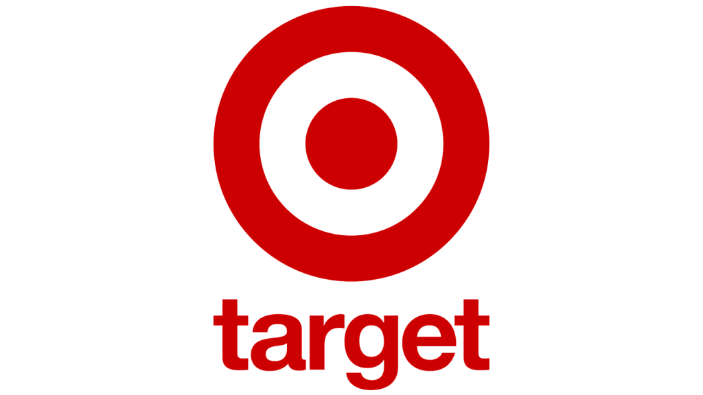
2018––Now: The Logo We See Today
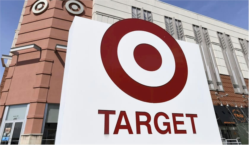
The logo we see today was created in 2018 and is currently used on all the branding for the company. This design was slightly changed from the one made fourteen years ago, with minor edits that were slight yet noticeable.
The most significant change was that all the letters were changed from uppercase to lowercase letters. This was sleeker and had more casual energy than the previous logo. In other variations, the name was entirely dropped, just using the bullseye to represent the company.
Design Elements of The Logo
The Target logo is one of the greatest and most iconic symbols of all time, with much we can learn from it. The simple and minimalist design has made its mark on the world and is stuck in many minds, evoking many positive emotions for those that see it.
The company chose red for its design, which displays power and energy while also being a nice color that stands out. The Target logo clearly shows the company, what they do, and what they want to display as a business. The circular symbol is timeless, representing unity for the brand. These essential qualities are what make the brand iconic and classic.
The Color
Red and white have always been the two symbolic colors of the Target logo that stand out and make a difference.
The emblem used black for the company name previously but then replaced with red, matching the rest of the design.
White is seen as a background color, while red makes more of a statement. The red is an eye-catcher and stands out boldly, symbolizing all that the brand is and what they want to be moving forward.
The Circles
The Target circles are the most iconic part of the logo, and although a few people think of the center of the design as a dot, most see it as a circle. The Target logo today has three circles shown.
These logos represent timelessness, movement, and completeness for the company. The circles represent unity for the company and show what they plan to do moving forward with the business.
Everything means something to the company, including the fact that there are three rings. Numbers symbolize a great deal for the company, and the fact that there are three symbolizes a lot for the brand.
What We Can Learn From The Target Logo
There’s a lot we can learn not only from the iconic Target logo but from the company itself as well. The business went through over 200 business names before settling on Target as the corporation’s name. The iconic and symbolic red bullseye came after the name, helping to perfectly tie together the two elements.
When we look at the logo, we can learn a lot from it. The classic design appears well across several backgrounds and platforms, helping to build emotional connections regardless of where it’s seen.
When we look at the logo, we see a clean and simple design that’s easy to see from a distance and identify. The emblem is minimalistic, making it sleek and classy from all angles.
The Target PR team has worked to create a design that has many positive associations with it. The company name, the design, and the symbols have associated positive things for customers when they see it.
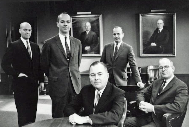
The Man Behind The Company
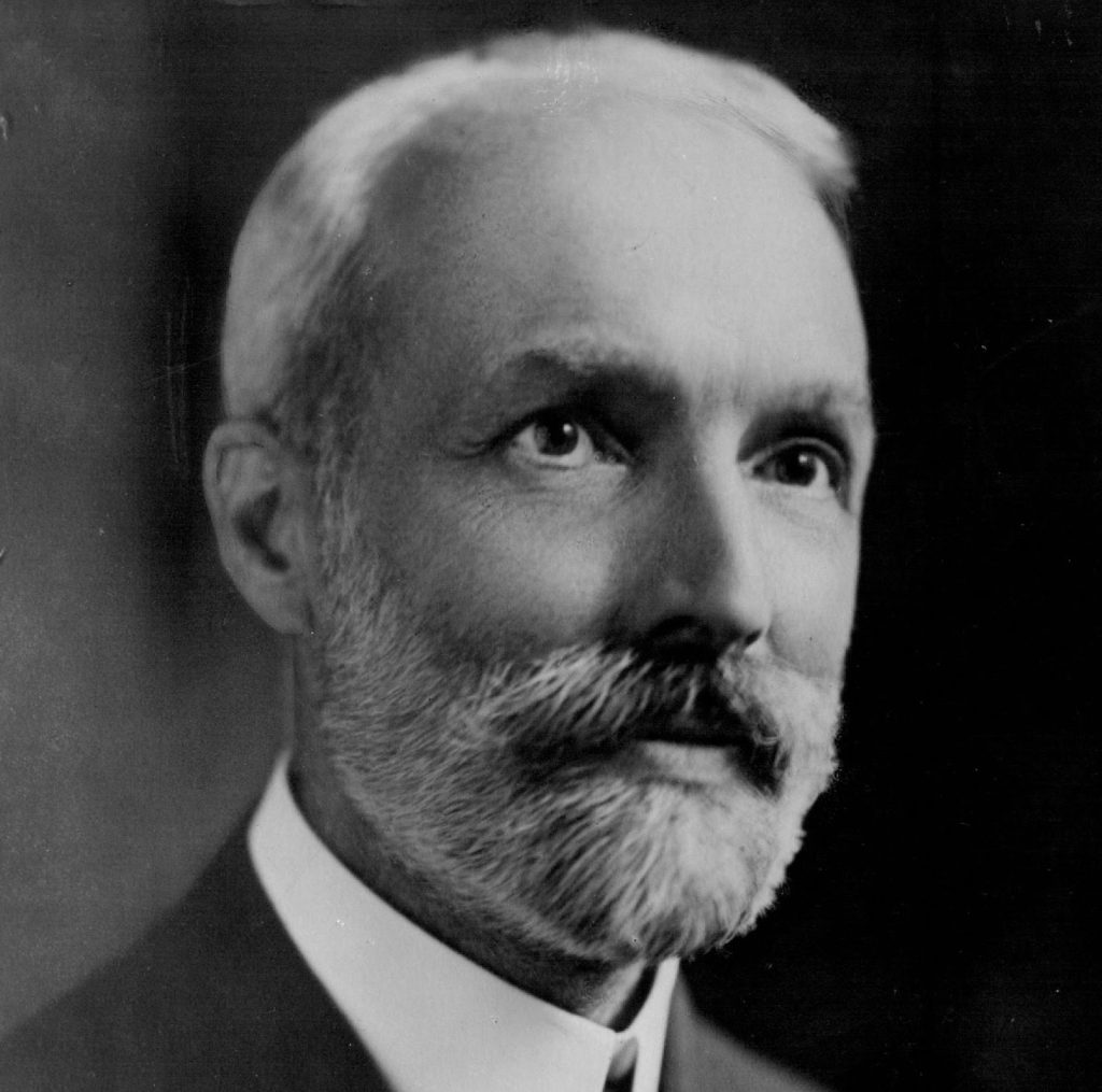
George Draper Dayton was born to David Day Dayton and Caroline Draper Wesley in New York on March 6th, 1857. Before starting a retail store, Dayton originally dreamt of becoming a church minister. He was deeply religious and wanted to enter the church field but ultimately went in a different direction.
As he grew up, he became more interested in real estate and eventually made his first purchase in Southwest Minnesota, where he bought farm mortgages.
Dayton was married to Emma Chadwich in 1878, and shortly after, he and his wife moved to Worthington, Minnesota. Dayton had grown more brilliant in the real estate and investment mindset, and when he moved to Worthington, he saw all the opportunities for investment and business. He rose to a powerful position in a bank and quickly grew as an entrepreneur. He was still religious, and while being an entrepreneur, he made steps to join the church community.
He was a Sunday School Teacher, a church clerk, and a trustee at the Westminister Presbyterian church. Dayton was involved in his church while keeping up with his entrepreneurial ventures.
He formed the Dayton Foundation in 1918 to support those in his community and church. The name of the foundation today is Target Foundation, and it still works to support the surrounding community and make a difference.
George Dayton died from cancer on February 18th, 1938, at 80. Dayton made a mark when he was alive, creating an iconic legacy that would live on for decades after his death.
The History of Target
George Dayton initially founded Target in 1902, who built the land and decided to construct a building on it. Dayton constructed a six-story building, and then a department store moved into the new building. Shortly after moving into this building, Good Fellow Dry Goods was renamed “Dayton Dry Goods Company,” which was soon a large retailer in the area and became very popular. In 1911 the company name was shortened to “Dayton Company.”
Over two decades after “Dayton’s” was opened, “Dayton’s Jewellers” opened a jewelry store the retailer had purchased. There was also a line of bookstores opened in the Dayton line. Dayton was known for starting many new things in the business world, including introducing barcode scanning for products.
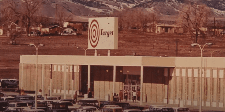
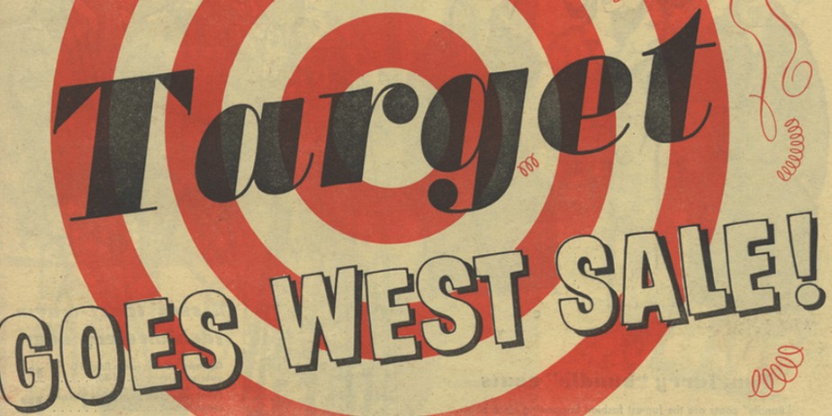
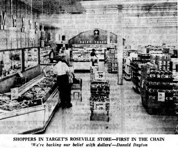
In 1962 the company opened its first Target, the first step toward creating the American mass market retail that would change the shopping industry. The first Target store was designed to be a discount version of Dayton’s. By now, Dayton’s had grown into a string of department stores and was considered one of the city’s best.
Seven years later, Dayton’s was merged with J.L. Hudson Company and was soon named the Dayton-Hudson Corporation. The Target chain was a massive success in no time, earning more profit than any of the company’s other brands. After seeing Target’s success, the company focused entirely on Target and added more stores. Soon after opening Target, they purchased other department stores, including Marshall Fields and Marvyn’s.
Even though they had purchased other department stores, the Target line was still marginally in the lead of success compared to the others.
At the start of the 2000s, Dayton’s name was officially changed to Target Corporation, and they began to either shut down or sell anything that wasn’t part of the new Target line.
Throughout the early 2000s, they continued to grow the Target line, using the capital they made from selling the other companies.
Today’s Target line is massively successful, with over 1938 locations and at least one in every state in the United States. They are known to be one of the largest companies in the world, and it’s hard to find a location that doesn’t have one of the most well-known and iconic stores.