
When you think of IKEA, what immediately comes to mind? Chances are, it’s more than just the flat-pack furniture and Swedish meatballs.
That iconic blue and yellow logo has become synonymous with affordable and stylish home furnishings.
But did you know that the IKEA logo has a rich history that spans decades, each iteration telling a story of design, branding, and evolution? Let’s take a deep dive into the history of the IKEA logo, exploring its various stages and the meaning behind its design.
The Meaning Behind the Logo
Before we delve into the logo’s evolution, let’s decode its meaning. The word ‘IKEA’ isn’t just a random combination of letters; it’s an acronym that encapsulates the Swedish heritage and roots of the company. Each letter stands for a significant aspect of the founder Ingvar Kamprad‘s life: ‘I’ for Ingvar, ‘K’ for Kamprad, ‘E’ for Elmtaryd (the name of the farm where Ingvar grew up), and ‘A’ for Agunnaryd (the name of the village in Småland, Sweden, where Ingvar hailed from).
This acronym connects the logo to its founder’s identity and the place that shaped his journey.
Typography and Colors: Crafting the Visual Identity
In the early days of IKEA, the logo was subjected to the constraints of newspaper printing techniques. To ensure clarity and legibility, the designers added tiny “serifs” to the bold Futura typeface, creating what is now known as the IKEA Sans font. This typeface, designed by Robin Nicholas, allowed the logo to maintain its sharpness and definition even after numerous printings.

This attention to detail and practicality laid the foundation for the logo’s distinct look.
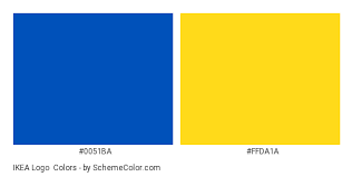
When you see those colors, you instantly know the brand. The colors, blue and yellow, were carefully chosen not just for their aesthetic appeal but also for their symbolism.
Blue commands attention and highlights the brand’s offerings, while yellow exudes optimism and positivity, leaving customers with a cheerful impression.
Additionally, these colors pay homage to the Swedish flag, emphasizing the brand’s roots and heritage.
Simplicity at Its Best
The simplicity of IKEA’s approach stems from a profound understanding of the company’s core concept.
Unlike many entrepreneurs who grapple with convoluted and intricate logo designs, IKEA’s success lies in its commitment to the essence of its business idea.
IKEA took a distinct path in a landscape where competitors were engrossed in crafting ornate bookcases adorned with lavish golden handles and excessive embellishments.
The company’s visionary engineers recognized the inherent value of the books themselves and thus conceived a timeless, minimalist design. This design philosophy, rooted in the notion that the form should never overshadow the content, set IKEA apart. This principle has endured over the years, forming the bedrock of IKEA’s identity.
Since its inception, the company’s unwavering commitment to simplicity has been unwrapped in its products and overall brand. This relentless focus on clarity, functionality, and minimalism has cemented IKEA’s reputation, and it’s represented in the simple logo.
The Evolution of the Logo: A Visual Chronicle
The IKEA logo has undergone numerous changes, reflecting the company’s growth, aspirations, and commitment to innovation.
The logo changed throughout the years, but the core elements remained. Sometimes, the company even used an upper- and lower-case logo. Here’s a chronological journey through its various iterations:
IKEA Logo 1951
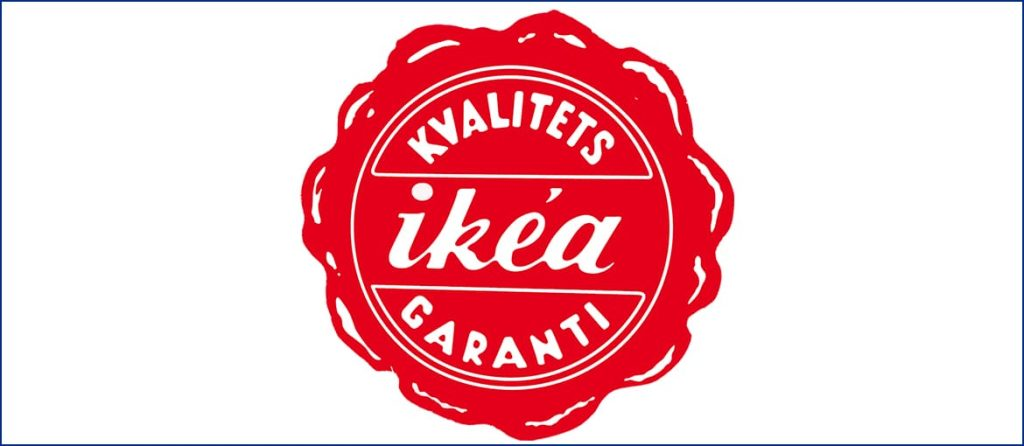
The blue and yellow we associate with IKEA didn’t come around for years into the company’s existence. The first-ever IKEA logo designed in 1951 was a round emblem featuring a red wax-seal design with the italic wordmark in lowercase cursive. The red represents the low prices offered by the brand.
It also included the tagline “Kvalitets Garantí” (Quality Guarantee) in Danish. Nice start for the brand, but it only lasted for a year.
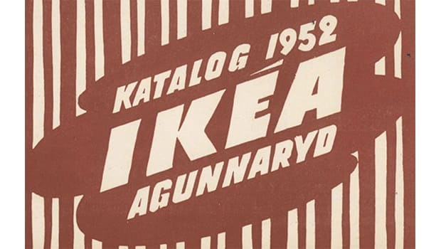
IKEA Logo 1952
A complete revamp was in order in 1952. The updated logo embraced an abstract design resembling a puddle, with an uppercase wordmark placed diagonally. The colors were cream and light brown which represent stability. Back in the early years, the IKEA logos were hand-drawn.
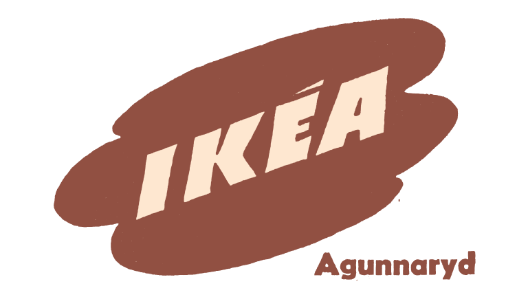
IKEA Logo 1953-1955
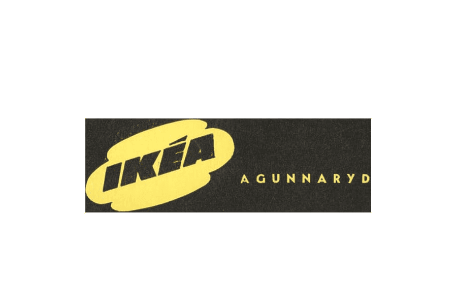
The logo underwent simplification with a light beige background and removing vertical stripes. The tagline “Agunnaryd” was placed at the bottom right corner.
IKEA Logo 1955-1956
A yellow and black palette was introduced, with the black wordmark and the yellow background. The tagline was shifted to the right, making a bigger statement.
IKEA Logo 1956-1957
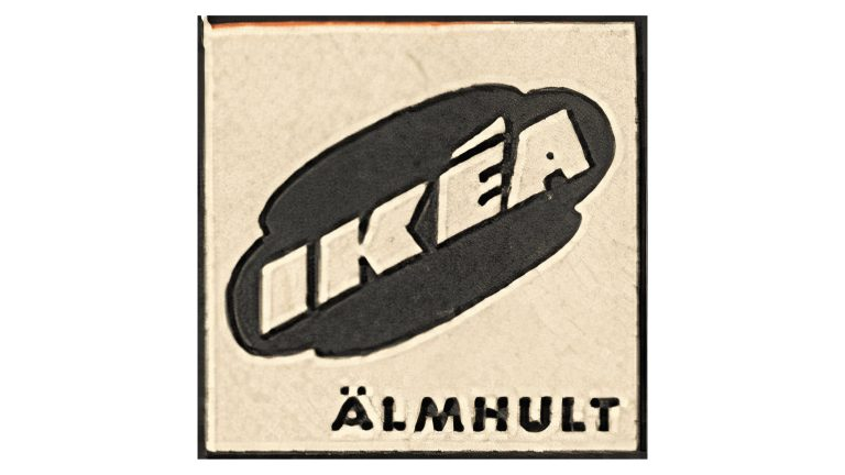
The logo transitioned to a light beige background with a black square and emblem. The tagline “Agunnaryd” was replaced with “Almhult,” named after the Swedish village where the brand started.
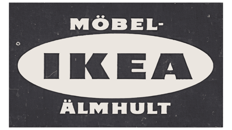
IKEA Logo 1957-1958
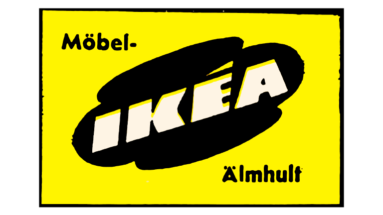
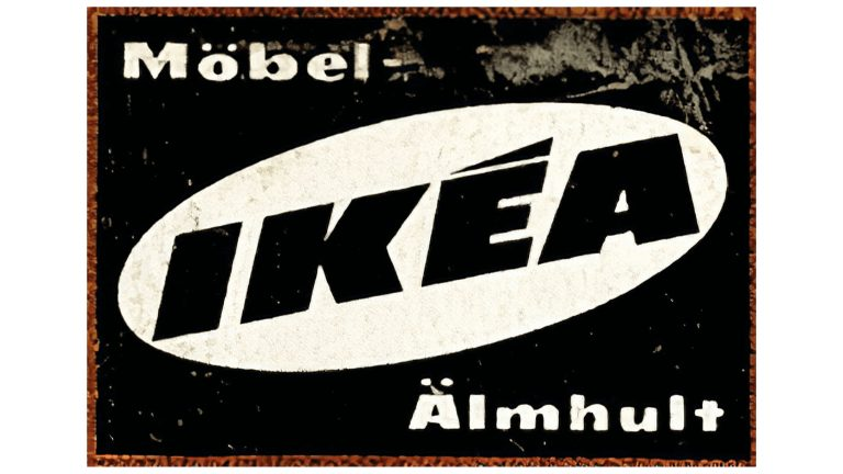
In 1957, the logo took on a brighter look. The emblem turned black and was placed on a bright yellow square outlined in black. The IKEA wordmark became white and creatively outlined in yellow. The taglines “Mobel” and “Almhult” appeared in black. The logo became more sophisticated.
IKEA Logo 1958-1962
The puddle was replaced in 1958 with an oval shape, with the emblem in white and the background in black. The lettering in the logo was refined for a cleaner look.
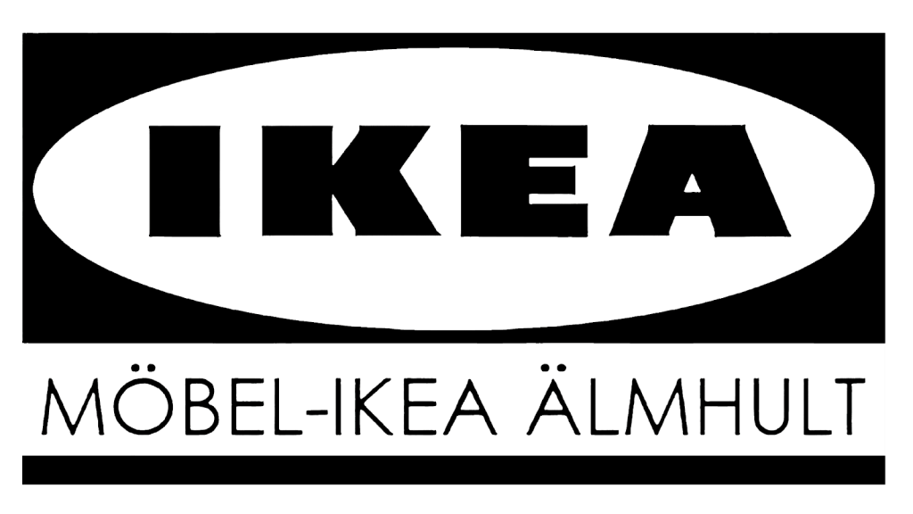
IKEA Logo 1962-1965
In 1962, we began to see the look of the IKEA logo we are used to today. The iconic horizontal wordmark inside the oval emblem took its shape, resembling the modern logo. The glyph above the “E” was removed.
IKEA Logo 1965-1967
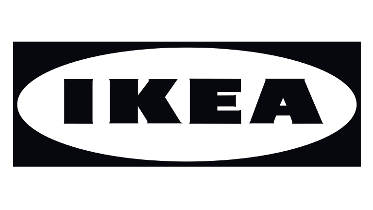
The logo turned monochrome with a black emblem and white background.
IKEA Logo 1967-1981
The tagline was removed, leaving the simple IKEA brand name. The logo didn’t include an outline or tagline, and the crisp font offered a more refined look.
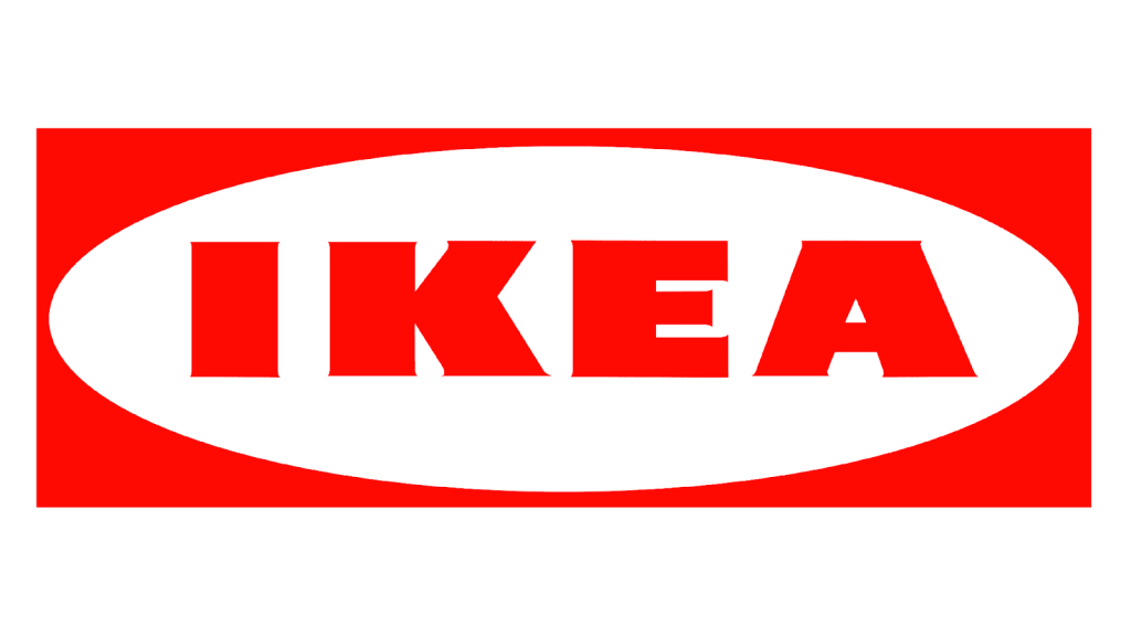
IKEA Logo 1981
After a decade and a half, it was time for a change. The color transformed to red, conveying passion and energy. While blue and yellow are synonymous with IKEA, red still appears throughout history. Stores, uniforms, and trademarks have appeared in the striking hue.
IKEA Logo 1982-2019
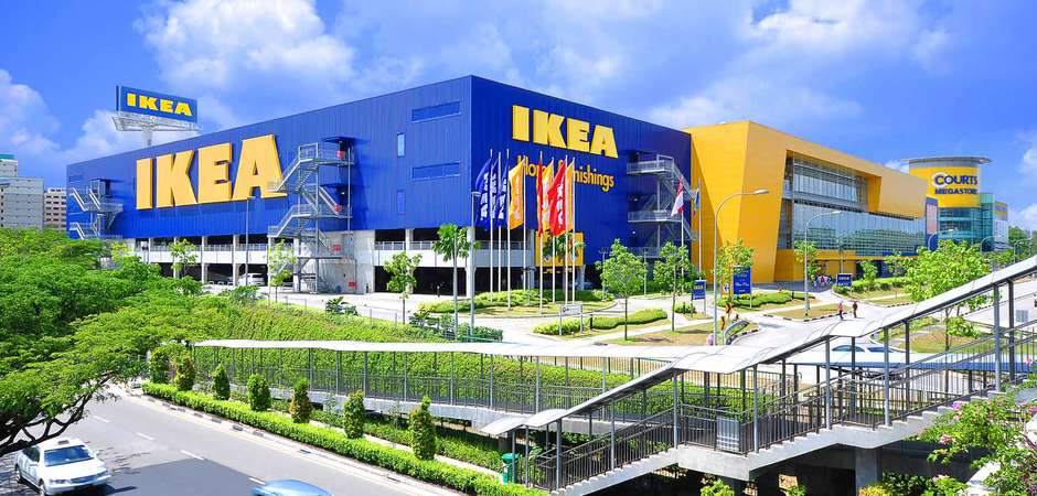
The familiar blue and yellow logo was introduced in 1982, becoming the hallmark of the brand’s identity. Save for one touch-up in 2019, this is the logo we see today.
IKEA Logo 2019-Present
While not a major overhaul, in 2019, the logo underwent a slight refresh with spacing, serifs, and color adjustments, maintaining its core identity while adapting to modern design standards.
Why the IKEA Logo is Still a Winner
Many prominent brands undergo logo transformations over time, occasionally opting for entirely novel designs that create quite a stir.
However, IKEA has maintained its core logo since the 1960s, exemplifying its overarching philosophy of measured progress, prudent expenditure, and heritage preservation. This alignment mirrors IKEA’s approach – a deliberate, economically mindful, and deeply rooted journey.
This practice is underpinned by the belief that a robust, distinctive commitment obviates the necessity for continual modifications. The IKEA logo’s longevity and recognizable design make it a winning logo for the brand. Its simplicity, memorability, relevance, and timelessness contribute to its effectiveness as a brand symbol.
The logo’s simplicity allows it to communicate key aspects of the brand’s personality and values without overwhelming viewers. Its memorability is crucial for establishing a solid connection between customers and the brand. The relevance of the logo to IKEA’s target market and its resistance to design trends ensures that it remains a consistent representation of the company’s identity.
Standing the Test of Time
As we’ve explored the history and evolution of the IKEA logo, it’s evident that this iconic emblem is more than just a visual identifier; it represents a brand’s values, heritage, and commitment to its customers.
From its humble origins to its global presence, the IKEA logo has adapted and transformed while staying true to its essence. In a world where branding is critical to business success, the IKEA logo is a testament to the power of thoughtful design and the enduring impact of a well-crafted visual identity.
So, the next time you visit an IKEA store or flip through their catalog, take a moment to appreciate the journey of the logo that’s been a part of countless homes and lives worldwide.
Change in Logo’s Can Be Positive Thing
While Ikea underwent numerous logo changes, it ultimately settled on the design that resonated most with its identity in 1982. Over the past almost forty years, the current version of the logo has remained broadly consistent, albeit with some minor refinements. Let’s delve into the distinctive features that make this logo stand out compared to its rivals.
The Brand Kept is Simple
Simplicity is the name of the game for IKEA – in their furniture and their logo. The emblem boasts a minimalist, flat, and captivating design. Simplicity is a cornerstone of effective logo design, evident in Ikea and iconic logos like Gucci, which derive their strength from their astonishing simplicity.
Studies underscore how the brain simplifies intricate information to enhance recall. An uncomplicated design is ideally suited for the brain’s cognitive processes. The reason is simple—the brain spends less effort in deciphering it. Incorporating only essential aspects of a brand’s identity, simple logos spotlight the core attributes that define a company.
A skilled designer adeptly trims excess design elements, focusing solely on conveying the vital elements aligned with a company’s mission and vision. An exemplary logo aims to forge a connection between customers and a brand. A simple logo, devoid of extra elements, can be etched into a customer’s memory more effectively.
They Found Their Color
The Ikea logo employs a harmonious blend of blue and yellow hues and oval and square shapes.
This amalgamation communicates notions of reliability, security, and happiness—core values of the furniture brand. Proficient designers recognize the potency of colors and fonts.
They grasp that colors can evoke diverse emotions, fostering a closer alignment between customers and a brand. Designers employ a range of subtle elements, such as colors and symbols, to fashion a simple logo.
When a logo is effortlessly remembered, it cultivates a stronger association with the brand’s essence and values.
It’s Memorable and Relevant
The Ikea logo distinctly achieves memorability through its color palette and typography, rendering it a symbol that lingers in memory. The Ikea logo aptly exemplifies a relevant logo. Though the company underwent several iterations before adopting the current logo, it encapsulates the brand’s identity and resonates with its target market.
The Logo is Timeless
A pivotal quality elevating the Ikea logo to iconic status is its defiance of design trends. Despite experimenting with various color palettes, symbols, and fonts, the furniture brand refrained from conforming to fleeting trends. This decision shielded the brand’s identity from the adverse impact of multiple logo changes.
A timeless logo sustains its effectiveness and relevance over time. The Ikea logo has matured gracefully, bearing the unmistakable traits of a timeless emblem.
Clutter Free
Another hallmark of a timeless logo is its freedom from clutter. The Ikea logo embraces a clean and focused design strategy.
Follow IKEA’s Lead
The IKEA logo offers compelling inspiration for logo design in several ways. First, the strategic choice of blue and yellow colors, reflecting the Swedish flag, establishes a globally recognizable brand image, evoking confidence and optimism.
Second, akin to luxury brands, IKEA employs its company name as the primary logo element, underlining the significance of choosing a fitting font to convey product essence and values—like IKEA’s use of sturdy, imposing characters to mirror furniture solidity.
Also, regional ties can be a rich source of inspiration, as seen with BMW drawing from Bavaria’s coat of arms. And don’t be afraid to adjust and redesign. The brand’s evolution underscores the importance of adapting logos to a company’s growth, drawing from values and origins to build a foundational brand image.


