
When we say, “Grande Café Mocha,” “Tall Vanilla Latte,” or “Venti Iced Chai,” what brand do you think of? Most of us would know immediately what brand we are referencing, but if you don’t, you’ll know soon.
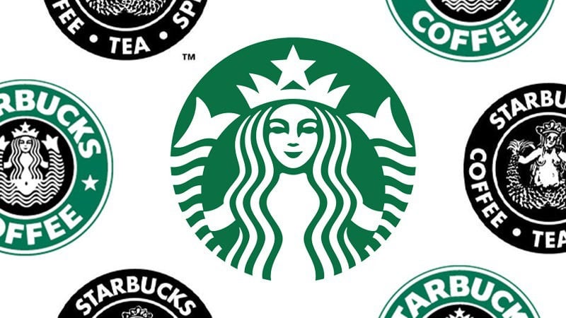
Some logos are a gateway into the brand. And often those logos, are some of the most recognizable and iconic logos of all time. When it comes to Starbucks, that’s exactly the case.
You likely already know the coffee brand, Starbucks. The brand has locations all around the world and its customers are die-hard Starbucks enthusiasts. With Starbucks though, what has helped launch this brand is a logo that customers can immediately associate with the trustworthy, mission-driven, community-oriented brand.
If your Starbucks knowledge doesn’t go beyond your go-to Venti Café Americano order which is delivered to you in a white cup with a green logo, then you came to the right blog. Below we’ll take you on a deep dive into this coffee powerhouse. By the end of this blog post, you’ll know not only how Starbucks came to be and how its logo was developed, but you’ll also know how you can incorporate key strategies from Starbucks’ logo design into your brand.
Meet Starbucks

Starbucks is a household name but in case you aren’t familiar with the brand, Starbucks is one of the most successful coffee shops to ever enter this space. In their quest for coffee domination, Starbucks currently operates more than 30,000 stores all around the world (in more than 60 countries).
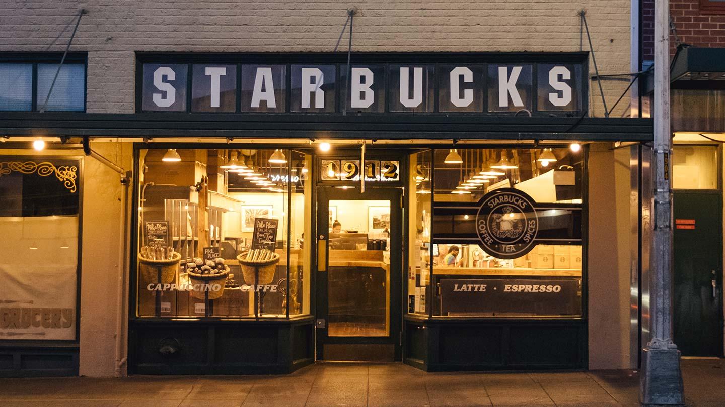
While Starbucks is a coffee powerhouse, the brand started from humble beginnings. Founded in 1971 by three business partners in Seattle, Washington, the original name was “Pequod,” named after a whaling ship in Herman Melville’s classic American novel, Moby Dick. However, this name was updated to Starbucks shortly after the trio selected this name.
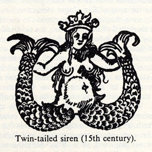
The name “Starbucks” stood out for a myriad of reasons. The first reason is that Starbucks is based in Seattle, which is a port city (and would allow them to stay true to the nautical theme). Secondly, the Starbucks mascot, “the siren,” represents the Greek mythical creature from historical tales who lured sailors to “Starbuck Island.” Because of the store’s location to the port, and the three founders’ desire to lure coffee drinkers to their brand, this name was a natural fit.
Starbucks’ Evolution
While Starbucks’ history is far more complex than we describe in this article, below you’ll find a brief history of how the Starbucks brand grew from a small flagship Seattle location to a global conglomerate.
1971: Starbucks is founded
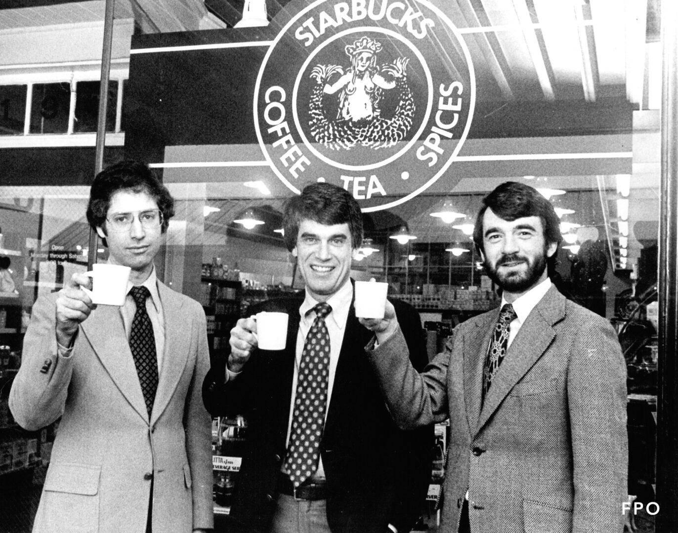
On March 30, 1971, Starbucks was founded by three business partners, Jerry Baldwin, Gordon Bowker, and Zev Siegl. While we refer to this coffee chain as Starbucks today, it was initially called Pequod, which was chosen as an ode to Herman Melville’s novel, Moby Dick. This name didn’t last long though and shortly after deciding on Pequod, the name was updated to become Starbucks.
This first Starbucks location didn’t sell brewed coffee, even though the company was targeting a coffee-drinking audience. What it did sell was bags of roasted coffee beans. The three founders learned how to roast coffee beans from a fellow coffee aficionado, Alfred Peet.

1982: Howard Schultz joins Starbucks
Howard Schultz walked into a Starbucks 10 years after the company was founded, and after his first cup of coffee, he was sold on the brand. Howard started as a store manager but that all began to change in 1983. While on a trip abroad in Milan, Italy, Howard tasted the signature Italian coffee. Once he returned to Seattle, Howard tried to incorporate Italian coffee techniques into Starbucks’ coffee offerings.

1986: Starbucks expands across Seattle
By 1986, Starbucks had expanded to include 6 locations across Seattle. It wasn’t until after 1986 that the company began to expand further across the United States.
1987: Starbucks is sold to Howard Schulz
After Howard became involved with the company in 1982, the three founders sold Starbucks to Howard in 1987. Once Howard became the owner, he grew Starbucks on a national (and global scale).

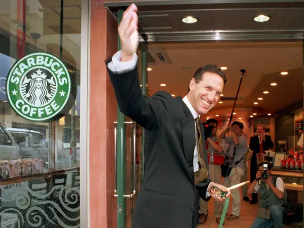
1996: Starbucks experiences international growth
After already taking over North America, with stores across Chicago, Vancouver, California, Washington, DC, and New York City, the company expanded overseas. In 1996, the first international Starbucks was opened in Japan. Following this location, stores began to open in Europe in 1998 and then in China in 1999. This grew Starbucks to become the brand we know it to be today.
Roadblocks Along the Way
The biggest roadblocks Starbucks has had to navigate are related to competition and price. Coffee is often a personal preference and coffee drinkers are loyal to their brands. That means that Starbucks had to win over the customers of their competitors and get them to choose Starbucks time and time again. At the same time, Starbucks is often associated with being a higher-end, higher-priced coffee chain. That means that for some, a daily coffee from Starbucks may be outside of their budgets. Both roadblocks are minor though because Starbucks has a business strategy that works for them and has helped the company continue to grow.
The Meaning of Starbucks’ Logo and Starbucks’ Logo History
When it comes to creating a logo, a company usually has its design team to thank. For Starbucks, the credit goes to Terry Heckler. To prepare for this design, Terry scoured old marine books to gain inspiration. The result was what has become the world’s most recognizable and memorable logo. Keep reading to learn how this design evolved through the years.
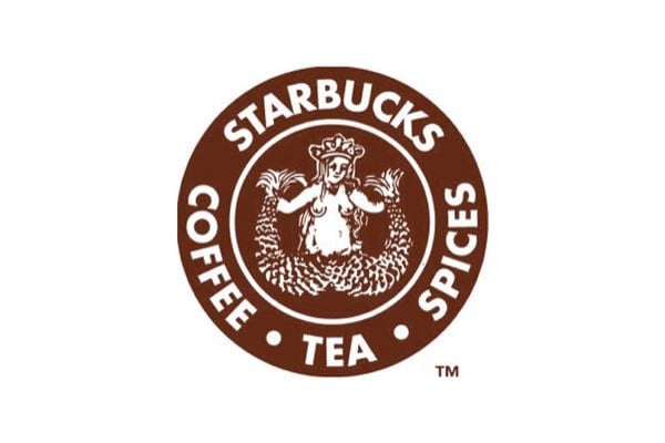
1971 – 1987: The first version of the Starbucks logo
This first iteration of Starbucks’ logo lasted for nearly fifteen years. As you can see in this design, the logo features the signature two-tailed siren. This version of the siren was complex with several small details incorporated to make the logo appear lavish. Beyond the siren design, text was included in this logo version. In small, block, sans-serif lettering, the wordmark read “Starbucks” at the top of the logo and then “Coffee Tea Spices” at the bottom. To frame the second set of words, two dots were incorporated on either side.
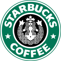
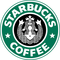
1987 – 1992: The second version of the Starbucks logo
The next version of the Starbucks logo was released in 1987. This was around the time that Starbucks’ ownership shifted to Howard Schulz. The biggest change with this logo design was the coloring. Instead of the past brown coloring, this logo was now green. Additionally, the design removed some of the words on the logo, only keeping “Starbucks” and “Coffee.” With this updated text, the team choose a bolder font that stood out even more. The siren was still present in this design, and she was bare-bodied with flowing hair. Unlike the first logo iteration though, this design had the body of the siren visible. The final update to this logo was with the two dots that formally framed the text. These dots were updated to be two, five-pointed stars and they were placed on both sides of the circle design.
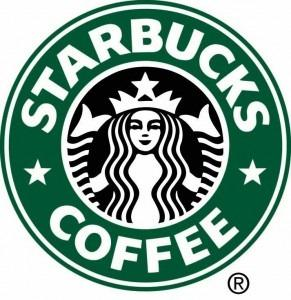
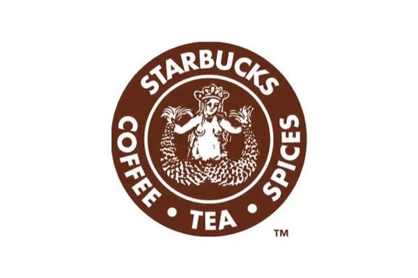
1992-2011: The third version of the Starbucks logo
In 1992, the Starbucks logo was updated again. This time, the siren was enlarged to become the prominent part of the logo circle. Instead of including her bare body, this design focused on her face and hair. If you look closely though, you can faintly see the two tails in the background. One additional change with this iteration was the typography. Shifting away from the past typefaces that were used, this font was more modern, and the letters were larger and wider.
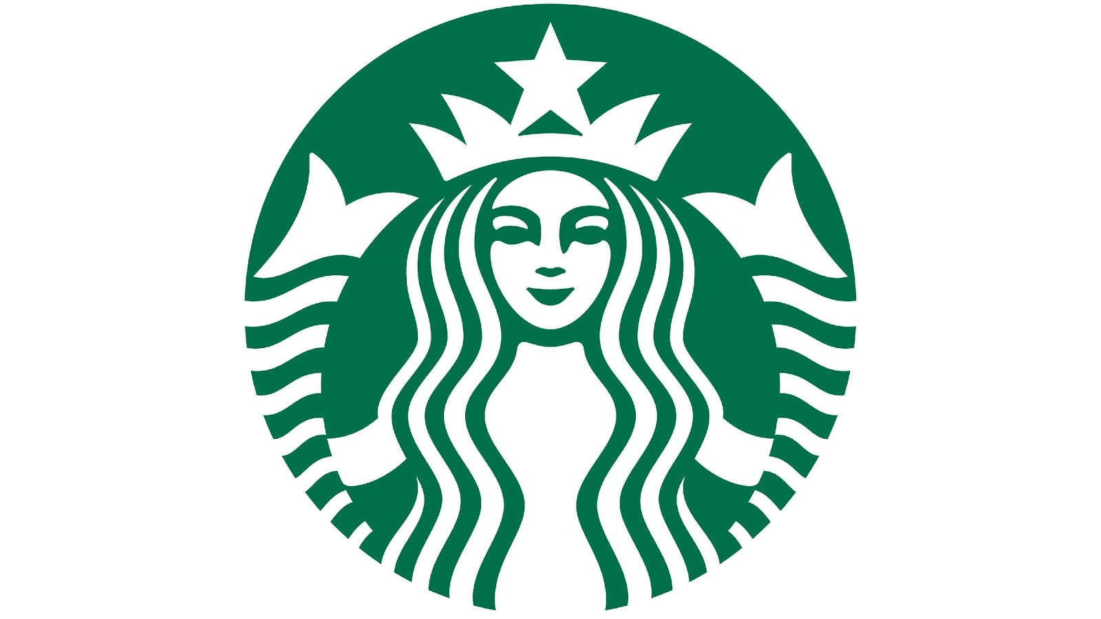
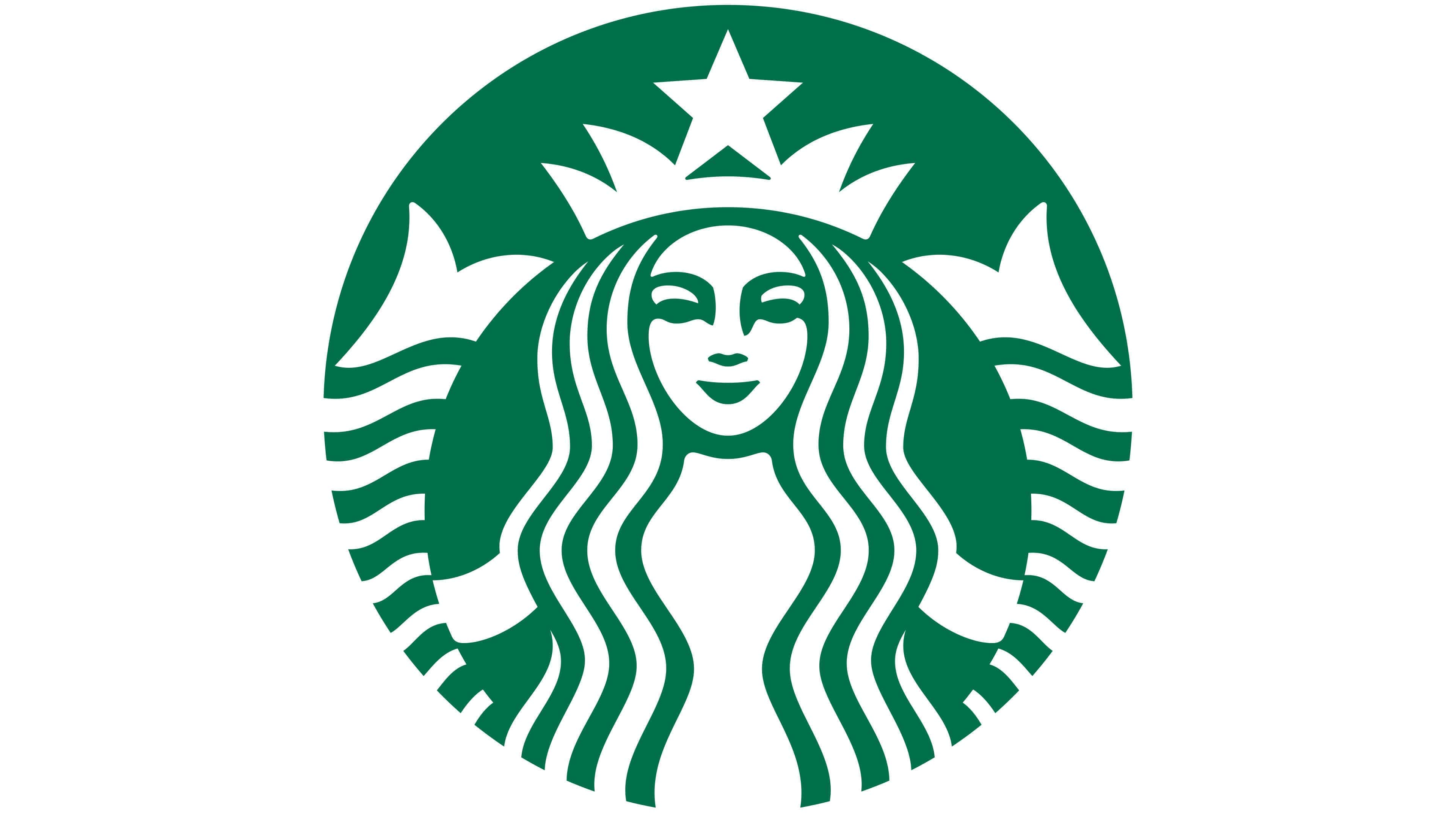
2011 – Today: The fourth version of the Starbucks logo
If you head to a Starbucks today, this is the logo version you’ll find. This design was created in celebration of the company’s 40th anniversary. This design is simpler with the removal of all words and the two stars. This design also swapped the colors, making the siren white and the background green. Since the siren was the sole focus point of this design, Starbucks’ design team made some changes to the siren’s face and hair, ultimately making the emblem look more approachable and human-like.
Starbucks’ logo font:
When you think of the Starbucks logo, the logo you are thinking about is likely the version that has no words on it. That wasn’t always the case though. Years ago, the logo included the Starbucks name in a bold, block sans-serif font, that was exclusive to the brand. While the company name was once included to build brand recognition, once Starbucks developed a following, the company name was removed.
Starbucks’ logo color:
There are two prominent colors on the Starbucks logo – green and white. Green was chosen to serve as the background of the logo. This color is often associated with healing, protection, nature, and wealth. Starbucks is a brand built on serving ethically-sourced coffee (and serving this at a higher price point than other fellow coffee chains). Because of these three things, green was a logical color choice. The other color, white, is used for the main symbol design. White is a color that represents humility, cleanliness, wholesomeness, and purity, which again, all tie into the Starbucks brand.
Starbucks’ logo symbols:
At first glance, the Starbucks logo may seem like a simple logo, but it is much more complex than meets the eye. To break down the logo symbols, let’s first start with the shape the logo creates, a circle. Even when the brand went back and forth with including the words, or stars, on its logo, the symbols always formed a circle. A circle is commonly used across logos because circles represent eternity and continuality. Circles have no beginning and no end, which is something every brand dreams of also having.
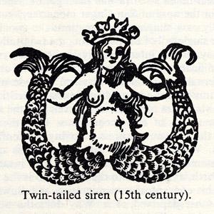
The next symbol to break down is what makes up the circle, the siren (or “twin-tailed mermaid”). This image was created based on ancient Greek mythology which includes tales of sirens luring sailors to shipwrecks. These sirens lured the sailors to what is sometimes called “Starbuck Islands.” The use of this image to represent the brand was intended because the founders hoped to “lure” coffee drinkers into their store and hoped they could make Starbucks their preferred spot to grab a cup of joe. This siren has gone through several redesigns where some of her imperfections were improved, only to add those imperfections, and asymmetrical features back in, to make the brand feel more human. Having the siren be imperfect embodies the mission of Starbucks – that there are people behind the brand that care about fellow people.
Starbucks Today
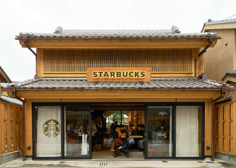
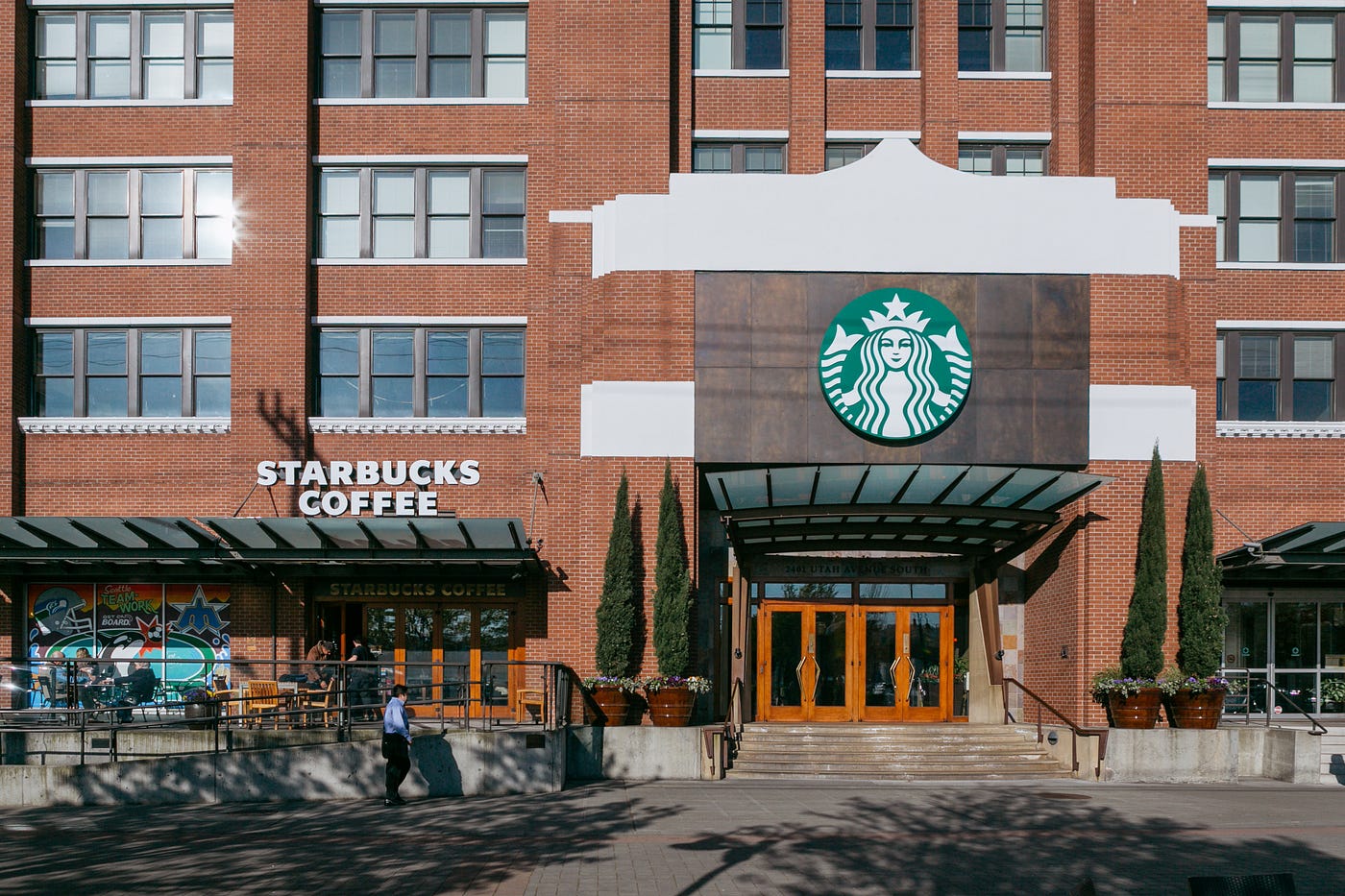
If you’re looking for Starbucks’ headquarters, you’ll want to head to where the company was first founded, in Seattle. Starbucks’ headquarters has never moved outside of its founding city. The only difference is that instead of being a small, local coffee shop, today, Starbucks is an international coffee powerhouse.

In 2020 it was reported that Starbucks had over 32,500 stores across 62 countries. This growth is due in large part not only because of their memorable logo but also because the brand has been reported to add two stores per day, worldwide. Those stores (and the Starbucks brand) collectively generated over $19 billion in revenue that same year. While their menu may look like a set number of items, you can order (almost) anything you’d like! Today, Starbucks is known to have more than 87,000 possible drink combinations!
As noted just now, one of the things that have helped grow Starbucks to be the brand it is today is its iconic logo. The design is one of the most versatile and recognizable logos across the world and when a logo embodies quality traits of a brand like Starbucks’, it’s no wonder consumers choose Starbucks time and time again.
Lessons Learned from Starbucks
With a brand as iconic as Starbucks, there are many lessons we can all learn from their logo design. For starters, the logo is a unique symbol, and this unique symbol has become the face of the brand. With this symbol choice though, Starbucks intentionally selected a symbol that connected back to the brand. Nowadays, the logo (and symbol) is synonymous with this coffee powerhouse and without the logo, it’s hard to imagine what Starbucks would be. And that right there proves how powerful their logo has become.
When you think about creating your logo, be intentional with any symbol choices, like Starbucks, and look beyond the symbols and color choices to see the deeper meanings those choices may convey. For Starbucks, the company chose elements that embodied trust and deep-rooted history. Together, this built brand loyalty among their customers. To maintain your brand loyalty, like Starbucks has, ensure that whatever you do end up choosing as part of your logo design, are timeless features that are not trendy, so that your logo can stand the test of time. Furthermore, you’ll want to ensure that your logo design has unique components that stand out from your competitors. You want to draw in the attention of potential customers and win them over, so they don’t head to a competitor’s brand because their logo dragged them in more.
When it comes to making a memorable logo, like Starbucks, follow these above pointers. And don’t be afraid to play around with certain features (whether it’s omitting text, changing colors, or something else) to see if that achieves the result you want.
If you’re ready to either rebrand your logo or create a brand-new logo, you don’t have to navigate this process alone. There are companies out there who you can partner with to work with creatives whose top priority is designing a custom logo that matches what you dreamed up. How these companies do this are through design contests.
While this may sound too good to be true, we swear it’s not and these are companies are worth exploring. We’re confident that once you partner with a design contest platform, you’ll be well on your way to creating a long-lasting, memorable logo just like Starbucks.


