
Though the famous Mexican-American fast-food chain was established in 1962, the bell we associate with the Taco Bell brand wasn’t introduced to us until 1985. The emblem we see today was first introduced in 1992 and is now the updated version the company uses throughout its promotions and marketing.
Before we jump into the history of the logo, it’s important to understand where the brand came from, so we’re going to cover the history of this well-known taco purveyor and how it came to fame.
Meet Taco Bell
Founded by Glen Bell, in 1962, Taco Bell was an idea that was born out of Bell’s love of tacos. Before Taco Bell as established as the fast-food chain we know and love, Glen first played around with taco recipes and other taco fast food joints.
He worked on creating a crunchy taco that replicated the crunch taco at one of his favorite restaurants, Mitla Café. Once Glen mastered a crunch taco that was similar, yet different from Mitla’s, Glen began to sell these at his first two taco establishments, Bell’s Drive-In and Taco Tia, both in southern California. From there, the rest is history.
The History Of Taco Bell
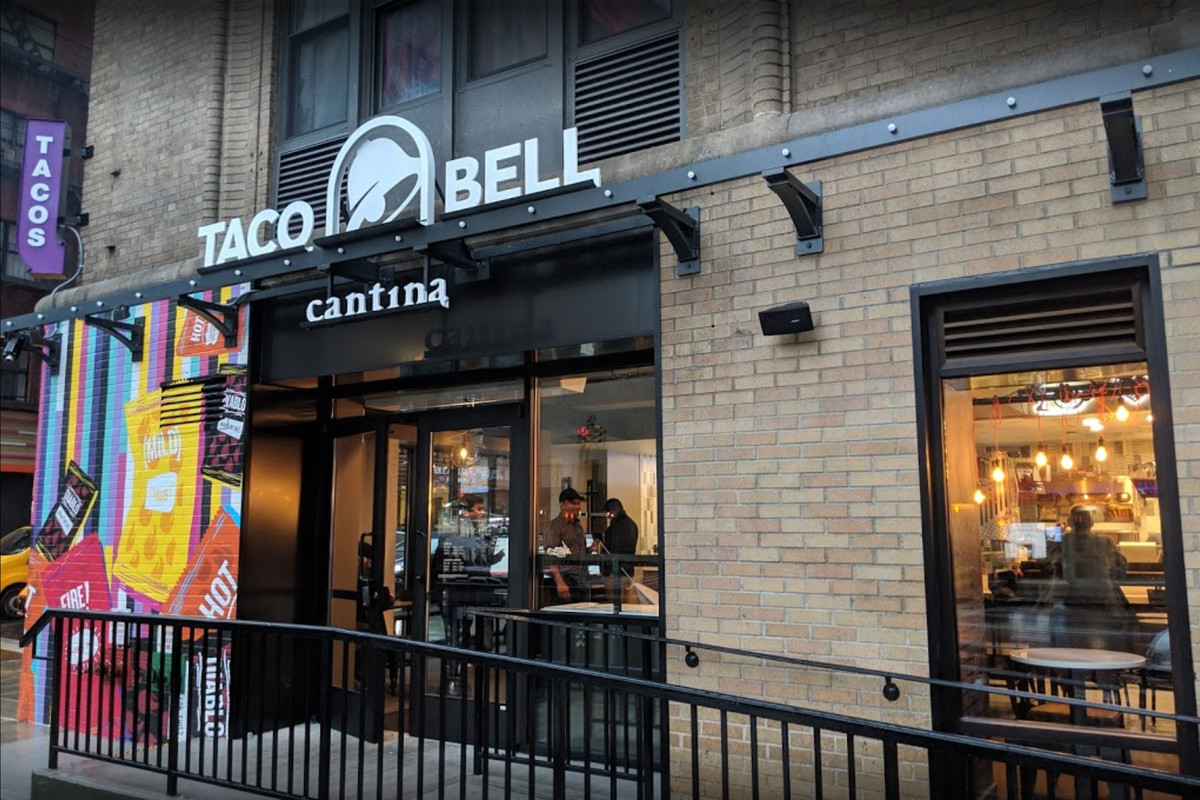
In 2016, Taco Bell debuted its Cantina flagship restaurant on the Las Vegas strip. It serves food and alcohol, and diners can enjoy music as well. It’s also open 24 hours. There are more of these type
1948-1962: The foundation for Taco Bell is set
Glen Bell came up with the Taco Bell concept after being inspired right in his neighborhood. Glen was living in San Bernardino and at the time was selling classic American food – hot dogs and hamburgers – at his fast-food cart, Bell’s Drive-In.
As he sold hot dog after hot dog and hamburger after hamburger, he saw his neighbors in the county selling traditional Mexican tacos, a food that his Mexican American neighbors knew well. Glen wanted to do more than replicate their tacos though. Glen wanted to take their recipes and give them an Americanized twist.
The only problem with Glen’s plans was that he wasn’t as familiar with this cuisine. To learn how a properly crunchy taco is made, Glen headed to one of his favorite Mexican restaurants, Mitla Café. He took what he learned and not only Americanized it a bit, but he also created a crunchy taco that had the ability to be efficiently mass produced across the country.
1962 – 1970: The early days of Taco Bell
Prior to opening “Taco Bell,” Glen was operating out of another one of his fast-food spots, Taco Tia. Once Glen was ready to unveil his crunchy tacos to his California community, he decided he wanted a new location to create a new identity. He opened this new spot in Downey, CA and named it “Taco Bell,” paying homage to his last name. It wasn’t long after the first Taco Bell was open that Glen was already thinking about franchising. Two years later, in 1964, Kermit Becky, opened Taco Bell’s first franchise location in Torrance, CA. This franchise model was one that worked for the brand and Taco Bells began to open around the States at lightning speed. By 1967, 100 Taco Bell’s were opened.
1970-1980: Taco Bell goes public
When a company grows as fast as Taco Bell did, it makes sense that the company would go public as soon as it could. For Taco Bell this was in 1970. Taco Bell officially transitioned to being a publicly traded company in 1970 and entered the market with 325 operating restaurants. In the late 1970s, Glen began to think through partnership opportunities that could help his brand grow even more. In 1978, Glen officially partnered with PepsiCo Inc., agreeing to only sell PepsiCo Inc. products in his restaurants, and agreeing to ultimately give PepsiCo Inc. ownership of the brand. This deal was finalized with Glen selling nearly 870 shares of Taco Bell, the equivalent of $125 million, to PepsiCo Inc., and with Taco Bell becoming a shareholder in their brand.
1980 – 1990: Taco Bell tries to expand overseas and expands its menu offerings
Taco Bell expanded internationally a little prematurely into the Australian market. After expanding into Sydney in 1981, Taco Bell was sued for having a similar name to an already existing Sydney taco spot. Taco Bell was forced to leave the market and didn’t return until 2017.
It was also during this decade that Taco Bell first introduced to the public some new menu offerings, that many consumers still love today. In 1984, the brand added their version of a taco salad and their Taco BellGrande to their menu.
1990-2000: Taco Bell plays around with its business model
To kick off this decade, Taco Bell offered new value pricing on their menu with some menu items being priced at 59-99 cents. The next year, Taco Bell launched a new Taco Bell business model, Taco Bell Express. While Taco Bell was still focused on fast food, Taco Bell Express was focused on serving food even quicker to people on the go.
To further grow its business (and its business’ visibility), Taco Bell also explored a variety of partnerships and initiatives to increase promotion of the brand. Taco Bell partnered with a beloved American non-profit, the Boys & Girls Clubs of America, in 1992, and sponsored the initial ESPN X Games in 1995. The most crucial partnership Taco Bell formed during this decade, which still exists today, is its partnership with KFC. In 1995, the two brands teamed up to establish a co-branding partnership.
2000-2010: Taco Bell continues adding to its menu and expanding its reach
At the tail end of the 1990s, the Gordita taco was added to the menu and quickly became a menu staple. This propelled the brand to continue to add new and innovative taco items to the menu. In 2005, Taco Bell added the iconic Crunchwrap Supreme to its menu, which is still a staple menu item today. Beyond these taco additions, Taco Bell also added an exclusive Mountain Dew flavor to its menu, that could only be found at a Taco Bell – the Mountain Dew BAJA BLAST!
During this decade, Taco Bell also revisited its international reach. Locations were opened in China, the Philippines, and more. Another way the brand expanded its reach was by becoming the official sponsor of the NBA, beating out what many to believe was the original American fast-food chain, McDonald’s.
2010-Today: Taco Bell shows no signs of slowing down
Throughout its history, Taco Bell continuously responded to what consumers wanted – a play on Mexican American tacos. In recent years, the brand has continued to do this by introducing us to the Doritos Locos Tacos, the Quesalupa, Nacho Fries, and so much more. What was critical to Taco Bell staying successful during this period was responding to the changing tech environment, and not falling behind. Taco Bell did just that by launching a new website and introducing mobile ordering and payment. Taco Bell has also stayed creative with its marketing, unveiling a retail partnership with Forever 21 and creating a popup fast food spot at Comic Con.
Today, Taco Bell is led by Mark King and the company’s headquarters is in Irvine, California. The chain is credited with having more than 7300 locations around the world, with nearly 350 of those being franchise locations. What started off as a small idea to Glen has grown to be a worldwide fast-food staple.
The Evolution of Taco Bell’s Logo
Now that you know the history of one of our favorite fast-food chains, let’s look at how all that growth and change affected the logo. As you’ll see below, the brand’s logo did not undergo extensive revisions, only 6 of them.
The bell icon started being used in the official logo in 1985. While the bell has been updated since 1985, it still is the bell we associate with this brand.
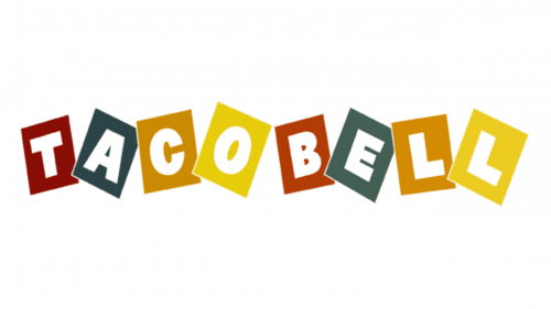
The First Version of the Taco Bell Logo (1962 to 1972)
Like we just mentioned, the first iteration of Taco Bell’s logo did not actually feature a “bell.” This version simply included the Taco Bell name. The wordmark itself is youthful and playful though. Each letter is enclosed in a colorful box, making this a funkier logo than competing logos at the time. The name was displayed in bold, capital letters which was a sans-serif font.
It reflected the lively energy of the “fun-loving” company as well as paid homage to the ingredients you could see in its food.
The Second Version of the Taco Bell Logo (1972 to 1985)
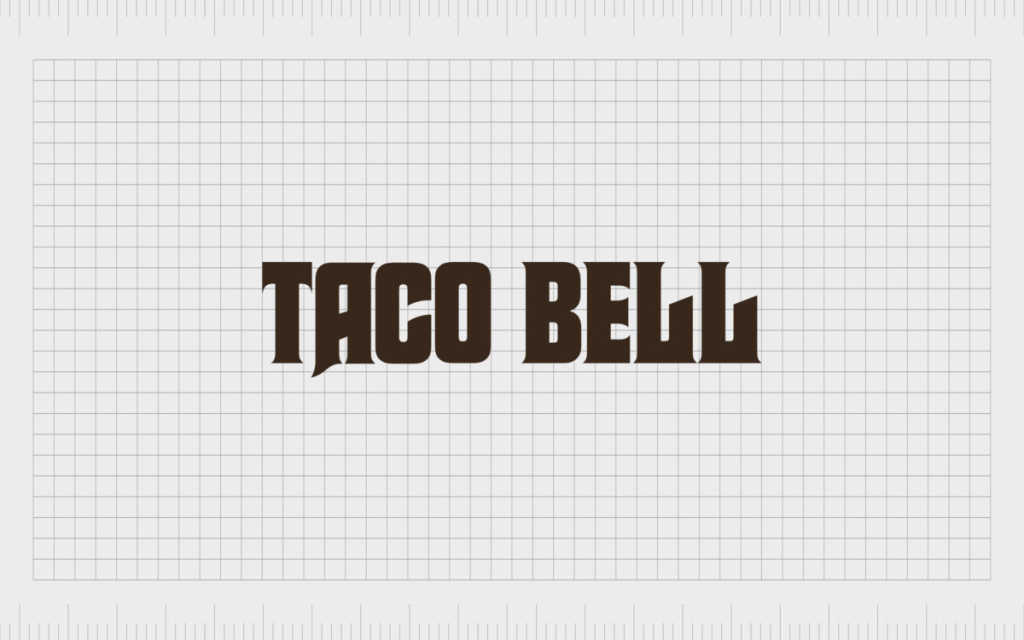
After 10 years, Taco Bell decided to go through tis first logo rebranding. This logo removed all the fun coloring and used a different, stylized font. The letters were in all capitals and used a custom typeface that featured elongated bold lines, diagonal cuts, and sharp serif angles, adding a modern vibe. The logo still consisted of just a wordmark and was a dark brown color.
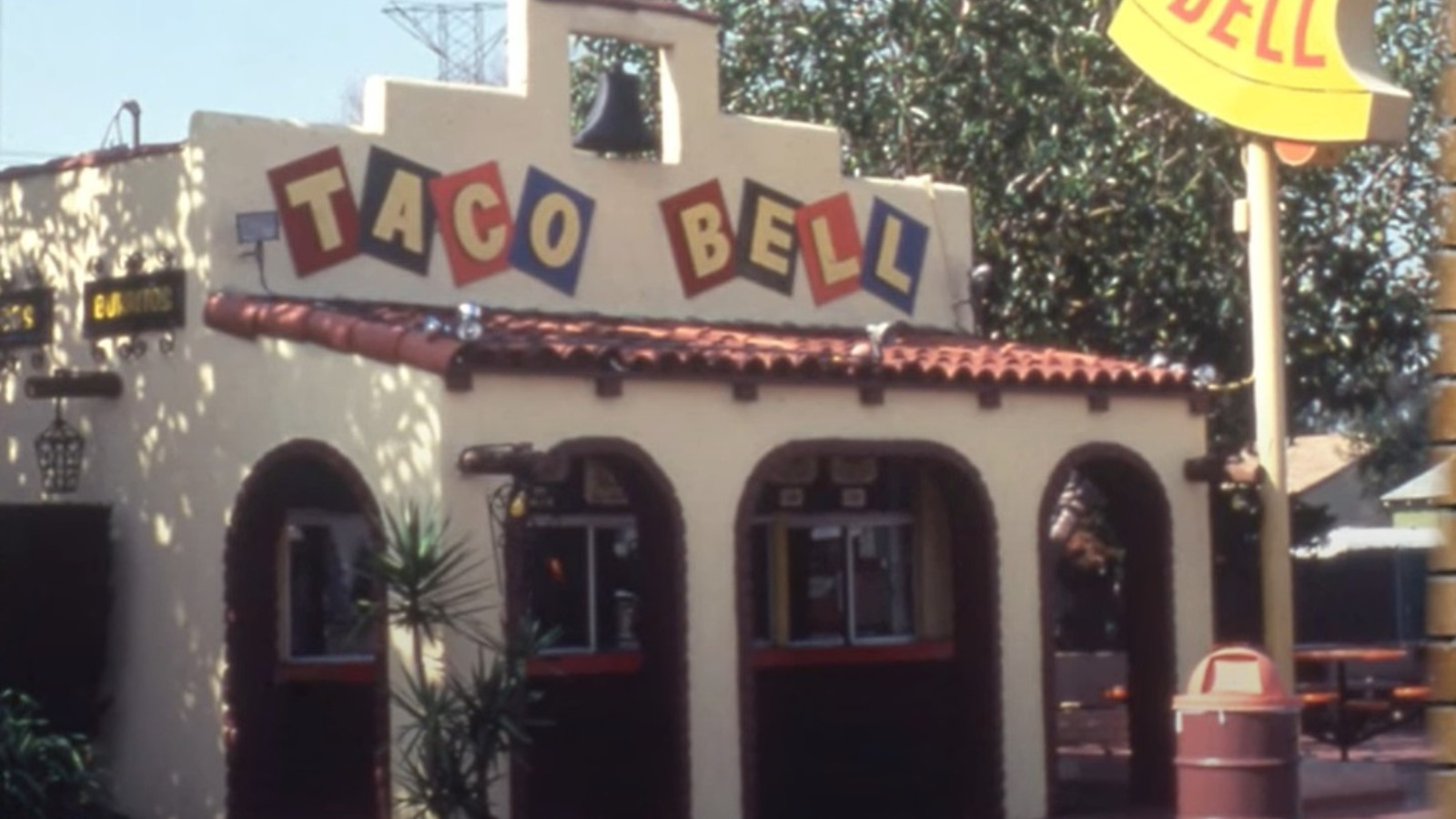
The Third Version of the Taco Bell Logo (1985 to 1992)
In 1985, the bell icon appeared in the logo. This logo was iconic because once the bell was added to the design, it has never been removed. The colors of this logo are different from the colors on today’s logo though. The colorful bell was placed above the lettering. The custom typeface also showcased curvy, extended, lines for the “T” and the “B”, like the previous design, and had sharp diagonal cuts within the letters’ lines. Like the logo prior, this iteration also lasted nearly ten years. It was also used along with the updated version that took over in 1992.
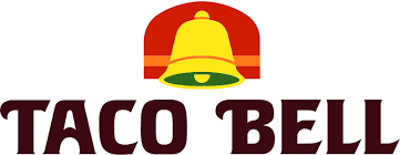
The Fourth Version of the Taco Bell Logo (1992 to 1994)
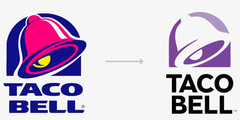
This logo iteration is an important point in Taco Bell’s logo history because it first introduced us to this pink and purple color scheme. Even today, these two colors blanket every location, and still are the official colors of the brand. The purple background behind the bell looks like a sketch and emphasizes the pink bell emblem. The font is the same font that was used in the prior logo, except for this version, the wordmark is written in purple and is stacked on top of each other.
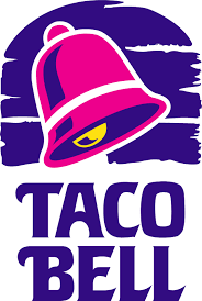
The Fifth Version of the Taco Bell Logo (1994 to 2016)
This design refined the previous version’s contours and details. This logo version included the same color scheme; however the pink and purple colors were brighter.
Other changes included the background behind the bell being a solid background, and the font being updated for the wordmark.
Beyond those changes, the logo still very much resembled the prior version.

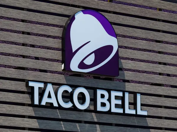
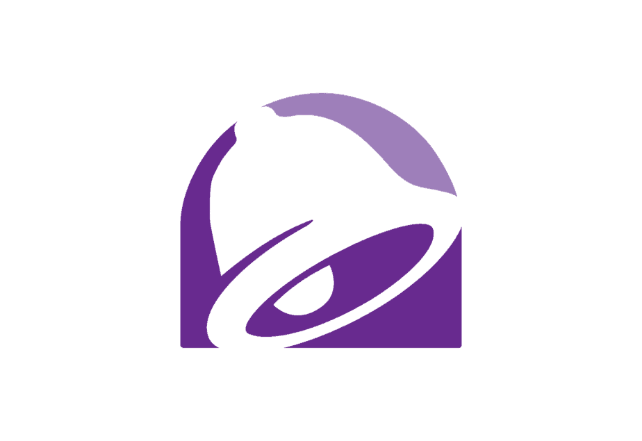
The Sixth (and Current) Version of the Taco Bell Logo (2016 to today)
The prior version lasted for nearly 20 years. In 2016 though, the brand felt it was time for a new logo design. While the purple coloring remained, the pink and yellow accents were removed. This logo also features an updated font which is straighter, thinner, and more uniform. This logo is the logo that you’ll see when you visit a Taco Bell today.
The Components of Taco Bell’s Logo
Throughout its long history, you can find these three features repeated in nearly every version of the design.
1. The Bell
Used to pay homage to the founder, the bell icon in the restaurant’s logo has been around for decades. While it originally sat straight, up, and down above the wordmark, the bell is now very recognizable for its mid-swing look in the most recent and current versions of the logo.
2. The Stacked Appearance
Since the icon was added to the logo, it has always sat right above the wordmark. What’s more, the wordmark itself has been updated to sit on two lines stacked one above the other. This stacked rectangle-like shape creates a uniform look across the logo.

3. The Bold Font
The logo design for Taco Bell has always used a bold font, particularly when the wordmark was the entire logo. In the past, the old Taco Bell logo font looked similar to Macbeth. As for a new Taco Bell logo font, it looks like Helvetica. This font choice provided a sleek and neat feel to the design.
4. The Chosen Colors
The most frequent colors used in this logo design are purple, pink, white, and black. These colors were different and stood out from any other fast-food chain. If you were driving and saw a purple emblem, without looking closely you would likely know it belonged to Taco Bell. The simplicity of the color choice ties back to the brand – a brand focused on simple ingredients, and innovative, good food.
Conclusion
This particular fast-food chain has seen incredible growth and success through its many years in business. While it did take a surprising amount of time for the brand to adopt the bell as its icon, it seems unlikely that it’ll go away anytime soon.
The bell calls back to the founder, who was inspired by a Mexican dish to create his own uniquely American offering. As the brand continues to grow, it will be interesting to see if another major redesign occurs or if this current logo will beat the twenty-year record for the longest-used Taco Bell logo. Whatever we see from the brand, they’ll continue to “Think Outside the Bun.”


