
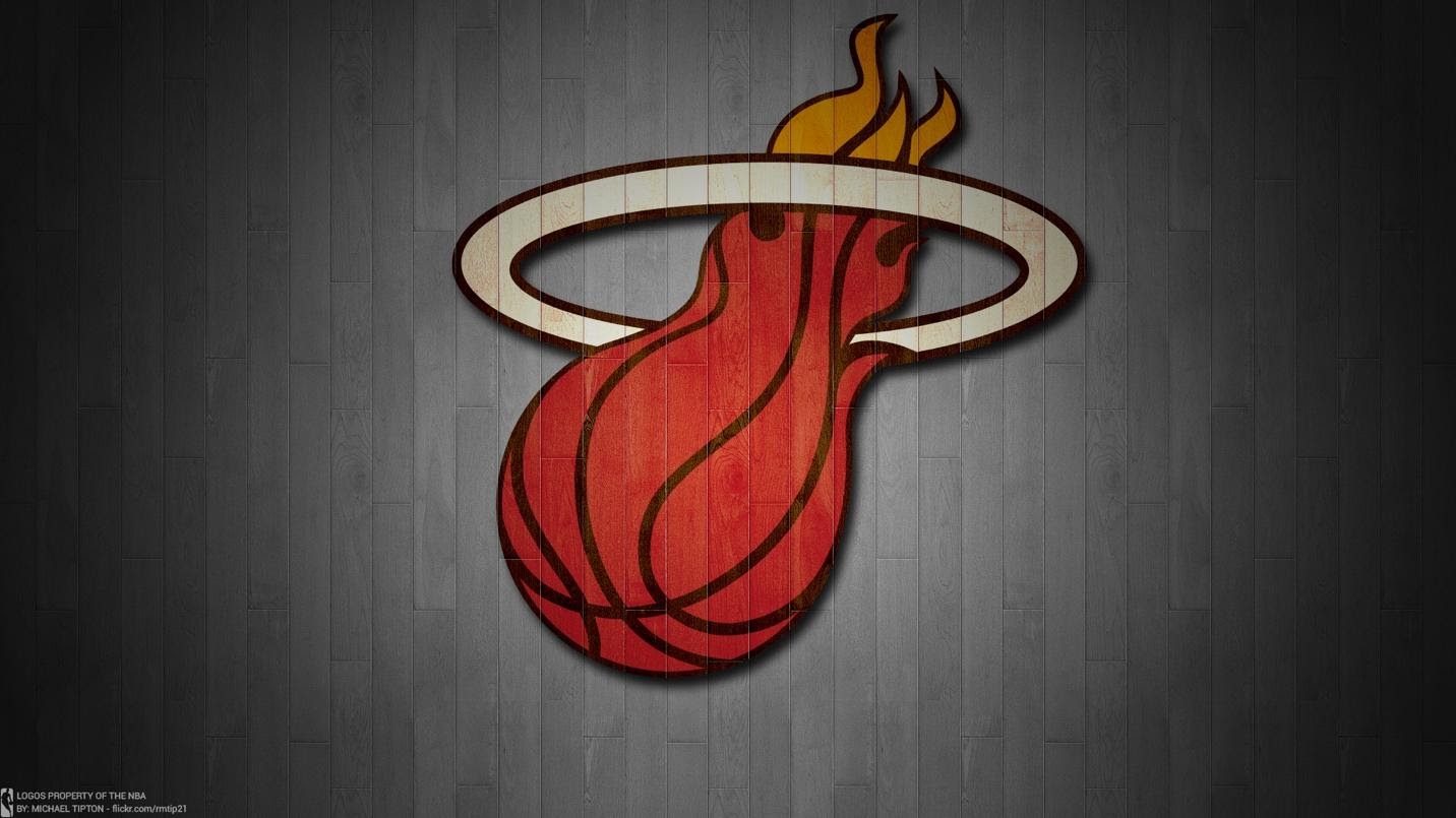
The Miami Heat logo perfectly captures the fiery energy and exciting thrills of basketball. It’s also a highly recognizable, easily understood image — which makes it an ideal logo! So, it’s no wonder that the Miami Heat has changed little since its debut in 1988. A flaming basketball swoops through a hoop. It’s compelling, symbolic, and looks great on uniforms!
As one of the NBA’s most famous logos, the Miami Heat is a great example of sports branding — as well as of brilliant, enduring design. Let’s take a look!
About Miami Heat
Miami Heat joined the National Basketball Association in 1988. As a professional team, they play in the Eastern Conference league, where they hold three titles. The Heat’s early years were a bit lackluster. They performed well enough to earn a spot in the playoffs, but always lost to another team.

Under coach Pat Riley, the Heat started to improve, Players Alonzo Mourning and Tim Hardaway brought some star power to the Heat, helping them get back to the playoffs. Their newfound enthusiasm led to them winning more playoff games and eventually a division championship. They earned the nickname “Road Warriors” after winning 6 games in a row in the 1996-1997 season.
Unfortunately, they were continually defeated in postseason games, and eventually, morale began to drop. The team’s overall brand wasn’t fully solidified; they were recognizable and beloved by their hometown, but they hadn’t yet found their footing. As Riley was preparing to step down as coach, the team decided they needed a fresh new look. Following their disappointing defeat by the New York Knicks in the 1998-1999 playoffs, the Heat adopted a new logo.
Perhaps it was just the push they needed, as the Heat went on to secure two more championships, 6 conference titles, and 14 division titles. Star players Shaquille O’Neal, Dwyane Wade, and LeBron James joined the team, driving the Heat to win more playoffs and titles. In the 2012-13 season, they set a new record with 66 winning games in a row — the second-longest in the history of the NBA.
The Miami Heat Logo Over Time

The Original Miami Heat Logo (1988-1999)
The team was named the Heat thanks to a 1986 naming contest. At the time, the team was an expansion franchise, one of just two expansions approved for Florida. Co-founding partner Zef Buffman, known for bringing Broadway performers to Miami, launched the contest, which pulled in 20,000 suggestions. To symbolize Miami’s hot temperatures, vivacious culture, and the fiery energy of the sport, contestant Stephanie Freed suggested “Miami Heat.” The owners could not pass up such a perfect name, which received the most fan votes. It also resonated with Buffman, who wanted a name that could be easily translated into promotional material.
Naturally, the logo needed to reflect this fiery energy. The Heat ran a logo contest, and Mark Henderson and Richard Lyons came up with the now-iconic flaming basketball. (See “Shapes” in the next section.) Their design resonated with fans, winning 34% of the vote out of 13,000 submissions.
The second and third place options both depicted a basketball wearing sunglasses. Somehow, we suspect that image wouldn’t be as timeless!
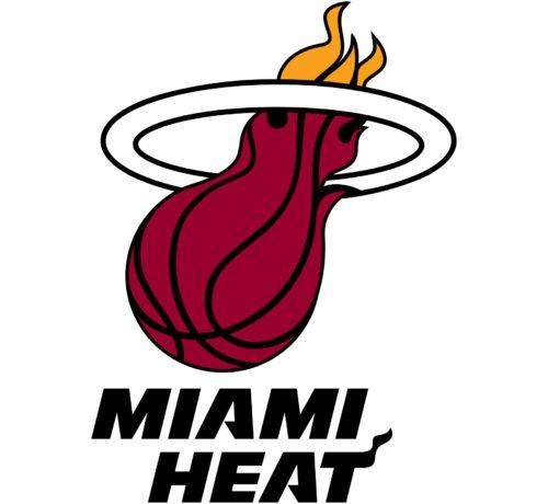
The Miami Logo from 2000 to Now
In 1999, in the wake of disappointing losses to the Knicks, the team decided to revamp their identity and reposition themselves as the champions they knew they were! Plus, it was the turn of the millennium, and like many franchises, they were eager to modernize their look.
They were redesigning their classic uniforms, so it made sense to freshen up the whole brand identity. To modernize their logo, they swapped out the orange flaming ball for one with darker colors and a hand-drawn aesthetic. It was as though to affirm the powerful talent beyond the team’s successes.
As the jerseys had also lost their orange hues and switched to a red-and-yellow design, the new logo would reflect this color scheme as well. (See “Colors” in the next section.) Without the orange gradient, the logo is better integrated with the team’s overall visual identity.
As the new millennium arrived, the Heat were ready to dominate the road again.
The Miami Heat Logo Main Design Elements
Shapes
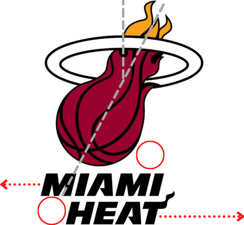
The Miami Heat logo is unusual in that it is asymmetrical, giving it a dynamic feel and edgy vibe.
The wordmark is split across two lines that are not aligned in either direction. This gives the illusion of movement, as though the words are passing each other. It’s a clever suggestion of basketball players dashing across the court.
Then, the flaming basketball shoots downward at an angle across the vertical axis, pointing towards the word “Miami.” The design uses negative space very well here, balancing out the misaligned words with the dominant image. Meanwhile, the hoop ties it all together as the only symmetrical part of the design.
Typefaces
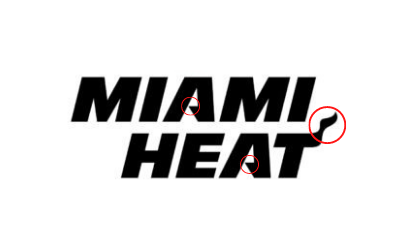
The Miami Heat wordmark is a geometric, oblique sans-serif font with thick crossbars and moderate kerning. It has a dynamic, sporty feel that’s ideal for a basketball team’s logo. Look closely, though, and you’ll notice that the As have angular crossbars that come to a point. This detail, paired with the miniature flame rippling off the “T,” gives the wordmark a fierce and exciting vibe.
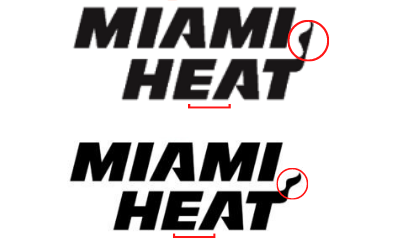
In the logo’s redesign, the typeface’s kerning was tightened up a bit, giving it a cleaner look. The T’s little flame also changed: it now has a more dynamic, recognizable shape that packs a fanfare.
The wordmark is fully black in the full logo, but when used on jerseys, it is typically rendered as white letters with a red outline, black inner border, and yellow inset. Earlier versions substituted red or black with a white border. (See also: “Lettermarks” below.)
Colors
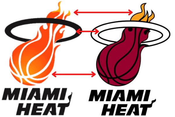
In typical 90s fashion, the original logo featured an orange gradient on the flaming basketball. The fiery hue stood in stark contrast to a solid black ring. The distinctive seams on the basketball are composed of negative space, giving the appearance of a fireball that happens to be shaped like a basketball.
The redesigned logo moved away from the fire imagery and instead emphasized the sport. The flashy orange gradient was replaced with a more realistic reddish-brown solid color and all seams were filled in with black. The trailing flames that appear above the hoop were now the only ones colored orange, as though to symbolize the fierce energy behind the shot.
To counterbalance these strong hues, the black ring was replaced by a white one with a black outline. This was another way to make the logo’s imagery a bit more grounded in the real world.
Lettermarks


A new lettermark was debuted in 2008. This one was derived from the actual wordmark. The initials “MH” are combined, with the outer stems of the “M” and “H” merged across the split baseline. The flame-like flourish from the “T” in the main wordmark is transposed to the “H.”.
From 1999 to 2006, some merchandise also included a lettermark version of the logo. Comprising the initials “MH” in a stylized typeface, the lettermark mirrored the color pattern and angle of the flaming basketball. The letters are shaped like flickering flames, red at the bottom with bright yellow tips.
Both letters are colored white with a thick red outline, black inner border, and a bright gold inset, making this design an eye-popping addition to uniforms and merchandise.
How the Miami Heat Logo Is Used
The original home-game uniforms were a simple white color, featuring red and orange trim with the logo on the bottom left of the shorts. The away-game uniforms inverted the colors, featuring black shorts and jerseys with white, red, and orange trim. In either case, the brand’s color scheme was vivid and recognizable.
Notably, the full logo only appears on the shorts. The jerseys feature the word “Heat” from the wordmark, reflecting the team’s nickname. The flame flourish on the “T” adds some personality.
When the uniforms were redesigned in 1999, the word “Heat” was restylized to reflect the new logo’s design. The orange trim was swapped for the bright golden yellow, and the logo was moved to the right side of the shorts.
Lessons from the Miami Heat Logo
The Miami Heat has some valuable lessons for brand strategists and logo designers alike!
Never underestimate the power of a strong symbol.
Many of the Miami Heat logo contests’ entries depicted some mixture of basketball and sun imagery. In addition to a sunglasses-wearing basketball, there was a sun with a basketball at its center (and vice versa).
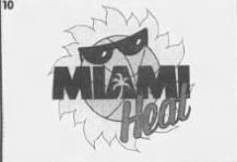
But these focused too much on a literal interpretation of the name. While Miami is famously sunny, the logo needed to capture the excitement and vitality of the new franchise and the city itself.
The flaming basketball worked because it was polyvalent, i.e. it carried several different meanings. It depicted the concept of “heat” but also the force used to shoot the ball through the hoop. By using general flames instead of a sun or even a typical fire shape, it could represent fierce competition, passion for the sport, Miami’s vibrant culture, and the warm climate all in one.
Simple is better.
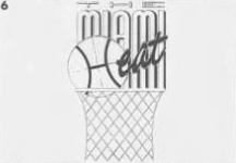
Some of the other entries in the logo contest were quite complex. All those intricate details aren’t easily translated to uniforms or merchandise — which are crucial to sports branding.
For example, this option turned the basketball’s seams into the “H,” layered the word “Heat” in an illegible font over an equally illegible font, then placed it all on top of a basketball hoop.
It’s busy and hard to read — therefore not recognizable.
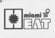
Another entry used a highly stylized geometric typeface and placed a sun shape in the center of the “H.” Unfortunately, the sun looks more like a rotary blade and obscures the “H’s” readability. Many people observed that this appears to read “Miami EAT”! And with the extra ball and hoop doodle at the type combined with the retro font, this design is visually confusing.
Communicate Ideas with Angles and Negative Space
As discussed in the “Shapes” section above, one of the Miami Heat logo’s most compelling characteristics is its asymmetrical design. When you look closely, you see that all of the elements are balanced on either side of the vertical axis. The secret is the skilled use of negative space: to the left of the word “Heat,” the space balances the basketball element above the wordmark. That space is then mirrored above the horizontal axis along the angle of the shooting basketball.
The hoop is symmetrical, so it grounds the dynamic angle of the basketball. That symmetry also helps the logo retain that balance even without the wordmark, the balance still works.
And don’t forget kerning: the negative space between letters aids readability and helps your design look great on all media.

For Logos, Solid Colors Are More Impactful Than Gradients
Gradients have a time and place, but many professional logo designers minimize their use for one simple reason: a logo must be able to appear on multiple media, potentially in black-and-white or greyscale. Gradients often don’t translate well in that regard.
While they do add dimension, that’s not the priority for a logo. Logos should be instantly eye-catching and vivid. As the Miami Heat logo shows, gradients can be used well in a logo design. But most people would agree that the solid colors in the redesigned logo are much bolder and more impactful!
Wrapping Up
A brilliant logo is the centerpiece of a strong brand identity. Few sports teams’ logos capture the spirit of the game and the culture of a team quite like the Miami Heat’s logo. (Just Google “worst sports logos” for some truly uninspired examples.) The flaming basketball, bold typeface, and dynamic shapes make the Miami Heat logo a memorable and iconic design — one that aspiring and professional designers everywhere can certainly learn from!


