
Three hamburger fast-food chains are usually the first fast-food chains people think of: McDonald’s, Burger King, and Wendy’s. While McDonald’s has never wavered from being the top burger chain when it comes to sales, Burger King has tried to rival them time and time again.
While Burger King doesn’t have any signature double gold arches, the company and logo have been around since 1953 and something keeps working for the brand. Many of us know more about McDonald’s rise to success, but Burger King’s story is worth following as well.
If you’re interested in learning more about Burger King’s story of growth, then you came to the right place. Keep reading below to learn more about the top burger chain and how its logo came to be.
Meet Burger King
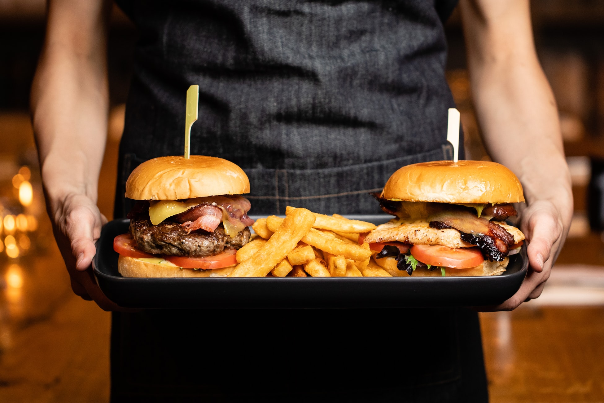
If you aren’t familiar with the brand, Burger King is a fast-food chain that specializes in hamburgers. When Burger King was first launched in Jacksonville, Florida in 1953, the company was launched under the name Insta-Burger King. The next year, the company was purchased by David Edgerton and James McLamore and they expanded the company under the name “Burger King.” With this purchase, the duo introduced Burger King’s signature hamburger, the Whopper. Since 1953, Burger King has come a long way and its French fries and hamburgers are an iconic part of the United States fast-food scene.
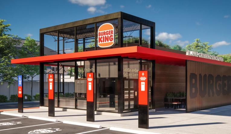
Today, Burger King is one of the largest fast-food chains in the world and is currently launching a new rebranding strategy. This is not the first time the brand has done this though. Burger King has gone through several rebranding designs over the years which we dive into later in this article.
Burger King’s Evolution
1953: Burger King is founded
If you look back to 1953, you’d find Keith Kramer and his wife’s uncle, Matthew Burns, dreaming up an idea of a burger fast-food restaurant that would rival McDonald’s. The two men were from Jacksonville, Florida but were inspired after visiting a McDonald’s in San Bernardino, California. Unlike McDonald’s though, Keith and Matthew had the rights to an Insta-Broiler, which inspired the restaurant’s name, Insta-Burger King.
1954: The first Insta-Burger King is purchased
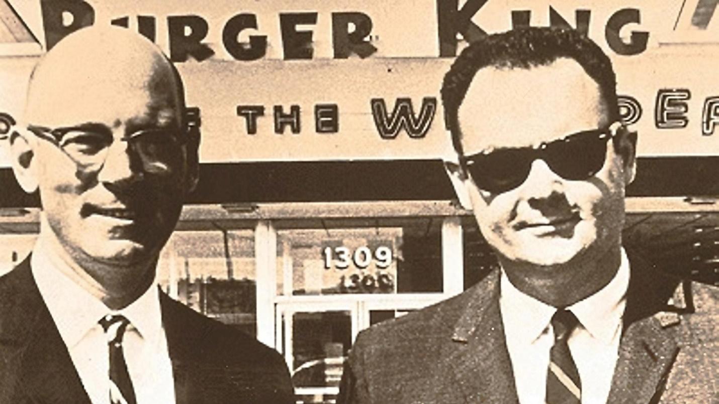
After the first Insta-Burger King was launched, the restaurant grew to a few other locations. In 1954, James McLamore and David Edgerton, two Cornell University students, purchased one Insta-Burger King location in Miami, Florida. While launching this location, James and David swapped the Insta-Broiler for a flame broiler, which was a gas grill. This eliminated all the prior problems the franchise was experiencing with their former broiler.
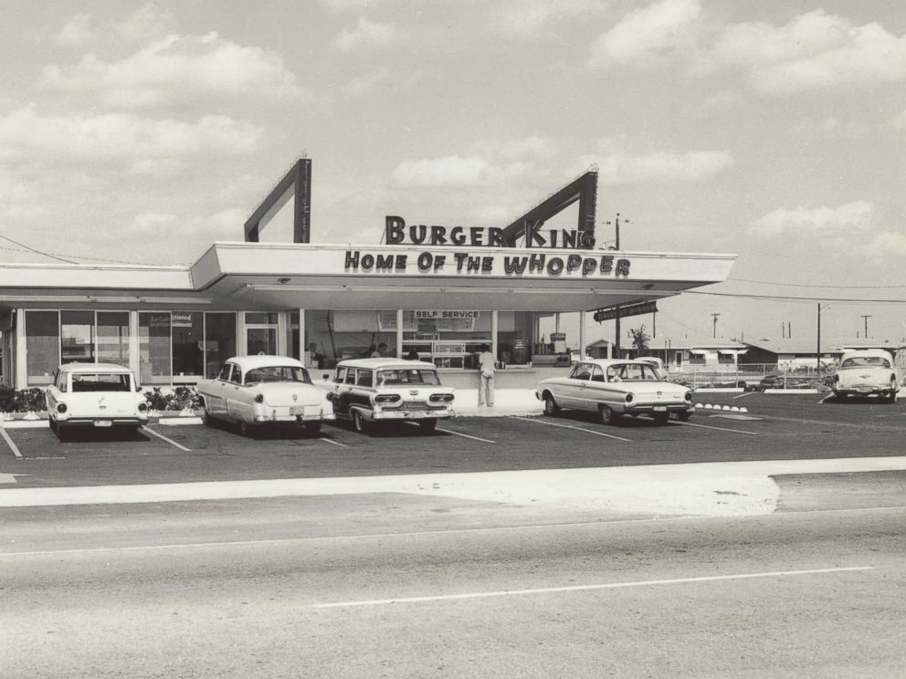
1959: Insta-Burger King becomes Burger King

After Keith and Matthew ran into financial trouble with their chain, James and David bought the entire franchise. With this purchase, the two were able to restructure the entire organization’s operations. This meant that the brand’s name was updated to become simply, Burger King, and the franchise’s signature burger was introduced to the menu. This signature burger was named “the Whopper,” and it immediately caught on with customers across the country.
1967: Pillsbury Company purchases Burger King Corporation
Less than a year after James and David bought Burger King, the franchise was sold to Pillsbury Company in 1967 for $18 million. With Pillsbury’s help, Burger King became the second-largest burger chain in the United States. The only burger chain ahead of Burger King was McDonald’s.
1978: Donald Smith is brought on board

Donald Smith was a McDonald’s executive and was brought on board to Burger King’s team in 1978. Once he arrived at Burger King, Donald restructured the franchise agreement and set it up so that the franchise owner could only own multiple Burger Kings, not any other chains. Additionally, franchise owners needed to live within an hour’s drive from their homes. Not only did this set up a framework for new ownership, but it helped cut out underperforming franchises.
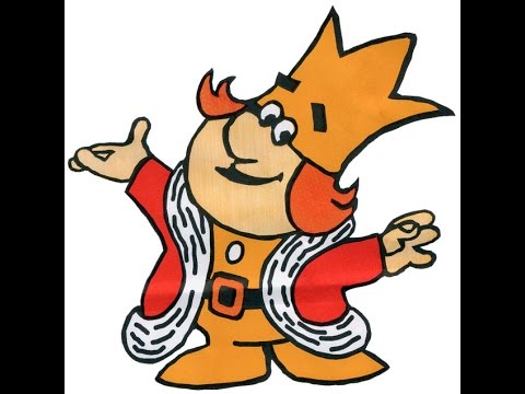
As part of Donald’s work with Burger King, he also introduced marketing to children. Donald worked with Burger King on introducing three child-friendly characters, a Burger King (that was also a magician), the Wizard of Fries, and Sir Shake-a-Lot.
A final strategy Donald implemented after joining Burger King was introducing Burger King’s first fish and chicken sandwiches. Donald left in 1980 after being poached by PepsiCo., but when he left, sales were up by 15%.
1980: Norman Brinker helps turn Burger King around
After Donald left, Burger King’s sales began to decline again. That meant that Burger King needed to come up with a new strategy to boost sales. After Pillsbury purchased Steak & Ale, Normal Brinker, Steak & Ale’s founder, was brought on to turn Burger King around. One of the first things Norman did was launch a marketing campaign consisting of commercials that cited Burger King’s burgers as being bigger and better than McDonald’s. This worked and helped to boost sales but just like with Donald, Normal also left the chain to work on and build another chain, Chili’s.
1988: Grand Metropolitan PLC acquires Burger King
As Burger King began to decline again, Grand Metropolitan PLC, a British company, acquired Pillsbury Company for $5.79 billion. This meant that Grand Metropolitan PLC was now the owner of Burger King. Once Burger King was acquired, the company changed Burger King’s distribution method, ditched Coca-Cola for a partnership with Pepsi Co., partnered with the Walt Disney Company to appeal to a younger audience by highlighting Disney films, and expanded the franchise all over the world.
2002-2006: Burger King is acquired again and launches an IPO
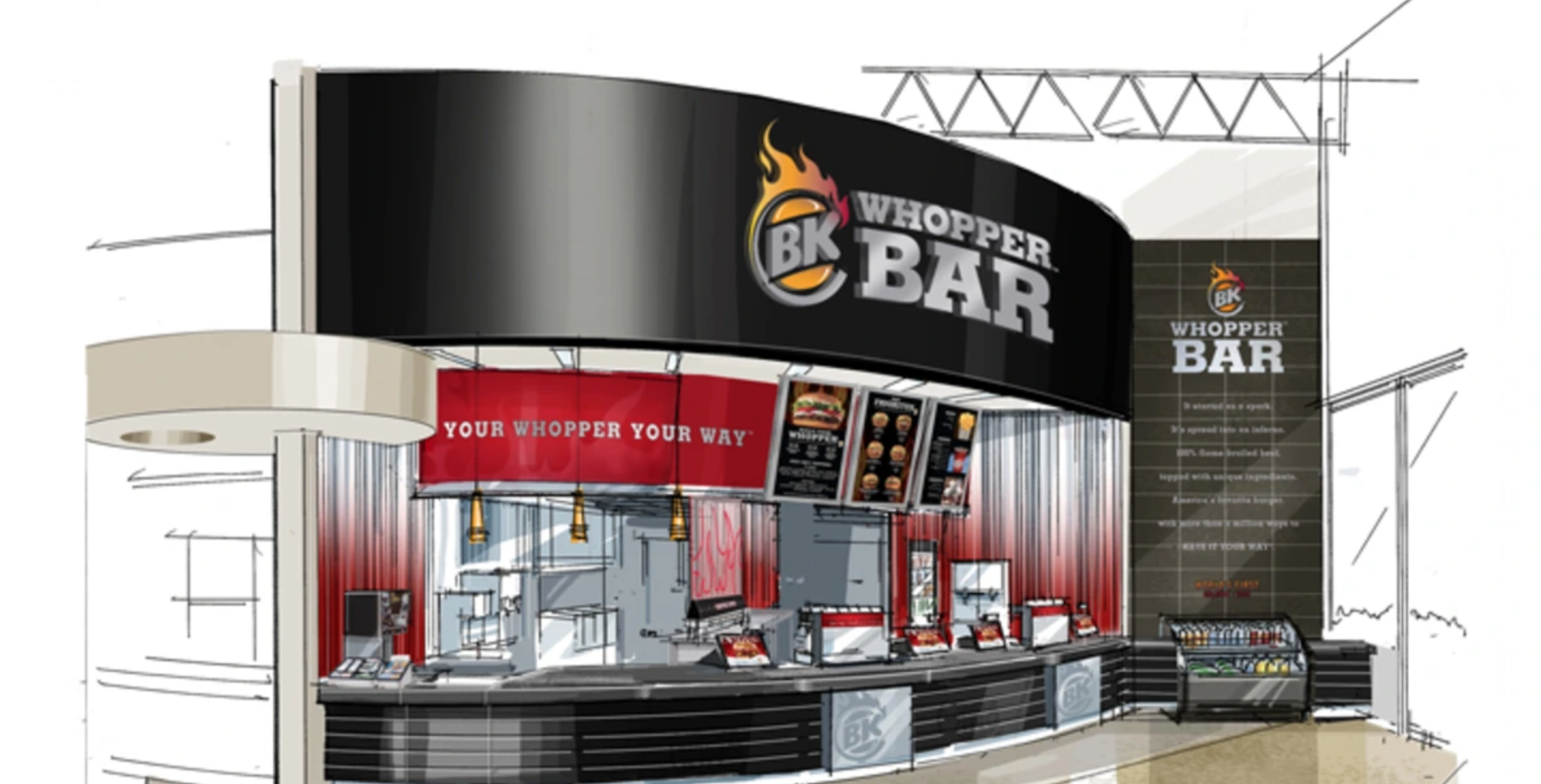
After Burger King experienced yet another decline, the company was purchased by Texas Pacific Group (TPG), Bain Capital, and Goldman Sachs for $1.5 billion. This purchase helped set up the company for an IPO, which was filed in 2006. This IPO generated $425 million, and this IPO helped propel TPG to grow the franchise and turn sales around by introducing the Whopper Bar. This Whopper Bar allowed customers to watch the burgers being made, and the Burger King employees were now referred to as “Whopperistas.”
2010: Burger King goes through another revamp
Like with past acquisitions, once Burger King was acquired by 3G Capital in 2010, changes were made to the brand. The new owners introduced new menu items and remodeled stores to revive the brand. Two years later in 2012, Burger King went public a second time after 3G Capital sold a 29% stake in the company to Justice Holdings LTD.
2014: Burger King merges with Tim Hortons
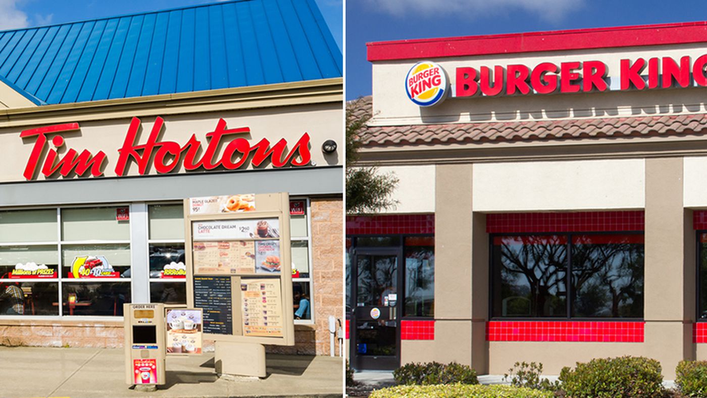
If you fast forward to 2014, you’ll find that Burger King merged with Tim Hortons, a popular coffee shop and restaurant chain based in Canada.
Roadblocks Along the Way
If you look at Burger King’s evolution, you’ll find many stories of Burger King trying to turn sales around and claim the number one “hamburger chain” spot. With Burger King, the biggest roadblock they experienced was competition and customer acquisition. With McDonald’s as a competitor, this became a difficult roadblock to navigate. Burger King was up for the challenge though. Burger King’s ownership throughout the years tried new revamp strategies that kept customers coming back and kept new customers walking through the door.
The Meaning of Burger King’s Logo and Burger King’s Logo History

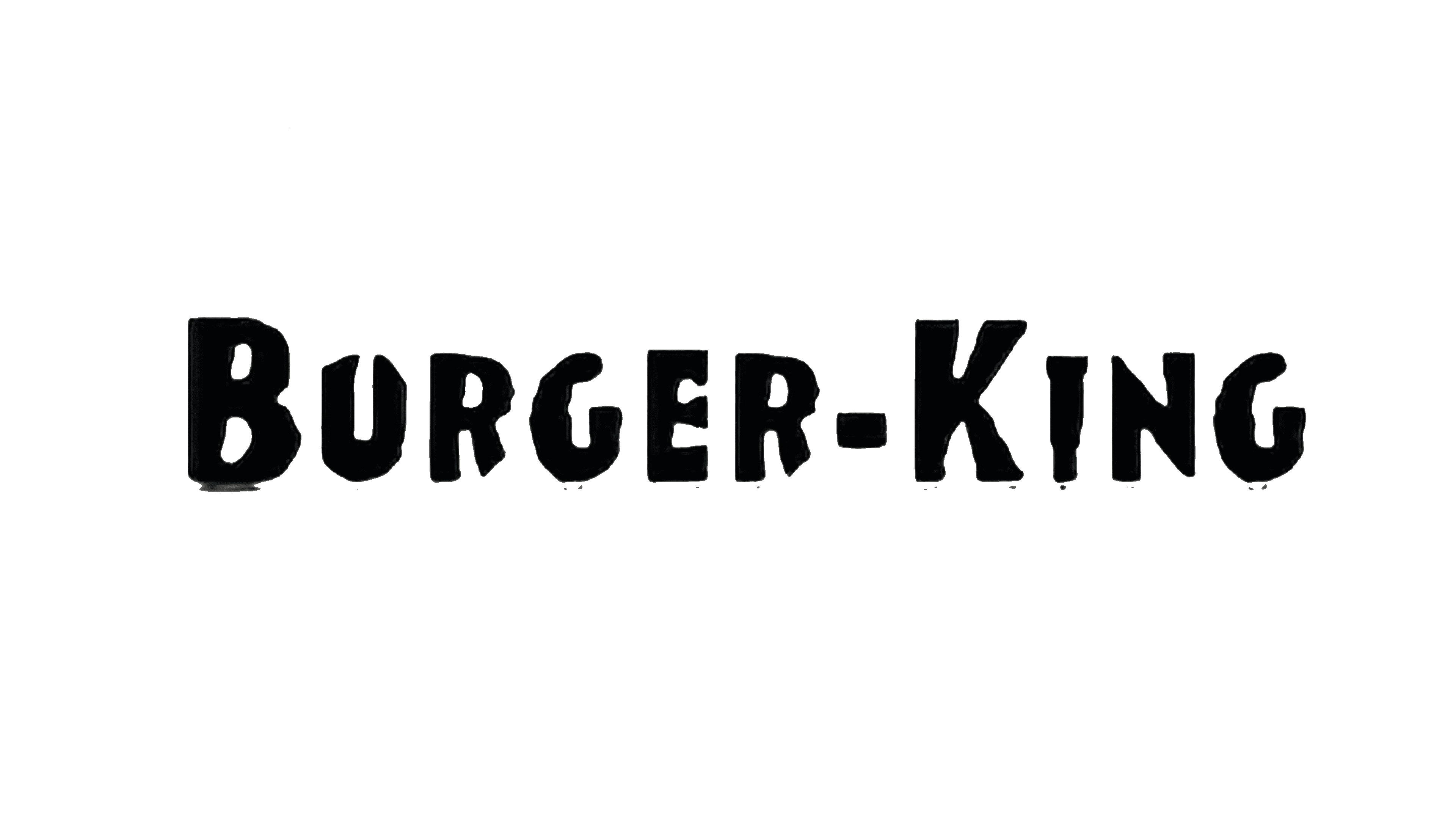
1953-1954: The first version of the Burger King logo
When Burger King was first founded, the company was called “Insta-Burger King.” With Insta-Burger King’s launch, the brand also launched its first logo. This logo was inviting and friendly, welcoming diners to the establishment.
1954-1957: The second version of the Burger King logo
Once Insta-Burger King’s name was formally changed and shortened to “Burger King,” the logo also changed. This new logo featured minimalist design elements with a sans-serif typeface.
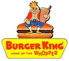
1957-1969: The third version of the Burger King logo
The third iteration of Burger King’s logo featured a king sitting on top of a hamburger. The king figure is also holding a soda. The text on the logo reads “Home of the Whopper,” which shows their consumers that their burgers are called “Whoppers.”
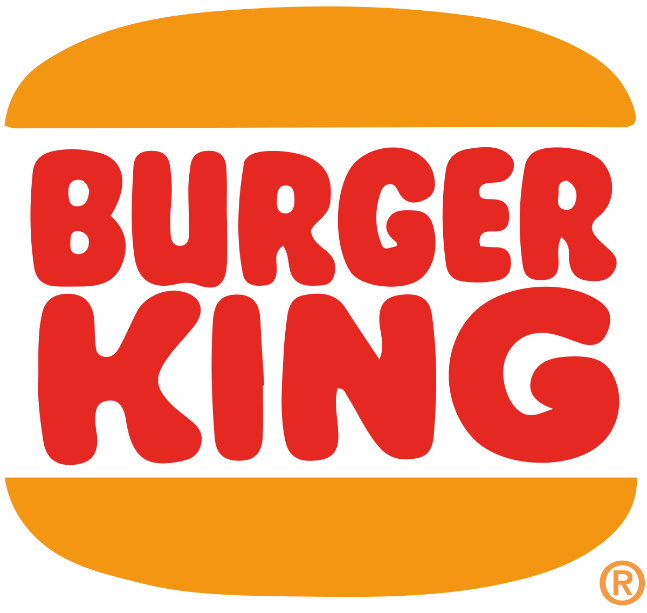
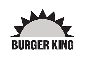
1969-1994: The fourth version of the Burger King logo
With this logo version, the designers did not stray far from Burger King’s previous color scheme. What the designers did though, was make this logo less complex. By featuring a simple bun with the company name between the two halves, it’s clear what Burger King offers its consumers.
1994-1999: The fifth version of the Burger King logo
This fifth iteration does not look drastically different than the prior version, however, this logo looks more refined. The colors of the bun are brighter, and the letters are bolder and flattened.

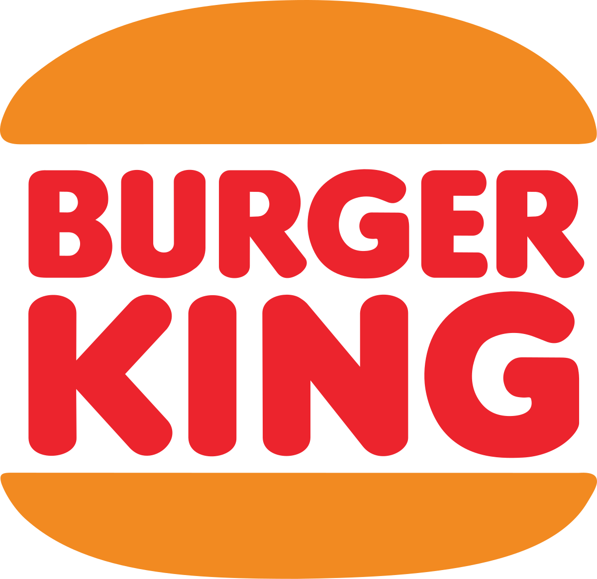
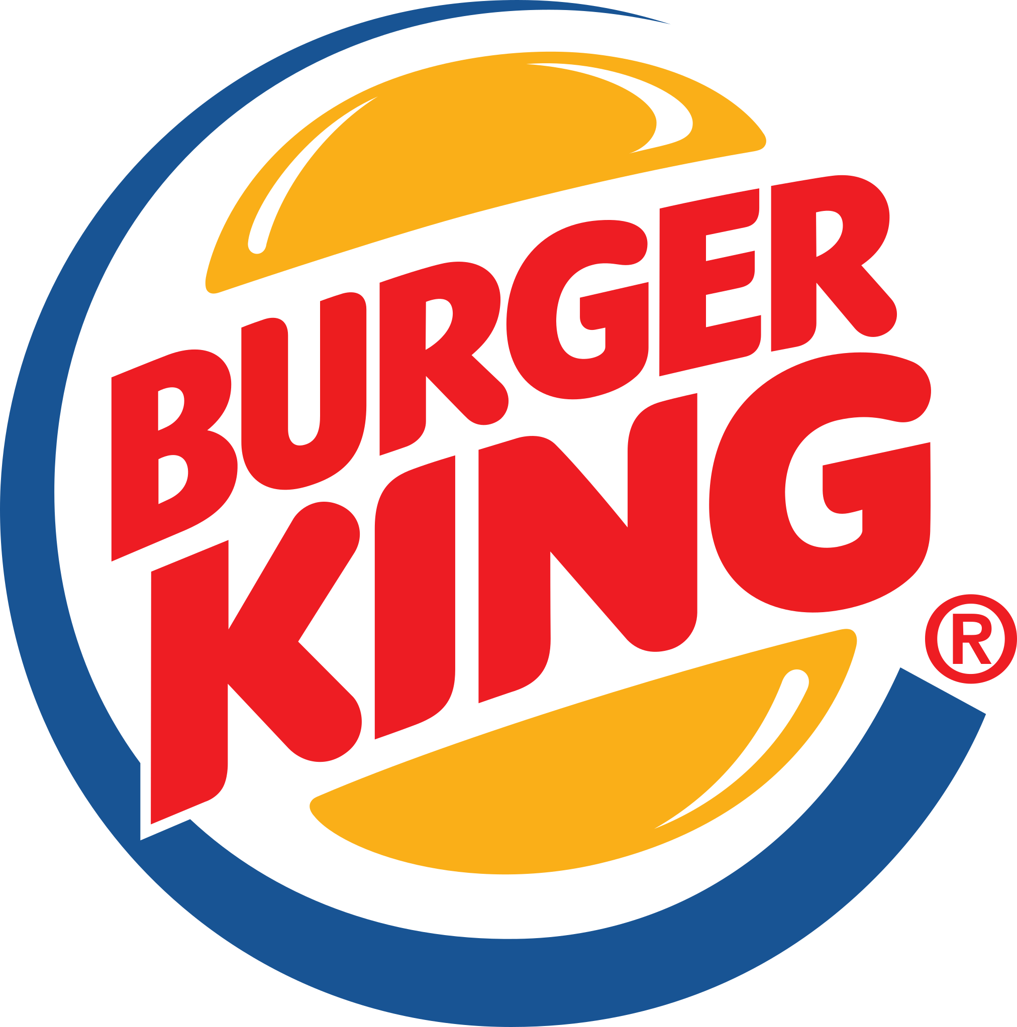
1999-2021: The sixth version of the Burger King logo
This version was redesigned by the Sterling Brands agency. This version includes the addition of blue and opts for the lettering to be positioned diagonally across the emblem.
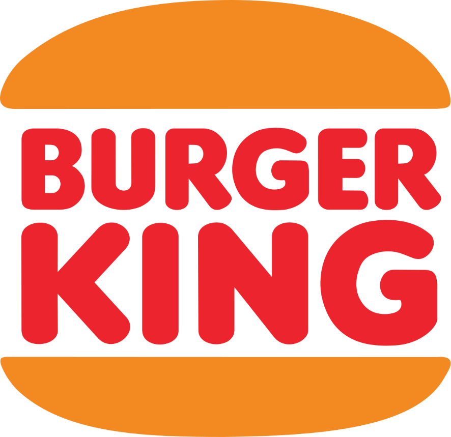
2021-Today: The seventh version of the Burger King logo
While you may still see the sixth version throughout the globe, Jones Knowles Ritchie redesigned the logo in 2021. This new version includes retro components and the blue addition from the prior logo is removed. Unlike earlier versions, this version includes a cream outline that frames the logo making it feel friendlier than past iterations.
Burger King’s logo font:
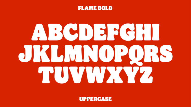
The initial Burger King logo font was like the font used for “Insaniburger.” This original font was designed by Adam Nerland. Throughout the logo’s evolution, Burger King elected for fonts that were bold sans-serif variations. As Burger King rebranded in December 2020, the brand introduced a new typeface that had two variations: bold and regular.
Burger King’s logo color:
Burger King is not a brand that has stuck to one color scheme. The first iteration of the logo was black and white and then later versions included orange and red. In 1999, the brand introduced a new color, blue, which gave the logo a modern look. One thing Burger King always did though was include colors that made the logo inviting and friendly.
Burger King’s logo symbols:
The prominent symbol in Burger King’s logo is the hamburger bun, which is the shape of the logo. While other logo versions incorporated other symbols like a sun or king, the symbol that has stood the test of time is the hamburger bun. This choice was intentional as the brand became a franchise. As more Burger Kings popped up, it was always clear to the consumers what they would get when they stopped by a Burger King.
Burger King Today
After Burger King and Tim Hortons merged in 2014, Restaurant Brands was created. With Burger King being part of this group, Burger King was able to get its sales back on track. In 2018, the group purchased Popeye’s for $1.8 billion, and this purchase allowed the company to expand the menu yet again with beyond meat offerings, donuts, fried chicken, and more. Today this group has continued to purchase other stable fast-food chains, further increasing Restaurant Brand’s market share.
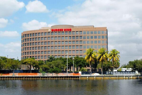
Speaking of market share, Burger King’s stock can now be found under Restaurant Brands and in 2018 the stock increased from $35 a share to $55 a share. Also in 2018, Burger King solidified their spot again as the second top burger chain in the United States, after it generated $9.6 billion, surpassing Wendy’s. McDonald’s, as expected, still has that top spot with its $37.6 billion in U.S. sales.
As noted in the logo’s evolution, the rebranding that Burger King is currently unveiling is the biggest rebrand the chain has launched in a while. This version is a modern version of their traditional logo that brings the company back to the essence of the brand.
Lessons Learned from Burger King
When it comes to Burger King’s logo, there are lessons we can all learn. Unlike other logos, Burger King went through some substantial changes. These changes were made in conjunction with some substantial changes that the company was also experiencing. With Burger King though, whenever the company went through a rebrand, this rebrand also included their packaging designs and employee uniforms.
If you ever need to rebrand your company, you can find success like Burger King did. How they rolled out their logo designs and changes worked for them, and consumers accepted it and like ultimately liked the changes. That means with your logo design, if you want to update your logo along the way, you can do that! All you need to do is be conscientious of the public’s perception of your logo and be thoughtful in developing an entire rebrand strategy.


:format(jpeg)/cdn.vox-cdn.com/uploads/chorus_image/image/38794610/tim-hortons-burger-king-merger-official.0.jpg)
)