
Sports team logos are some of the most iconic logos in our culture. They help fans of the same team identify each other in public, even outside of a sports arena, and provide powerful merchandising opportunities for the team. Sports create a powerful sense of community or people in the same geographic area and even those dispersed across the country or the world, and logos are very important to facilitate that connection.
Most of the time, a sports team’s logo is a very literal representation of the team’s name. Both the logo and the name are carefully selected to highlight the team’s skill and prowess in their sport, convey a fighting spirit, or honor the cities that they call home. The Carolina Panthers are just one of the many NFL teams that have chosen to represent themselves with a fearsome predator.
As one of the youngest teams in the NFL, the Carolina Panthers have only changed their logo once. However, this is not to say that aspiring designers don’t have much to learn about logo development from the team.
A Brief History of the Carolina Panthers
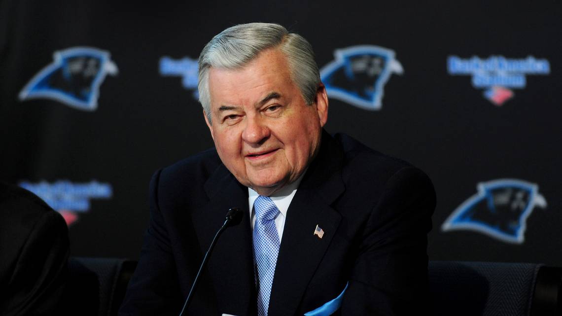
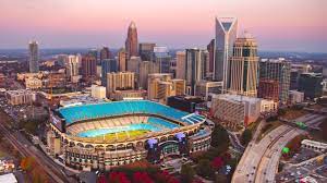
The Carolinas have Jerry Richardson to thank for their professional football team. Born and raised in Charlotte, North Carolina–where the team is headquartered–Richardson was a former wide receiver for the Baltimore Colts.
He began his campaign for a local NFL team in the late 1980s. He enlisted businessmen and politicians from North and South Carolina to help him lobby existing NFL franchises to support his cause.
Richardson and his company went on to host several preseason games in cities throughout North and South Carolina to demonstrate the region’s strong interest in an NFL franchise to the league.
Richardson put forth the Carolinas’ bid for a new NFL franchise on December 15, 1987. On October 26, 1993, the NFL owners unanimously voted to accept Richardson’s bid for the Carolina Panthers to join the NFL as the league’s 29th franchise.
This was the first time the league had welcomed an expansion team since 1976.
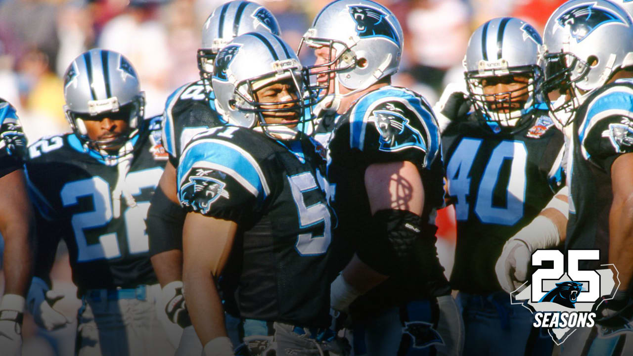
The Panthers played their first season in 1995. In 2003, they finally earned a berth in Super Bowl XXXVIII after winning the NFC championship.
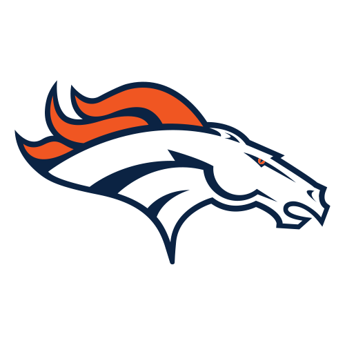
In 2015, they played in Super Bowl 50 against the Denver Broncos, though they were not victorious.
How did Richardson land on the name Panthers? While other teams held focus groups to get fan feedback or even ran contests, Jerry Richardson asked his son for input.
Mark Richardson, now the club’s president, selected the name “Panthers” and the black, blue, and silver color scheme.
Mark reportedly chose the name because it “signified what [the Richardsons] thought a team should be–powerful, sleek, and strong.”
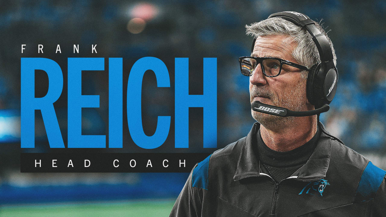
Since 1995, the team has been managed by 5 head coaches. Most recently, Frank Reich took over the role in January 2023.
History Of The Carolina Panthers Logo
As a more conservative NFL owner, Jerry Richardson was notoriously resistant to change. As a result, the Panthers’ logo has only been redesigned once in the team’s nearly 30-year history.
To clear up a common misconception, the shape of the panther’s head and neck is not supposed to resemble the two states together, though many people have claimed it does. Any resemblance to the geographical boundaries of the Carolinas is merely coincidental, as nice of a thought as it would be. North Carolina and South Carolina have often been considered rivals, but they come together as #OneCarolina to back the Panthers.
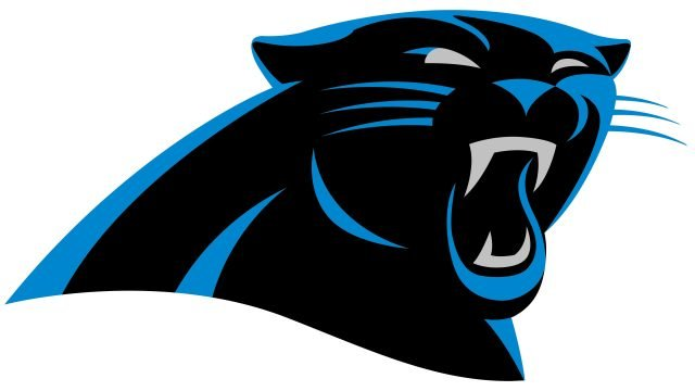
1995-2011
The original Panthers logo is strikingly similar to the one still used today. It features a stylized roaring panther, visible only from the neck up. The main body of the panther is black outlined with a medium-dark cyan blue (called “Process Blue C” by Pantone). The blue also helps highlight the contours of the jaw and muscles, while a thin black line outlines the entire shape. The panther’s eyes, eyebrows, teeth, nose, whiskers, and the inside of the left ear are silver to stand out and add detail against the black background.
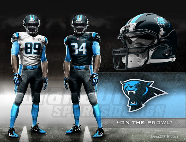
In 2012, Nike and the NFL partnered to create a new uniform template for the league called the Nike Elite 51 collection. These new uniforms were optimized to enable a wide range of motion, encourage cooling, and create an overall lighter-weight uniform. With updated uniforms, the Panthers decided to upgrade their branding as well.

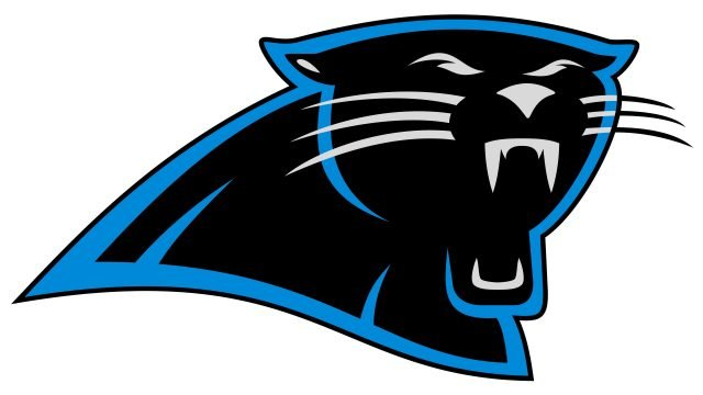
2012-Present
Some slight modifications were made to the shape of the panther, including the rounding out of the jaw, ears, and fangs.
The prominent eyebrows were also removed to give the illustration a more threatening look.
The 2012 redesign brought only a few minor changes to the logo.
First, the brand removed the thin black outline that had made the original look flat and cartoonish.
Instead, they used bolder, more dynamic swathes of blue to add definition and give the logo a more fluid look.
Instead of an outline, the blue looks like highlights hitting the panther’s fur, The overall effect is more realistic and fearsome.
The brand also transitioned to a slightly brighter shade of blue to create more contrast. The nose and whiskers were changed from silver to blue, leaving only the teeth and eyes silver.
History Of The Carolina Panthers Wordmark
In addition to the iconic panther logo, the Carolina Panthers also have a distinctive wordmark used in their branding. Like the primary logo, the wordmark has undergone very few changes in the team’s relatively short history.
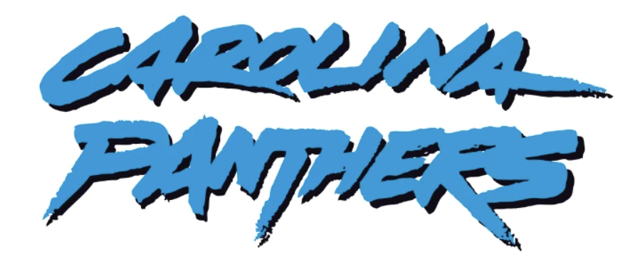
1995
The original Panther’s wordmark was designed to look like a banner waving the wind. As a result, the letters at the ends are taller than the letters in the middle. The wordmark used a custom font with blocky, angular, sans-serif letters. The letters themselves were silver and outlined in blue on a black background. The bottom swish of the S was elongated to underline the rest of the words, resembling the claw marks of a big cat.
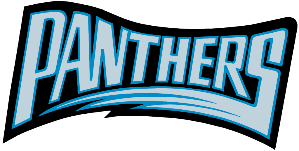
1996-2011
In their second season, the Panthers came back with an all-new wordmark. This wordmark was designed to look wild and animalistic. As opposed to the neat block capitals of the previous wordmark, this version looked like it had been hastily scrawled using chalk or charcoal. The edges of the letters were rough and textured, and the tapered ends of some of the swashes had a mottled look. The team’s name was written in all caps with a slight slant, and the letters seemed to run into each other. Though the wordmark was primarily blue, it featured a black drop shadow to add emphasis.
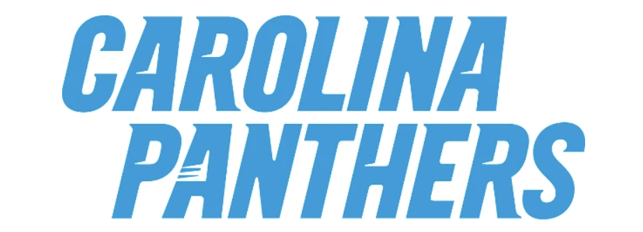
2012-Present
When the team’s branding got an overhaul in 2012, the wordmark got “tamed.” The animalistic scrawl was replaced with neat, serifed block capitals, all equally sized.
One element that was retained from earlier versions was the slight leftward slant of the letters. Some of the letters feature small white slashes that imply a panther’s claw marks.
This is particularly pronounced on the A in Panthers.
Major Design Elements
Football is a game of strength, dexterity, and ferocity. The branding team and logo designers for the Carolina Panthers have used several design choices to help convey these attributes in their primary logo and wordmark.
Animal Mascots in the NFL
The Panthers are far from the only team in the NFL–or the only sports team, for that matter–named after an animal.
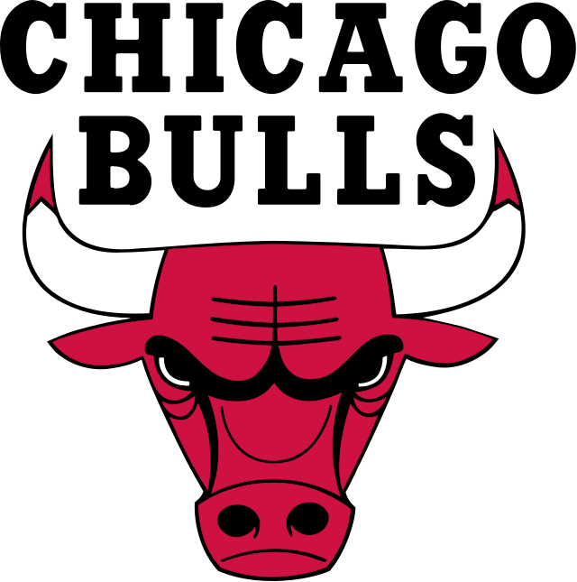
Predators are the most common, but teams like the Chicago Bulls (a basketball team) and the Denver Broncos use animals traditionally considered prey.
The best logos elicit strong feelings, helping the audience to understand the brand’s essence with nothing more than a picture.
Animals are very evocative, and we tend to associate certain traits with certain species.
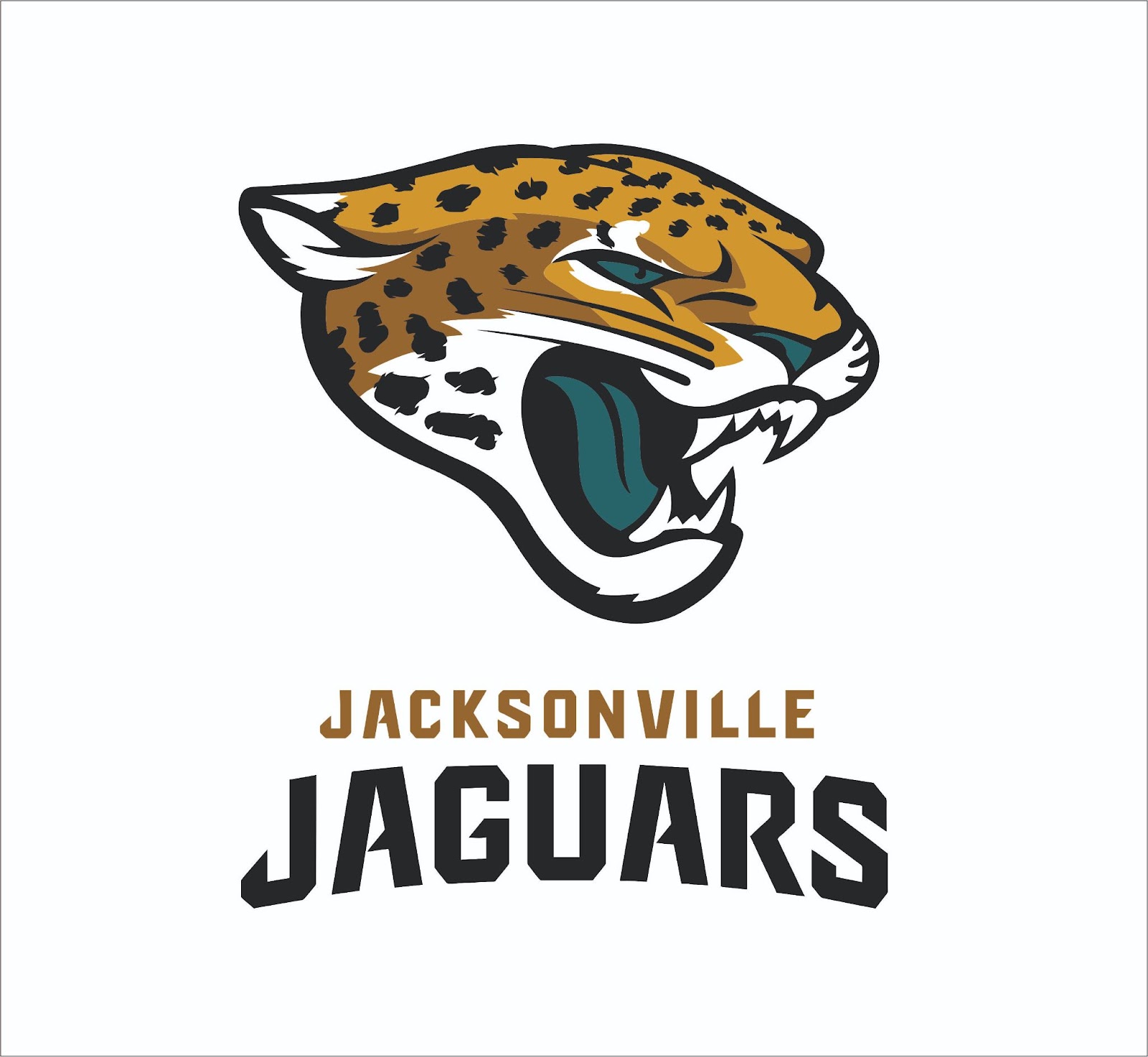
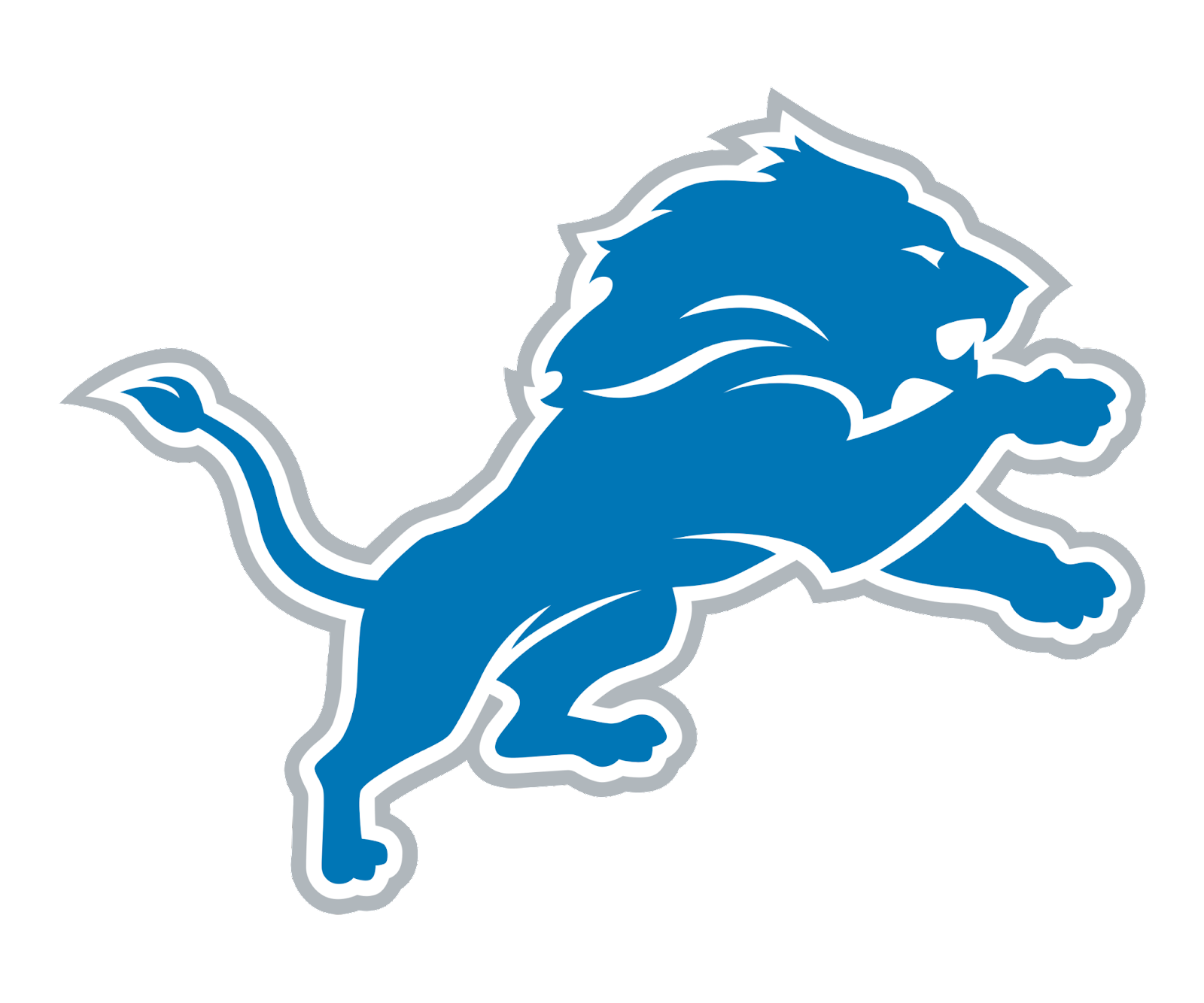
For example, the Chicago Bears, Jacksonville Jaguars, and Detroit Lions all chose predatory animals renowned for their strength and ferocity.
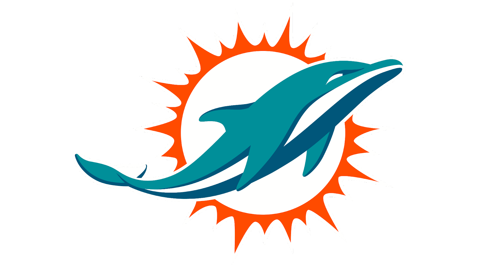
However, there are other ways teams can use animals to convey a sense of athletic prowess. Take the Miami Dolphins.
Dolphins, though they are technically predators, aren’t generally considered particularly fearsome creatures.
However, as anyone who has ever seen a dolphin show at an aquarium can tell you, they are incredibly quick and agile, both of which are desirable traits for a football team.
Dolphins are also very common off the coast of Florida, creating a connection between the team’s logo and where they are from.
The Baltimore Ravens are another team that chose an animal mascot based on its connection to their city. Author Edgar Allan Poe, a Baltimore native, famously wrote a poem entitled “The Raven.”
These large black birds have a spooky aura and intimidating presence. Though they do eat small animals and chicks from other birds’ nests, the Baltimore football team relies on attributes besides their hunting prowess to make their logo feel menacing to rivals.
The underlying motivation of sports is competition. Each team wants to prove that they are faster, stronger, more agile, and better at strategy than their opponents.
Animal mascots easily create a connection between the team and certain desirable attributes in the minds of fans.

The panther is a ferocious predator known for both its strength and agility. Anyone who came up against one in the wild would be right to be scared, as any confrontation would most likely end with the panther’s victory.
Though panthers are not native to the Carolinas, the Richardsons chose this animal mascot because they wanted those traits associated with their team.
Color
When people think of a panther, the first thing that comes to mind is a large black cat. However, blue is considered the primary color of the Panthers’ branding palette, with black and silver as accents. There are a number of reasons why blue might have been selected as the team’s primary colors.
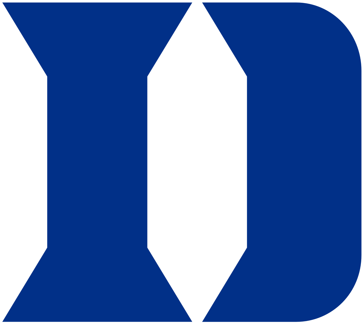
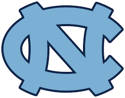
First, blue is the color used by two of North Carolina’s most popular college football teams: the UNC Tar Heels and the Duke Blue Devils. Some people claim that the Panthers’ process blue–hex code #0085CA– is halfway between the light Carolina Blue–hex code #7BAFD4– of the Tar Heels and the royal Duke Blue–hex code #003087– of the Blue Devils. Using blue for the state’s NFL creates a connection with these two elite football teams.
Fifteen of the 32 teams in the NFL–nearly half–have some shade of blue in their color palette, including the Miami Dolphins’ aqua and Jacksonville Jaguars’ teal. Worldwide and across different demographic groups such as gender and age, blue is the most common choice when people are asked to pick a favorite color.
In addition, blue is also associated with calm and tranquility. It might seem counterintuitive to use a calming color when you want to inspire passion, but the presence of blue in high-pressure situations may help promote a sense of focus to help players perform their best.
The electric blue chosen for the Panthers creates a stark contrast when used against the black of the panther’s body, creating a more dramatic impression. In the most current version of the logo, the blue looks like it could be a realistic highlight from light hitting black fur, creating a 3D effect. Silver serves as a natural way to complement the other cool tones in the palette and add extra detail.
Text
When the Panthers first joined the NFL in the mid-1990s, novelty fonts were all the rage. The second Panthers wordmark is a prime example of the more innovative wordmarks many brands sported at the time.

However, by the time the team redid its branding package in 2012, design tastes had pivoted toward minimalism.
The current wordmark took this new design ethos into account but still managed to incorporate the panther’s claw marks to convey a sense of ferocity and highlight the team’s competitive prowess.
Lessons Learned From The Carolina Panthers Logo
The Panthers are still a relatively new team, and we may see more iterations of their logo yet–especially since Jerry Richardson’s passing.
However, if the team’s logo proves anything, it’s that you don’t need to make drastic changes to a logo to keep it modern and fresh.
Sometimes, even minor tweaks can go a long way to keep your branding relevant.


