
If you were to look at businesses that grew from humble beginnings, Fruit of the Loom would be one of the first businesses you stumble upon. And for many of us, it’s a brand that we are familiar with.
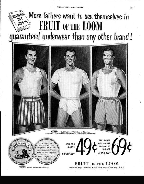
If you need cotton underwear, a new package of socks, or a basic t-shirt, Fruit of the Loom is the brand you’ll find at some of your favorite retailers as you are shopping. That’s because the brand is almost 200 years old and is a brand that is trusted by Americans.
How a brand builds trust like this doesn’t happen overnight. It’s built by remaining true to your core mission and creating a logo that resonates with customers, which is exactly what Fruit of the Loom did.
If you want to learn more about this iconic brand’s road to global domination, and how its logo came to be, then keep reading below. Throughout this article, we’ll walk you through everything you need to know about this brand in hopes that you can implement some of these business strategies into your own brand.
Meet Fruit of the Loom

If you’re one of the few people that has never heard of Fruit of the Loom, the brand is known for offering a wide collection of basic casual wear and comfortable undergarments. Most notably though, Fruit of the Loom is the world’s largest and oldest clothing manufacturer, with roots that date back to the late 1800s. What has remained consistent for the brand over the last ~130 years is the company’s mission to create high-quality, and ethically crafted clothing.
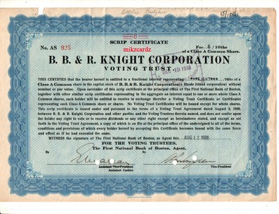
Looking back at how the company came to be, the brand was founded in 1851 in Warwick, Rhode Island by two brothers, Benjamin, and Robert Knight. Before the company was called “Fruit of the Loom” it was first named “B.B. and R. Knight.” During the early days of the company, Fruit of the Loom was a factory that produced its own textiles and fabrics, made from cotton. Twenty years after the company was founded, Fruit of the Loom was registered as a brand and was granted a trademark, number 418. Today, Fruit of the Loom is one of the oldest trademarked businesses that is still standing.
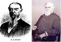
To get a better sense of the brand though, it’s important to take a closer look at both founders. Before Benjamin Knight found an appetite to launch his own business with his brother, he got his start working on a farm until he was 18. Once he turned 18, Benjamin transitioned to a new role, working at Sprague Print Works for a short while. After Sprague Print Works, Benjamin opened a grocery store before founding his second company, Penniman, Knight & Company, a business that bought and sold grains and flour. In 1852, Benjamin bought into his brother, Robert’s, business, and Robert bought some of Benjamin’s.
Robert was younger than Benjamin and got his start working also at Sprague Print Works at the age of 8. From there, Robert worked at a variety of places until he found his way into working at Pontiac Mills, which he eventually purchased.
After the two brothers bought into each other’s companies, the brothers decided to create the Fruit of the Loom brand.
Fruit of the Loom’s Evolution
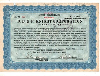
1851: B.B. and R. Knight Corporation is born
After working in a variety of industries for a wide range of businesses, Benjamin and Robert Knight came together to create B.B. and R. Knight Corporation (which we know today as Fruit of the Loom). The company’s focus was textile manufacturing and when the company was founded, the brand created high-quality cotton clothing for women, men, and children.
1856: Fruit of the Loom becomes the new name of the brand
Many of us never realized that Fruit of the Loom wasn’t the official name of the brand when it was founded, but that was the case. This company name was inspired by a friend and customer of Robert Knight, Rufus. Rufus’ daughter was an avid painter and she often painted fruit labels. These sold well so the Knight brothers decided to go with this name and used this name as an inspiration for their logo.
1871: The company is trademarked
Twenty years after the company was founded, the brand filed for an official trademark which was granted in 1871.
1985: Northwest Industries, Inc. acquires Fruit of the Loom
William Farley of Northwest Industries, Inc. acquired Fruit of the Loom in the 1980s. William’s leadership helped grow this brand to $2.5 billion in sales but even with substantial growth, William struggled to maintain sales consistently.
1999: A new future for Fruit of the Loom
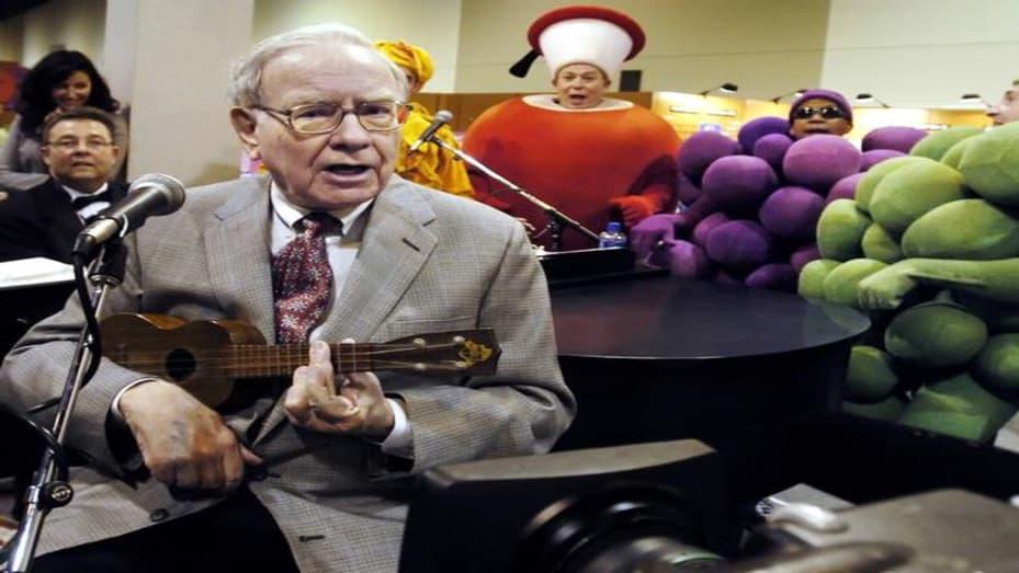
As noted, William hit a roadblock with Fruit of the Loom and the company had to file for chapter 11 bankruptcy in 1999. That wasn’t the end of the road for the company though because, at this same time, Warren Buffet, of Berkshire Hathaway was looking for a new brand to invest in. Warren found Fruit of the Loom and made this investment, purchasing the company for $835 million.
Roadblocks Along the Way
The challenges Fruit of the Loom has experienced are not unique to the brand. The challenges are pretty much universal across the retail and manufacturing space – and those challenges revolve around retail being an industry that deals with people and an industry that is heavily saturated with competition. The issue these companies run into is that you are dealing with personal preference and not everyone has the same taste in clothing and undergarments. Some people may want a different fabric or different color, so companies like Fruit of the Loom are constantly tasked with creating products that appeal to their current customers, while also seeking to acquire new customers and convert them over to the brand.
The Meaning of Fruit of the Loom’s Logo and Fruit of the Loom’s Logo History
It’s rare for there to be a company that has been around for as long as Fruit of the Loom that hasn’t gone through several redesigns. That’s why it’s no surprise that the original logo that Fruit of the Loom designed went through various redesigns over the years. Below we walk you through each of these logo iterations and the components that collectively make up this iconic logo.
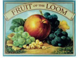
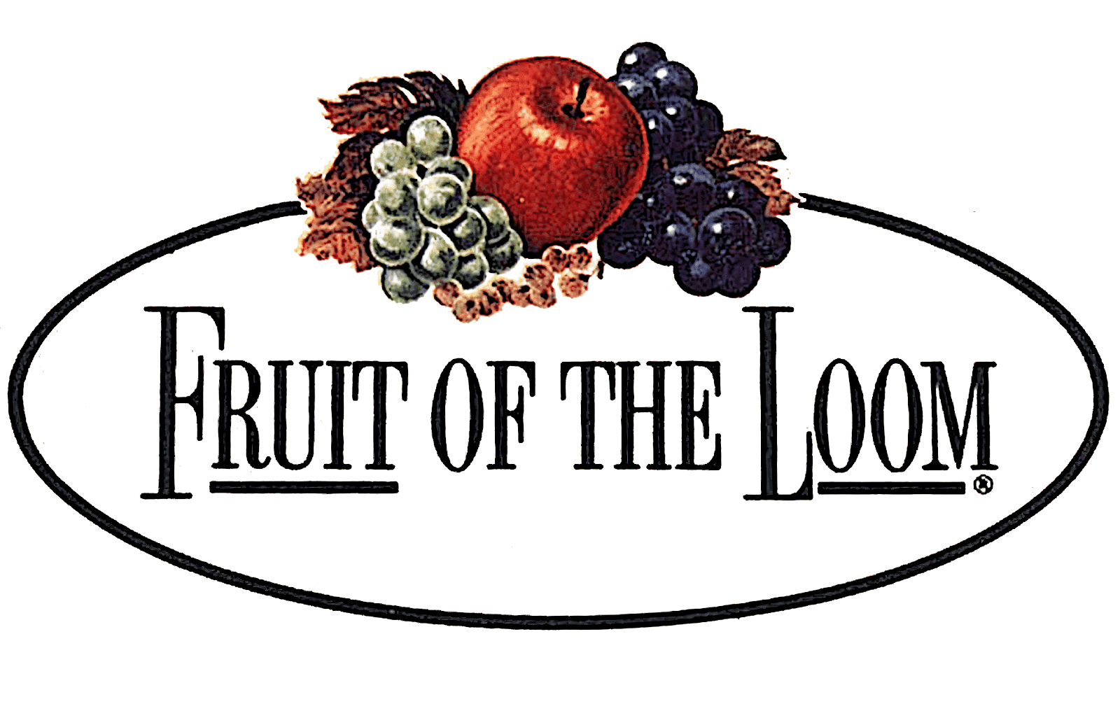
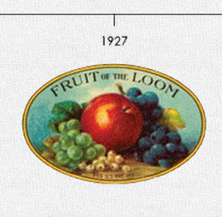
1893 – 1927: The first version of the Fruit of the Loom logo
After Fruit of the Loom was founded, the first iteration of the brand’s logo was introduced. This first version was intricate and full of details. These details included an apple, grapes (both purple and green), and berries and together the elements resembled a painting more so than a logo. What the logo did successfully execute though was a play on the brand’s name, with the company name displayed prominently at the top.
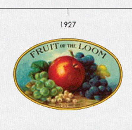
1927 – 1936: The second version of the Fruit of the Loom logo
For this second iteration, over thirty years after the original logo was introduced, the shape of the logo was redesigned, as well as the fruit images. While the shapes of the fruit were reimagined, the fruit maintained their same coloring and positioning. One other update for this version was the removal of the banner, allowing the brand’s name to be displayed largely on its own in capital letters.
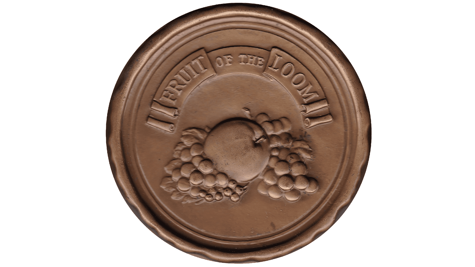
1936 – 1951: The third version of the Fruit of the Loom logo
Even with the second version of the logo, the design still resembled a painting. With this iteration, the logo shifted to resemble a seal more than a painting. This version introduced a gold color, helping the logo resemble this seal (or coin) and the fruit symbols had a 3D effect.
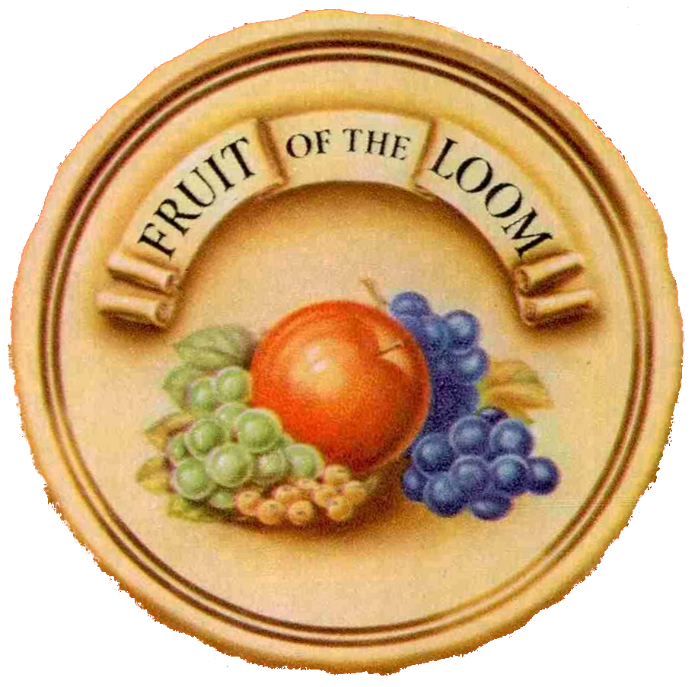
1951 – 1962: The fourth version of the Fruit of the Loom logo
When it was time for another iteration of the brand’s logo, the design team opted to keep the seal structure, but instead play around with the coloring. The background was updated to a lighter color, helping emphasize the fruit symbols, and the fruits were made brighter.
1962 – 1978: The fifth version of the Fruit of the Loom logo
After almost thirty years of the logo resembling a coin, this logo styling was updated to be a white ellipse. To better convey the name of the brand, the wordmark was enlarged and made more legible, with some of the letterings underlined.
1978 – 2003: The sixth version of the Fruit of the Loom logo
With this sixth iteration, the positioning of the fruit symbols was updated and the coloring of some of the grapes was updated as well. The fruit was also no longer highlighted, and the brand name was again updated to become more legible.

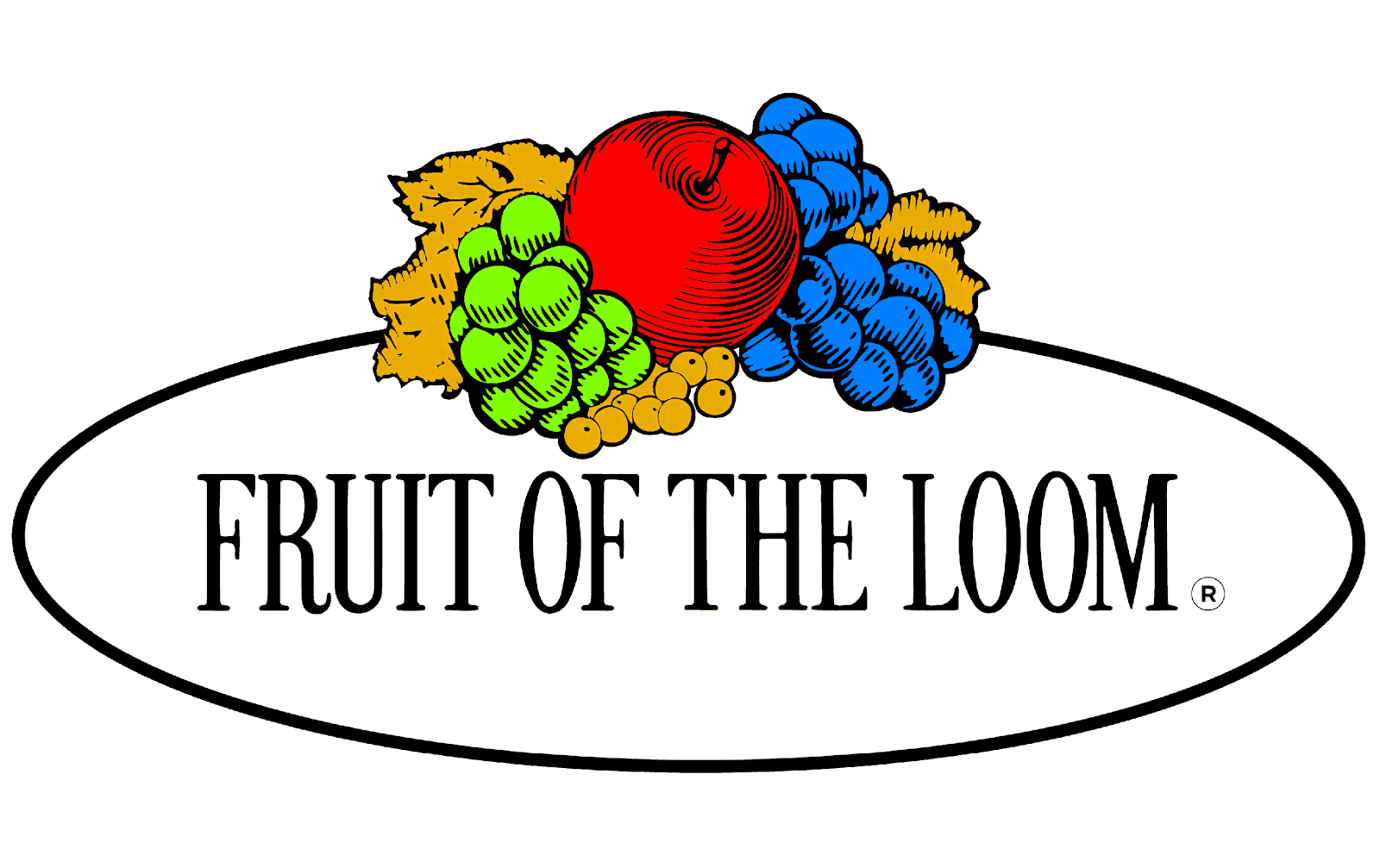
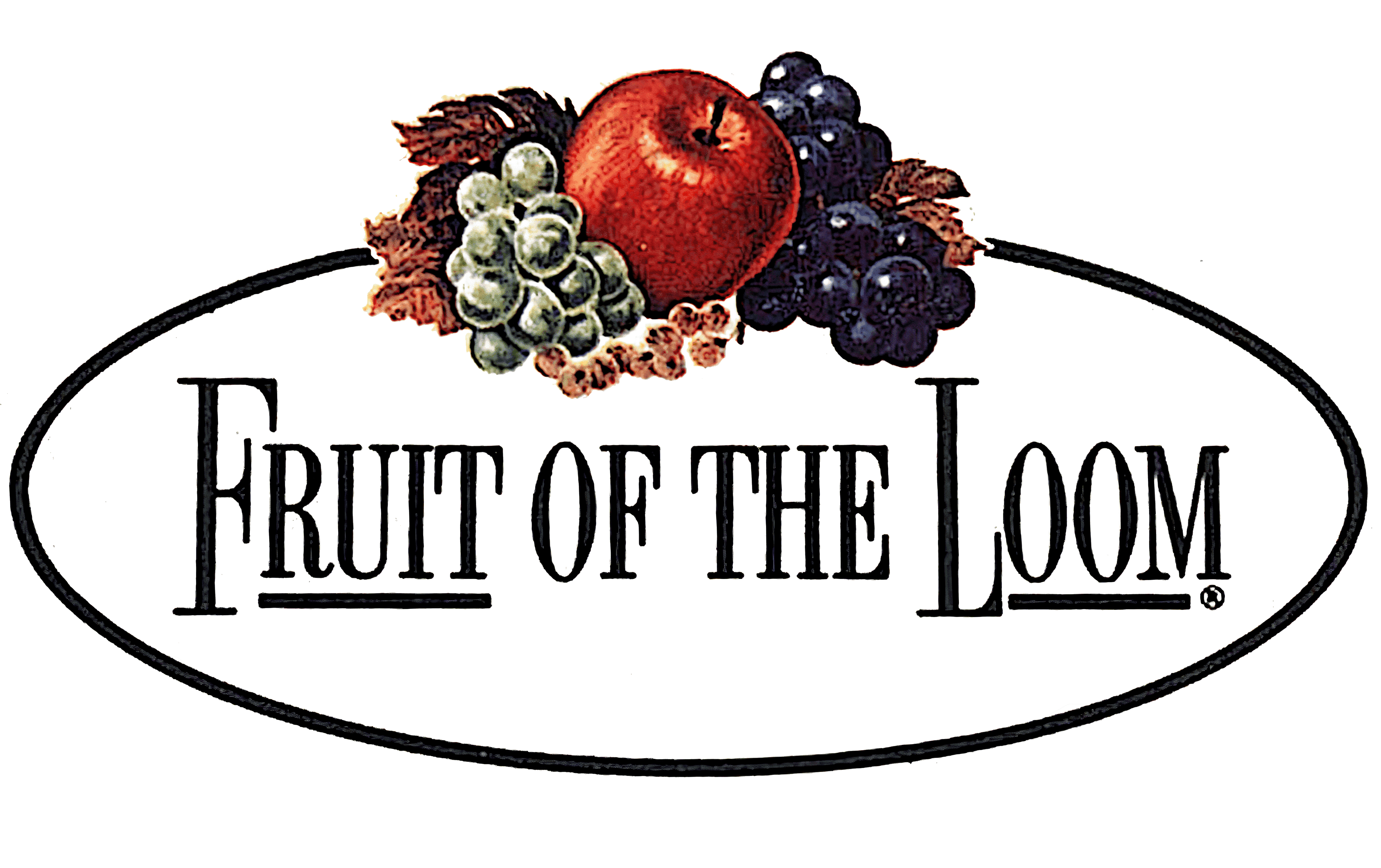
2003 – today: The seventh (and current) version of the Fruit of the Loom logo
The Fruit of the Loom logo you know today has no oval and appears simpler. The fruit symbols have again been redesigned and overall, the logo appears more modern. How the designer was able to do that by making the lines and features sharper, cleaner, and bolder.
Fruit of the Loom’s logo font:
As you look at the logo’s evolution, the wordmark was played around with often. Despite the regular updates to the logo’s wordmark, the brand’s name was written in Futura Book, a geometric sans-serif font created by German typographer, Paul Renner.
Fruit of the Loom’s logo color:
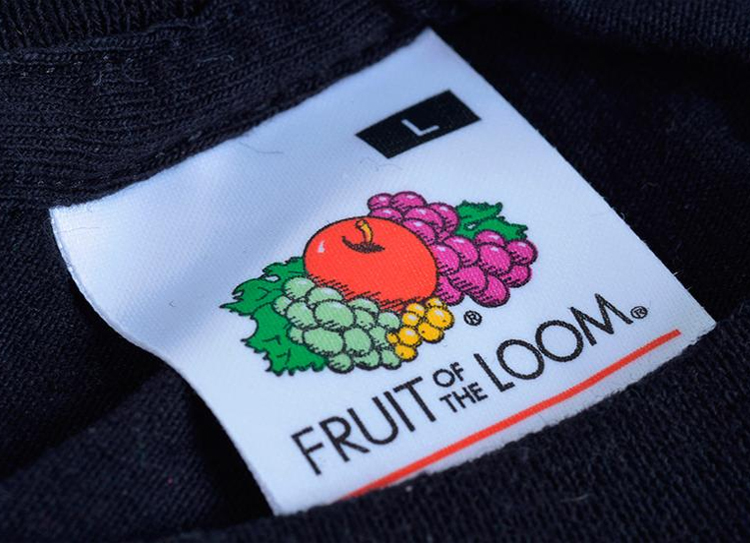
Color is in abundance on the Fruit of the Loom logo (which makes sense because various, colorful fruits are incorporated into the design). The first color to note is black. Black is used for the wordmark and to highlight other elements of the logo. Black is often used for logos because it conveys power, elegance, and strength.
The other colors you’ll find on the logo are green, red, purple, and yellow. Green is used to bring the leaves and green grapes to life. Green is often used to signify freshness, healing, and nature. The next color you’ll find, red, is used for the apple. Red conveys love, passion, and desire, and is an attention-grabbing color choice. Purple is used for the other grape symbol and this color choice helps to signify royalty, wealth, and luxury. The final color you’ll find is yellow. This is also used for the fruit symbols and yellow is a common color choice to help convey hope, happiness, and honor.
Fruit of the Loom’s logo symbols:
The symbols you’ll find on the Fruit of the Loom logo are fairly obvious – they are a series of fruits. These logo symbols directly tie into the brand’s name and help with building brand awareness.
Fruit of the Loom Today
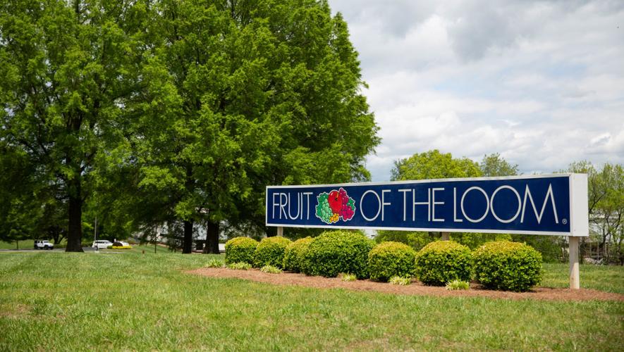
Nearly 130 years since the company was founded, Fruit of the Loom continues to be a company that has no intention of slowing down. Today, while Fruit of the Loom is an international corporation with stores in more than 30 European countries, its headquarters is still in the United States, in Bowling Green, Kentucky. Fruit of the Loom has also grown to include online sales and delivers these orders all over the globe.

Owned today by Berkshire Hathaway, Inc., Warren Buffet (Berkshire Hathaway’s Chairman and CEO) and his team has kept the brand true to its original mission. Fruit of the Loom has remained an American fashion brand that specialized in casual wear, underwear, and sports gadgets for men, women, and children alike.
Today, Fruit of the Loom employs nearly 32,400 workers worldwide and in 2018, overall sales had increased to $4.3 billion. And as noted above, the company operates globally in more than 30 countries including Germany, the United Kingdom, France, Morocco, and South Africa.
Lessons Learned from Fruit of the Loom
If a company has been flourishing since 1893, there are certainly lessons we can all take away from the brand. One of the easiest lessons you can implement right away is related to your logo design. These tips and tricks have helped to make Fruit of the Loom’s logo memorable, and they can help your brand too.
The first tip is to keep your logo clean like Fruit of the Loom’s. Even though the logo is intricate with many details, the designer was intentional about not going overboard with features and elements with each detail. Additionally, you can also work towards creating a logo that is consistent and memorable like Fruit of the Loom’s. This will be dependent on what your brand and logo design entails but for Fruit of the Loom this meant that they chose design elements that a consumer would have a tough time forgetting or being able to tie back to the brand – fruit.
Even with each logo redesign, the design team kept these fruit symbols prevalent on the logo to help build trust and brand recognition. Two other tips you can also incorporate are keeping your logo scalable (no matter the marketing channel you are using) and keeping it legible. You want your customers to be able to recognize your logo no matter what it is printed on, and you want these customers to also be able to decipher that what they are seeing is a logo that ties back to your brand.


