
The Los Angeles Lakers basketball team uses one of the world’s most recognizable logos. Sports logos are a special class of design since the logos are so closely associated with the team.

Players come and go, but teams like the Lakers endure for decades. Fans form lifelong loyalties to their favorite franchises.
These teams need strong evocative logos with plenty of longevity. The Lakers logo, with its bold gold and purple colorway, is a design that definitely stands the test of time.
Explore the history of the Lakers basketball team and the Lakers logo to see how this design reflects the organization.
The History of the Los Angeles Lakers
The LA Lakers are a professional basketball team located in Los Angeles, California. The team was founded in 1947 when the defunct Detroit Gems team was purchased by new owners. The Gems were rebuilt from the ground up and moved to Minnesota.
Minnesota famously features many lakes and so the team was renamed the Minneapolis Lakers after its new home. Their first logo also showcased their Minneapolis roots by prominently using the state’s shape in its design.
The team played in Minnesota in the 1940s and 1950s. They had many successful seasons in Minneapolis, including winning multiple championships. The Lakers played in several different leagues in the mid-1900s. They were members of the National Basketball League (NBL) and the Basketball Association of America (BAA) before joining the National Basketball Association (NBA).
However, the Lakers began to struggle when their star player George Mikan retired. The team began losing games as well as money. It was clear they needed a change of pace—or maybe a change of scenery.
The Lakers moved to Los Angeles for the 1961-62 season and started to turn things around. The team changed its logo twice in the 60s but kept the name, even though LA is far from any lakes.
The new Los Angeles team went to the NBA finals six times in the 1960s, more than half the seasons that decade. Somehow the Lakers lost each of these championships to the Boston Celtics.
This decade laid the groundwork for a long-lasting rivalry. The Lakers finally won their first NBA series as an LA team in 1972.
The team saw successes in its early decades, but developments in the 1970s cemented the franchise as a national phenomenon. Head coach Bill Sharman and new owner Jerry Buss made drastic changes that impacted gameplay as well as the overall basketball culture.
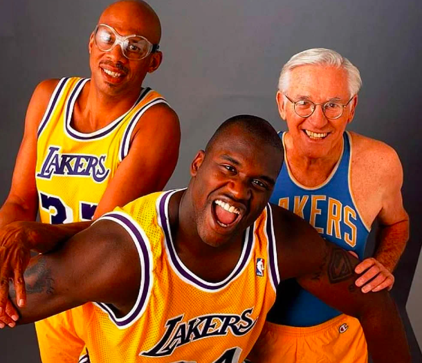
First, the team acquired amazing players through trades and drafts. Kareem Adbul-Jabbar joined the Lakers as a trade in 1975, and Magic Johnson was a first-draft pick in 1979. Johnson and Abdul-Jabbar formed the team’s backbone throughout the 70s and 80s. The team took home five championships in ten years with Johnson and Abdul-Jabbar, including two tournament wins over their mega-rivals the Celtics.
The 70s and 80s saw more than just powerhouse playing. Team owner Jerry Buss had a clear vision for revolutionizing the basketball game experience. He thought games should be an immersive entertainment experience, not simply a sporting event.
This mindset played into Johnson and Abdul-Jabbar’s dominant, fast-moving play style. Buss’s idea laid the groundwork for celebrities sitting courtside, performances by chart-topping musicians, lighting shows, and other aspects of modern pro basketball culture.
After Johnson and Abdul-Jabbar retired, other powerhouse players like Kobe Bryant, Shaquille O’Neal, and LeBron James made their marks on the team.
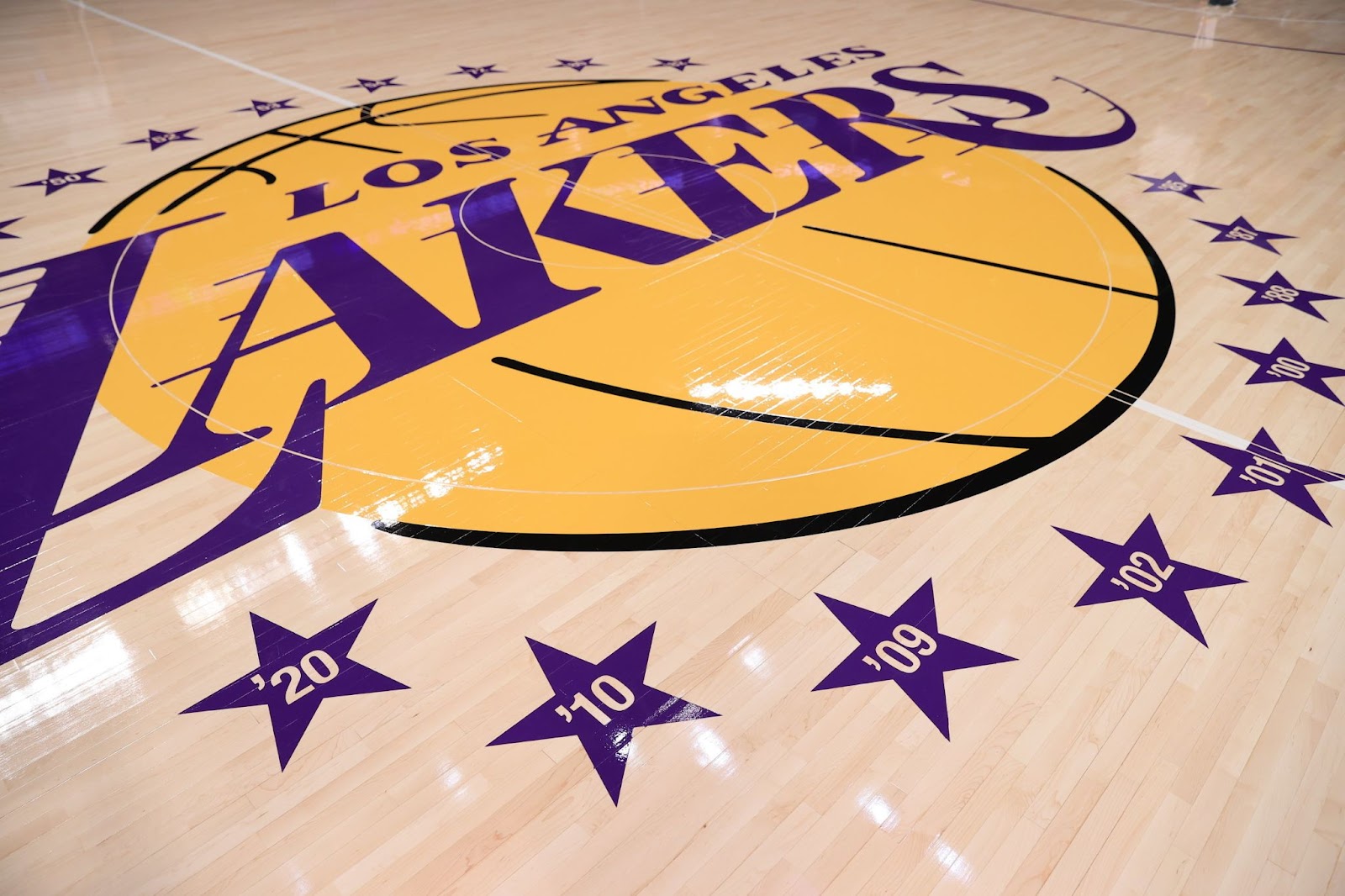
The Lakers are currently part of the NBA’s Western Conference Pacific Division. They’ve won 17 NBA championships and are tied with long-time rivals the Celtics for the most series wins of any basketball team.
The Lakers’ logo reflects its winning history. The team has had some ups and downs, but overall the Lakers are one of the most successful franchises in sports history. The team makes changes as needed but keeps the same overall focus on success. Likewise, they found a winning logo design and have used the same basic design for decades.
The History of the LA Lakers Logo
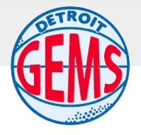
The Detroit Gems Logo (1946-1947)
The Detroit Gems was a short-lived team, playing only one season with a 4-40 record. The team was disbanded almost immediately and sold to a new owner, who developed the franchise into the Lakers.
Despite their performance on the court, the Gems did have a solid logo. The round design featured a stylized basketball as its background. A horizontal line crossed the center of the design with an arced semicircle above and below. These lines created the distinctive appearance of a basketball. Dots on the top and bottom of the design referenced a basketball’s pebbled texture.
The logo featured the team name as a wordmark in sans-serif typefaces. “Detroit” was displayed at the top of the design in a rounded blue font. “Gems” was centered on the logo’s horizon and took up most of the visual space. The team name was displayed in red which forms a bold contrast with the otherwise-blue design.
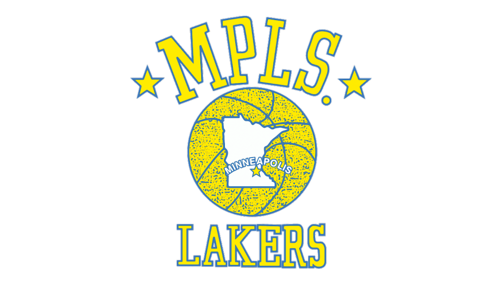
The Minneapolis Lakers Logo (1947-1960)
The Minneapolis Lakers played more than a decade in Minnesota and the team used the same logo the entire time. The logo highlighted the team’s hometown pride by using the state as a main part of the logo.
The Lakers used a yellow and blue logo in Minneapolis. A yellow basketball outlined in blue, and studded with blue texture, forms the center of the logo. A whitespace state of Minnesota was also outlined in blue in the center of the ball. A yellow star marked Minneapolis’ location on the map. The city was also labeled in a sans-serif typeface that arched over the star.
The team name was displayed as a blue-and-yellow wordmark above and below this design. Minneapolis was abbreviated to “MPLS.” It was surrounded by stars above the basketball. The team name was displayed in smaller characters underneath the graphic.
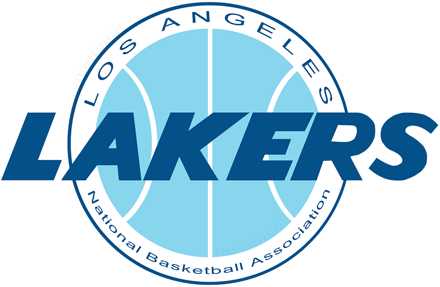
The Los Angeles Lakers Logo (1960-1965)
The Lakers introduced a new logo when they moved to Los Angeles. Their previous logo prominently featured their Minneapolis, Minnesota roots, so the new location required a new design. The updated logo included mid-century design elements that would have given the team a cutting-edge, modern look at the time. The design resembled Pan-Am’s iconic blue logo, which also featured a blue circle bisected by white lines.

The first LA logo shifted the team’s colors entirely to blue. The round design featured a stylized, light-blue basketball surrounded by a wide white circle and a deep blue outline. The team name wa displayed horizontally over the center of the basketball in a slab, italicized sans-serif. The forward-leaning typeface gave the logo a clear sense of movement and speed.
“Los Angeles” curved across the top of the logo in all caps. “National Basketball Association” was also included at the bottom of the logo using title case. This is the only Lakers’ logo that included details about the NBA.
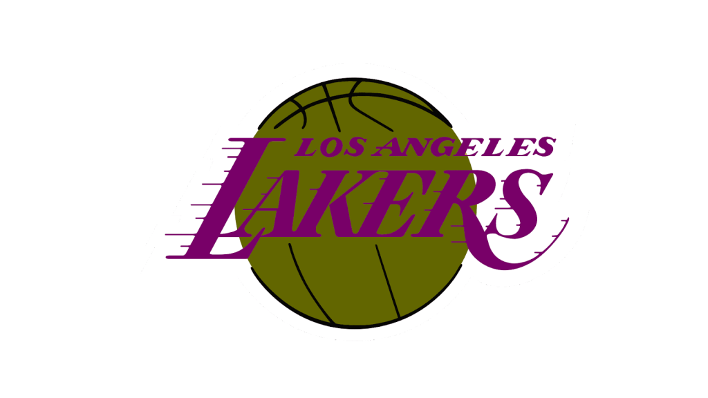
The Los Angeles Lakers Logo (1965-1976)
The Lakers introduced another new logo in 1965. This logo would go through several changes before reaching its modern iteration, but it would be immediately recognizable to sports fans today. This design included major design elements that the team still uses.
The 1965 logo still included a stylized basketball as its background element. A basketball was featured in the previous Lakers logos as well as the Detroit Gems design, so this choice continued the tradition. This design also kept the forward momentum of the 1960 logo by using an italicized serif font for the team’s city and name. However, the new design also introduced two new elements.
First, this design featured a completely new color scheme. The new logo used a green-brown, almost chartreuse, color for the basketball, which was now outlined and accented in black. The text was a deep purple. This was an interesting color choice since there was a low visual contrast between the dark wordmark and the dark basketball. But since chartreuse (or “acid-green”) was a popular color in 1960s design, the colorway was also era-appropriate.
Second, the new logo added horizontal lines to the characters of the team name. These lines extended from the left-hand strokes like speed lines in a comic book. This detail accentuated the movement and intensity already present in the italicized typeface.
This logo was a great design because it communicated everything a viewer needed to know about the team. Someone who had never heard of the Lakers will immediately know they’re a basketball team thanks to the stylized basketball background. The team name was prominently displayed, even if the 1965 color choices made the text difficult to read in some settings. The hometown of Los Angeles was mentioned above the team name.
Finally, the logo’s forward-moving elements gave a clear impression of fast-paced play. The Lakers updated this design over the next few decades, but most of the 1965 design elements remained unchanged.
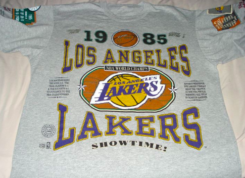
The LA Lakers Logo (1976-2001)
The Lakers logo got a slight update in 1976. The text used a lighter purple and the basketball design was now shown in a rich golden yellow. These new colors offered more visual clarity. The lighter basketball color allowed more visual contrast, even though the updated purple was also lighter than the previous version.
The new basketball color was notable for other reasons as well. The brighter yellow was closer to the traditional orange color of a basketball. The new color was also in line with the major 1970s design trend of using updated natural colors like avocado, burnt orange, and harvest gold. Just like the 1965 logo used a trendy color when it was released, the 1976 version also featured a color of its time.
The colors were the only element the Lakers changed with this logo redesign. The font, layout, and overall design stayed the same.
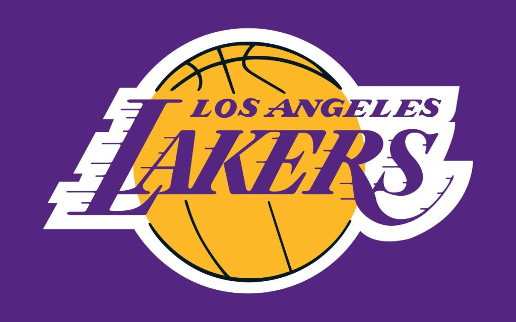
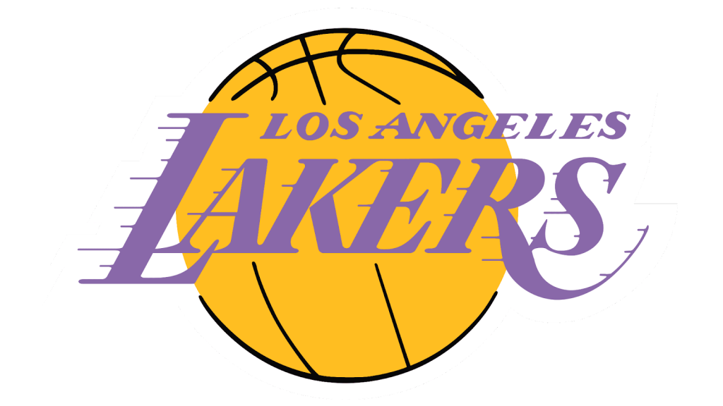
The Los Angeles Lakers Current Logo (2001-Present)
The Lakers made a few more updates to their logo in 2001. Much like with the 1976 redesign, the 2001 version stayed very similar to its original design. The layout, typefaces, and general look and feel remained the same. The biggest change was in the font color.
The new logo uses bolder, more saturated purple text. This design choice gives the logo a stronger visual contrast between the deep purple wordmark and the bright golden basketball in the background. Aside from these color changes, the Lakers logo looks the same as it has for more than 50 years.
The LA Lakers Main Design Elements
The Lakers have used almost identical logos since 1965. This logo has built an extremely strong brand consistency.
Shapes
The Lakers logo has a prominent basketball design as its background. This element is an obvious choice for a basketball team. It also gives the logo a pleasing round shape that’s easy to identify at a glance.
Font
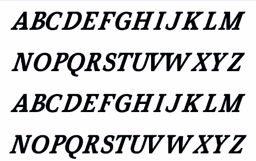
The Lakers have used the same italicized serif font since the 1965 logo redesign. The forward-leaning characters give the design a feeling of speed and mobility.
Accent lines add to the sense of movement while also making the text feel more like a graphic treatment than a wordmark. Treating the team name as a graphic instead of text keeps the typeface from seeming dated or out of style as trends change.
Colors

Color palettes have been the biggest difference between recent logo versions.
The current Lakers logo uses bright yellow and purple tones that are bold, playful, and easy to read.
Previous designs used similar colors that were less successful.
Lessons from the Los Angeles Lakers Logo
The biggest takeaway from the LA Lakers logo history? There’s no need to change something that works. The Lakers have essentially used the same logo since 1965.
The team has tweaked the colors to keep up with design trends and improve readability, but they kept the same typeface, accents, and layout. When a design is a good fit for a brand, it stays relevant despite the trends.


