
Color theory explores the complex relationship between colors, examining both their aesthetic harmony and the scientific basis for their use.
It encompasses the psychology of color perception, the dynamics of color blending, and the harmonious or contrasting relationships between different hues.
In the field of graphic design, a deep comprehension of color theory is crucial. It empowers designers to convey messages powerfully and purposefully in their work.
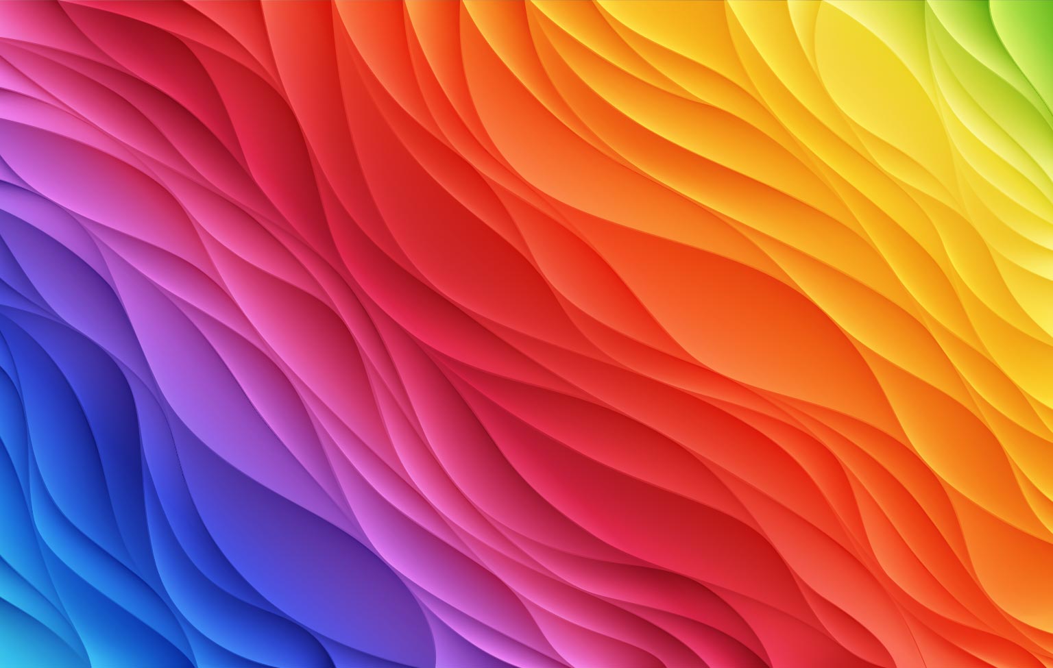
Although it’s essential to have text-based content, visuals are equally important to create sharable visuals that will grab people’s attention and enhance marketing content. Color theory provides a window into the messages inherent in colors and the methods used to faithfully replicate them.
Color theory can help you build your brand, connect with your audience, and increase sales. It enables you to choose the colors that will go best together and convey the right message to your audience through visual messages. Let’s explore the extensive impact of color theory on graphic design and its fundamental principles.
Why Does Color Matter?

Why should you bother trying to understand color? Why can’t you choose the color you like best and use it on your visuals? The importance of color starts with our perception and how we see and understand it. We see something, whether a poster or a soda bottle, and we form an opinion about it.
We decide whether or not we like people within a few sentences of seeing them, and we do the same thing with products.
One of the most significant reasons why we decide whether or not we like a product and, ultimately, if we’ll buy it is due to color. A substantial part of your brand is based on color, and understanding what colors connect with your audience will encourage them to purchase from your brand.
Primary, Secondary, and Tertiary Colors
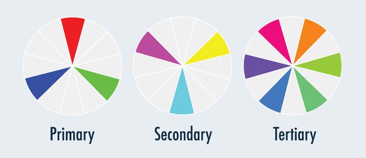
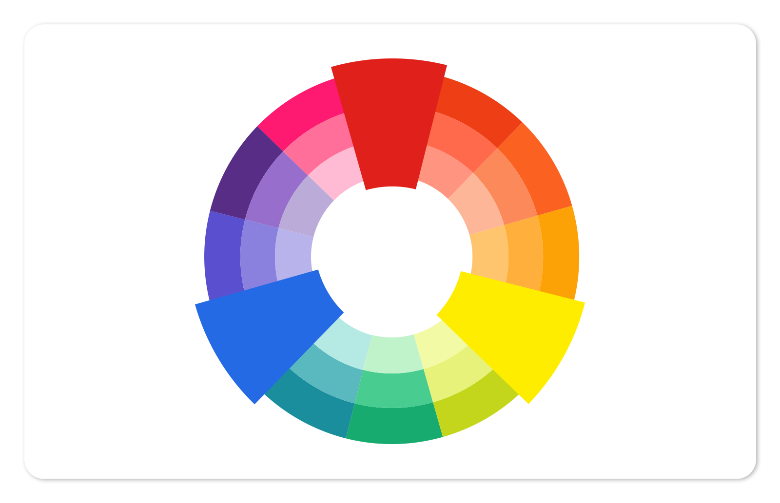
To grasp color theory and its intricacies, one must first understand the fundamental categories of colors. Color theory organizes colors into three fundamental categories: primaries, secondaries, and tertiaries. The primaries—red, yellow, and blue—are the purest hues, impossible to create by blending other colors.
Every other hue originates from these primaries. Secondaries—green, orange, and purple—are the result of mixing primary colors. Tertiary colors, like vermilion, amber, amethyst, olive, teal, and chartreuse, are formed by blending a primary color with a secondary color.
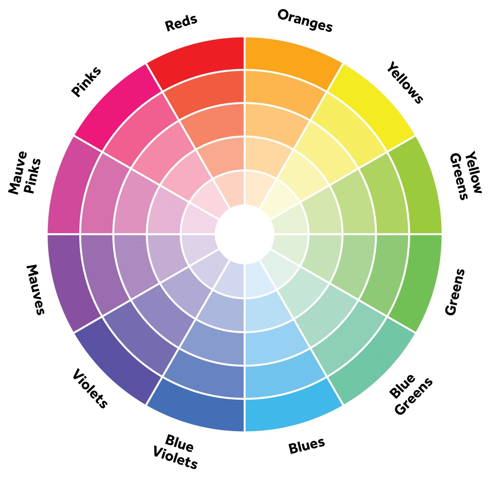
Exploring The Color Wheel
You might know your primary, secondary, and tertiary colors; however, when designing marketing material, every graphic designer knows that colors get far more complex than simply these two categories for graphic design.
There are more colors than these main colors, and when you start to choose color combinations for designs, the options are vast.
The color wheel is a crucial tool in the arsenal of every graphic designer. It’s a circular graphic that showcases primary, secondary, and tertiary colors, along with their various hues, tints, tones, and shades.
When choosing a color palette, the color wheel provides a plethora of options for graphic designers to explore. This enables designers to create schemes that are darker, softer, lighter, or brighter by blending the original colors with black, white, and gray.
RGB and CMYK: Color Mixing
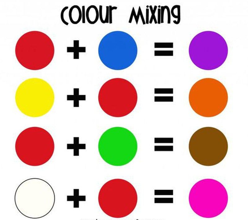
Color perception in humans is intricately linked to the interaction of light waves. The combination of these waves, known as the color-mixing model, is responsible for the diverse array of light colors we see. There are two different types of color models––additive and subtractive.
We’ll look at the additive color model for color theory, also known as additive mixing or additive color system. The RGB color model looks at the three primary color models the human eye mixes: red, green, and blue.
When it comes to our brains and how we process colors, the human eye combines these three primary colors and mixes them in various combinations to perceive the full range of colors. White has all the colors present in it, and black doesn’t have any.
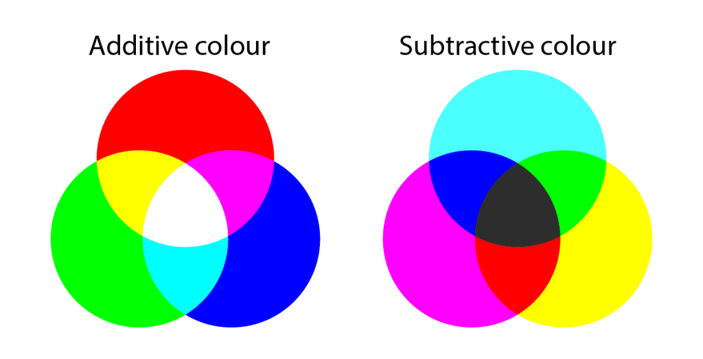
In the world of color, our perception and reproduction of hues are guided by two primary models. The additive model comes into play with devices like TVs, projectors, screens, and computers, utilizing red, green, and blue (RGB) as primary colors. By mixing these hues, these devices can generate a wide spectrum of colors.
The subtractive color mixing model is used on physical surfaces. This type of color-mixing model is taught to kindergartners, and it’s taught by the idea that you’re subtracting light from the paper by adding more color. The subtractive color mixing model is used to print physical surfaces.
Why does this matter?
So why should you care about color mixing models at all? The answer is that color mixing models are very prominent and essential to creating marketing material for businesses.
Regarding the additive model, you want to ensure that the marketing material you curate will show up properly on your marketing platforms.
If you don’t use the correct color process, your brand’s colors won’t appear correctly on social media platforms such as Instagram or Twitter. As for the subtractive color mixing model, when you curate content that has to be printed, you want to ensure that your marketing material will print correctly and the colors will appear perfectly.
Color Harmony

When you hear the word harmony, you probably think of music. After all, harmony is usually used in conjunction with music; however, when we refer to harmony in color theory, we aren’t talking about music.
In this case, we’re talking about visual experiences, and harmony is when something is particularly pleasing to the eye. Color harmony is the captivating result of elements in a design interacting in a balanced and engaging way, drawing the viewer’s gaze. With graphic design, you want to ensure a certain level of color harmony with each marketing material used for your brand.
Viewers don’t find under-stimulating information interesting and ultimately reject it. This is why, in graphic design, the difficult part is understanding how to create a logical visual piece with the perfect color harmony.
Tint, hue, shade, and tone
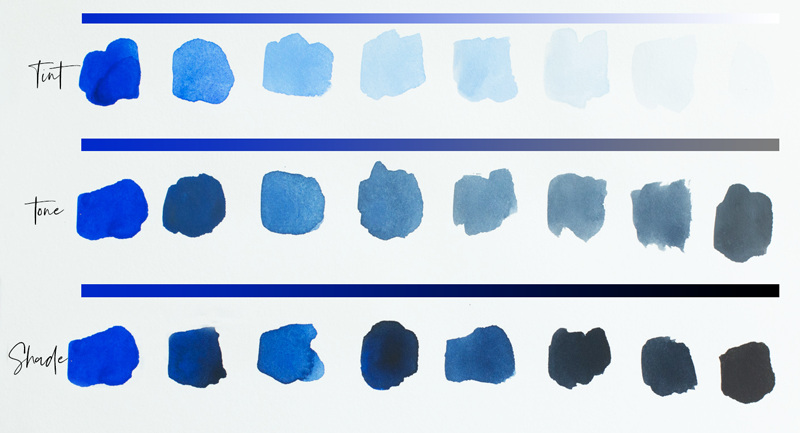
When discussing color, the concept of shade is integral. It determines whether a color appears lighter or darker while retaining its hue.
At its core, a shade is the amount of black added to darken color or the amount reduced to lighten it.
Tint essentially refers to the opposite of shade. Instead of adjusting the amount of black added to a color, it’s referring to adjusting the amount of white added. Every color has a range of shades and tints depending on the amount of black and white that’s added. Tone is another important aspect of color, achieved by adding white or black to a hue.
The Principles of Design With Color Theory
Graphic design is creating visual compositions for marketing to solve problems or communicate ideas through imagery, color, form, and typography.
As expected, there is no specific way to create these different visual compositions, which is why there are several design principles. In discussing color theory, it’s crucial to recognize how design principles intersect with its concepts.
There are eight main principles of design, and although they often overlap, each principle of design requires knowledge of color theory and how to use it in graphic design.
Essentially, graphic designers can’t create content specific to a brand without knowing what colors to use to connect with the brand’s audience.


