
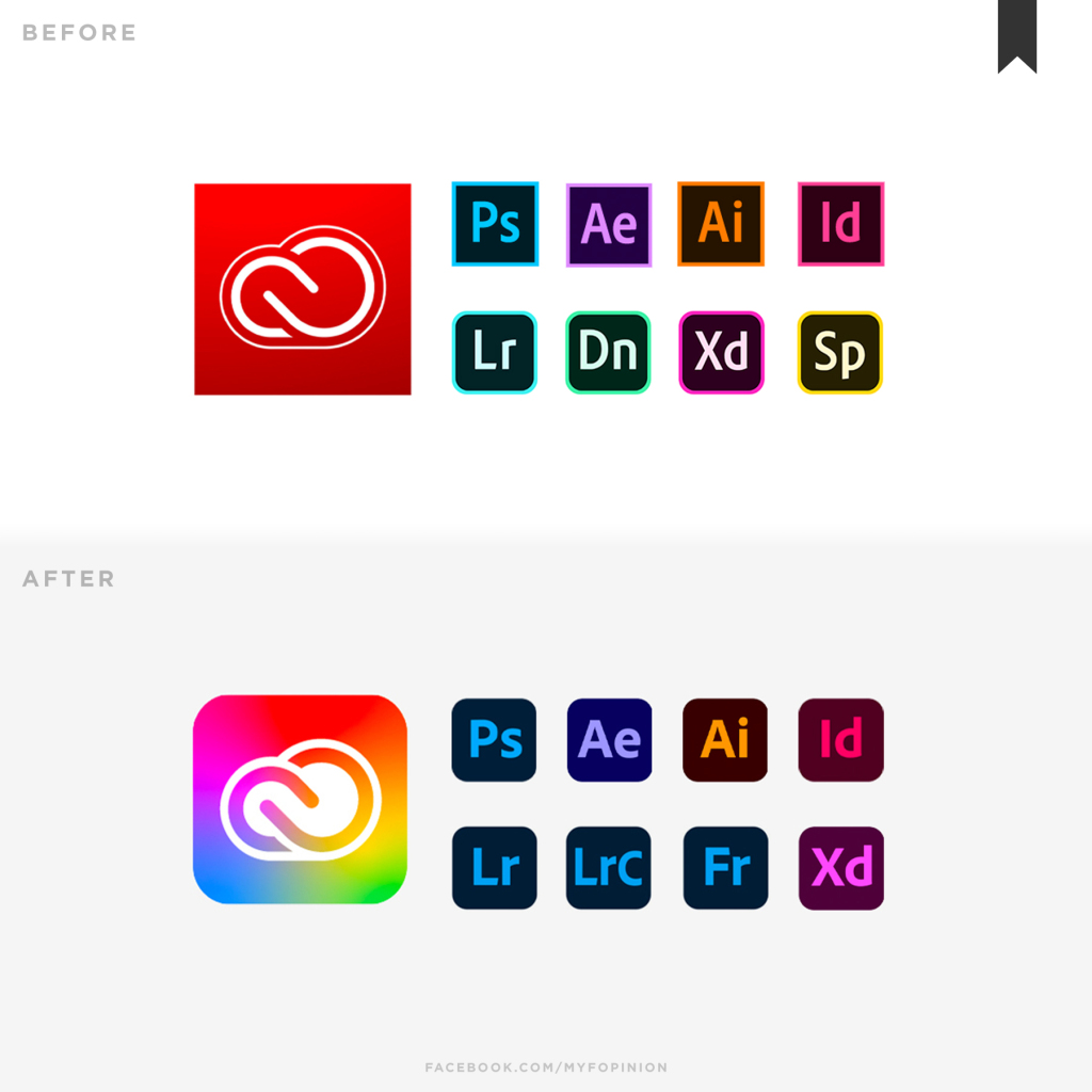
In 2020 Adobe Creative Cloud decided to take the step and rebrand their company from the same logo that they’ve had since 1993 and design fresh new icons. Adobe announced these as brand identity updates, and although the expectation was to receive positive feedback from their users, a large number of their users disliked the new updates. The opinions were mixed when it came to the rebranding, some thinking that the change was a much-needed one while others disagreed.
Sourced here.
When Adobe first announced these updates, they said that they were aiming to make their creative cloud suite easier to navigate and more consistent across their branding. Similar to what Gmail did when they decided to update their icons, they changed all the icons to be consistent and similar in looks. However, similar to Gmail, Adobe was not meant with the response that they expected from users.
Screenshot from here.
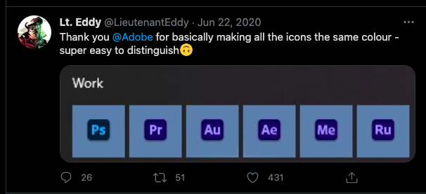
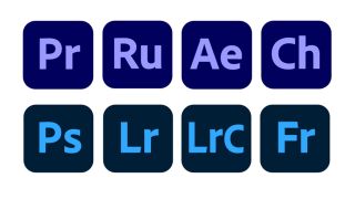
Users complained that all the logos were too consistent. Adobe decided to keep a similar color across their platform, making all icons look very similar to one another. They’ve decided to color similar groups together, saying, “using color to organize products into categories such as Video & Motion or Photography, to ensure customers can easily find the products they need”.
Sourced here.
Back in May 2020 when the company announced their updates to the icons and logo, they also published an article, explaining their reasons for the changes and breaking down the process for users. “We’re making these branding changes to ensure our portfolio continues to be easy for our customers to navigate and understand, as well as maintain a fresh look and feel.”
To unify all of the apps together, Adobe decided to rebrand their logo as well. The logo that users remember and are familiar with, that had been with the company since 1993, was replaced with a colorful logo instead. Their original logo was a simple dark red and white, so this was a fairly drastic change for the company. The new logo is definitely a more modern look and is consistent with their new branding, although long-term users took a while to adjust to the change.
Sourced here.
All logos are now rounded and long-term users will recognize that Adobe updated the logos to include three letters instead of two. This along with the color-changing updated Adobe Creative Cloud to a new level that was supposed to positively impact users and create an efficient navigation experience.
Despite the feedback, nearly a year has passed since the update launched and Adobe still hasn’t decided to revert to its original branding. Adobe took a bold step with this refreshed brand identity and over time it’s grown on some of their users.


