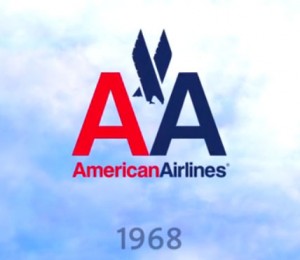
It looks as though American Airlines has joined the many companies that are updating their new logos and has for the first time -since 1967-updated their logo.
It seems to have taken many folks by surprise that they chose such a different design from the one they have had for the past 45+ years.
It rather interesting to hear the discussion going on back and forth about it, and true to form, opinions differ widely on who loves it and who hates it.
For those of you who hate it, in defense of the airline, the new logo is more of part of an effort to reinvigorate the entire company and other changes also include service to new destinations, new planes, and upgraded amenities in flight.
And, although we may not all like change (I for sure am one who falls into that category!), everyone must be forced to admit that after 45 years with the same logo, it is probably high time for a new one!
I personally like the new one better and feel that they have made a wise decision in having the design of the new logo completely different (aside from the colors ) and not at all similar to the old one.
The new one…
..and the old.
..and the old.


