The trend for simplifying logo designs has been popular for a while. But have logo designers gone too far with the clean and controlled looks they’re coming up with for their clients? We’ll take a look at three different logos for Magnitude, kcal, and Sony Music Publishing that have been stripped back and see if their new, simpler logos really work.
- As we continue to look at how companies are changing their branding, Logo Design News is exploring the trend of making it simple.
- Magnitude, kcal, and Sony Music Publishing have all recently rebranded and embraced a cleaner look.
- We’ll take a look at these three brands and then answer the question – did these brands lose anything in simplifying so much?
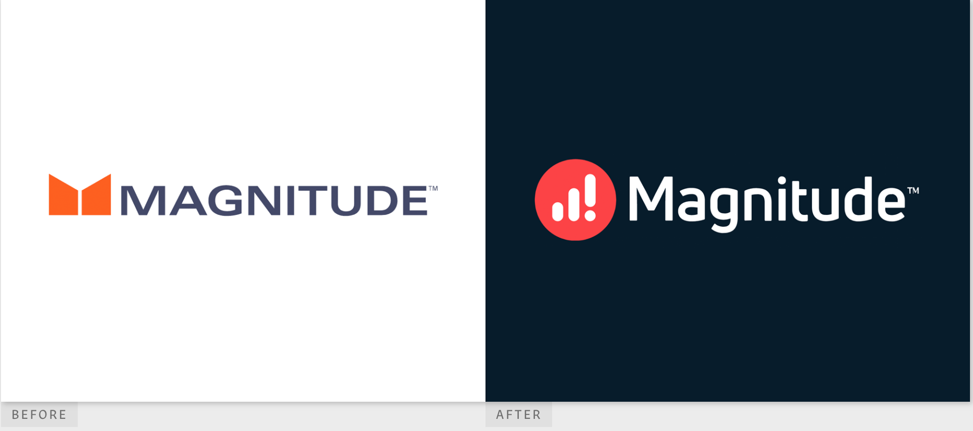
Magnitude
Magnitude is a cutting-edge IT company that sorts data for large enterprise businesses. Because they’re at the razor edge of IT, Magnitude needs a logo that reflects their position at the forefront of what’s new.
Their previous logo makes a bold statement: an orange icon paired with an all-caps wordmark is loud and confident. The new logo uses a simpler font – there’s nothing complicated about a sans serif font that’s formatted in sentence case.
However, the new icon has more shapes, which might make it seem more complicated, but it’s ultimately simpler. The old orange icon relied on negative space, meaning the viewer had to fill in the blanks about what exactly the funnel/stream shape means.
The new icon looks just like the universal symbol for cell service, with the last bar an exclamation point. This indicates a strong connection, excitement, and steady growth. The new icon is set in an orange-red circle, which is also a bold color that conveys confidence. You don’t have to fill in any blanks here – the new icon makes their purpose very clear!
Overall, we think that Magnitude has done a great job of making their message simpler through their new icon and sentence case font. The new, simpler logo actually tells us more about their company than the old.
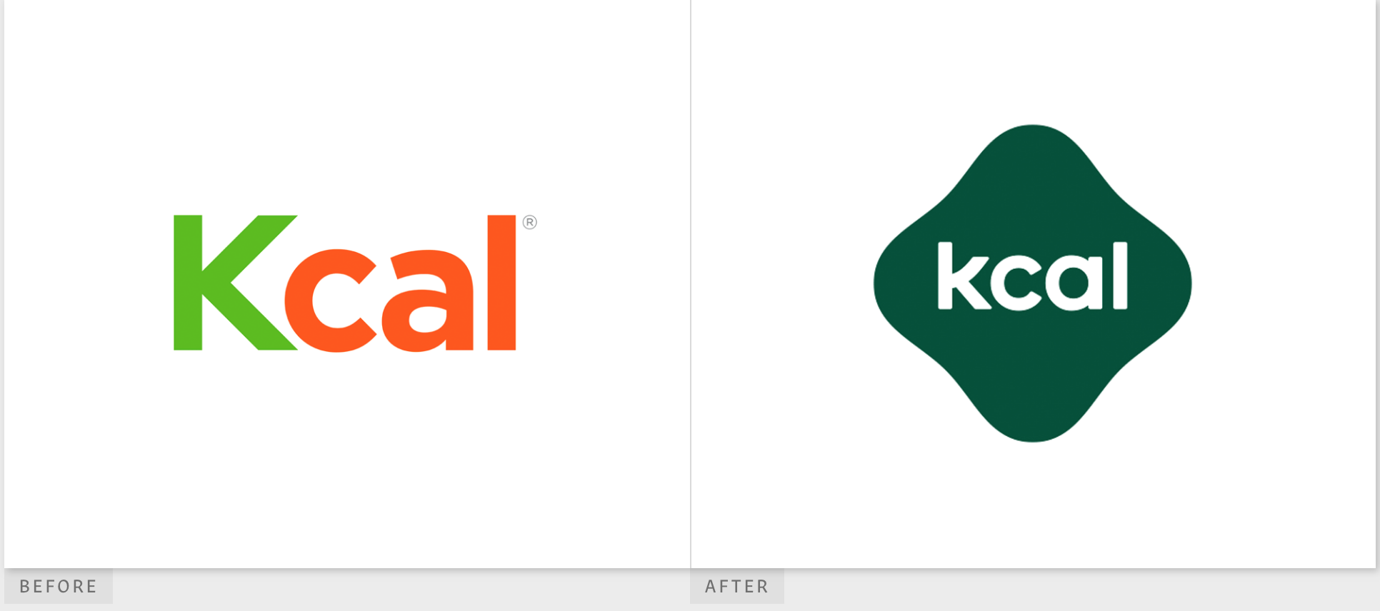
kcal
kcal is a healthy-eating-focused restaurant located in the UAE. They promise to deliver the highest-quality meals that help people stick to their health goals. Nutrition is the future, according to kcal, and now they have a new logo to bring them forward.
kcal’s previous logo was already pretty simple. Importantly, the old logo featured a capital K in bright green, and that capital letter has disappeared in the new logo. Sticking to one case (upper or lower) throughout the logo is more simple, and we approve of this decision for kcal.
The old logo colors of bright green and bright orange make it look a little bit like a carrot. If that’s what the designer was going for, there should be something else to indicate a carrot in the design. While it’s not all that difficult to make that connection, it shouldn’t be hard at all. Making the viewer fill in the blanks isn’t simple and isn’t recommended, either.
kcal’s new logo design features a forest green deconstructed diamond shape with white lettering, again all the same lowercase, centered in the middle. The decision to change from two bright colors to one color and one neutral was a huge change, but we think it paid off. The forest green is a peaceful color that makes us think of how a person who’s eating healthily is at peace with their body. We like this new simple color palette!
We’ve saved the most dramatic change for last with Sony Music Publishing’s new and totally different logo. Sony has published some of the world’s most famous songwriters, including The Beatles, Queen, and Michael Jackson. Now they’re embracing a new logo that moves them forward with the changing world.
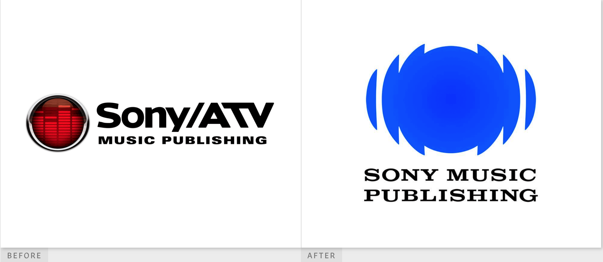
Sony Music Publishing
The old logo was bold but a little unnecessarily complex. The icon features a boom box style, silver-rimmed red circle with sound bars inside, but it’s a little confusing. It almost looks like a car part more than it does anything to do with music.
The name of the company is also confusing. While “Sony” is set in a classic font, the “ATV” is different because the “T” is backwards, stretched, and slanted. To anyone unfamiliar with the brand, this part of the wordmark is confusing. We do like the simple, all caps font used for Music Publishing underneath, and how much smaller it is.
However, we love everything about the new logo, which uses a bold, simple, and clean approach. The blue circles are reminiscent of the traditional Sony icon we’ve seen on CD players and boom boxes for ages. Although it’s just deconstructed circles, the designers have shaped it in such a way that it truly makes it seem like sound is coming off the screen. Underneath is the wordmark Sony Music Publishing, all in the same font, which is the traditional serif Sony font – we like that, too. Sometimes, tradition is just simpler.
We think Sony absolutely made the right choice to leave the old logo behind. In this case, simple was absolutely better.
Simple And Clean Win
While both Magnitude and kcal’s original logos were both originally already pretty simple, the changes in their new logo strengthened their branding by telling us more in a simple way. Sony Music Publishing’s new logo simplified both the icon and the wordmark and the result is a bold, modern statement. Logo design should embrace the simple when it can tell us more with less!