

When we think about logo design and graphic design in general we often associate it with colors. After all, when we see images we see color and as a graphic designer, you work closely with colors to be able to create eye-appealing designs. All of us have seen a rainbow at some point in our lives and few things can compare to the beauty of a colorful rainbow.
- When we start breaking down color and thinking about the colors in the rainbow, the meaning of specific colors, and how to use them in graphic design, things start to get more complicated
- Although it’s easy enough to understand the base of colors and the colors of the rainbow, understanding color theory and how it works in logo design can be more difficult
- In this article, we’ll discuss the colors of the rainbow, how they can influence graphic design, and overall facts about the colors of the rainbows

The Colors Of The Rainbow In Graphic Design
The colors of the rainbow are red, orange, yellow, green, blue, indigo, and violet. This means that every rainbow which you’ve seen and will see has these colors in it from top to bottom. It also means that as a graphic designer that this is the base for all the colors that you’ll use in your designs. As a graphic designer, you’re probably familiar with all of these colors and have used them more often than not in your projects.
Colors play an important role in graphic design since the color is the base for all designs. After all, what we see visually impacts our idea of not only the design itself but the brand it’s used for and the graphic designer who created it. Colors can evoke emotions, reactions and impact consumers. As a graphic designer, it’s important that you understand how to combine and contrast colors to create colors that work together.

Color Theory in Graphic Design
The question as a graphic designer is how do you understand colors and how to make them work together. The answer is color theory! Color theory is an important part of every graphic designer’s job and understanding color palettes is important for understanding colors. Although we all know that colors are broken up into primary colors and secondary colors, few take the time to explore beyond these basics.
However, when you’re in marketing, it’s essential that you understand color theory and what colors make people feel specific emotions. Color theory is complex and can’t be explained in one article, but understanding the base of it and how it plays into graphic design can help create designs for clients.
The idea of color theory is to basically understand what emotions each color envokes in consumers when seen and what they stand for. For instance, when you see red, you may associate it with passion, fiery, love, or danger. Isaac Newton was the first to figure out color theory back in the 17th century when he focused on breaking the rainbow up into specific colors.
Color Theory Basics
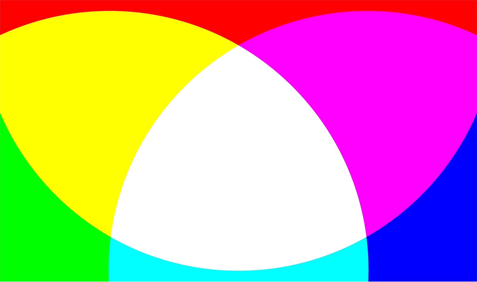
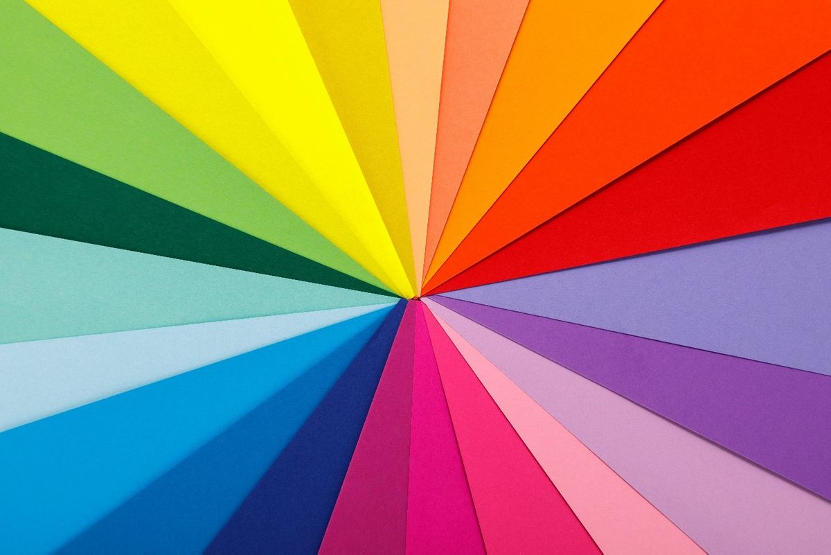
Color theory starts with understanding the basics of colors, which starts with understanding that all colors are organized on a color wheel and from there broken up into three categories; primary colors, secondary colors, and tertiary colors. Primary colors are red, blue, and yellow, secondary colors are orange, green, and purple and six tertiary colors are all on the color wheel.
If you were to draw a line through your color wheel you would see that all the colors are broken up into two sides; cool colors and warm colors. When we think of warm colors we associate them with energy and action and cool colors are associated with calmness and peace. When thinking about graphic design, understanding the color wheel and what each color is associated with is important. Once you understand the importance of each color temperature the better you can understand choosing specific colors for branding.

When thinking about color theory and what emotions they evoke in others, most graphic designers tend to use a combination of both warm and cool colors. Understanding that all shades, tints, and tones are just different variations of colors on the wheel can help you when combining colors. Researching how different colors work together can help you better understand how to use them in your designs.
Overall
The colors of the rainbow are a fascinating idea for any graphic designer since this is the base of color that they’ll use for all projects. Color theory, as well, is an important part of a graphic designer’s job. Above we discussed the colors of the rainbow as well as talking about color theory and the basics of color theory.
Color theory influences graphic design drastically since it’s the formula for what colors graphic designers can use to impact consumers. After reading this article, you should have a better understanding of color theory and how to use it in graphic design.


