

Who is Milton Glaser? He’s a designer for the ages, most famous for the iconic “I <3 NY” design that’s synonymous with the city. Born in 1929, he studied in New York City and Bologna, Italy. He founded New York Magazine in 1968 and in 1983 he formed the publication design firm WBMG with Walter Bernard. His work has been featured all around the world and is known for its powerful beauty.
- Glaser has designed for many different clients, and his final products are undoubtedly works of art.
- We’ll take a look at ten of his designs for clients ranging from libraries to TV shows.
- Glaser’s work focuses on immediately making the purpose of the design clear, so that the viewer sees and understands right away.
Temple University Music Festival and Institute
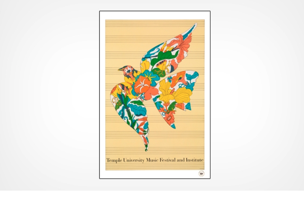
Glaser’s design for the Temple University Music Festival and Institute shows just what music can do. The background clearly imitates sheet music, although there are no musical notes or markings present. The bird is in flight, showing how music can lift off the page and come alive, as it no doubt did during the festival. The beautiful, bold, intricate floral design within the bird is almost reflective of how the many parts of a symphony can come together to create an emotional experience.
J B Parilux
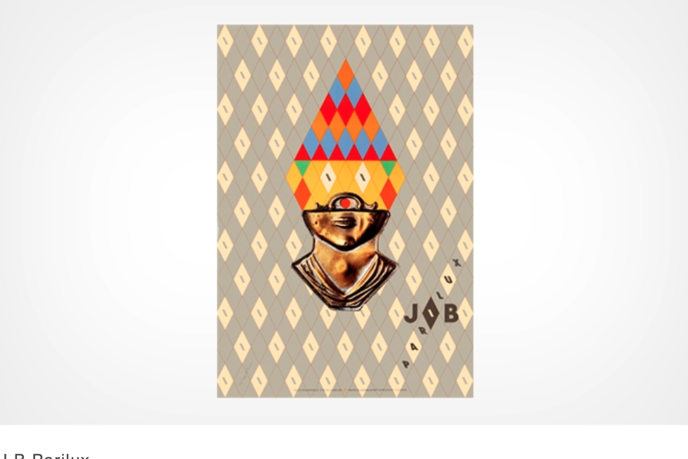
Scheurfelen was a traditional manufacturer of fine papers. JB Parilux seems to be a particular line that the company offered. This design plays with contrast, shape, and texture to make an impact on the viewer. The face looks both clownish and realistic, and the bright colors contrasting with the neutral background make an impression.
Philadelphia Museum of Art

This design for Glaser’s own exhibit at the Philadelphia Museum of Art combines intricacy and simplicity. It shows the final version of a sketchbook drawing of what seems to be an architectural decoration. The colors, the blurring, and the shadows all focus the viewer in on the artistry of the design, and the simple layout makes it easy to understand just what this flyer is for.
Campari Soda

The bold colors in this design for Campari soda are so incredibly lifelike, although the design itself is almost abstract. The geometric checked tablecloth contrasts with both the perfectly spherical orange and, most of all, the Campari organically spilling out of the glass. There’s so much going on this design, but it sends a message: drinking Campari means living an exciting, bold life
I Love NY

Glaser’s iconic logo will live throughout the ages. He designed it as a tourism campaign symbol for the New York State Department of Commerce. The heart in this design is practically the precursor to the emoji. Experts say that Glaser created a new style of communication that combines both graphic (the heart) and intellectual (the letters) elements with this design. The simplicity and boldness of this logo won’t be forgotten.
Masque Sound 75th Anniversary

Masque Sound provides audio services for Broadway productions. For the company’s 75th anniversary, Glaser crafted this beautiful design featuring two faces, the bottom face clearly referencing Shakespeare, and the upside-down face possibly representing an actor. The clever design, contrasting colors, and dramatic black background make this a work of art.
Mad Men

Moving from the stage to the screen, this design for Mad Men is unquestionably iconic. Featuring the Empire State Building, a wine bottle, and of course, the silhouette of Don Draper himself, the design embraces key elements of the show while simultaneously portraying a 1960s hippy-madness aesthetic with its bright colors and florals. This is another of Glaser’s epic works.
American Library Association

Reading a book can indeed feel like being swept up in a magical tornado, which is part of the reason we love this design so much. It combines elements of dynamic drawing (the tornado), still life (the book and the bowl of fruit), and even portraiture (the painting of Murasaki Shikibu, the first-ever novelist), all contrasting with the bright red tablecloth. This design immediately informs the reader with the words “Knowledge is Power,” that this art is all about the books.
National Poetry Month
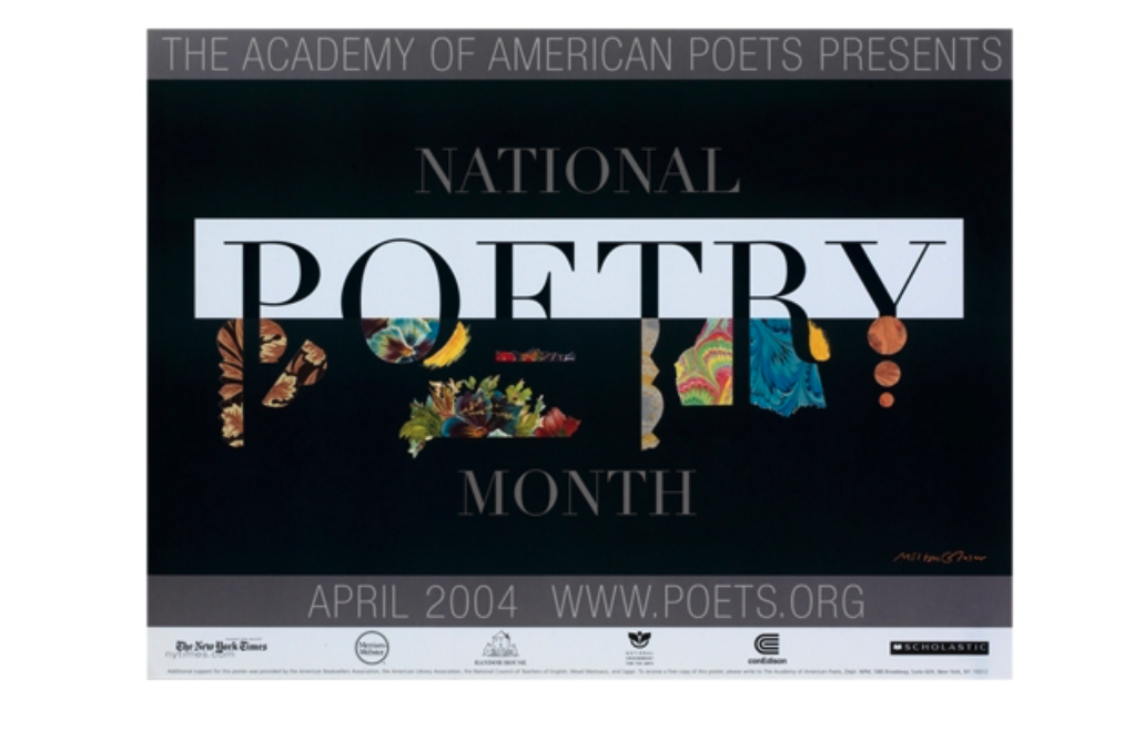
Glaser delivered a beautiful design for another literary client, the Academy of American Poets. His elegant graphic work for National Poetry Month in 2004 was featured in classrooms around the country. Each letter features its own colorful design, and the layout of the poster clearly communicates its purpose. Poetry can take simple letters and turn them into art.
Angels in America

Last but not least, the Broadway play Angels in America benefitted from Glaser’s talent with this beautiful design. Both simple and intricate, the contrast of the bold letter and the beautiful wing combine to create a stunning visual experience. The detail work in the wing is incredible, making this design a true work of art.
Milton Glaser Is an Artist for the Ages
Without Milton Glaser’s designs, who knows where the world would be? The artist passed away in June 2020 on his 91st birthday, but we know his designs will live on forever. These ten are just a few of the many he left as his legacy.


