
If you watched the inauguration along with the rest of America then you may have noticed that the White House website looked a little different than it normally does. With all the action that was going on at the time of the inauguration, it was no surprise that the new logo and website may not have been noticed immediately. The website, along with the White House logo, changed. With a new president came a new White House logo and an original website design. These changes were made with President Biden’s goal to bring the country together.
A little history on The White House logo
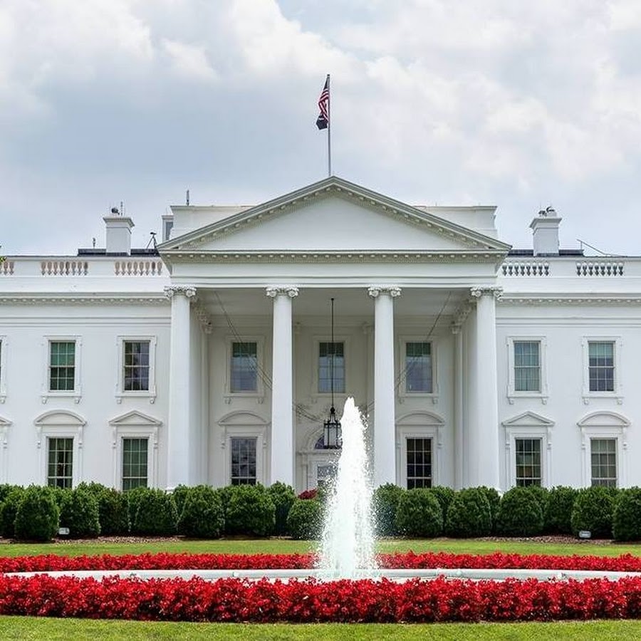
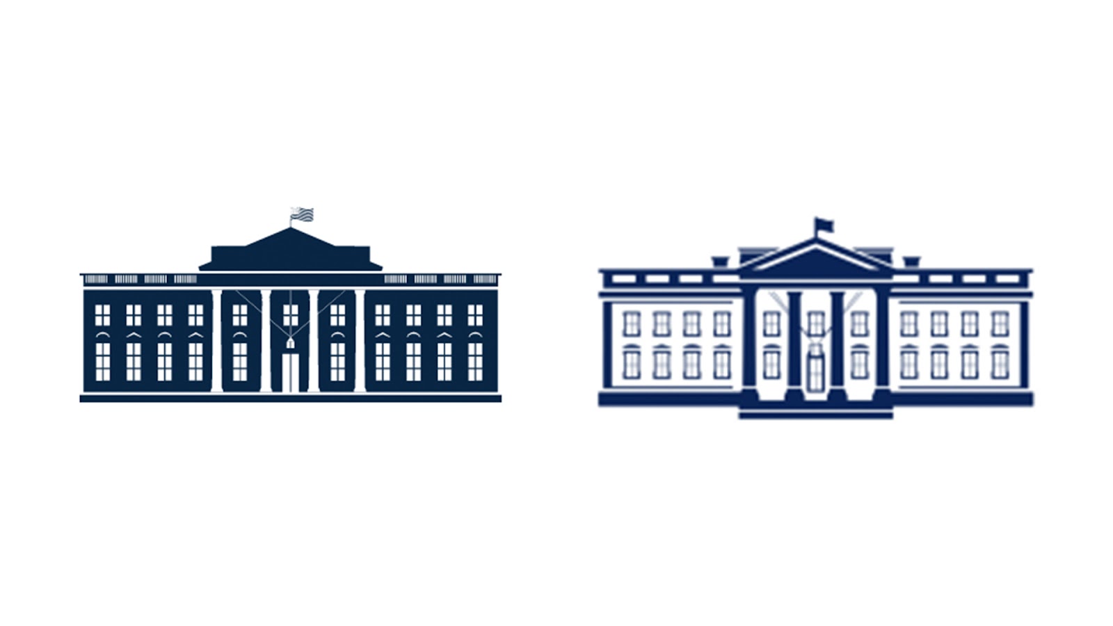
The old logo was first introduced when Trump entered the office and the new logo is drastically different than what it used to be. The creative agency Wide Eye was hired to design the logo, saying, “Following the tradition and the legacy of past White House brands, we depicted the north facade, symbolizing that the White House is the People’s House and accessible.” The main difference to the logo is the well-defined columns and more detailing to the logo.
According to a new report, it took Wide Eye, the creative agency, nearly thirty tries before they got it just right. The whole process only took a total of six weeks, with the creative agency having to completely scratch the original design and create a new logo. Although the logo may look similar to the old one, there was more work put into the new logo than meets the eye.
According to the White House director of digital strategy, Robert Flaherty, the logo redesign included specific important elements. “Our whole pitch, that we assembled in about two to three days, was the idea that the White House is the people’s house,” says Flaherty. The logo had key elements included that reflected the goals of Biden and the Biden-Harris administration.
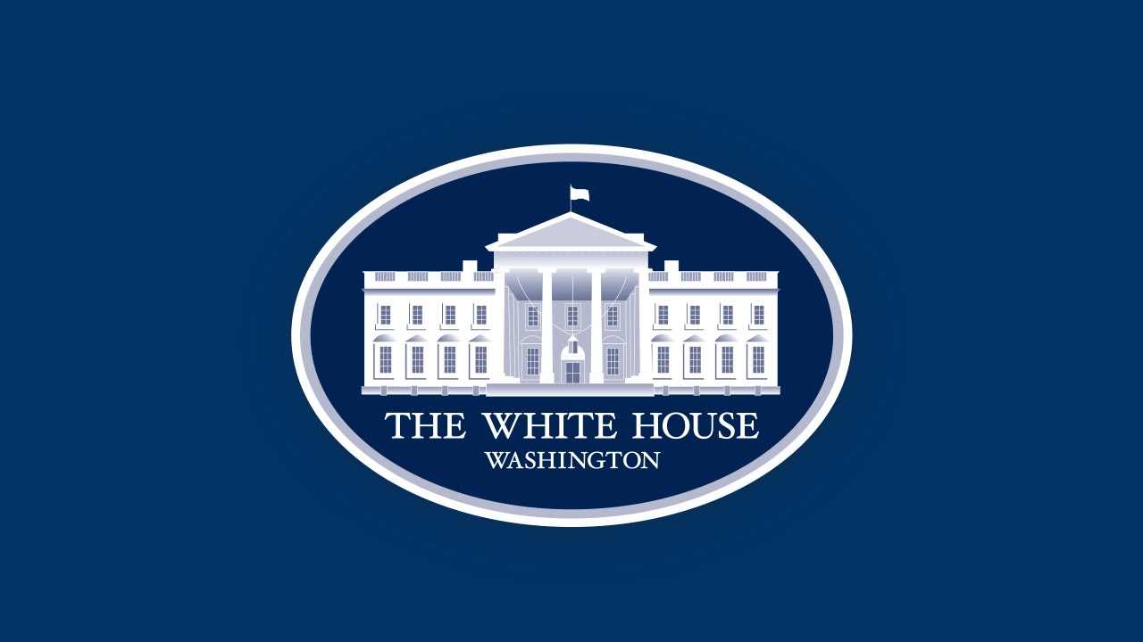
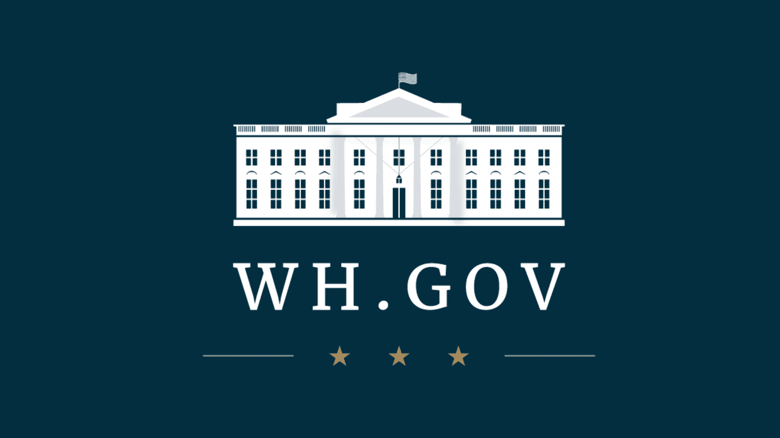
The logo itself features the White House on a blue background, with the only two colors used being white and blue. Compared to the old logo, there’s more emphasis put on the columns and windows than there was previously. We also see more shadows incorporated into the new logo, making it so that even though the logo itself is flat, it has a front forward-facing look.

“There’s a bit more texture to [the logo] than you might have on a flatter logo,” Said Flaherty. “It is both forward looking while having its roots in something very traditional. That’s a nice statement about what we’re trying to do here. We are bringing the country together and winning the battle for the soul of the nation, but also trying to do it in a way that makes people’s lives materially better.”
The creative agency created different variations of the new logo to be used in different settings. Depending on where you see the logo it may change slightly in variation. However, all variations of the logo convey the same presidential significance that the creative agency wanted. The changes are subtle, making it so that regardless of where it’s seen it’ll always have the same professional look.
Although this may not be the greatest or most dramatic new logo design of 2021, it holds significance for our country and shows the significance of the logo being redesigned. Although this logo may have taken Wide Eye nearly thirty tries to get perfect, in the end, we think it turned out amazing!


