

- Although most of us are familiar with the famous logos in the world, not everyone knows about the mysterious hidden meanings behind them
- There’s a lot of logos that have hidden meanings behind them that you may not have known before
- We share all of the famous logos and what hidden meanings that their logos hold behind them
Most of us are familiar with the world’s topmost famous designs and have seen them around often. After all, the logos that we see daily get imprinted in our brain and we see become so familiar with them that we know them instantly off the top of our head. However, how many of us know famous designs and the hidden meanings behind them? If you’re looking for some inspiration for your next design project, looking at some of the greatest designs that hold significance and what they have hidden behind them is sometimes just what you need to feel motivated to start on your next project.
If you need some inspiration to help you get started on your next project, we’re here to show you some of the top famous logos with hidden meanings!
Famous Logos With Hidden Meanings

FedEx
The FedEx logo is one of the most iconic and well-known in the world, with people instantly being able to recognize it. But how many know that the logo has a hidden meaning in it? Although at this point many are familiar with the hidden image inside the logo, for those that don’t already know take a look between “E” and the “X”. If you look closely, you’ll see that the negative spaces form an arrow. This is certainly a creative logo and conveys the company’s speedy delivery.
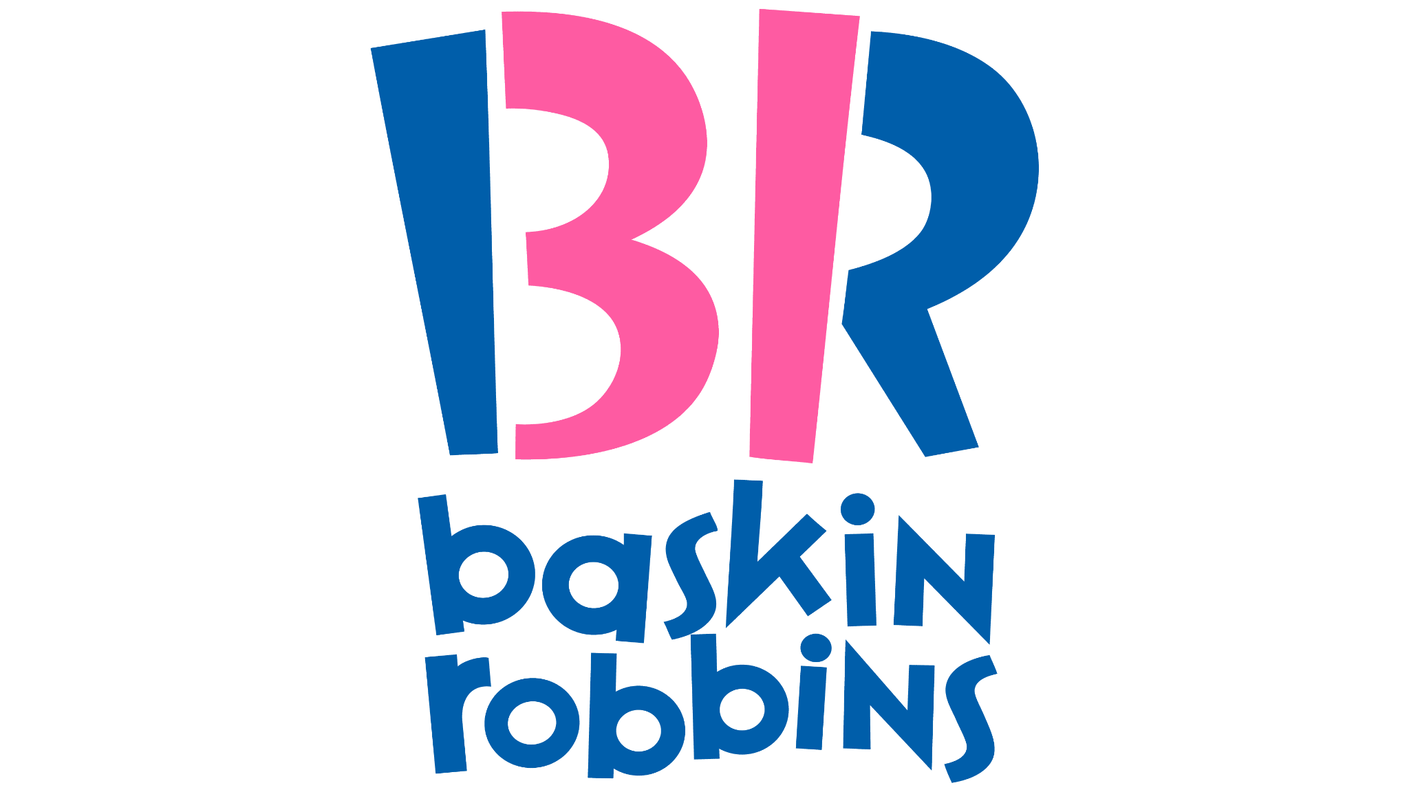
Baskin Robbins
Baskin Robbins is one of the largest chains of ice cream specialty shops, known for their famous 31 flavors. The company has a very fun and creative logo that uses fun colors, but it also has a special meaning behind what you see at a glance. The logo shows a “BR” that, when you look from afar, doubles as a ‘31’. The logo was a part of an entire brand refresh back in 2005.

Hershey’s Kisses
If you haven’t opened and enjoyed a Hershey’s Kiss at least a few times in your life, are you even living? Hershey is a brand that’s famous for their delicious chocolate and they’ve made quite an impact with their well-known brand. However, a fact that not everyone is aware of is that, if you look closely at the brand’s logo you’ll see that there’s an extra kiss baked into the logo. Look between the ‘K’ and ‘I’ while tilting your head just right and you’ll see that extra kiss on the logo.

The visual social media platform Pinterest has been around for long enough that it’s established itself as one of the veterans in the social media community. When you look at the logo this hidden meaning isn’t quite as obvious as a few of the others that we’ve mentioned here, but it is there. When you look at the ‘P’ in the logo you’ll see that the ‘P’ also doubles as a pin in the logo. This is certainly a creative design and one that catches you off guard when you first notice it!

Tostitos
It’s true, even the famous tortilla chips and salsa brand that you buy from your local grocery store has a hidden meaning inside their logo. When you first glance at the logo it appears that it features the company name on a vibrant background, but once you look closely you’ll see it. The two ‘T’s that are shown in the logo are two people dipping a tortilla chip into a bowl of salsa which is shown on the top of the ‘I’. This is something that people may not notice at first, but once they see it there’s no going back!

Goodwill
The organization takes pride in working to make people’s lives better and improving them through what they have to offer. They’ve tried to convey this with their logo, subtly including a meaning that many people don’t notice until it’s pointed out. Everyone notices the smiley face that appears in the upper left corner of the design, but how many notice the second smiley face that the organization has subtly included in the design? If you look in the lower-left corner of the design, you’ll see that the lowercase ‘g’ in the name doubles as a second smiley face. This makes it so that the smiley face appears twice in the design.

Wendy’s
A far less obvious hidden meaning that some have never even noticed before is in the famous fast-food chain logo ‘Wendy’s. This fast-food chain prides itself on being a brand that has elements of home and warmth included. They advertise home-cooked meals that will bring you right to the kitchen at dinner time. But if you take the time to look closely at Wendy’s color in the logo you’ll see the letters ‘Mom’. This may not be something that you notice, but over time it stays in your brain and you associate it with the brand.


