
Normally, designers have to remain neutral when designing logos. However, there are times when they’ll have to create a logo that is specifically catered to one gender through its characteristics. If you want to check out some of these logos to see what we’re talking about, check out this article!
They say that there should never be gender bias when a designer creates a logo. However, if you’ve spent any length of time in the business world I’m sure you already know that, in some industries, it is necessary to have logos specifically aimed at one gender.
You have to include specific gender characteristics in some situations. Typically, you’ll see nail salons, jewelry, and beauty salon logos directed towards the female gender.
Sportswear and gym logos are generally directed towards the male gender. This means that, in a designer’s job, they’ll run into instances where it’s necessary to create a logo directed towards one specific gender. When doing this, you’ll no doubt want to get some inspiration. That’s why we’ve gathered a list of the top gender bias logos.
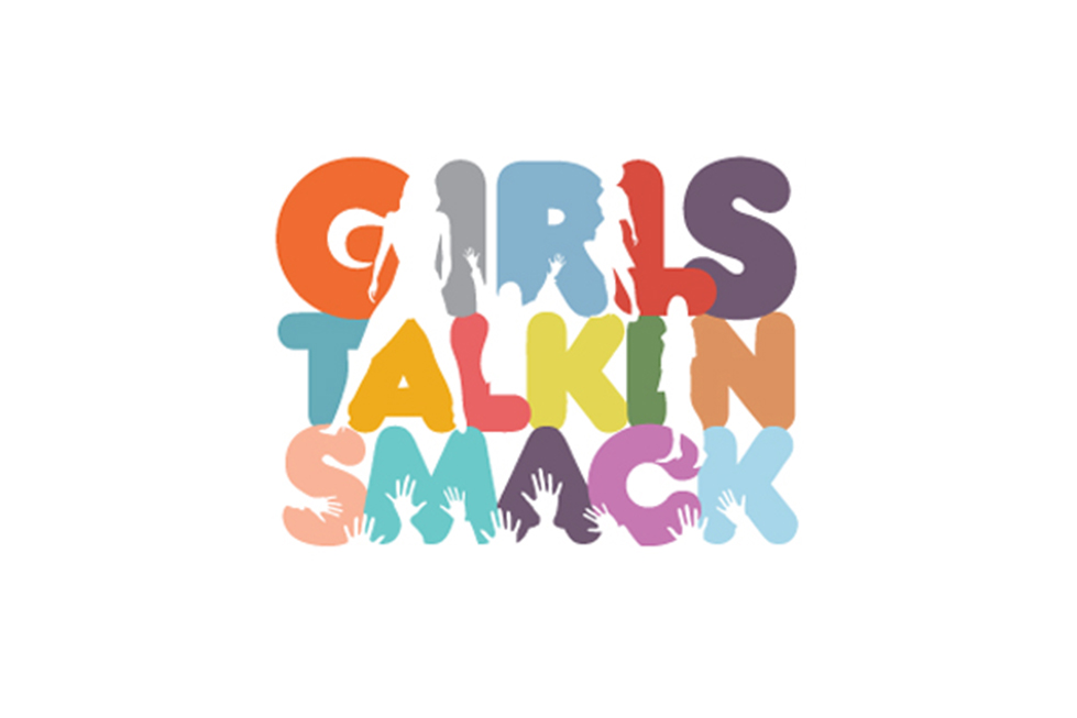
Girls Talkin’ Smack
This company is a gossip portal that’s updated with the latest news on celebrities, tv shows, fashion, and more! The logo itself features the company name, silhouettes of women in the top part of the name, and hands reaching upward in the bottom part. The logo is colorful and is aimed at females.
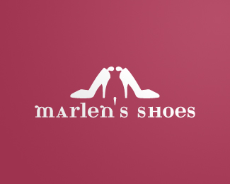
Marlen’s Shoes
This logo is simple, yet elegant. The shoes outline a silhouette of a woman between them, showing customers that the company provides shoes for women. We can see that the logo is more feminine than masculine at one glance.
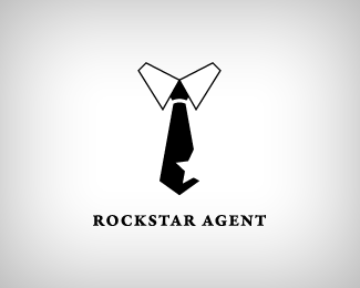
Rockstar Agent
This logo shows a men’s tie with a star cut out in it. It gives a rock-inspired look, while the style of the agent. Not only does it represent the company name, “Rockstar Agent”, but it also shows the gender that the company aimed it at.
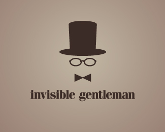
Invisible Gentlemen
This shows a hat, glasses, and a tie, as well as the company name. It gives the impression that it’s a more masculine logo, but in a more subtle manner. The name itself, “Invisible Gentlemen” also shows the gender that the company’s aimed towards.
Girls World
This logo is fun, filled with bright colors and a fun font. It’s creative and has butterflies and bright pink colors included. It’s easy to tell at a glance that this logo is pointed towards the female gender by the name, which is included, as well as the colors and style of the logo.


