
Only a few months into the New Year and we’ve already seen a surprising amount of new logos emerging from some of the top brands, with some being amazing new logos and a few rebrand flops that would’ve been better left alone. One thing has been certain though; all of these new logos have caused an uproar from the public, whether the logo changed for the good or bad.
Image sourced here.
The internet has had a lot to say when it comes to the new logos that we’ve seen, Burger King and Pfizer’s new logos shocking the public, but especially about General Motors. The company decided to announce that their brand was getting a makeover and announced their new logo. Although General Motos was due for a logo update, it still came as a shock to customers when the company changed its logo for the first time since 1964.
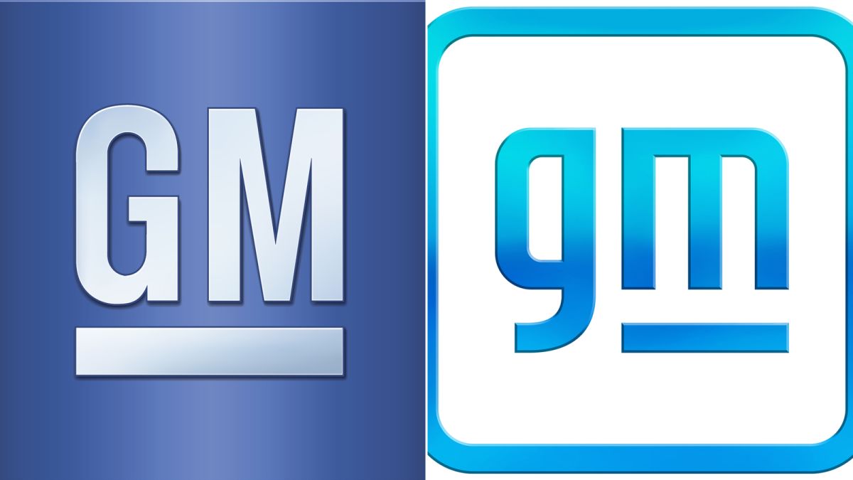
Image sourced here.
The new logo is apart of the company’s new marketing strategy as they focus on all-electric vehicles. Their new logo, although similar to their original logo, is supposed to symbolize this next step for the automaker company and their new strategy. The new logo is simple, featuring the company’s initials ‘gm’ in lowercase light blue letters. The ‘m’ is underlined and both letters are encased in a box of the same color with rounded edges.
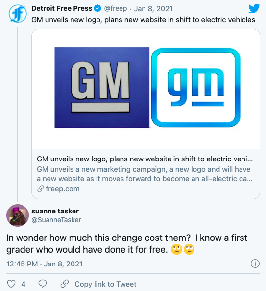
Screenshot sourced from Twitter.
Although GM’s old logo wasn’t anything special, there has been a strong dislike for the new logo, customers being quick to mock it and claim that the look is ‘outdated’ and even ‘embarrassing’ for the company. As to be expected, they were quick to head to social media and the internet to show their disdain for the new logo. Twitter saw a mass of users engaging in mocking and criticizing the new logo, users even comparing the work of the logo to elementary children’s work.
The new logo was designed by GM’s own designers, even the font was created in-house. The blue is said to evoke feelings of ‘clean skies’ and the logo seems to have some slight references to GM’s announcement about their new marketing strategy focusing on electric cars. For instance, the lowercase ‘m’ has arches squared to resemble the prongs of a spark plug, the company said.
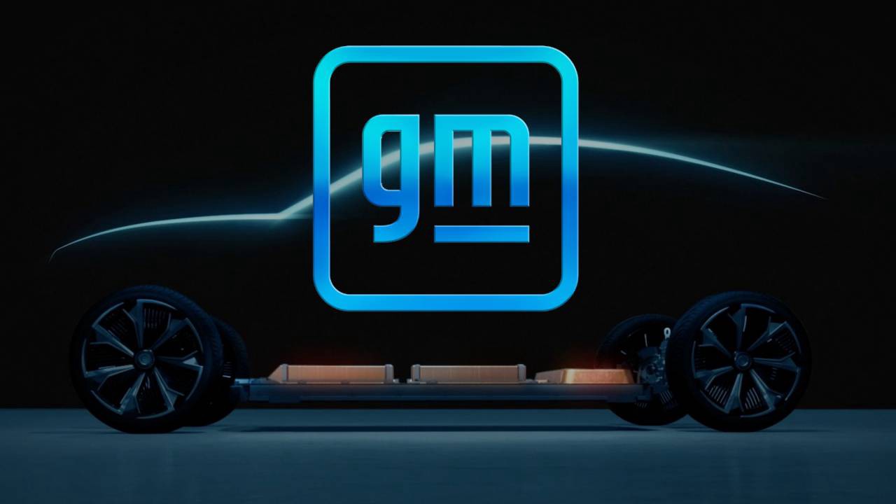
Image sourced here.
Not only did the company announce their new logo, but a new tagline, ‘Everyone In’ also accompanies the logo. The changes going on in the company have caused a stir around the community, but GM has been fairly quiet about the campaign itself besides a few interviews where the new strategy and GM’s plans for the future were discussed.
Compared to Burger King’s big rebrand of the year, GM’s seems underwhelming and frankly, disappointing. After over fifty years of the same logo and a mere five redesigns in their lifetime, customers expected more of the company’s rebrand. We’ll have to wait to see what the company has in store for its future and if they’ll speak out about the new logo.


