
Few brands have had the enduring success and iconic image that Coca-Cola has enjoyed. It’s a staple of cinemas across the nation — the perfect complement to a bucket of popcorn. This global company sells its beverages in virtually every country, from China’s apple-flavored sodas to South Africa’s fruity Bibo drinks.
However, the classic Coca-Cola is beloved around the world. One can find a Coca-Cola beverage cart both on the streets of New York and in the port towns of Belize. The logo is highly recognizable — and a welcome sight for thirsty travelers everywhere!
Coca-Cola’s international success is certainly due to its exceptional marketing. Since its debut in the late 19th century, the company invested heavily in its brand identity, knowing it would need to outcompete copycat brands. And they did.
Let’s take a look at the history of this notable brand’s logo and marketing.
The Origin of Coke
The year was 1886. Dr. John Stith Pemberton was close to perfecting his medicinal beverage. He wanted something that would invigorate the body and mind — and of course, taste delicious as well.
A Civil War veteran, Dr. Pemberton suffered chronic pain from a saber wound. He’d developed an addiction to morphine and was eager to find an alternative. In 1866, a year after his injury, Dr. Pemberton began experimenting with various herbal extracts and alcohols in his lab in Columbus, Georgia.
Wine medicines were popular in that era. In France, a coca wine called Vin Mariani promised “health and vitality.” Dr. Pemberton crafted his own version of the tonic, Pemberton’s French Wine Coca. He infused the beverage with extracts from the kola nut, known for its caffeine content. After a few tweaks, the first sip proved the tonic’s potency.
Dr. Pemberton took the tonic to Atlanta, where it quickly became a hit. He eagerly marketed the French Wine Coca as a panacea, benefiting everything from chronic pain to constipation to cognition to libido. (His claims may have been a little fantastical.)
But in 1886, Fulton County passed a temperance law. Dr. Pemberton was forced to remove alcohol from his formula. Drugstore owner Willis E. Venable helped him test various combinations of plant extracts and essential oils.
On May 8, 1886, Dr. Pemberton finally discovered the perfect blend. While attempting to pour another glass, he accidentally mixed the syrup with carbonated water. Inspiration struck. He took a jug of the tonic to Jacobs’ Pharmacy and suggested that they sell it as a fountain drink. One sip was all it took to declare the beverage “delicious and refreshing” and begin selling it for 5 cents a glass.
All they needed was a name. The two main ingredients were coca wine and kola nut extract. Dr. Pemberton liked the alliteration, which was a popular approach to naming wine medicines. His bookkeeper, Frank M. Robinson, suggested Coca-Cola, saying “the two Cs would look well in advertising.”
He was absolutely correct.
The Birth of a Brand
Robinson wrote the name of the beverage in Spencerian script, a writing style commonly used for business correspondence. The angled, flowing letters seemed perfect for an innovative beverage like Coca-Cola.
As you see, it’s quite similar to the contemporary Coca-Cola logo! The handwritten style resonated with people. As the beverage popped up in drugstores and diners across the nation, this recognizable wordmark became synonymous with refreshment.
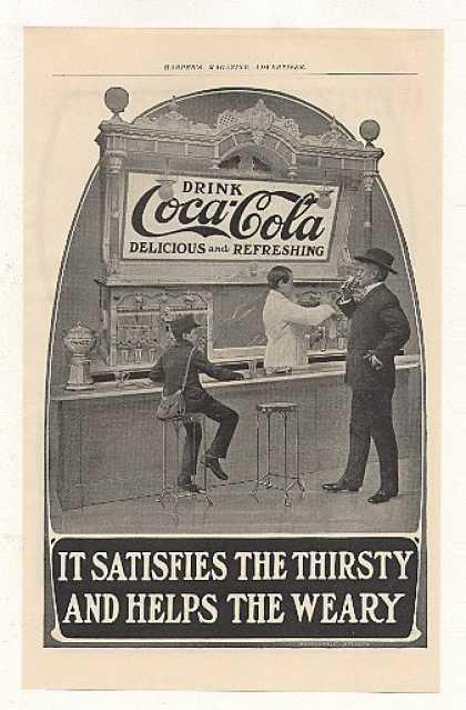
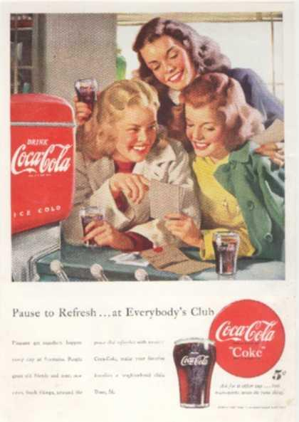
Advertisements featured the wordmark along with the original description of “delicious and refreshing,” which became Coca-Cola’s first tagline. Often, the word “Drink” was added to help customers know what was being advertised.
But while Coca-Cola was gaining popularity, Dr. Pemberton was losing his health. Facing bankruptcy and stomach chance, he began selling parts of his patented formula. He’d hoped to retain partial ownership, but in 1888, he sold the last share — the recipe — for just $238.98 to pharmacist and business owner Asa Griggs Candler. The secret recipe has been heavily guarded ever since.
Dr. Pemberton passed away a few months later, but his legacy would endure through Candler’s marketing acumen.
Creating a Soda Empire
Asa Griggs Candler was a pharmacist by trade but had an entrepreneurial streak. Dr. Pemberton knew that Coca-Cola could become a national sensation. Candler aimed to make that vision a reality.
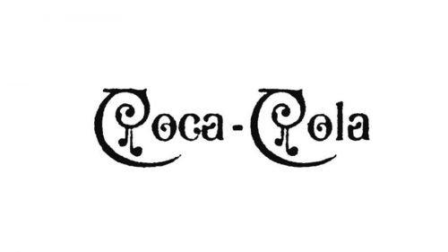
He seemed to experiment a bit with the brand identity. The following wordmark appeared in advertisements between 1889 and 1892:

And for just one year, this intricate and artsy version of the logo made the rounds.
Ultimately, Candler wisely returned to the Spencerian script that had already made the drink so popular. The company has kept some variation of the logo ever since.
By 1891, Candler had purchased the remaining shares for a grand total of $2,300 (more than $54,000 today) gaining all rights to the company. He officially founded the Coca-Cola Company in 1892.
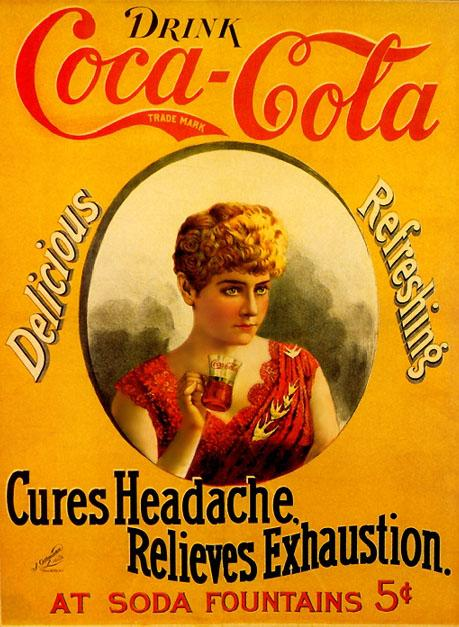
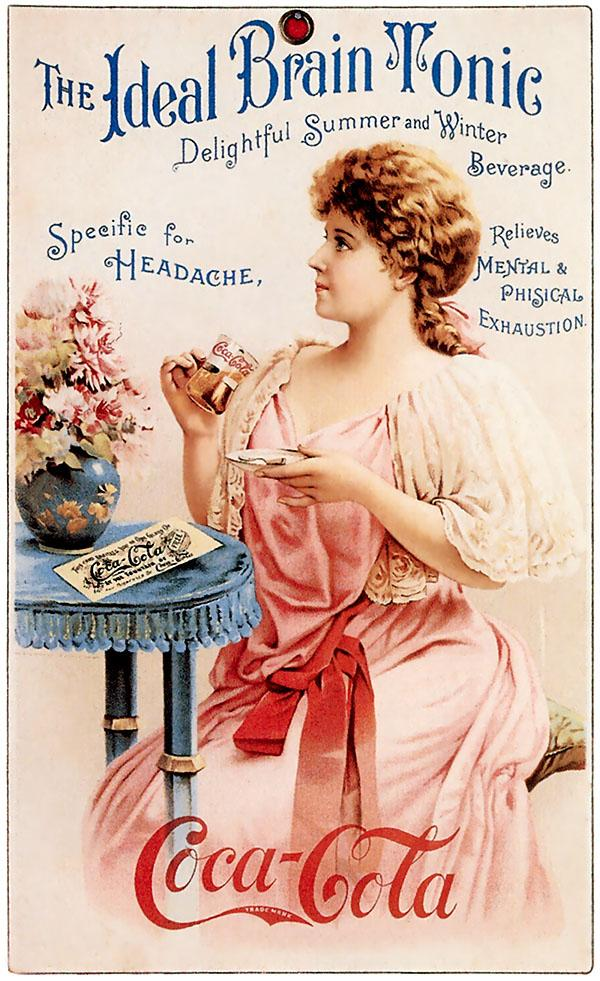
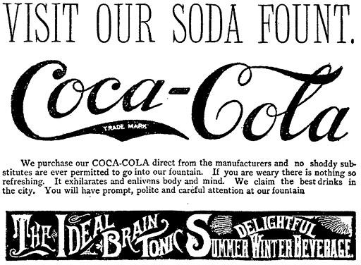
He began marketing Coca-Cola to drugstore owners around the nation, continuing Pemberton’s claims of mental and physical benefits. The beverage was often advertised as a cure for headaches and exhaustion, with slogans such as “The Ideal Brain Tonic” and “Delightful Summer and Winter Beverage.”

By 1906, Coca-Cola was more than a national sensation — it had gone global. Candler eventually stepped down to pursue a political career and sold his shares. By then, Coca-Cola had gained icon status in American pop culture, as well as prominence around the world.
Candler knew that other pharmacists would try to copy Coca-Cola and its brand identity. He trademarked the logo on January 31, 1893. The logo was tweaked to reflect this milestone:
Candler kept the original tagline and messaging. Red became the brand’s main hue, especially as color print advertising became more available.
Interestingly, Candler didn’t believe that bottling Coca-Cola was a good idea. After all, it had become a fixture of soda fountains across the nation. Still, he sold bottling rights for $1 to various retailers. This made the drink portable, allowing it to travel across the world.
Refining the Brand
In 1941, Coca-Cola redesigned its famous wordmark. The differences were subtle yet memorable, including the whimsical “fishtail.” The words “Trademark Registered” were removed from the tail, which also gained a slimmer shape.
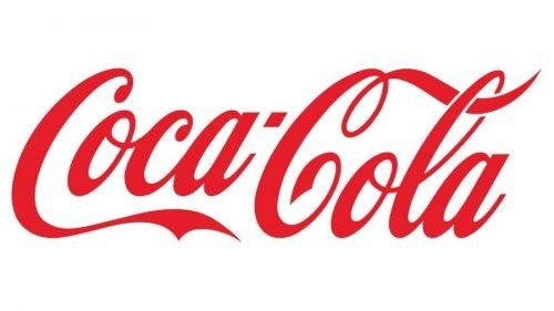
As you see, this is very similar to today’s version, which was based on this significant logo. Here’s the contemporary Coca-Cola wordmark. The letters are slightly more italicized, the swirl in the second “C” is less pronounced, and the tail is even slimmer.
Meanwhile, the company finally embraced the popularity of bottled Coca-Cola. It had become a necessity as, despite Candler’s best efforts, copycats were popping up everywhere (pun intended). Bottling Coca-Cola allowed the company to make its product distinctive. In 1916, they released the famous contoured bottle that we all know and love.
This shift toward bottling was reflected in the iconic red button logo that debuted in 1947. An illustration of the beloved glass bottle appears against a vermillion backdrop, overlaid with the wordmark. The disc shape made this logo ideal for everything from bottle caps to outdoor signage.
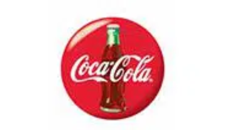
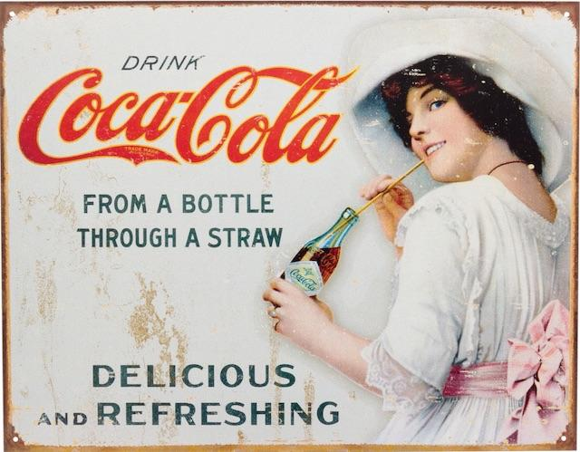
Early versions of the red button had appeared in print advertisements with the word “Drink” as well as the brand’s tagline. This era was also when Coca-Cola gained its nickname, “Coke” and began using the slogan “It’s the real thing.”
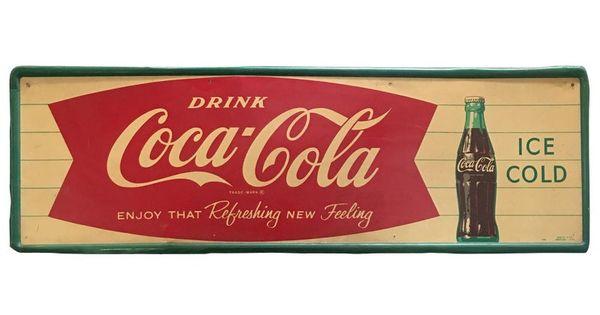
As the national aesthetic shifted in the late 1950s, the famous “Fishtail” sign emerged. This design used a common graphical shape called “arciform.” The wordmark boldly stood out against a brilliant red background. The fishtail was regularly used from 1958 through the ’60s, but it still appears in a lot of vintage-style signage.
At the end of the 1960s, Coca-Cola debuted its “Arden Square” emblem, featuring a dramatic white wave (the “Dynamic Ribbon) below the wordmark. This aesthetic change ushered in Coca-Cola’s modern era.
The Brand that Unified a Beverage Empire
Over the past 50 years, Coca-Cola has released many variations of its flagship product. Some, such as the disastrous “New Coke” formula, are better left forgotten. Special flavors such as cherry, vanilla, and the latest “Stardust” version have proven popular.
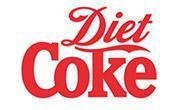
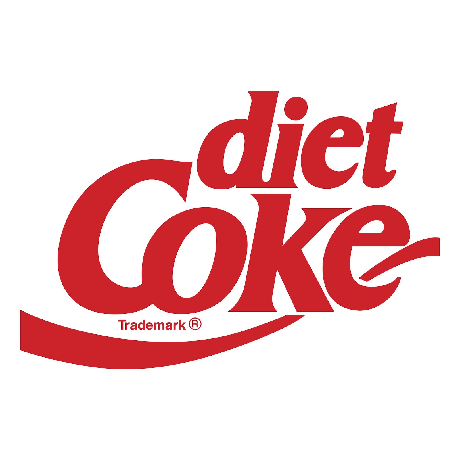
But it all began with Diet Coke. The company embraced the beverage’s nickname and rendered it in a bold serif to highlight the difference. The initial 1982 Diet Coke logo used Spencerian script for the word “Diet”, underscored by the famous fishtail shape.
Other versions featured the “dynamic ribbon.” These elements created enough recognizability to attract consumers.
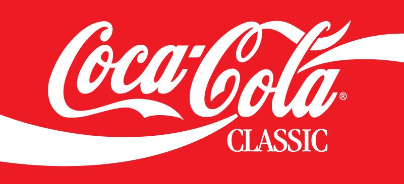
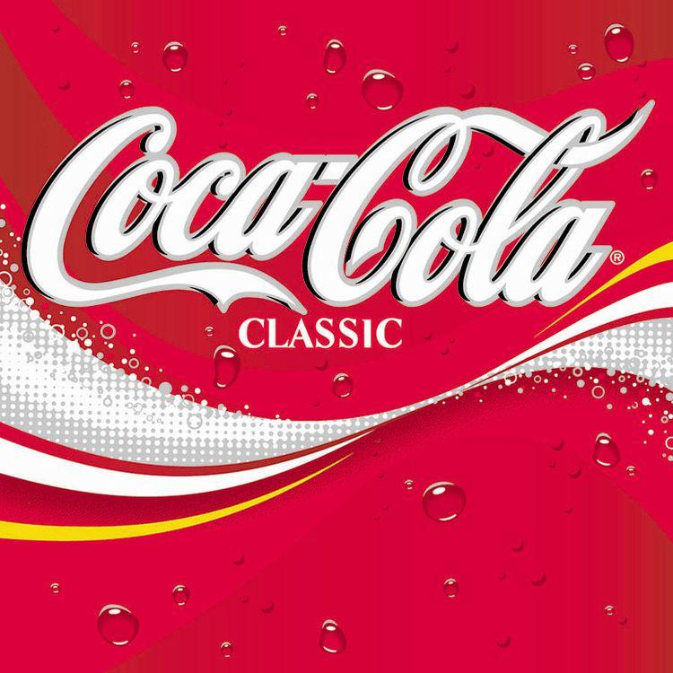
In 1987, Coca-Cola redesigned its logo to make it appear bolder and thus better suited to the 80s aesthetic. Many iterations included the word “classic” to assure the customer they wouldn’t be drinking “New Coke.”
In 2003, the company resumed the “real” theme in their advertising and launched a new version of the Arden Square featuring a yellow wave and fun bubbles.
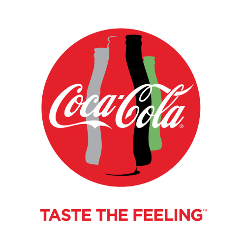
But ultimately, they’d go back to the basics. 2007 saw the original wordmark return, accompanied by the “Classic” tagline. This logo design has persisted ever since, although the latest tagline is “Taste the Feeling.” Recent advertisements also brought back the red button shape for a timeless feel. There was briefly a “Taste the Feeling” version of the new logo that still makes the rounds today.
Wrapping Up
Technically, there have been many, many iterations of Coca-Cola’s logo. And yet it has not strayed far from the original version — a true testament to Frank Robinson’s clever design and Candler’s marketing savvy. The logo might even be called “old-fashioned” for any other company, but Coca-Cola’s enduring success proves the importance of strong branding.
And let’s face it: some things are “classic” for a reason.


