
- Movie posters matter significantly when promoting movies and advertising them to the public
- There are a few things that you want to keep in mind when designing a movie poster to provide the best possible result
- In this article, we give helpful info on how you can design a movie poster
Since even the earliest days of movies, movie posters have played a substantial part in advertising movies and showing fans information about them before it’s released. Movie posters are the first impression of a movie that most people will get and, as with book covers, will often have people decide if they’ll watch the film or not. Although, with technology and the advancements that we’ve made most people think that there’s not a need for movie posters, we still believe that they’re a strong necessity for promoting movies. Movie posters can be what convinces someone to watch a film that they made not have thought of before. As a graphic designer, when you’re hired to create a movie poster there’s a lot of pressure since this is what displays the movie and shows what it’s about. The first thing to keep in mind as a graphic designer is that you want to take your time.
Don’t feel pressured to complete the design as soon as possible and tell clients that it’s taking longer if need be. Especially your first time around it’s critical that you take the time that you need and provide the client with the best possible result that suits their brand. If you’re wondering how you can start with designing a movie poster and need help, we’ve got you covered. In this article, we’ll go over the steps of how to design a movie poster!
How To Design A Movie Poster

Capture The Movie
Since a movie poster is directly displaying the movie, you want to give a glimpse into what the movie is about without giving it away. This can be tricky even for the most experienced graphic designer since you have to show what the movie is about without giving away the plot or too much of the storyline. You want to grab people’s attention and get their interest but you don’t want to give them so much of the plot that they already know what happens.
Think about movies with intense storylines and how that’s shown through the posters. Movies like Harry Potter have shown the intense battle that goes on throughout the movie between good and evil and how that plays out. This is what you want to accomplish with the movie posters that you create; they should establish the essence of the movie and what it’s about at the core, but not give away any major plot points.
Think About Images
You want to put a lot of thought into the images that you’ll include in the poster and how they’ll add to it. You only want elements included in the logo that matter and will bring something to the design. You want to choose effective images that will accomplish your goal and draw people in while still keeping them curious about the movie plot. There’s a couple of different options with what images you’ll choose and what they will mean for a movie poster.
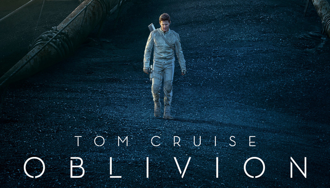
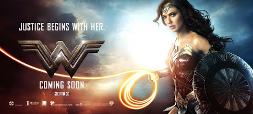
You can choose to take an image from a scene in the movie and use it for the poster. When you do this, that scene should be the center of the poster and jump out at people. You want to choose an action-packed scene that gets their curiosity without giving the plot away. The other option is to choose a key feature from the movie and make it the main point. This could be a character or an item that’s essential to the movie and stands out for the plot and making it the main focal point for the design.
Color Choices
Posters are large and they stand out regardless of where they’re shown, which means that the colors need to pop. This is important that the colors not only stand out but that they contrast and work well together.
Choose colors carefully and pick those that contrast well with one another and portray the movie. You want to create visual interest with the poster and spark interest through the colors that you choose. You want to think about what the colors add to the theme and tone of the movie.
Is the movie intense? Choose to go with dark, or muted colors.
Happy? Uplifting? Generally, a lighter color tone is good.
And always remember that you can’t go wrong with the background one on the central points of the movie (see for example in these posters; Hogwarts, Emptiness, The sky, Christmas Tree Lights).

Image sourced here
Know It’ll Be Seen From A Distance
This is something that a lot of designers struggle with. Many forget that their design won’t always be appearing as they see it on their computer screen. This means that the sizing and proportion that they tend to use don’t look good on larger scales. You want to make sure that everything you use on your design will work equally well on all scales, even the largest. You want to choose text that’s large and images that won’t appear blurry when they’re scaled to larger sizes.
Summing It Up
A good poster is mainly about knowing what is going to draw your audience in, and grab their interest, making them want to actually go and SEE the movie. In addition to that, it needs to be visually appealing, and follow the basic formula above. Remember, both storyline, images, color, scale ll need to be combined to make a stunning poster.


