Angela Cuellar’s designs are simple, balanced, and somehow, always modern and fun. By using colors, contrast, movement, and icons, she creates beautiful logos again and again. Let’s take a look at Cuellar’s work to see how she helps brands represent themselves so well.
- Angela Cuellar, a Spanish designer and illustrator, loves simple designs and children’s illustrations. Her passions make her logo designs visually engaging.
- Cuellar’s portfolio on 99 Designs is impressive, with 111 contest wins, 270 runner-up designations, and 76 1-to-1 projects.
- To top it all off, 29 of her clients are repeats. Clearly, Cuellar is doing something right! We’ll take a look at several of her designs to see how she keeps winning.
WisePawz
Cuellar’s logo design for WisePawz, a brand that provides dog toys that make your dog smarter, is clever and neat. The lightbulb and glasses are both traditional symbols of intelligence, and the wink is a great touch! We love the bright red as well, and by using the same shade in the icon and the wordmark, Cuellar seamlessly unifies the logo.
Careers Insider
A media platform that offers job matching and loads of information, Careers Insider chose Cuellar’s design as the winner of their contest. In her design, the little businessperson is reaching for the stars – something many who are seeking to change careers can relate to! The navy blue and orange-yellow color palette work well together to represent both tradition (navy blue) and modernity (bright orange-yellow).
Woof Boost
Woof Boost helps professional dog walkers increase their profits through managing the technical online aspects of a dog walker’s business. Cuellar’s design is a cutesy and yet ultra-dynamic depiction of a smiling dog moving forward. The bright orange is definitely eye-catching. Ultimately, this dynamic dog icon is unforgettable!
2 Weirdos Travel
Another contest winner, Cuellar’s design for 2 Weirdos Travel embraces the simple and adorable while also conveying movement. The bird and snail contain the same colors and the dashed line looks like it came straight off a map. The two animals are a great benefit for the two No wonder this design was a winner!
Ramirez Chiropractic
What better way to illustrate a chiropractor’s office than through highlighting a spine? The logo Cuellar designed for Ramirez Chiropractic is a clear contest winner. We love how the fox is looking back at his spine, almost concerned, just as a patient would be (if a patient were shaped like a fox!). The color choices of an orange-red and black contrast fantastically with the white of the spine.
Tandem
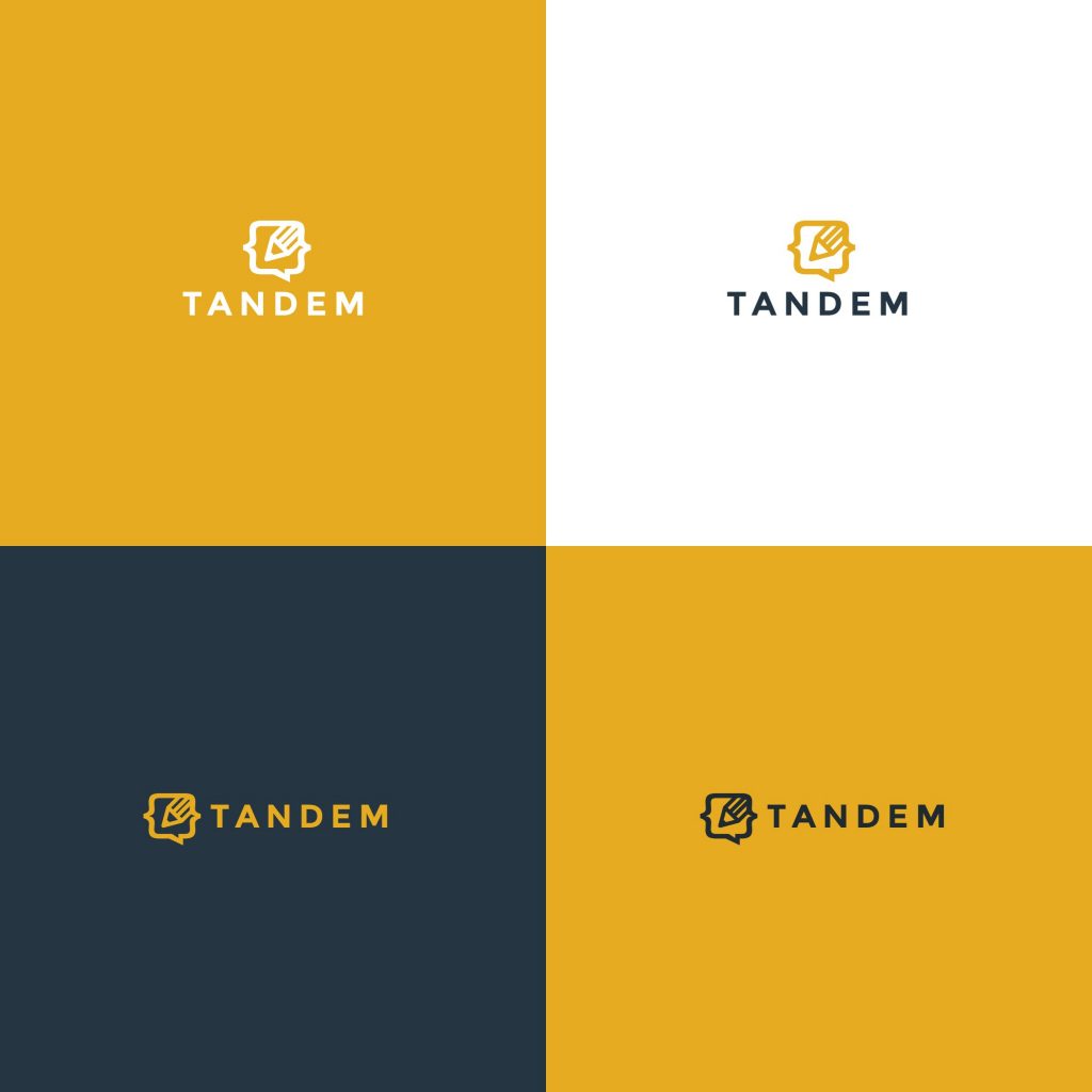
Another of her 111 contest wins is Cuellar’s design for Tandem, an open-source software company that enables web developers to visually create applications using tools that are similar to what designers often use. The icon in the logo Cuellar designed is a square with protruding triangles that almost looks like a code box. Itontains a pencil, which is a universal symbol for creation. We love the subtle color scheme of yellow, blue and white.
Swimwear Records
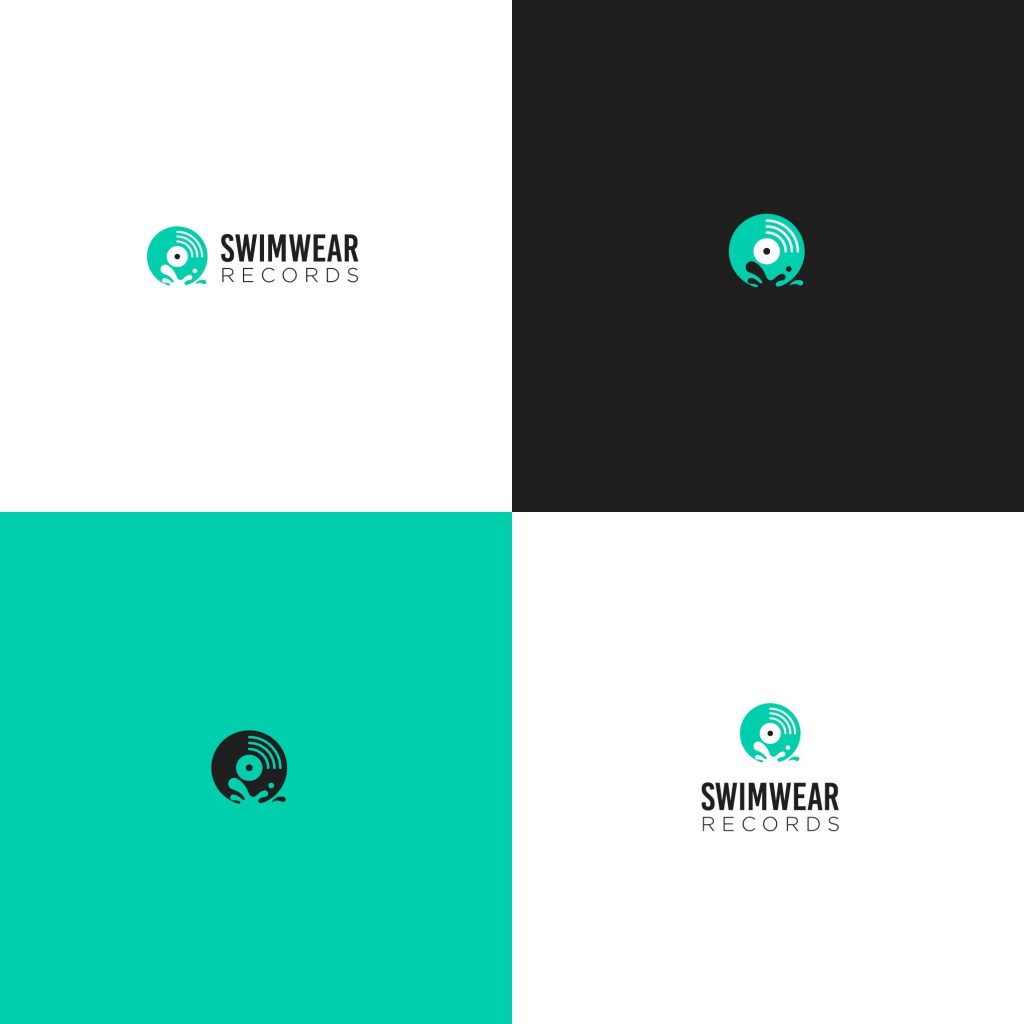
This design makes a splash! The funky splash shape on the record icon is a great touch that ties the logo for Swimwear Records together. We also like how Cuellar balanced the important, visually heavy-weighted, and long word, “Swimwear,” with the lighter font for “Records” beneath it. There’s enough contrast to keep it interesting while also bringing the attention to the name of the label. The teal and blue color choices work great given the name of the brand!
PearJobs
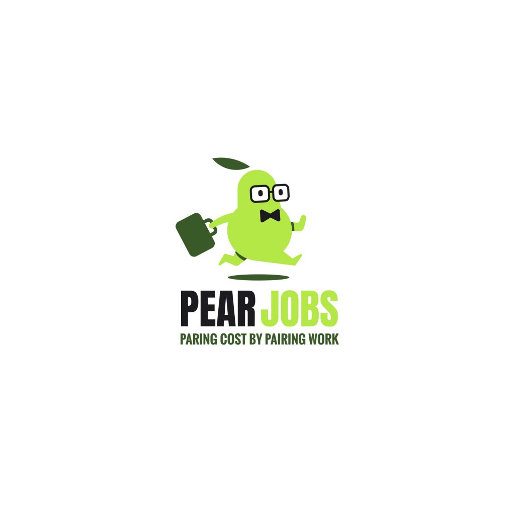
Cuellar’s design for the Pear Jobs logo draws on her strengths: make it cute and show movement. These two elements work well in the context of the busy pear-businessman on his way to complete the job. The color choices are natural for a company labeled “PearJobs,” which we think was the right call. We love the detail of his shadow and the strong contrast throughout!
Perfect Peace Pet Care
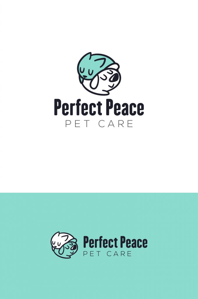
Perfect Peace Pet Care got lucky when Cuellar entered their design contest. She came up with the perfect (had to make the pun!) logo for the brilliantly named company. Her drawing of a cat and dog nestled together in a circle, clearly at peace, is an amazing icon that captures the spirit of the company. The light blue of the cat is a calming shade that works perfectly for the brand.
Cuellar’s Designs Have Heart
Many of Cuellar’s designs include drawings of animals. Because animals are so close to our hearts, perhaps that’s why her designs win contests again and again. People can’t resist a cute fox or a cheery bird. But her expertise goes beyond animals; she also cleverly uses colors to contrast and highlight the most important part of each logo design. Cuellar’s designs are cute, dynamic, and obvious winners!

