

- Logo redesigns can be big tasks and a risky move for brands, but with the right knowledge you can have a successful one
- We share some of the most successful redesigns in history to help you tackle your redesign and know what to include in it
- A few of the greatest redesigns of all time include Google, Pizza Hut, and Netflix
Taking on a logo redesign is a big endeavor for any business and can leave a lasting impression on customers. Although it’s a challenge for any business, for big corporations that have millions of customers and a wide audience, it’s a touchy thing to make any major changes to their brand. There’s a lot that they have to think about and a lot that has to be decided before they can decide to launch anything officially. Unfortunately, many redesigns are unsuccessful, regardless of the effort that goes into them. Many brand redesigns miss the mark entirely and lose businesses millions of dollars and earn them a bad reputation with customers. If brands aren’t careful, they can establish themselves negatively with customers and have made a million-dollar mistake.
If you’re afraid of making that million-dollar mistake and failing at your logo redesign, sometimes looking at the past can help you to know what you need to include in your redesign.
Let’s take a look at some of the best logo redesigns of the past and what you can learn from them!

Google is one of the most well-known brands and, when we’re thinking about in terms of what brands had to lose with redesigns, Google had a lot on the table. Although it’s been a while since Google has done any truly jaw-dropping and altering redesigns to their brand, there was a redesign that switched things up. We said goodbye to the Serif watermark on the brand’s logo and instead, the brand used a new custom font for the logo.
This was only a smaller part of Google making changes to their brand in an attempt to make it more modern and simplistic. They made a shortened version of their logo, using a simple ‘G’ for use on smaller scales. They also animated the watermark, a few changes that were meant well by the public. Google is an example of a brand that managed to make changes to its brand and incorporate more simplistic and modern elements while still keeping its brand identity consistent.

Budweiser
A redesign that is truly worth mentioning, it’s Budweiser. Budweiser’s brand identity is based on customers needing the value that it has to offer. The brand advertises itself as ‘America’s Beer’, therefore giving the consumers personal values when purchasing from the brand. When the company rebranded, they made the brand ‘cool’. They rebranded to show that they’re a patriotic brand, one to be proud of. This has made the brand into one that people are proud to display, even wearing apparel and buying merchandise with the branding on it. Budweiser deciding to rebrand may have been risky, but customers fully supported it.

Netflix
There’s no question that Netflix takes the award for the number one streaming media technology platform that’s used by millions. For years, Netflix had the same logo that they had been using back when they were strictly a mail subscription service. As they grew and branched out to become the ultimate streaming platform with rapid changes, it was about time that the logo got a redesign as well.
The new logo showed a cleaner and more minimalist version of the logo. While the old logo was meant to pop out and give you the feeling of being at a movie theater and seeing the logo light up the screen, the new logo ditched that. Instead, it showed simply the letters, continuing the use of the brand’s red and white color choices. The new logo brought the red color choice right to the front and made it stand out.
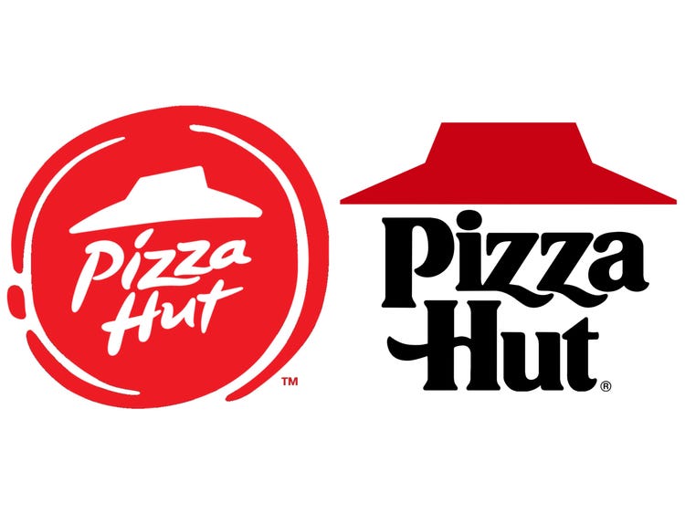
Pizza Hut
Pizza Hut won customers over with this logo redesign by keeping all the elements of the original design that made it special. It incorporated all the signature aspects of the business’s brand identity that made it unique while using modern design trends for the logo. Mainly, the logo cut down the number of colors that were used in the design and opted instead to use all red. This was a smart redesign on the brand’s part and one that they executed well.
Summing It Up
A brand redesign is far from easy and not a task that should be taken lightly by any means. When we’re thinking about redesigns and what you can do to ensure that yours isn’t a flop, taking a look at what some of the greatest redesigns have been can help. Above we talked about some of the best redesigns that we’ve ever seen and what made them successful. These rebrands were received well by customers and turned out to be the best redesigns we’ve seen.


