

Every few years we see the business industry experience a variety of changes, one of these being big brands updating logos, some that they’ve had for decades. 2021 has seen an especially unique and fun variety of logo updates and redesigns, with major companies like Burger King deciding to redesign their logos. One of these major logo redesigns has been Pfizer’s new logo, the first major logo change for the company in over seventy years.

The rebrand itself isn’t news, in fact, the company has been working on a rebrand for nearly two years. However, the rebrand was put on the backburner last March when the company had to shift its focus on the vaccine. Initially, the company was having focus groups and gaining input from their doctors, nurses, and employees, so everyone’s focus needed to be on the vaccine going forward.
“As it became clear we had a highly effective vaccine that was going to be a game-changer, we moved very quickly to finalize this work because it was the last chapter in the book, not the first,” Sally Susman, chief corporate affairs officer at Pfizer.
We’re all familiar with the old logo; having seen the familiar light blue pill with ‘Pfizer’ inside. The new logo has decided to completely forego the pill and instead opt for a cleaner and simpler look. The new logo still includes a large part of the company’s past, representing it by keeping the name included in a familiar font as the one before. The company also managed to represent the future by including what they call a ‘ribbon helix’ to the left of the name.
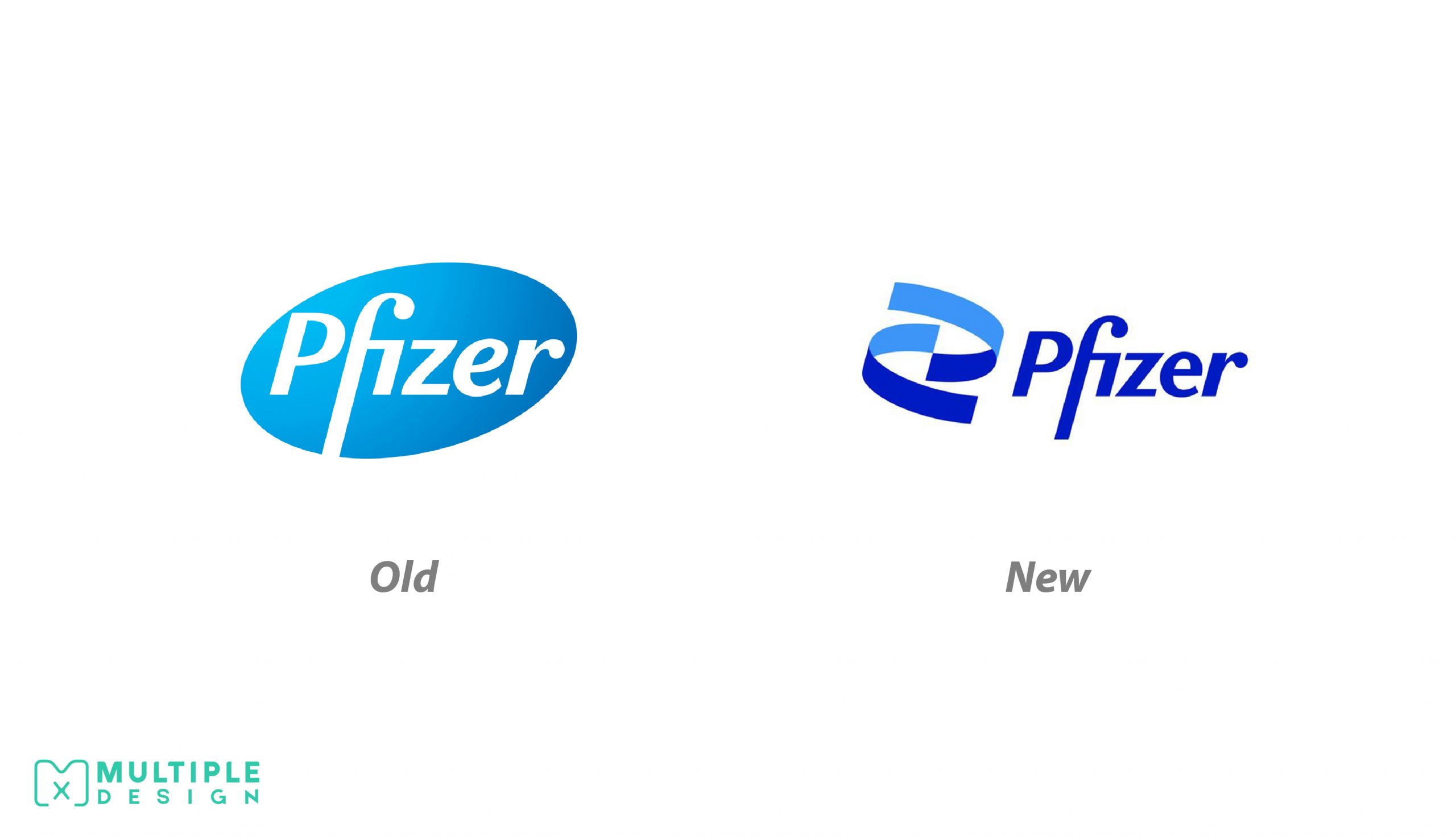
This part of the logo is supposed to represent the gene-based technology that was used behind Pfizer’s COVID-19 vaccine. This logo has faced mixed reviews from the public, some claiming that the logo is too corporate and that Pfizer didn’t put the effort in. Others say that, although the logo may not win any design awards, it does the job and is meant for a corporate company.
In addition to these changes, Pfizer has also decided to change their color scheme. The eight-color palette has been simplified to a mere two-tone color scheme. Not only is this simpler, but it’s easy on the eyes and makes for easy branding colors. The logo took a total of 18 months from the design agency Team.

“You don’t change your look just because you want to be different,” says Susman.“It doesn’t work and can appear superficial and shallow. But I’m confident in this change because we are a science company and we are pursuing breakthroughs, and the vaccine is just the most recent example.”
Although Pfizer’s new logo may not be the most exciting of the year or the most intriguing one, it can’t be denied that the logo gets the job done. Pfizer seems confident in its new brand identity and the public’s opinion doesn’t seem to phase them.


