
- We’re all familiar with the famous Apple logo, but how many of us know the history behind it?
- The Apple logo is a great place for graphic designers to seek inspiration and see amazing designs to inspire them
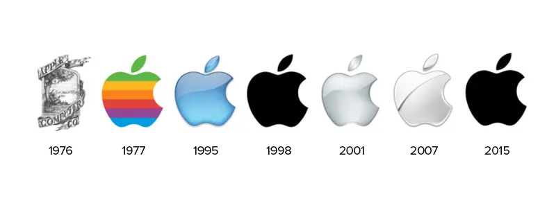
- Let’s take a look at the Apple logo through the years and where it began compared to where it is now
Nearly all of us are familiar with the apple with a single bite taken out of it that’s shown on electronics around the world and has established itself as one of the greatest logos of all time. After all, this logo has been hugely influential for not only businesses and the public, but graphic designers as well. Looking at what brands did to establish a strong business by using a compelling graphic design is sometimes exactly what graphic designers need to create stunning logos themselves. If you’re a graphic designer that needs some inspiration for your next logo design project and are thinking that the Apple logo may be a good place to start, we’re here to help.
In this article, we’ll show where the Apple logo began and what changes it’s gone through since its very first rough sketch. Just as any other company, Apple wasn’t always the large corporation that we see it as today. It also came from humble beginnings and its logo began as a mere sketch idea that turned into much more. Let’s take a look at the Apple logo through the years.
The Apple Logo Through The Years

The First Apple Logo
Back in 1977 was when the first Apple logo was attempted and the first idea was illustrated by Ronald Wayne. This design was an actual illustration in black and white, exactly as you would see it in a book. The designer was attempting to incorporate the company name into the design by showing Isaac Newton sitting underneath an apple tree and rolling hills behind him. This logo was far from perfect, largely since the logo merely just wasn’t realistic for branding purposes. The logo may appear okay on other branding material (a restaurant menu or a beer can) but it wasn’t suitable for electronics. Fortunately, Steve Jobs saw this as well and the logo didn’t stay long.


The Apple
Steve Jobs soon realized that the illustration wouldn’t work for his products, since scaling it down would make it impossible to distinguish and it would appear too detailed. He wanted something more fresh and straightforward, something that could distinguish the company instantly but also would work well as a symbol on his products. This was when he reached out to Ron Janoff and asked him to create an original app design. Janoff designed the logotype in two weeks and gave Jobs a much cleaner logo. He worked to trim down the details and instead show a single apple with a bite taken out of it.
In 1977 the logo was shown in rainbow-colored stripes, which many related to the LGBT community. But these color choices were more related to computers than they were anything else. The only reason that the order of the colors had any significance was due to that Jobs requested that green is at the top since that’s where the apple’s leaf was. The bite taken out of the logo was simply so that the logo wouldn’t be confused with any other fruit such as a cherry. The bite gave the apple logo personality and helped it to stand out in a world flooded with unique logos.
Through The 2000s
For the most part, Apple stayed consistent with Janoff’s design through the rest of the 1900s. Although they experimented with some translucent ideas towards the end of the century, there were no real substantial changes made to the logo after the apple with the bite taken out of it was designed. Through the 2000s marked a period where Apple experimented with different colors, glosses, and shines. The logo switched from the black apple in the early 2000s to a glossy silver color.
That logo stayed with the company for nearly six years before the company decided that it needed some more detail and gave it a shiner look. In 2014 they decided to completely get rid of both the silver color choice and the glossy idea. Instead, they decided to go back to the cleaner and more modern idea from the early 2000s. The logo went back to the black logo, a cleaner and simpler look for the brand. Nowadays the logo appears in a few different colors depending on what it’s shown on.
Summing It Up
As a graphic designer, seeking inspiration from well-known logos that have ruled our world and brands that have established themselves as strong parts of our world is crucial. Reflecting on what logos have failed and what have been successful is a part of knowing what areas of design you want to focus on. The Apple logo is a great example of a brand that went through many changes and came out with a beloved logo that we all love to this day and is famous.


