

- We may not be at the end of the year yet, but there have still been a variety of amazing redesigns this year
- Let’s take a look at some of the best logo redesigns that we’ve seen this year and those that have been the worst
- These include iconic redesigns this year like the Amazon Shopping Logo, Burger King’s New Redesign, and Planter’s new logo
Although it may be a little soon to start looking at the collection of logo redesigns from this year, it isn’t too early yet to start talking about which ones have been successful and which ones have failed us. There have been several incredible logo redesigns this year that have completely blown us away with companies launching new, stylish, and modern logos to give their brand a fresh look. Every year there’s a variety of redesigns, some being the best change that a company could make while others being one that the public reminds them was their worst move.
We see bad logos every year, but this year has been different in terms of truly horrible logo designs that we’ve seen. A logo is single-handedly the most important part of any brand identity and one executed poorly can be the worst mistake for a company. While many brands tweak their brand identity with little notice given, a bad logo can leave a lifelong impression on a brand. Once you launch a bad logo, there’s no going back.
In case you’re wondering what brands completely failed at redesigning their logos and what brands killed it and amazed us, we’ve collected them all for you! This article will talk about all the best and worst logo redesigns so far in 2021.
The Best And Worst Logo Redesigns Of 2021
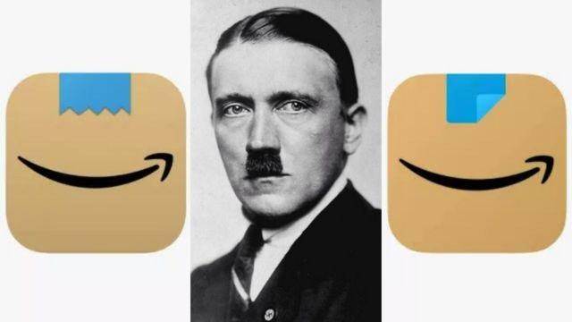
Amazon Shopping Logo
This was one of the first logo design changes of this year and one that left jaws on the floor and social media going crazy. Amazon subtly changed its logo at the beginning of the year and users were quick to stare their opinion on the new logo. Users were quick to criticize and say that the new logo, a brown parcel with jagged blue packing tape at the top and the swooping black arrow, looked similar to Adolf Hitler.
The original logo was a shopping basket with the Amazon logo above it. People claimed that the new jagged tape along the new logo resembled a toothbrush mustache, worn by Adolf Hitler. Amazon has since then updated the logo to change the jagged tape to straight tape folded over in the bottom corner. This was one of the biggest flops this year and is one that we don’t see people letting Amazon forget soon.
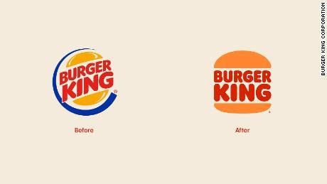
Burger King Logo
Burger King’s redesign was one that not only surprised everyone this year but also gave the traditional fast food brand a lift. This was Burger King’s first redesign in over twenty years and it was meant with praise from the public, with people quick to share their thoughts on social media with what they thought of the new logo. The new logo takes a modern turn on the original Burger King logo, including big mac colors and giving the logo a fresh look.
The restaurant name is shown in between two buns and the colors used in the logo are brown, red, yellow, and orange. Although the logo was the biggest aspect of the company that changed, it wasn’t the only aspect that received drastic changes. All of Burger King’s brand received a redesign, including fresh new employee uniforms and packaging for the products. The new branding has received praise from the public for the new logo and is by far one of the best redesigns that we’ve seen this year.
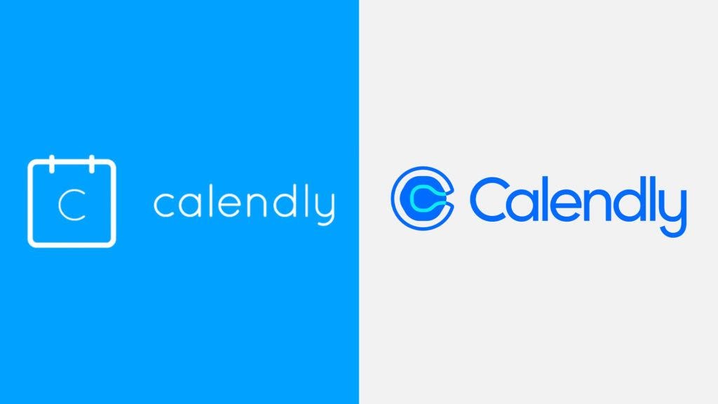
Calendly Logo
Another brand that launched a brand new logo design that took us by surprise was the new Calendly logo that came out this year. Although this logo received a lot of mixed feelings from the public, the consensus was that the new logo was not Calendly’s greatest decision. The original logo showed a calendar with a simple c in the middle and the company name to the right of the logo. The new logo is not only modern but it was also simplified and cleared up the clutter.
The new logo uses a capital ‘C’ for the name and, next to the company name, a big ‘C’ is shown. This is where the criticism came from and where the public began to talk on social media. Many people commented on the new logo and said that there was a strong resemblance between the logo and a toilet. Allegedly Calandly paid $1.5M for their new logo and users on Twitter quickly took to shaming the company for spending that much on the new logo. This was one of the biggest logo redesigns failures this year.
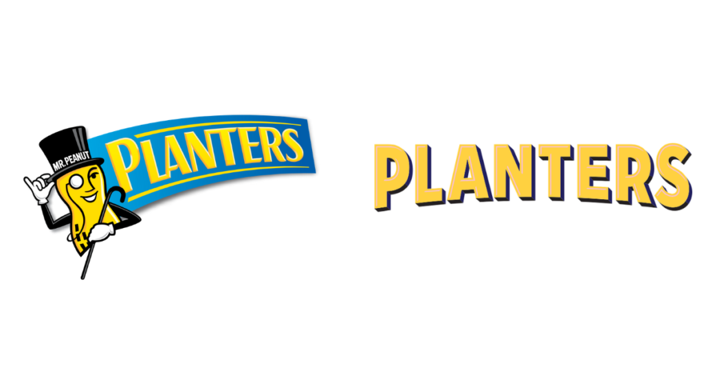
Planter’s New Logo
Another surprising rebrand this year was when Planter’s decided to rebrand their 115-year-old brand for the first time in decades. Along with a fresh new logo to speak for their brand, Planter’s launched a completely new campaign this year that blew the public away. During the Superbowl last year the iconic Mr. Peanut was killed off, only to be revived this year better than before.
Although the brand received many changes, the biggest was the changes made to the famous Mr. Peanut. It may appear at first that the new Mr. Peanut is the same as he’s always been, but small details have improved him greatly. This is one of the better redesigns of the year so far and has impressed the public greatly. Out of all the redesigns that we’ve seen this year, this one has been one of the greatest.
Wrapping Up
2021 isn’t over and we’ve already seen a variety of redesigns from iconic brands. Some of these designs have been absolutely killer and amazed us, while others have fallen short. Amazon’s Shopping Logo redesign and Calandly are two examples of what you do not want to do when you’re redesigning. On the other hand, Burger King and Peanuts are two examples of what you want to keep in mind when you’re working on your rebrand. We expect to see many more amazing (and not so amazing) rebrands in the future, which can always help us learn something new about branding!


