

Budweiser still remains one of the top-selling beer brands in the U.S., but the brand has had a long rich history far before then. Anheuser–Busch, the parent company of Budweiser, has been around since the 1880s.
First created in 1876, the Budweiser logo has changed around 15 times. Starting with a more elegant, script-like written label with predominant colors of red and white, and accents of gold and black, the logo has made many transformations before becoming the bold and modern red and white logo it is today.
The Origin Of Budweiser
Adolphus Busch was born in July of 1839 in the small community of Kastel near Mainz, Germany. After years of schooling, along with working in his father’s lumber yard followed by a shipping house in Cologne, Busch decided he wanted to pursue greater business opportunities in America. In 1857, he made the move to St. Louis, Missouri.
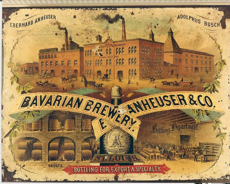
Just 5 years prior, George Schneider, German saloon operator and brewer opened a brewery in South St. Louis called the “Bavarian Brewery.” At the time, there was very little beer in the area because only a few German settlers resided in the area prior to the 1850s. He saw some success in the following years, opening an additional location in St. Louis. In 1857 – the same year Busch moved to America – Schnieder began facing financial struggles at his breweries and was forced to sell. In 1860, the brewery was sold to William D’Oench and Busch’s father-in-law – Eberhard Anheuser – and by 1869 Anheuser became the brewery’s sole owner.
One day in 1876, Busch decided to join his father-in-law, taking over 50% of the St. Louis, Missouri, brewery. Although his skill set was not in beer and brewing, his trade and sales skills allowed him to find bargains and judge brewing supplies.
Alongside his father-in-law, Busch created the Anheuser-Busch brewery in hopes of perfecting a recipe that would combine European brewing traditions with an appeal to the American palette. Additionally, Busch was no stranger to marketing tactics. By the 1880s and 1890s, Busch had already begun an extensive marketing strategy sending out free bottle openers, corkscrews, pocket knives, calendars, and more to promote the Budweiser brand and get their logo out into the world. The plan was a success and the company had to quickly expand to keep up with the demand.
The Creation Of The Logo
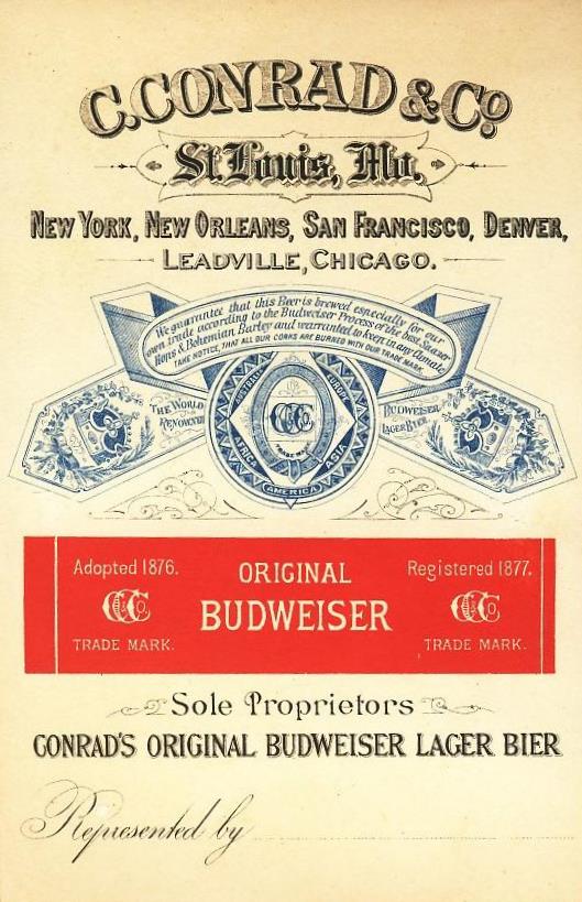
Although nobody knows for sure, the Budweiser logo is believed to have been created by Carl W. Conrad, a friend of Adolphus Busch. He is also credited with helping to develop the recipe for Budweiser beer. Conrad was an importer of wine and liquor in St. Louis.
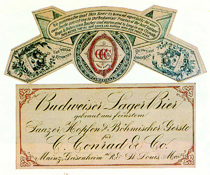
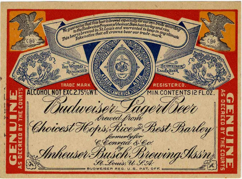
In 1876, Conrad, who was also a German immigrant, teamed up with Busch to help him with the development of a “Bohemian-style” lager beer inspired by beers from the town of Budweis (now České Budějovice) in Bohemia. Conrad registered three trademarks in 1878 – “Carl Conrad & Co.”, “CC&Co”, and “Budweiser” – which appeared on the early paper labels for their beer. The earliest Budweiser labels featured the “CC&Co” monogram logo, with serifs or embellishments on the “C” letters, along with the German and English text describing the Bohemian ingredients used.
Early bottles produced for Conrad were etched with “ORIGINAL BUDWEISER/C. CONRAD & CO.” written on the side and had the CC&Co monogram on the base. After Conrad declared bankruptcy in 1883, Anheuser-Busch acquired the rights to the “Budweiser” name and trademark, though Conrad’s monogram remained on labels until around 1910. While Adolphus Busch is credited as the founder of Anheuser-Busch, it was Conrad’s partnership and trademark registrations that helped establish the iconic Budweiser brand name and its early logos/labels featuring the CC&Co monogram.
The King Of Beers
Although there are a lot of important aspects to the Budweiser logo, there are two key elements that continued to shape its appearance over the years – the “The King of Beers” slogan and the bow tie design.
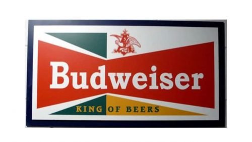
First, Budweiser traces its name back to the Czech Republic town of Budweis. It was the first nationally distributed beer and at the time draught kegs and glass bottles were the only packaging formats available to brewers. At first, Budweiser was primarily sold in bottled form unlike the common can form we see today, making the original slogan “King of Bottled Beer.”
This helped further define the Budweiser brand. Before prohibition began in 1920, the slogan was first changed to “King of All Bottled Beers.” The slogan was changed again to the “King of Beers” in the mid-twentieth century as aluminum cans became a more popular form of packaging and that slogan has stuck ever since.
The Bowtie
Although the bowtie on the many variations of the Budweiser logo is often seen as a way of adding a more classy and sophisticated appeal, it actually began appearing in advertisements in 1956 when the beer more frequently began to be referred to as “Bud” as it was ordered at the bar.
In order to emphasize the full name and get people to look at the brand again in a new more distinguished way. The bowtie has remained one of the more memorable aspects of the changing logo over the years and continues to be strongly associated with the brand – so much so that in 2013, the company even began releasing a new can style that not only had the iconic bowtie printed on it but was shaped like it too.
The Budweiser Logo From 1876 -1987
The Budweiser logo has gone through many transitions over the years. Many variations of the original logo have stayed over the years, including today. The very first logos were based on the seal’s coat or arms and included many words in cursive lettering. In the center of the “coat of arms” was the Carl Conrad & Co monogram logo, which remained in these more traditional label variations until 1910 when it was changed to the Anheuser-Busch monogram logo.
Budweiser also began creating simpler variations of their logo in 1936, where instead of the predominant red and blue colors, the brand created a circular logo that was predominately black and white with an eagle and red capital “A” in its center, followed by red text reading “Lager Beer” below. The eagle represented Budweiser’s commitment to quality, strength, and its deep roots in American culture and tradition. This variation only lasted until 1947 as the brand tried more bold and non-cursive fonts for its simpler logo variations and began incorporating more red again into the overall design. However, a similar black and white circular design did reappear in 1948 and the eagle and red capital “A” design made several reappearances in logos throughout the years.
The Budweiser Logo From 1955 -1987
In 1955, Budweiser had gotten increasingly experimental with its logo.
Instead of stocking with only red, blue, black, white, and occasional gold, the brand started incorporating more colors into their logos, as well as new shapes.
Starting in 1955, it made a logo that featured a more abstract background using different shades of blue, yellow, and green.
They strayed away from the cursive font and added diamonds and circles in the background.
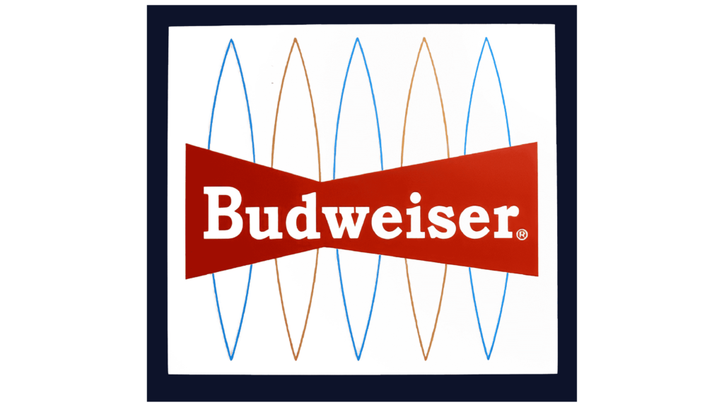
This would only last until 1957, however, when it would then be replaced with a more tame variation with triangles making up the geometric shapes in the background in green and yellow. Mostly notability, this was also the first logo where the brand introduced its iconic red bowtie surrounding the bold white letters of “Budweiser.”
The Budweiser brand continued their experimental backgrounds for a little longer, with another variation in 1961 featuring a more fun background to the bowtie with contours in blue and gold, and in 1963, the logo was reduced to something that looked completely different. A bold serif typeface spelled out the name “Budweiser” in red, purple, and green, looking more similar to the “Google” logo that was created in the 1990s.
This was also very short-lived. By 1968, the brand reverted back to its original colors and the iconic bowtie which has remained in almost every short logo variation since.
The Budweiser Logo From 1968 – Today
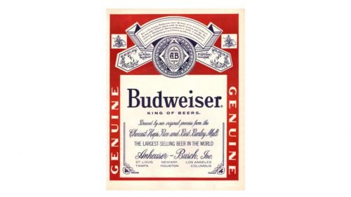
In 1987, Budweiser created a more simplified and easy-to-read version of its very original label logo back in 1876. This logo also used eye-catching red, blue, and white colors and included designs showcasing a crown, hop leaves, and a shield emblem. Very similar to the 1945 label logo, this logo also features phrases such as “This is the famous Budweiser beer” and includes the tagline, “WORLD’S LARGEST SELLING BEER.” At the bottom reads the manufacturing company’s name “Anheuser-Busch, Inc., St. Louis, Mo., U.S.A.”
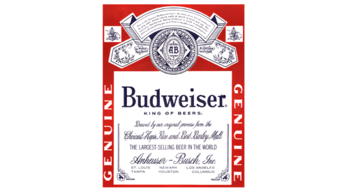
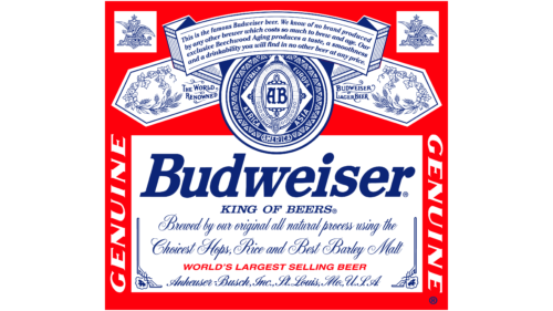
Two more variations of this label would be made in 1999 and finally in 2017, which is the same label that is used today. The most recent 2017 version jumped back in time, making the logo look more traditional again, with less vibrant colors, more text, and proudly still displaying the “KING OF BEERS” tagline, Anheuser-Busch logo, and many of the more original illustrations.
As for the shorter logo, there were only two more times the logo was created without using the bowtie – once from 1996-1999 when the brand did another complete redesign with new extra-bold italicized serif typeface lettering and more colors, and then again in 1999 where it was reduced to just a cursive written “Budweiser” in bold red lettering. The 1999 version is also still used today.
One other logotype is still used today by the brand, and that is the final bowtie logo variations which were created in 2016 and in 2020. Some of the previous versions of the bowtie logo, like the 1999 and 2011 versions, also tried to incorporate more color and experimental elements, such as a 3D aesthetic and added a crown in the divet of the top of the bowtie.

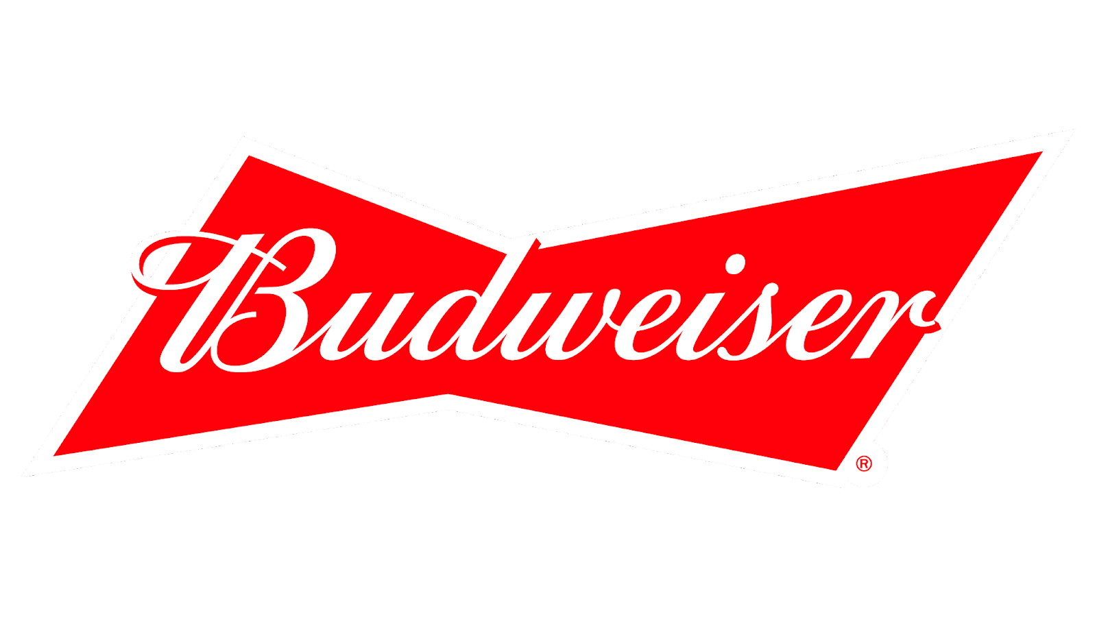
Its final 2016 version is a simpler version of the other bowtie variations that were made throughout the years, with a red-filled bowtie background with cursive text spelling out “Budweiser.”
This logo combined modern designs with its old-style script typeface, encapsulating its years of rich history while staying relevant to modern times. In the final 2020 version, which is also still used today, a less bright red is used for the bowtie background, and the lettering for “Budweiser” once again put in a more minimalist non-cursive typography.
What We Can Learn From The Logo
The Budweiser logo shows a huge evolution of branding, adaptation, and the power of consistency. As one of the longest-standing beer brands in the U.S., Budweiser’s logo journey reflects the company’s commitment to innovation while staying true to its heritage. Some key takeaways from their evolution include:
- Embracing Change – Throughout its history, Budweiser has undergone numerous logo changes to reflect shifts in design trends, consumer preferences, and marketing strategies. This willingness to evolve demonstrates the brand’s adaptability and responsiveness to the changing times.
- Maintaining Core Elements – Despite the various iterations, certain elements of the Budweiser logo have remained consistent. Even if at some points they were removed, many resurfaced, such as the iconic red and white color scheme, the Anheuser-Busch eagle logo, and the bowtie motif. By preserving these core elements, Budweiser has maintained brand recognition and continuity across generations.
- Blending Tradition with Modern Times – Over the years, Budweiser has skillfully balanced tradition with modernity in its logo designs. While honoring its rich heritage, the brand has embraced contemporary aesthetics and design trends, to make sure they stayed relevant in the competitive market.
- Telling a Story – Each iteration of the Budweiser logo tells a story. One thing the logos have consistently done is reflect the brand’s history, values, and aspirations. From the early coat of arms-inspired designs to the modern, minimalist renditions, the logo serves as a visual narrative of Budweiser’s journey and evolution.
- Consistency – Despite the evolution of its logo, Budweiser has maintained consistency in its brand messaging and identity. The tagline “King of Beers” and the emphasis on quality and heritage have remained constant even after all its other experimental phases.
The transformation of the Budweiser logo showcases how the brand has successfully adjusted to the evolving landscape while staying true to its roots. Without its logo, the future of the Budweiser brand may have looked very different than it does today. As we trace its journey from the past to the present, the logo continues to act as a symbol of Budweiser’s lasting impact and iconic status within the beer market.


