
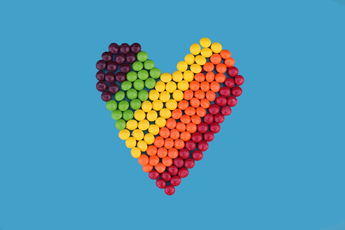
- Although the trend in recent years has been towards simple and modern logos, many successful brands are identified by their brightly colored icons and logos.
- Colors can evoke emotions, send a message, and immediately connect the viewer to a brand.
- It’s not just the bright classic red of the Coca-Cola can that works when it comes to colors that stick in the mind of the consumer. We’ve gathered five examples of color-forward branding that works.
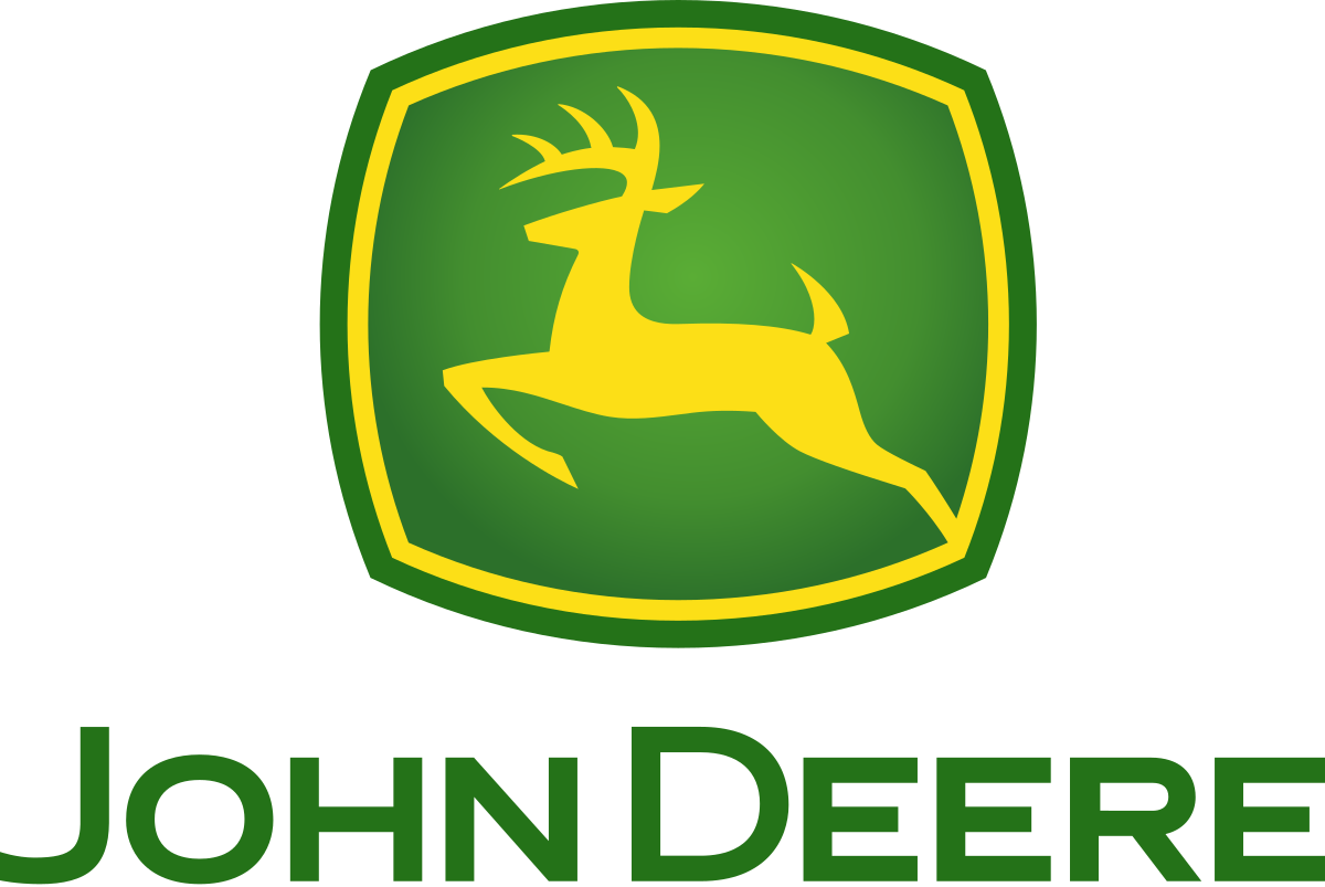
John Deere
John Deere’s logo is immediately recognizable because of its colors. It features a bright yellow stag leaping on a green field with a yellow border. When you take a close look at the logo, you’ll notice that the deer is leaping from the ground and into the air. This suggests moving forward and making progress, which the company intends to continue doing for a long time.
What really makes the John Deere logo stand out is its colors. The two simple bright colors of green and yellow evoke nature, sunshine, and when you combine them, the success of a good harvest. The color choices make sense considering that John Deere’s products aim to help farmers succeed.
Domino’s Pizza
Now that we’ve looked at one brand that uses yellow, let’s take a look at the two other primary colors: red and blue. In the US and other countries, when red and blue are used together they immediately evoke a sense of patriotism. Red, white, and blue feature on many flags and can create a sense of pride and belonging.
This might have been the founder of Domino’s intention when he came up with their simple and boxy logo, but the history is unclear. One fact is certain: the franchise founder included three dots in the logo to represent the three original stores that the founder established in the first five years of business.
The bright red and blue are cheery colors that, in combination with Domino’s white dots, might have been intended to make viewers think of how the company belongs to the country, and therefore people who purchase from the company also belong to the broader country.

Taco Bell
It’s basic color theory that when you mix red and blue, you get purple, which has been one of the mainstays of Taco Bell’s logo for quite a while. For years Taco Bell featured a brightly-colored logo with purple, pink, and yellow, as this photo indicates. Now the brand has moved to a simpler, more modern design that uses only white and a gradient purple.
While the new design does utilize fewer bright colors, purple on its own is still a bold statement. However, the quieter colors of Taco Bell’s new logo present as more muted and tame, and less active and exciting than Taco Bell’s longstanding pink, yellow, and purple logo.

Home Depot
Home Depot stores are really warehouses, but the original founders and the branding guru they worked with didn’t want to name the company “Home Warehouse.” Instead, they decided to use “depot,” or a place where large quantities of things are deposited.
Depots store products shipped in crates, which used to be labeled with stencils rather than the printed boxes or labels that we’re used to today. The founders of Home Depot decided that a stencil wordmark was the right choice to represent their store.
But why use a white stencil on an orange background? Typically, orange brings up negative connotations like prison and construction work that causes bad traffic. Orange is not commonly used as the main logo color, although it can be seen as a secondary color in many logos.
Well, the founders of Home Depot embraced the bright warmth of orange from the get-go. They and their branding advisor decided that orange signaled action, and because their stores helped people actively fix problems in or improve their homes, they decided their logo should embrace that association of action.

Pizza Hut
Similar to Taco Bell, Pizza Hut used to boast a bright logo with several different colors, but it has now embraced a simple logo that keeps only the brightest color: red. For years Pizza Hut’s logo also contained a splash of green for the dot over the “i” in pizza, which reminds the viewer of green peppers that many people love on their pizzas. It also used to have a bright yellow line that looked like a paint brush swipe underlining “Hut,” and might have made viewers think of cheese or may have evoked a sense of the sun and happiness, as yellow often does.
While two of the colors (green and yellow) were removed and the wordmark font was changed, the Pizza Hut logo still is topped off by its famous red “hat,” which was a design element chosen to match the popular architecture of the time when the company first really began to take off. The simplicity of only using two colors, the red hat and the black wordmark, keeps Pizza Hut moving right along with the logo trends we see today.
In Conclusion…
John Deere, Domino’s Pizza, Taco Bell, and Pizza Hut are all companies with logos that featured, for many years, more than one bright color. Modern logo designers might shy away from following these companies and using more than one bright color in the name of minimalism. However, there are plenty of successful companies (like Google) who use bright colors in their logos and are still perceived as extremely modern.


