

Every year we see amazing redesigns from companies that have decided to give their company a refresh in the new year. We’re over halfway through the year and already we’ve been surprised with some of the greatest rebrands yet. There’s no denying that this year the design industry has been packed with action, with some of the biggest companies coming out with legendary logo rebrands. Let’s take a look at these redesigns and see what prompted these companies to change their brand!
Burger King

Quite possibly what has been the greatest redesign of the year and the one that shocked most people was the Burger King rebrand. The new logo brought back the familiar nostalgia minimalist look with their whopping rebrand that seems to be dominating this new decade. Burger King decided to go back to an older and more nostalgic look for their first rebrand in over 20 years.

This modernized version of Burger King’s old logo is retro and has a warm vibe, similar to its old classic look and feel. Burger King didn’t only give their logo a new look, but their entire brand got a new refresh. Although some elements of the brand have taken longer to roll out, we’re seeing all areas of the brand improved with their new signature look. This rebrand was well received by the public and some have even declared it the best logo redesign of the year.
GM
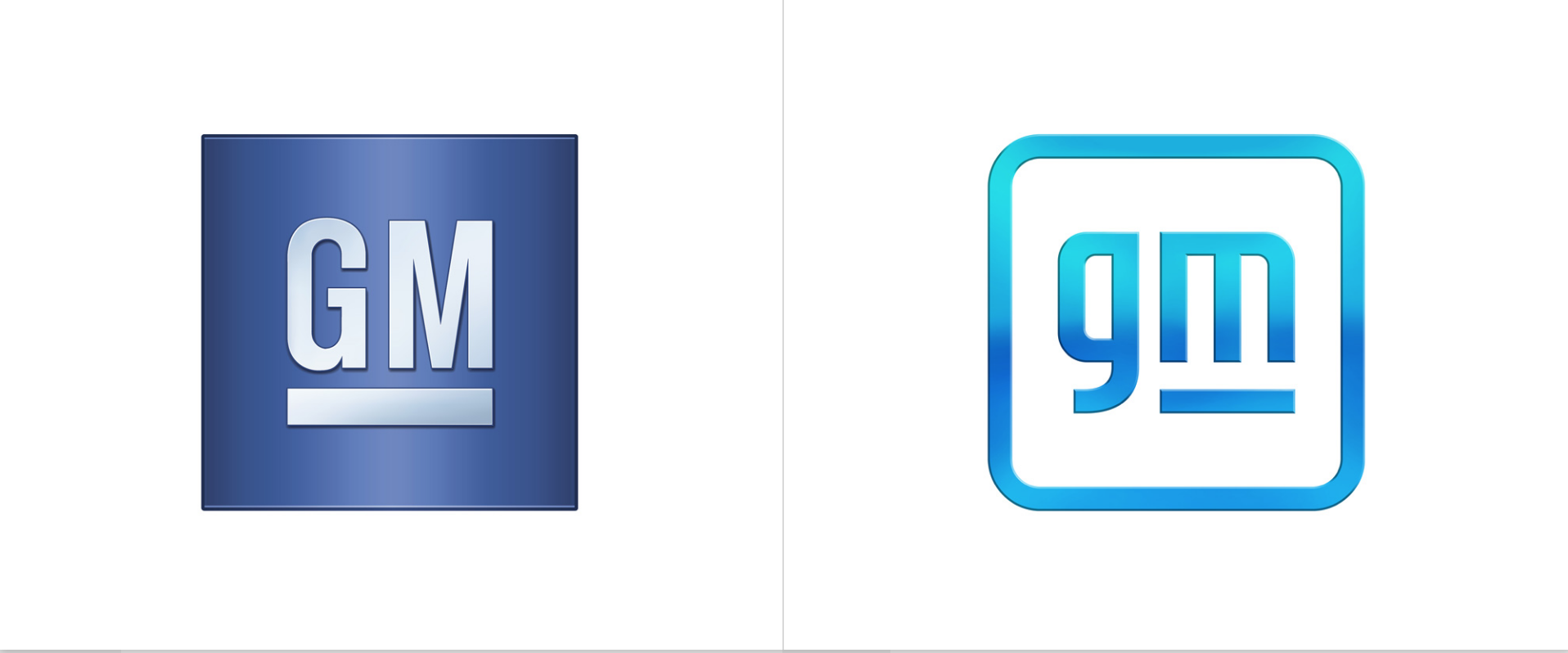
GM was along with many other car brands that have been updating their brand recently to adjust to a new era. This new era is that of electronic cars and more digital concepts being included in the motor car world. GM decided to redesign its logo to be flatter, sleeker, and more modern than before. GM decided to make what were previously uppercase letters lowercase and used a gradient for the logo.
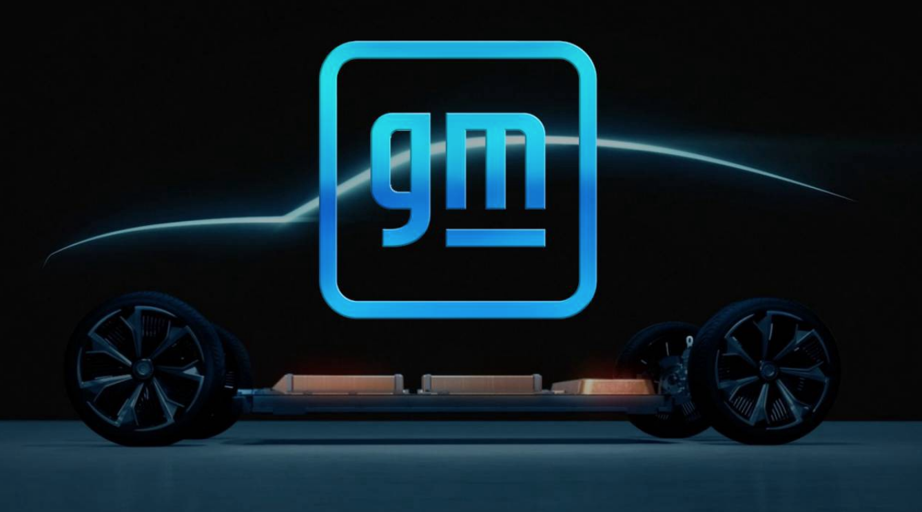
This logo redesign was received with mixed feedback from the public. The ‘m’ is underlined, leaving some to wonder if there may be a hidden meaning behind the new logo. The logo has a more vibrant color palette, using a few different blues in gradient to create a vibrant impact at first sight. Although we can’t tell for sure the history or meaning behind the logo, we do know that it had quite an impact on this year’s design industry.
Planters
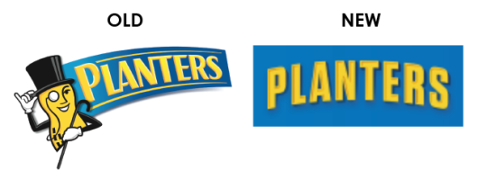
For many, this logo redesign came as a shock since Mr. Peanut has been around for as long as many of us can remember. Planters decided to kill off Mr. Peanut in 2021 and aim for a more modern and signature look for their brand instead. The beloved Mr. Peanut leaving may have come as a hit for some, but it ultimately had to be done to give the brand the lift that it needed heading into the new decade.
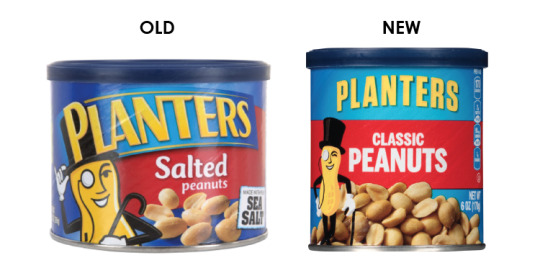
This is a difficult thing to do when you have a signature part of your brand that is what makes you memorable and different. Planters took on the challenge of establishing a brand that was still recognizable despite killing off existing elements of their brand and executed it very well. Without losing the nature of the brand, this logo is confident, fun, and conveys the signature look of the brand.
Warner Brothers
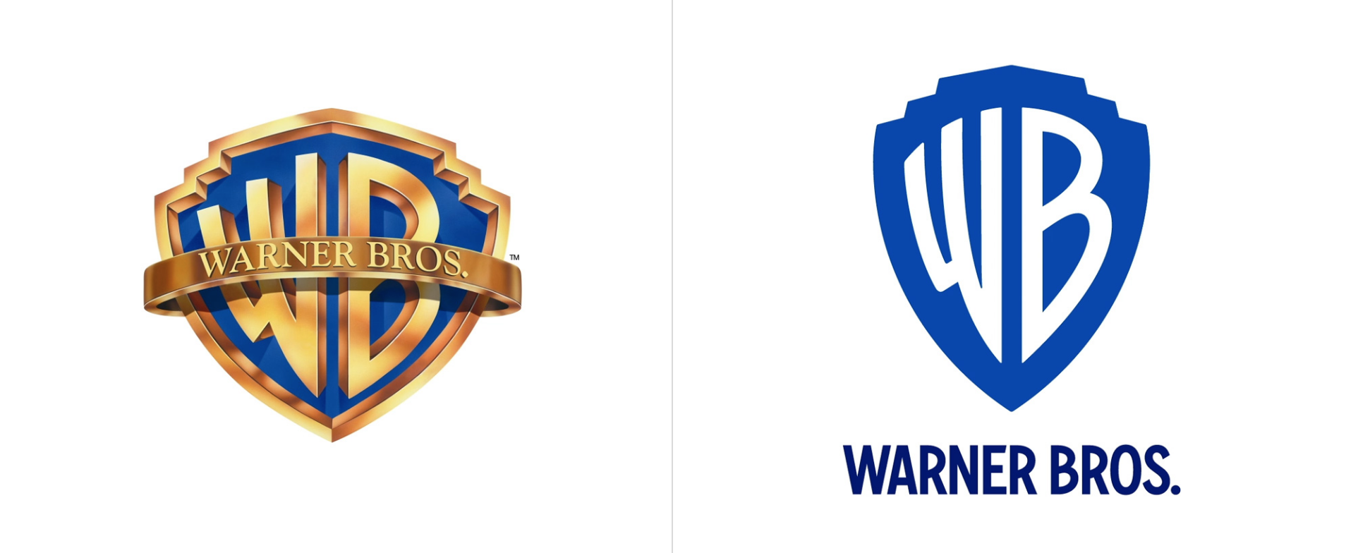
The idea of the new WB logo was first shown in 2019 and two years later the new logo officially appeared on screens. The new logo first appeared at the start of a show called Locked Down, although slightly different than the logo that WB showed in 2019. The logo went through a few changes from the original one shown in 2019, opting for a touch of 3D included in the logo.
The letters and the edge of the shield were the two elements that were affected the most in the logo. The edge of the shield and the letters both had metallic silver added, with the signature blue for the shield. Fans loved the new logo, thinking that the signature elements were kept while enough was changed that it was improved.
The White House

With the new president came a new logo for the White House. At the beginning of the year, President Biden’s administration team decided to do an overhaul of the original White House website and give it an upgrade. Although at first glance the most obvious change might be the colors in the logo, there were other changes that are more subtle made to the logo.

Subtle details to the architecture were made to the logo. Details were added to the pillars and windows, the new logo meant to reflect the goals of the new president and his administration team. The goal was to convey that although our country will be looking forward, there will still be traditional roots of the past. This logo was one of the greatest logo redesigns this year and received well by the public.


