
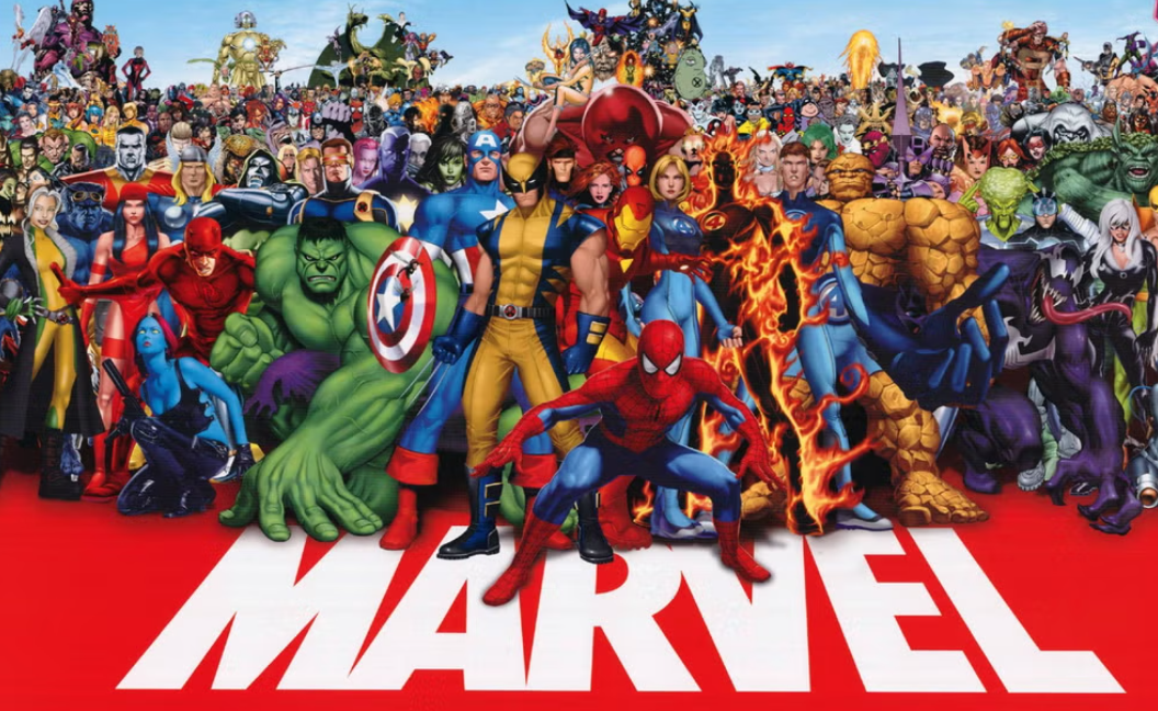
In pop culture, few names hold as much weight as Marvel. This empire has captivated audiences worldwide for decades with its epic storytelling and iconic characters.
Yet, there’s more to Marvel’s success than just the stories and superheroes – their logos have played a pivotal role in establishing their brand identity and leaving an indelible mark on our collective consciousness.
Here, we delve into the ten best Marvel logos of all time. We’ll also unravel what makes a Marvel logo exceptional and what designers can learn from the creators behind these legendary symbols.
The Marvel Universe Empire
Before we dive into the intricate details of Marvel’s iconic logos, it’s essential to understand the scope of the Marvel Universe empire. Marvel, officially known as Marvel Entertainment, LLC, is an American entertainment company renowned for its vast array of comic books, superhero films, animated series, and merchandise. Founded in 1939 as Timely Publications and later known as Marvel Comics, it has transformed into a global multimedia juggernaut.
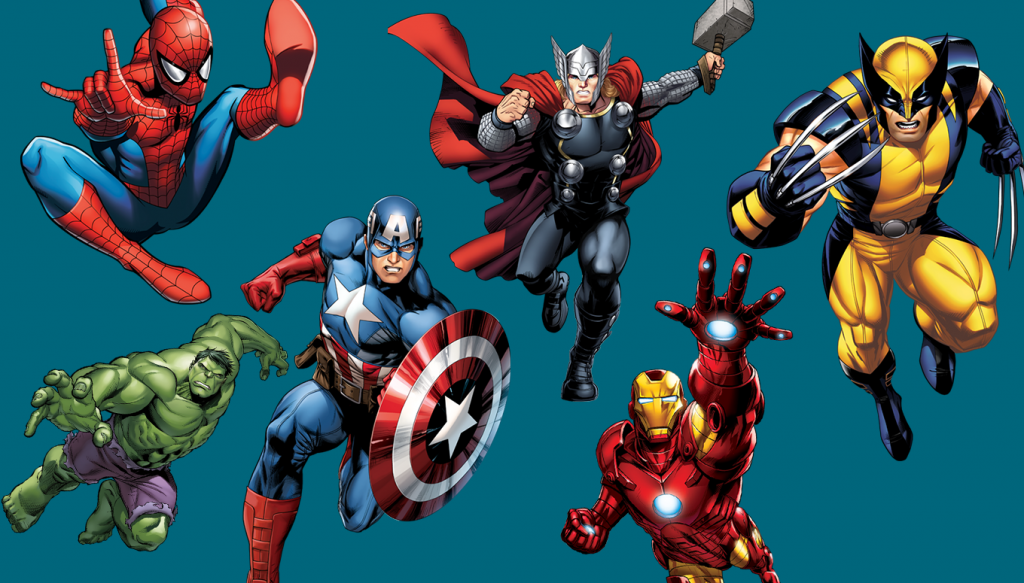
Marvel’s roster of characters reads like a who’s who of superheroes, including Spider-Man, Iron Man, the X-Men, the Avengers, the Fantastic Four, and the Incredible Hulk, among many others.
These characters have transcended the comic book pages to become cultural icons, earning Marvel legions of fans worldwide. Behind the scenes, visionary creators such as Stan Lee, Jack Kirby, Steve Ditko, and countless others have sculpted this rich tapestry of superheroes.
Marvel’s journey from a small comic book publisher to a multimedia conglomerate is a testament to its enduring appeal. Central to this success is the role of logos in building and reinforcing the Marvel brand. These logos are more than mere designs; they are symbols that embody the essence of Marvel’s storytelling, imagination, and larger-than-life characters.
These logos serve as a visual celebration of beloved characters making their way to the big screen, seamlessly blending cinematic grandeur with their comic book origins. Look at the Marvel logos that have graced our screens and won our hearts!

Iron Man
First up is the Iron Man emblem, which marked a pivotal moment for Marvel as it released its inaugural in-house film in 2008. The design masterfully bridges the gap between past and present, paying homage to the original comic logo while infusing it with a gritty, photorealistic metallic texture.
The fonts are from the future; the edges are sharp and have sparks of color. But there’s more to it than meets the eye. Iron Man’s logo symbolizes redemption, renewal, sunlight, and rebirth.
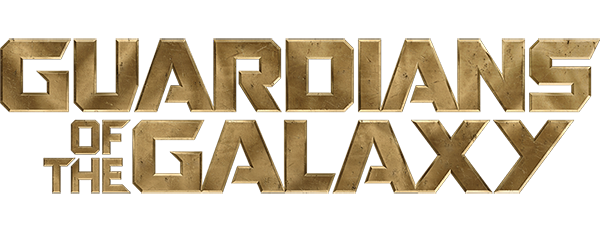
The Guardians of The Galaxy
The Guardians of the Galaxy comics brought a unique and zany flavor to the Marvel universe, endearingly blending fun, irreverence, and absurdity. When the announcement came for a big-screen adaptation, fans were understandably anxious. Could Marvel successfully translate this distinctive comic essence to film?
As it turns out, they more than delivered. The movie proved to be a massive hit, captivating both die-hard comic enthusiasts and mainstream audiences, thanks in no small part to its breathtaking visual effects. The logo for this film retained the core style seen in previous Marvel movie logos but added a twist.
Its worn-metal appearance and slightly rugged lettering complemented the narrative of a dysfunctional and uproarious crew of space pirates. This creative adaptation of the Marvel logo style perfectly captured the essence of the film.
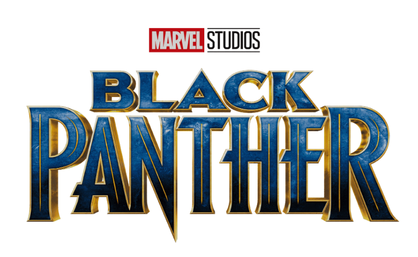
Black Panther
In 2018, Marvel achieved another milestone with “Black Panther.” This groundbreaking film featured a predominantly Black cast. It garnered universal critical acclaim, making history as the first superhero movie ever to earn a nomination for Best Picture at the Oscars.
The film’s logo boasted sleek lines and precise geometric elements, aligning with the advanced technological theme throughout the movie. It also resonated with the story’s focus on a concealed African kingdom, exuding regality and grandeur. The logo’s 3D presentation, with the ‘P’ and ‘R’ subtly pushed forward and the striking ‘N’ thrusting into the foreground, instilled a sense of dynamism and purpose, mirroring the film’s compelling and uplifting storyline.
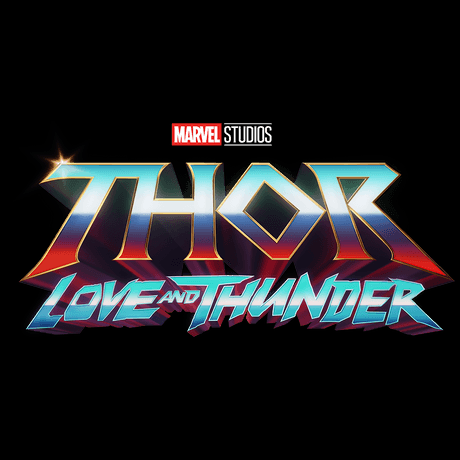
Thor Love and Thunder
While the Avengers series concluded, the Marvel cinematic universe continued its epic journey with the release of “Thor: Love and Thunder” in 2022.
This film, marked by its delightful extravagance, harkened back to the glorious days of 1980s and 90s Marvel cartoons with its vibrant and colorful exuberance. In all its playful splendor, the film’s logo offered a tantalizing glimpse of the sheer enjoyment awaiting audiences.
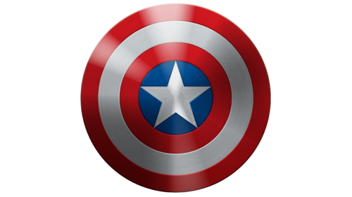
Captain America
Captain America, undoubtedly one of Marvel’s most iconic superheroes, embodies the ideals of justice, patriotism, and the relentless pursuit of the greater good. Within the ranks of the Avengers, he stands tall as one of its central figures, alongside Tony Stark (Iron Man) and the formidable Hulk. The Captain America logo is a powerful symbol, mirroring the hero’s renowned shield, which stands as his weapon and emblem throughout the comic book and cinematic universe.
The emblem features the stars and stripes of the American flag, further reinforcing Captain America’s deep-rooted association with the spirit of the USA. This emblem, rich in meaning and symbolism, has become an enduring representation of heroism and unwavering dedication to noble ideals.
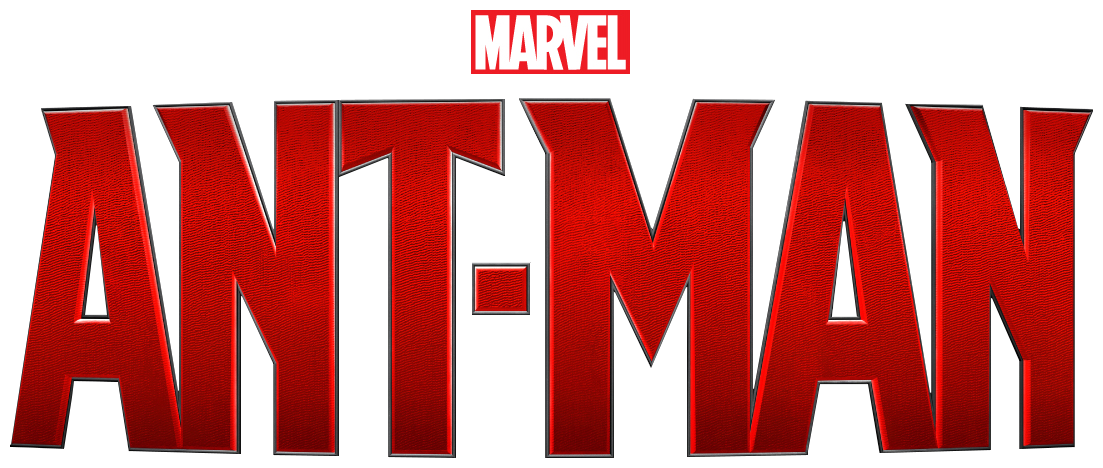
Ant-Man
The logo employed for the first Ant-Man film marked a significant departure for Marvel, venturing into more playful design territory. While it retains the prominent block letters typically associated with Marvel movies, it introduces a distinctive element of innovation. The letters in the logo have a subtle stretching effect at their center, a design choice that mirrors the character’s ability to manipulate his size.
Ant-Man, portrayed as capable of colossal growth and minuscule diminution, finds representation in this logo’s creative visual metaphor. This emblem captures the essence of the superhero, where size is both a superpower and a source of storytelling intrigue, making it a notable departure from Marvel’s traditional logo style.
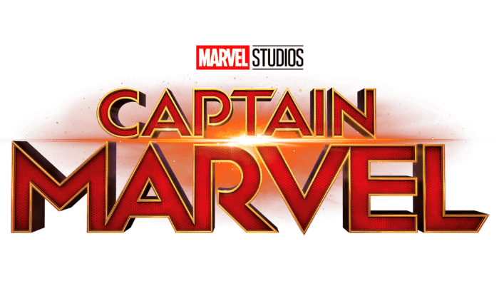
Captain Marvel
The release of the Captain Marvel movie marked another significant milestone in Marvel cinematic history, as it became the first to feature a female lead. Set against the backdrop of the 1990s, the film showcased an array of astounding technology and cutting-edge graphics that enthralled audiences. In terms of logo design, the emblem makes a deliberate stylistic choice.
It employs a slightly retro typeface, evoking a sense of nostalgia while embracing a classic color palette of bold red and gold. These colors harmoniously align with the prominent hues in the character’s iconic uniform. The logo’s backdrop, reminiscent of a cosmic explosion, is a powerful visual reminder of the character’s cosmic abilities and the vastness of the Marvel universe.
This thoughtful fusion of design elements pays homage to Captain Marvel’s comic book origins and effectively encapsulates the character’s enduring appeal and formidable presence within the Marvel cinematic landscape.
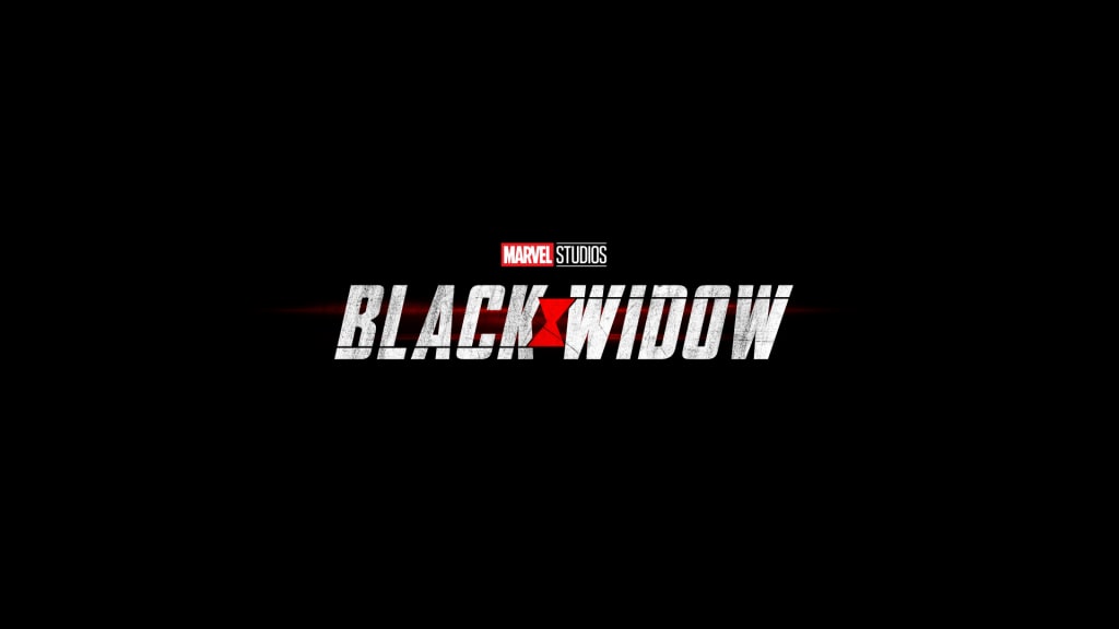
Black Widow
The Black Widow movie provided fans with a unique opportunity to delve into the untold origins of the iconic Avengers character. The film’s release followed the character’s demise in the Avengers series, adding depth to her story. The emblematic Black Widow symbol is at the heart of the film’s branding, a visual representation of the character’s enduring legacy.
The movie’s logo design, in particular, is a striking blend of aesthetics that encapsulates the essence of the enigmatic Black Widow. In a slightly textured, bold block lettering style in jet black, the wordmark stands out as a bold and edgy representation. This deliberate design choice mirrors the character’s persona, accentuating her mysterious and multifaceted nature.
Weaving these design elements together, the Black Widow movie logo pays homage to the character’s rich history. It captures the essence of her complex and compelling journey, making it a standout emblem.
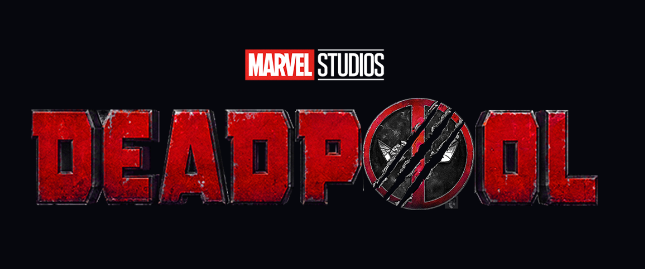
Deadpool
The Deadpool logo is iconic, embodying the character’s humor, unpredictability, and anti-heroic inclinations. It encapsulates the darker and edgier facets of the Marvel Comics universe. Incorporating a striking red and black color scheme, the Deadpool logo prominently showcases the character’s name in bold lettering above an image of his masked visage.
This visage is partially obscured by bars, creating a metaphor for confinement and suppression, hinting at the character’s struggle to contain his true nature. This design carries profound symbolism, mirroring Deadpool’s dual identity as a hero and an anti-hero.
It signifies the delicate balance between his darker, often violent tendencies and his underlying morality, his desire to do what’s right. The bars in the logo symbolize the rules and limitations that restrain him, preventing a full release of his formidable powers and the embrace of his darker impulses.
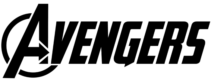
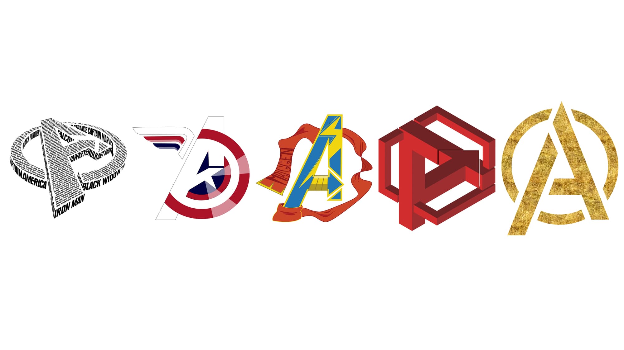
The Avengers
While the Marvel logo for the Avengers films may have felt fresh to many, die-hard Marvel enthusiasts instantly recognize its lineage, mirroring designs from the comics. Rooted in what insiders referred to as the ‘Big A,’ characterized by its forward-thrusting arrow, this emblem saw its genesis in the hands of Marvel’s esteemed letterer, Gaspar Saladino, and first graced print in 1972. The cinematic adaptation of the logo took the ‘A’ to the next level, ensconcing it within a circular frame to add dynamism.
The word ‘The’ is slanted forward, adding propulsion. These enhancements, coupled with a metallic texture and sharper contours at the tips of ‘G’ and the two ‘E’s, yielded a pixel-perfect design. This icon remains remarkably consistent, scarcely requiring alterations in subsequent Avengers films.
What Makes a Good Marvel Logo?
The Marvel logos have left an indelible mark on popular culture, but what sets them apart? What makes a good Marvel logo? Several vital elements contribute to their success:
Distinctive Typography
Marvel logos often feature bold, custom-made typography that is instantly recognizable. The choice of fonts and letterforms conveys the brand’s personality.
Iconic Symbols
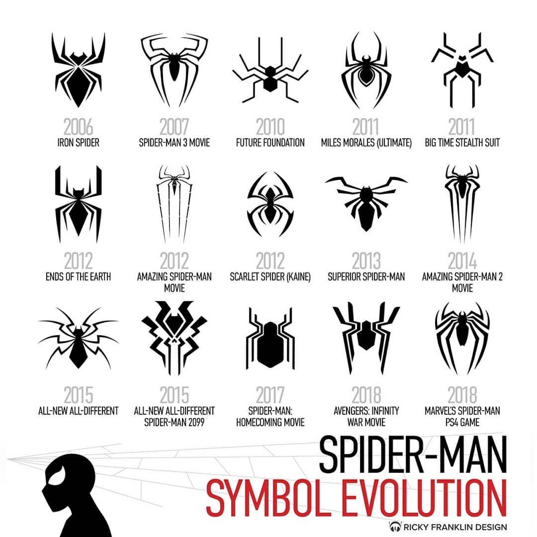
Many Marvel logos incorporate iconic symbols, such as Spider-Man’s web or the Avengers’ “A.”
These symbols instantly connect with fans and symbolize the characters they represent.
Adaptability
Marvel logos have demonstrated adaptability over the years, evolving to suit the changing times and media.
This flexibility allows them to remain relevant in different contexts.

Color Psychology
The choice of colors in Marvel logos is deliberate. Red symbolizes action and energy, while blue conveys trust and reliability.
These colors evoke emotions that resonate with audiences.
Storytelling
Marvel logos are not just static designs; they are storytellers in their own right.
They convey the essence of Marvel’s storytelling, often about ordinary people becoming extraordinary heroes.
Lessons from Marvel Logo Designers
The creators behind Marvel’s logos have invaluable lessons to offer designers and branding experts:
Embrace Evolution
Marvel’s iconic logos have evolved remarkably over the years, a testament to the brand’s commitment to remaining relevant and at the forefront of pop culture.
This journey through design is a valuable lesson for all designers, highlighting the importance of embracing change and continuously adapting their creations to mirror the ever-shifting landscape of culture, technology, and audience preferences.
Symbolism Matters
Symbols are powerful communicators. A well-designed symbol can convey complex ideas and emotions, creating a solid connection with the audience. They are not limited by language barriers, making them a universal means of expression transcending words.
Typography Is Key
Typography plays a central role in logo design. Customized fonts can make a logo unique and memorable.
Use Color Psychology
Colors have psychological effects on audiences. Designers should choose colors that align with the brand’s message and values.
Storytelling Through Design
Logos are not just visuals; they tell a story. Compelling logos encapsulate the essence of a brand’s narrative and create an emotional connection with the audience. Marvel’s logo history is a testament to design’s profound impact on brand identity and pop culture.
It’s evolved from early blocky typography to today’s sleek designs, adapting to cultural shifts, tech advances, and changing audience expectations.
A good Marvel logo balances distinctive typography, iconic symbols, adaptability, color psychology, and storytelling. Marvel’s logos are more than graphics; they inspire and ignite our extraordinary potential.
Marvel’s iconic symbols embody characters’ traits, values, and bravery. They’re cultural touchstones, igniting heroism in fans worldwide.
When you see these emblems, remember they’re not just symbols; they represent characters and ideals, urging us to make a lasting impact on the world.


