When it comes to social media, there are platforms that are universally used across the globe. One of those platforms is Facebook, and its logo has become a big part of the brand.. Since its inception, the Facebook logo has always maintained a simplistic design. The wordmark is in a white lowercase font on a blue background for the majority of its iterations.
So, where did the logo come from and how have small changes updated the design to make it more technology and mobile-friendly?
Let’s discuss this famous social media company and go through an overview of the evolution of its simple but memorable logo.
If you haven’t seen the film, The Social Network, we’ll give you a kick low-down on how the Facebook brand came to be. Facebook was born out of a college dorm room, but not just any college – the prestigious, Harvard University. It was long before Facebook caught the attention of people all over America and grew to be a social media powerhouse. Today, Facebook clocks in with more than two billion users that regularly use the platform. Below we look a little bit closer on how this brand grew to social media domination.
About Facebook
What makes Facebook unique is that it was one of the first social media platforms to catch on. Facebook’s simple logo started as the company began to grow from its own humble beginnings as well.
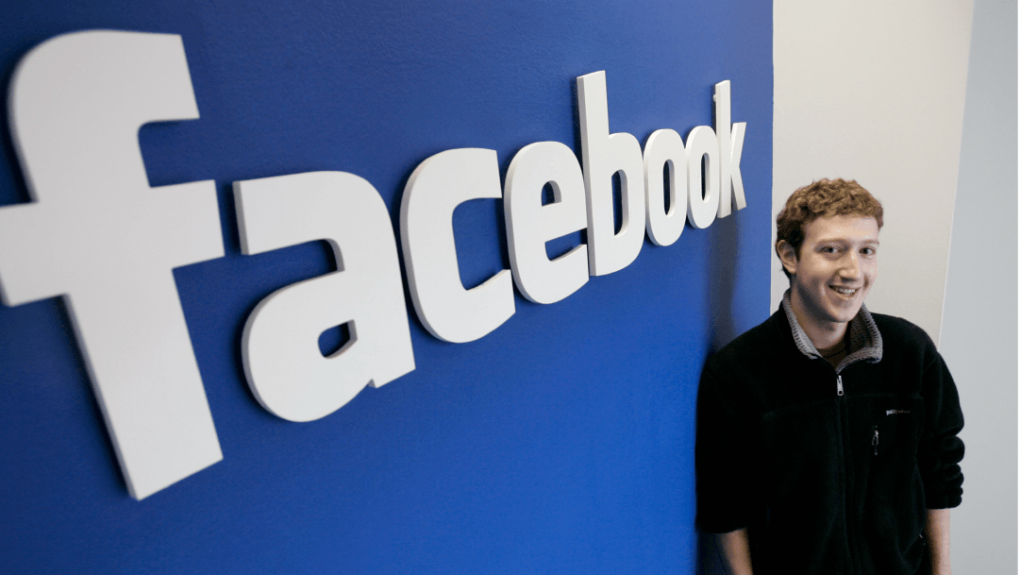
We already noted that Facebook started in a Harvard dorm room but who were those students? The most well-known student is the Facebook CEO we still associate with the brand today, Mark Zuckerberg. During his sophomore year at Harvard, Zuckerberg came up with this idea after a night out. Before Facebook was named “Facebook,” the platform was originally called “FaceMash.”
The site would allow students at Harvard to rank side-by-by pictures of fellow students based on which one was more attractive. These types of ranking sites were popular during that era, but it was caused quite the scandal at the university. Harvard was not a quick supporter of the website. Rather than supporting this website, Harvard removed the website and considered expelling Zuckerberg from the college. With this, Zuckerberg knew he needed to quickly pivot his idea. This led him to build a website that served as an online directory of current Harvard University students, allowing fellow students to find their classmates. He deemed it “TheFacebook.” Just six days after launching, Zuckerberg’s site drummed up even more controversy.
According to the tale, three fellow students accused Zuckerberg of pretending he would assist them with the construction of the site HarvardConnection.com. They stated that instead, he stole their ideas and used them for his own benefit, essentially plagiarizing their concept.
Like his first attempt at a website, this second idea was also critically reviewed. Instead of it being reviewed at the University level, the college newspaper, the Crimson, investigated these allegations. While this unfolded, TheFacebook grew in popularity on campus, with more than 50% of current Harvard College students signing up for a profile.
Like other technology websites and platforms, Facebook started small, only rolling out on Harvard’s campus initially. Once TheFacebook grew in popularity on Harvard’s campus, Zuckerberg decided to roll it out to Yale, Stanford, and Columbia’s campuses. Shortly after that, he opened them again, this time to all ivy league schools. This was only the beginning though. Like Harvard, these schools took a liking to the platform and once it grew in popularity on those additional campuses, Facebook was rolled out to other schools in the United States and throughout the world.
As Facebook grew, the company needed to solidify leadership. Facebook became an incorporated company in 2004 and named Sean Parker the President of the company. The next year, in 2005, TheFacebook became simply, Facebook. Also in 2005, Facebook took the steps to purchase the Facebook domain we still use today for the price of $200,000.Facebook went through its first IPO in 2012 and since its entrance, Facebook has continued to perform well in the markets.
Just like Facebook’s early days, Zuckerberg wasn’t immune to conflict as the company grew. Throughout the 2010s, there was increased concern and speculation with how the company used its user’s data. This investigation and speculation resulted in Zuckerberg testifying in front of Congress. In Zuckerberg’s testimony he addressed this head on and discredited any claims that Facebook abused private user data and other claims such as Facebook influencing the 2016 presidential election.
These controversies hasn’t been able to take down the company and today, Facebook is a social media powerhouse, acquiring several important social networks, including Instagram, WhatsApp, and Messenger, to become the overarching Meta.
As the company has changed from Facebook, Inc. to Meta Platforms, Inc. it has leaned into the embracing of growing technology and seeks to expand “the metaverse.”
Where has the logo come into play over the years through the course of the company’s expansion and success?
Let’s take a look.
Facebook’s Logos Through the Years
While Zuckerberg and Parker were the brains behind the brand, one thing they didn’t excel in was design. Mike Buzzard, from Cuban Council, was hired to design Facebook’s iconic logo.
. As you look at Facebook’s logo evolution below, you’ll notice that the logo never drastically changed, until Meta was conceptualized.
Facebook’s logo inspiration
As Buzzard set out to design Facebook’s initial logo, Buzzard was inspired by the font, Klavika. With this font as the source of inspiration, Buzzard and his team, Eric Olson and Joe Kral, set out on designing.
As Buzzard set out to design Facebook’s initial logo, Buzzard was inspired by the font, Klavika. With this font as the source of inspiration, Buzzard and his team, Eric Olson and Joe Kral, set out on designing.
Facebook’s logo color has always been a shade of blue. This color was the vision of Zuckerberg. For those who aren’t aware, Zuckerberg suffers from a form of color blindness, so it was important to Zuckerberg for the designers to choose a color he could see clearly. This color blindness caused colors like red and green to be eliminated.
Blue is supposed to be much easier for those with the condition to identify.
As we noted above, Facebook’s logo never went through an extensive redesign. The credit for this goes to Buzzard and his team because they designed a logo that worked in the early days and still works today.
The Facebook logo is a very distinctive symbol and focuses on the wordmark. Even its smaller icon form, used to represent the app in stores and other situations, has changed very little and has stuck with the simple letter f in white against the familiar blue.
Now, let’s look at variations of the logo icon Facebook has used over the years and how it has changed since its beginnings as FaceMash.

The Original FaceMash Logo (2003-2004)
)The first attempt at creating a social website by Zuckerberg was called “FACEMASH.” As you know, this wasn’t truly a precursor to Facebook, but it start the wheel turning. Before Buzzard and his team were hired, Zuckerberg had created a logo that was font focused, just like later logo versions. FaceMash was written in white, uppercase letter and sat against an elongated red rectangle.
Blue Appears from 2004 to 2005
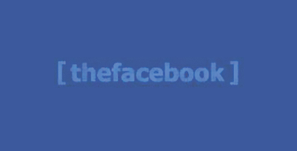
From there, big alterations were made not only to the site but the logo. Rather than incorporating images into the logo, Facebook focused on the brand name even during these early years when Facebook was called “TheFacebook.” The corresponding logo was this blue lowercase font enclosed in a darker blue rectangle. The company name appeared as one word and the company name boldly sat in the rectangle box.
The Logo from 2005 to 2015
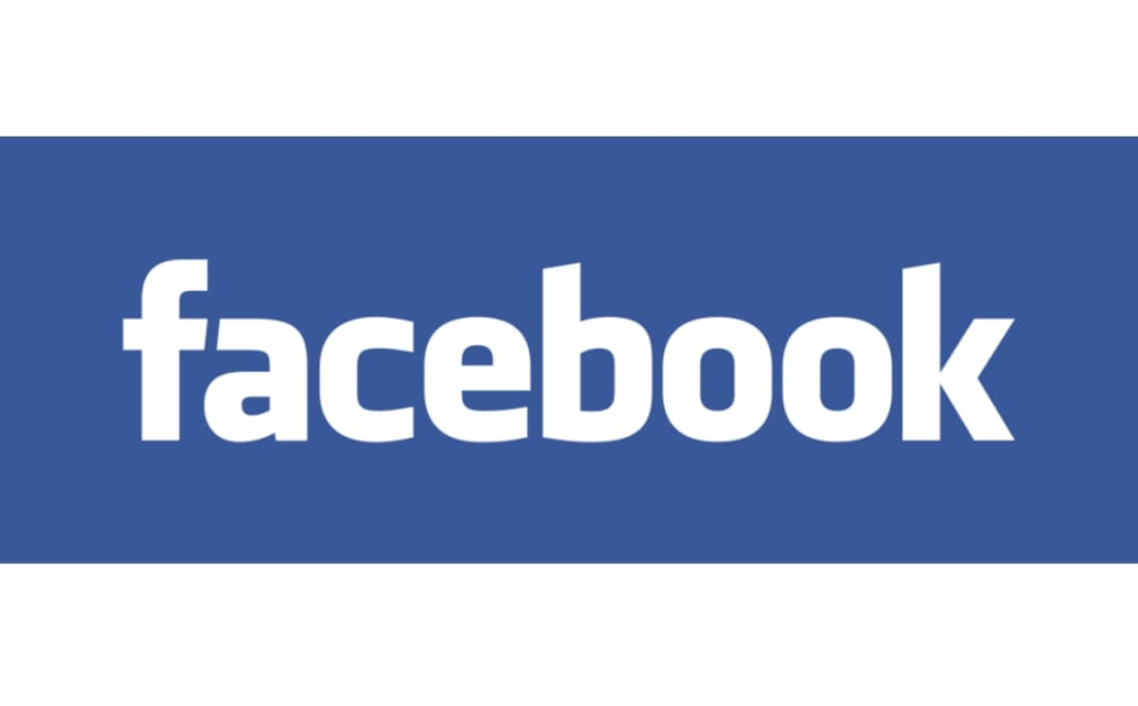
It was a crucial year for the social network. This was the year that the Facebook URL was purchased and with the URL now belonging to the brand, Facebook was able to go through a full redesign. Not it was officially facilitated and perfected. The first part of the redesign was removing “The” from the name, and this new Facebook name was rolled out on the website. The font was enlarged and switched to white so that the wordmark was more attention- grabbing and, as stated, easy to read. The wordmark also changed in scale, filling nearly all of the blue rectangle. From here on, the logo would stick with a rectangular, simple format of the two primary colors. This period of Facebook was the period when Facebook transitioned from being a college dorm room idea to an entire business operation. The wheels were set in motion with this shift once Microsoft purchased shares of the company. This woke up Zuckerberg and his team and they took the steps to not only make their company more business-centric but took the steps to ensure the logo represented this as well. The Facebook logo was updated to be a white, lowercase font that was placed on a blue square box. This new logo was a simpler version that allowed for easy brand association for users.
The Current Facebook Logo (2015 – Present)
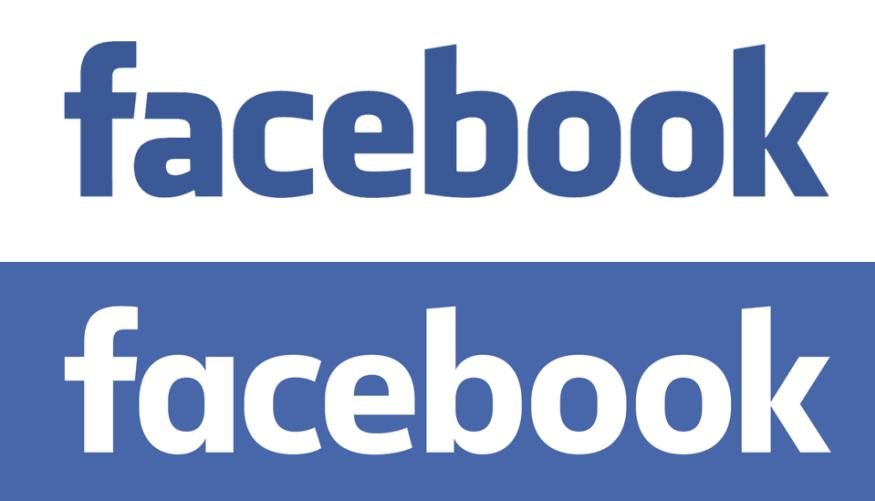
It wasn’t until 2015 for a new Facebook logo to be rolled out. Just like the earlier versions, they only used the wordmark, “Facebook,” and corresponding colors. The changes to the logo were so minor that without a close look, the updates can be missed.
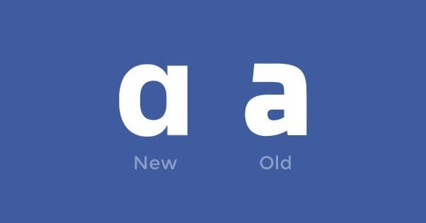
When viewers look closely they can see that the letter “a” and “b” are completely different. The logo now has a greater intra-letter clearance. The company also created a black-and-white version of the logo to be used in conjunction with the typical blue.
As the brand continued to expand, Facebook thought creatively about its logos. One creative move that the company made was in 2019. It was this year that Facebook thought about how its logo was displayed on mobile devices and ultimately decided that the logo needed to stand out more.
The decision that resulted was to make the logo a brighter blue. Beyond this color choice, Facebook’s design team was conscious of how much smaller these mobile and smart devices were from a standard computer screen. As a result, the design team elected to simplify and enhance the logo, so it was scalable, no matter the device.
If you look at changes to this app icon, you may not notice any changes at first. Given how simple the app logo was (it only included a single, lowercase “f”), the designers decided to play around with the placement of the letter to update the app logo. Instead of staying in the middle of the blue, rounded square, the “f” was placed on the lower right-hand side slightly.. The lower part of the f reached the edge of the icon, causing the design team to rethink what colors the logo should consist of.
This icon wasn’t updated again until 2013 when the 3-dimensional features of the logo were scaled back. The “f” itself moved even more to the right, but this wouldn’t be the final stop either.
The current icon logo is a circular blue shape with the lowercase f contained within it. The blue used also matches the bright version of the wordmark logo that is used for mobile devices and was introduced along with it in 2019.
The Meta Logo
The new Meta logo debuted in 2021, and the idea behind it came from a desire to make its visual branding simpler and showcase the brand’s utilitarian values.
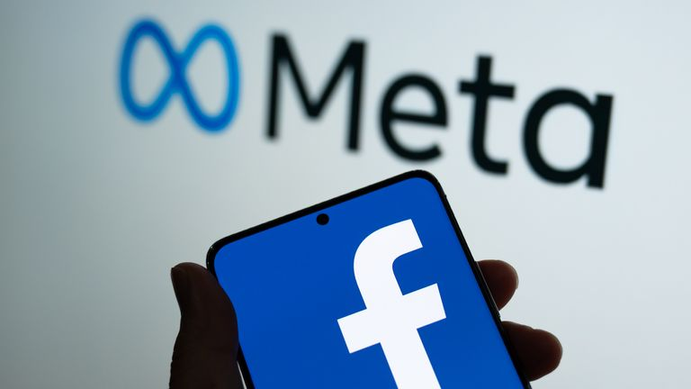
Facebook, Inc. changed its name to Meta Platforms, Inc., often just referred to as Meta, and switched over to an infinity-style loop logo that resembles the letter M.
This symbol was designed to look good no matter where you’re seeing it and draw attention to the new iteration of the company’s innovation and simplistic appeal. The design also holds with the modern austere design trend.
Facebook Logo Key Elements
There are a few things that have been updated since the logo’s creation, but most of creative logo decisions have remained the same. The most significant parts of the logo are detailed below.
1. The Wordmark
The simple wordmark of the company name has been a staple of the logo design since the days of FaceMash. Facebook, and even “thefacebook,” has been the heart of the logo with not much else going on. From the full logo to the icon, the letters and the word are the staples of the logo.
2. Facebook’s color choice
Even though the logo has gone through minimal updates, one thing has always remained consistent – the logo color.
The shade of blue varied from time to time, but blue was always used because it was a color that Zuckerberg could see despite his color blindness.
Since 2004, Facebooks’s official symbol is the iconic rectangular shape and its connection to color.
However, there’s a lot of speculation, and many don’t support The New Yorker’s claim that it was Zuckerberg’s vision impairment that prompted the company to select the blue background. Regardless, the blue has been a constant for years.
Additionally, when it comes to marketing, color theory states that they can influence a customer’s purchasing habits. Colors, even those ties to a brand, can be associated with an emotion, and one study concluded that nearly 90% of impulsive buying decisions can be based on color perception alone.
Additional research has looked at the effect of particular colors on a brand’s reputation, and some theorists and marketers state that certain colors work better for certain industries.
For instance, makeup, retailers, construction, and fashion brands frequently showcase black in their logos, packaging, and branding materials. Green is often connected to food, health, environmental, fitness, and education industries.
Blue is often seen as neat, spacious, and connected with technology. From Facebook to LinkedIn, high- tech companies across the globe use this color in their brand visuals. In fact, the color is almost synonymous with technology, which could make any decision to steer away from blue a poor one. Even the new Meta logo is a shade of blue.
The darker blue of Facebook’s logo is Celtic Blue, whereas the Meta logo also includes two additional blue shades – Azure and Gunmetal.
3. Facebook’s font choice
Facebook has a customized, unique font developed just for the brand. Despite that though, the font is based off a common font we find, the Klavika font. This distinctive but simple font has remained with the brand with few changes since its branding as Facebook.
The choices Facebook’s design team made regarding its logo were intentional. For the font, the decision to use a lowercase typography was an intentional one and helped to convey the business culture. Facebook is a relaxed business and office setting, which this lowercase typography helped to convey.
Facebook is a platform for easy entertainment and the ability to informally connect with family, friends, and acquaintances across the globe. So, having an understated wordmark can showcase that well. The company can convey part of its messaging regarding the website’s atmosphere quickly through the lowercase font.
The lettering in the new Meta logo is a full-size sans serif. It is smooth, even, and easy to read. The typeface sits somewhere between the Nexa Text Bold and Carmen Sans Semi Bold fonts.
Conclusion
Facebook’s logo is simple, only consisting of two things – a blue color and a stylized font.
The company has only altered minor details, including sizes and shadings, in the years since it first started using the Facebook wordmark, including “thefacebook” wordmark.
When it comes to its logo, the company flaunts simplicity as the key to its visual identity and hasn’t altered what has been a winning design.
Even as the brand changes and updates to become Meta, the individual logos of the branches within the organization remain. Facebook, Instagram, Whatsapp, Messenger, and Oculus all showcase their unique logos under the Meta umbrella, and as the new AR/VR side of the company grows, it’s unlikely that they will mess with a design that’s stood the test of time.
Whatever the future holds, the Facebook blue and lowercase wordmark will likely stick right along with it.

