
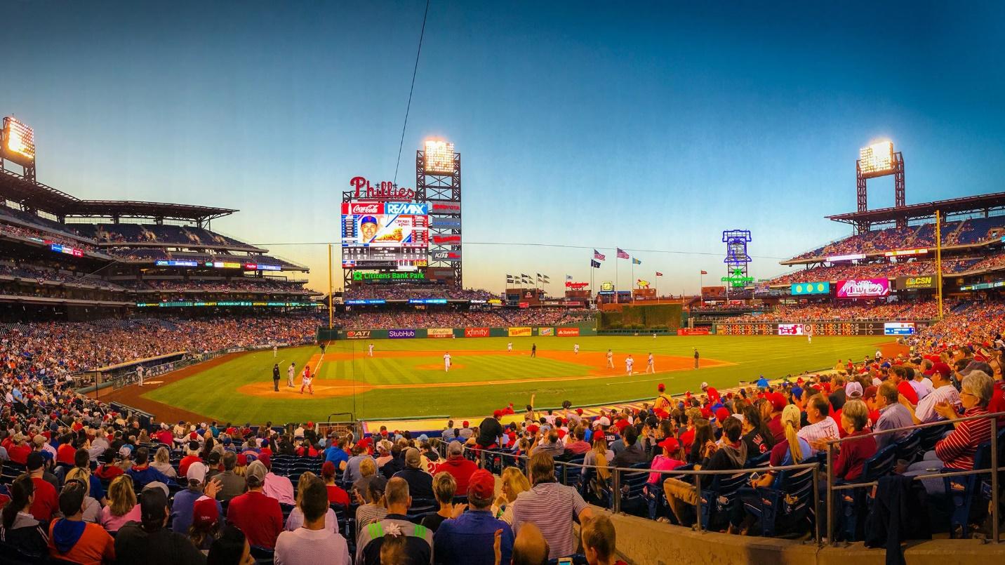
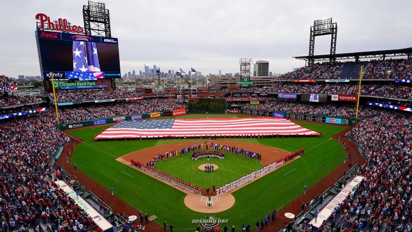
America’s favorite pastime is everyone’s favorite ballgame, baseball. While Fenway Park, Wrigley Field, and Yankee Stadium may steal some of the attention, Citizens Bank Park is another staple ballpark, and that ballpark is home to the Philadelphia Phillies.
For most of us, the Major League Baseball team we know the best is the team that resides closest to us. For those in Philadelphia and those residing around the city, that team is the Phillies. And for those of us who are loyal to another team, the Phillies are a team we likely at least know of.
Whatever your knowledge of the Phillies is going into this article, by the end of this blog post, you’ll surely know a lot more than you originally did. Throughout the remainder of this article, we’ll highlight the history of this team, the iconic Phillies logo, and the key lessons you can take away from the Phillies’ logo design.
Meet the Philadelphia Phillies
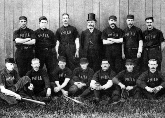
The sport of baseball has been around for nearly 150 years, so it’s no surprise that the Philadelphia Phillies team was founded quite a while ago, in 1890. Before the team was officially named the “Philadelphia Phillies,” the team was originally referred to as the “Philadelphia Quakers.” However, the team’s name was long – too long for fans. Fans quickly referred to the team as the “Phillies” and even today, that name has stuck.
The Phillies were officially established as a professional baseball club in 1883. As the sport of baseball progressed, the team also progressed. Today, the Phillies are part of the East Division in the MLB. Their home ballpark is the Citizens Bank Park right in the city of Philadelphia. While some teams have won title after title, the Phillies have only won two World Series championships ever. Also, while some teams win game after game, the Phillies have claimed an opposite “recognition,” being the first team to lose 10,000 games in the MLB.
This is only a brief introduction to the Phillies team. Below we’ll take you through a deeper overview of the Phillies’ history.
The Evolution of the Philadelphia Phillies
1883: The early days of the Phillies
Before the Phillies were known as the team we know today, they were founded under a different team name, the Philadelphia Quakers. Since the team was founded, they have remained part of the National League.
1890-1915: The Quakers change their name
Instead of being called the Quakers, the team changed their name to the Phillies. This is a play on “Philadelphians” which felt like too long of a team name. The early days of the Phillies were not the brightest ones. The team struggled to win games, not qualifying for a playoff game until 1915.
1919-1947: The Phillies embark on a losing streak
While some teams were able to rotate between winning and losing, the Phillies seemed to only lose for several decades. They continued to finish last in the league year after year. In 1947, the team acquired some new talent and players, and the Phillies began to take steps to turn this losing streak around.
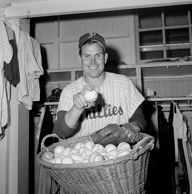
1950: The Phillies finally make it to the World Series
Two of the team’s new athletes were Richie Ashburn and Robin Roberts. This duo helped the team make it to the World Series, their first appearance in 35 years. While we would love to be able to say they won in this matchup, unfortunately, the Yankees took the win.
the early 1950s-1973: The Phillies have another losing streak
After the team made it to the World Series, the Phillies lost their way again. It took them until 1972 to make it to the playoffs again. The two ballplayers that are credited with helping the team break out of this losing streak are Mike Schmidt and Steve Carlton, who are both Hall of Famers today.
1976-1993: The Phillies trade in their losing streak for a winning streak
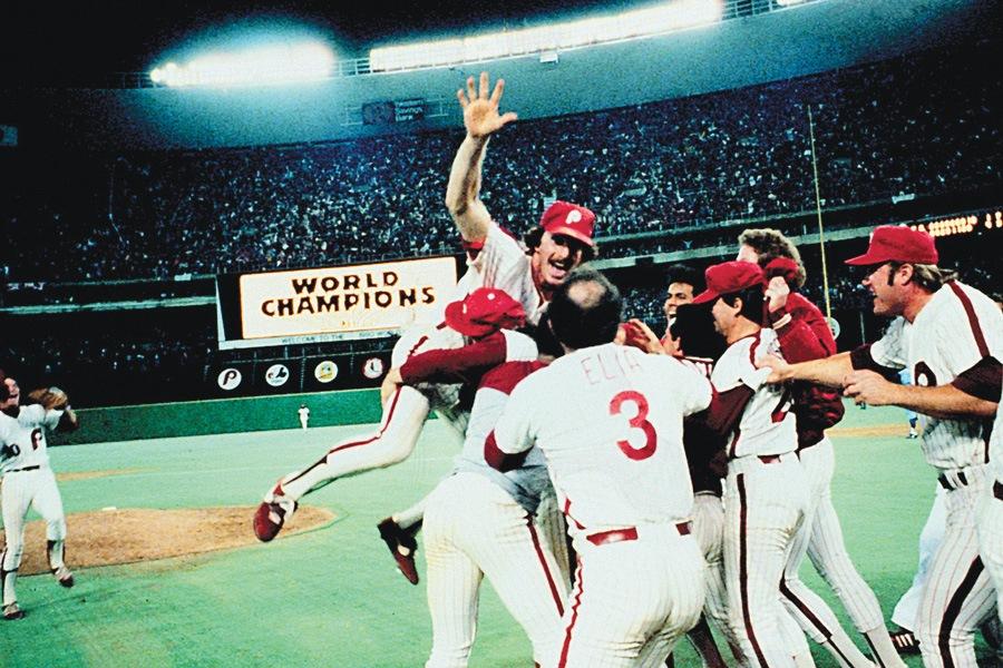
After being a team that people rarely betted on, the duo of Schmidt and Carlton helped bring the Phillies on a winning streak. The Phillies consecutively won the East Division titles for 6 years in a row during this time (between 1976-1983). Also, during this period, the Phillies competed in the World Series twice, winning their first title in 1980. Later, in 1993, the team competed in the World Series again, losing to the Blue Jays in game six.
2007: The Phillies have a bad and good year
2007 brought a high and a low for the Phillies. Their low was that they were dubbed the first franchise to lose 10,000 games. Their high was quite higher. That same year, the Phillies earned the East Division title, breaking another losing streak again (this time a 14-year one).
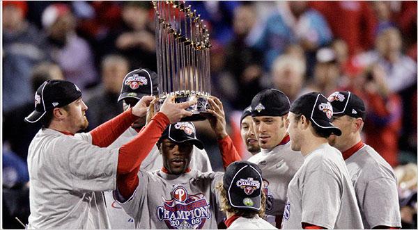
2008-2009: The Phillies make it to the World Series (and win!)
Finally, in 2008 the team got the praise they had been seeking for so long – they were finally World Series Champions again (for the second time).
They defeated the team they lost to prior, the Blue Jays. The next year they made it to the Series finals again, but unfortunately couldn’t pull out back-to-back wins.
2009-Today
The Phillies have continued to take steps to ensure they remain a competitive team, whether it is through their roster or training programs. In 2011, a strong pitching team was compiled which earned them a record 102 wins.
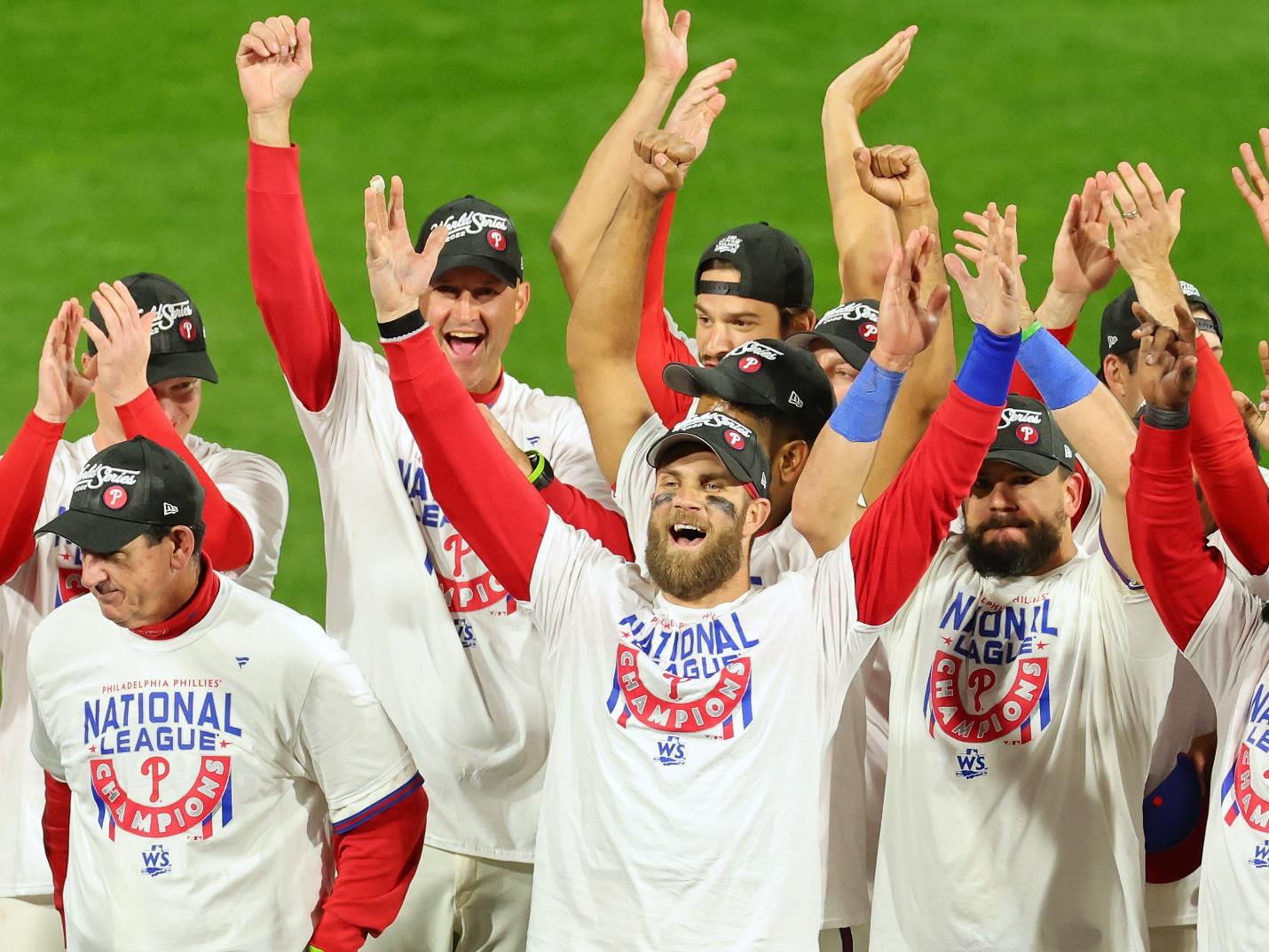
After 2011, the Phillies went back and forth with making it to the playoffs, but recently in 2022, the Phillies made it to the World Series again.
They couldn’t come out with a win, but for this team, resilience and determination are a common thread so we’d be shocked if they didn’t come out with another win one year soon.
Roadblocks Along the Way
For a team that hasn’t ever been a consistently strong team when it comes to consistent wins, building (and keeping) a loyal fan base was an important challenge to overcome. One way the Phillies did this was through their logo and friendly mascot.
The logo reminds its fans who they are all rooting for and that this team is Philadelphia’s home. Choosing the “Phillies” name was a critical decision because the team needed a name that was short enough to fit in newspapers and marketing materials, but big enough to create loyal brand recognition.
The Meaning of the Philadelphia Phillies’ Logo and the Philadelphia Phillies’ Logo History
As you’ll notice below through the Phillies’ logo history, the Phillies’ focused on the second part of their team’s name versus “Philadelphia.” The team is relying on the fact that fans will know the Phillies are based in Philadelphia and the logo ties back to this brand.

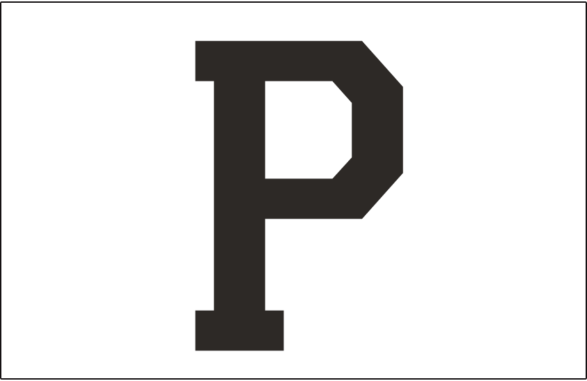
1900 – 1901: The first version of the Phillies logo
As you’ll see not only in this iteration but also in the following earlier iterations of the logo design, the initial logo design was a solo letter, “P.” This “P” was displayed in bright blue and was a simple, capital letter.
Since the team was not quite called the Phillies yet (they were initially called the Philadelphia Quakers), these initial logo designs symbolize the city where the team was founded, Philadelphia.
1901 – 1909: The second version of the Phillies logo
The only update to this logo is the different color of it. Instead of blue, this design featured black as the primary color to depict the “P.”
1910 – 1911: The third version of the Phillies logo
While this third logo version still is a simple “P,” this “P” is far more intricate than the first two versions. The black coloring has switched to green, and the script has transitioned from block lettering to an elegant script font.
1911 – 1914: The fourth version of the Phillies logo
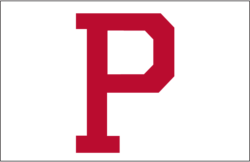
After only using the elegant script for a year, the Phillies ditched this design and returned to a simple, red “P,” in a block capital lettering.
1915 – 1937: The fifth version of the Phillies logo
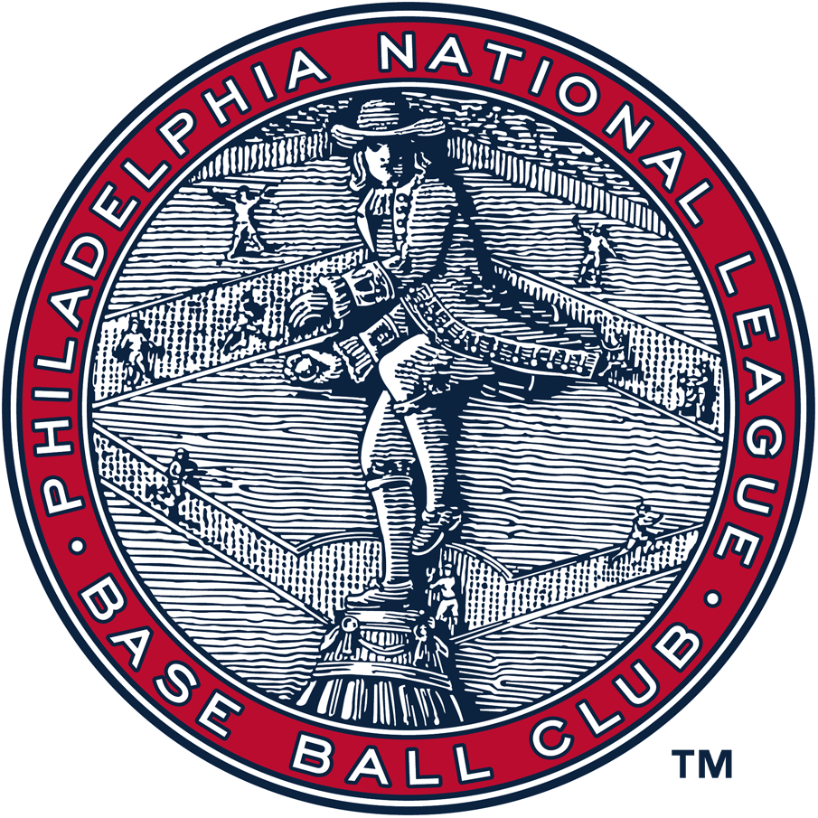
15 years after the Phillies were founded, the team decided to unveil a far more intricate, and different design. This logo design features a new shape and resembles an imprinted coin or emblem, versus a scalable logo design. The outline of the circle is a red border that displays the Phillies’ official name at the time. Within the red border is an image of a man who is likely a Philadelphia man you would encounter during this time. Due to the intricacy of this logo, it’s hard to reprint and scale up or down on a variety of mediums.
1938-1939: The sixth version of the Phillies logo
While the previous logo lasted for more than 20 years, in 1938, the Phillies decided to release a new iteration of their embossed emblem design. Some may have thought the previous logo was too coin-like and complex, but it lasted for a while which shows how positive Philadelphia’s response was to this design. For this iteration, a simple update was made to the color scheme. Instead of blue and red, the colors were updated to be orange and blue.
1939 – 1943: The seventh version of the Phillies logo
One year after the Phillies updated its color scheme, the team decided to update it again. This design looks like their first “emblem” design, except with new colors. For this iteration, the prominent colors were gray and white, with red as an accent color.
1944-1945: The eighth version of the Phillies logo
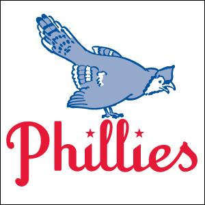
It wasn’t until 1944 that the Phillies got its first drastic update to the logo. This logo introduced us to a bird character that sat atop the wordmark that read the team’s name. The colors of this logo were like the colors previously used, gray and red. The chosen font was also playful using stars to add symbols to the logo design.
1946-1949: The ninth version of the Phillies logo
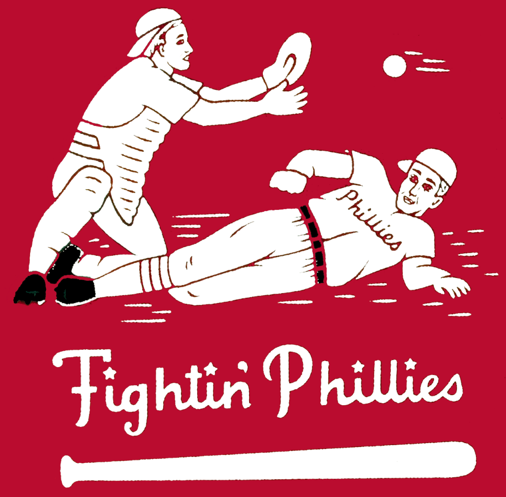
This era of the Phillies logo was defined by experimentation. This iteration ditched the bird character and instead included two players playing this sport. One player is seen sliding into the base and the other is seen catching a baseball. Beneath the figures contains the Phillies slogan at that time “Fightin’ Phillies.” Beneath the wordmark sits a baseball bat, serving as an underline to the slogan. Given the complexity of this logo, this iteration only lasted for a few years.
1950 – 1975: The tenth version of the Phillies logo
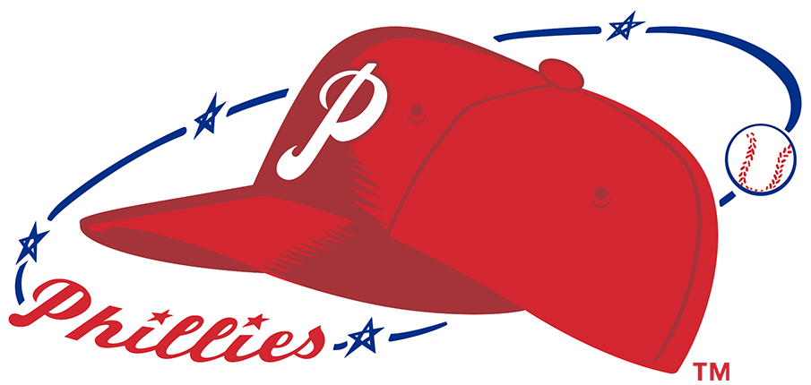
In 1950, the Phillies logo was updated again. Once the baseball players were removed, the designers opted to replace that image with a red baseball hat. This hat included a white emblem of the team initial, “P.”
1976-1983: The eleventh version of the Phillies logo
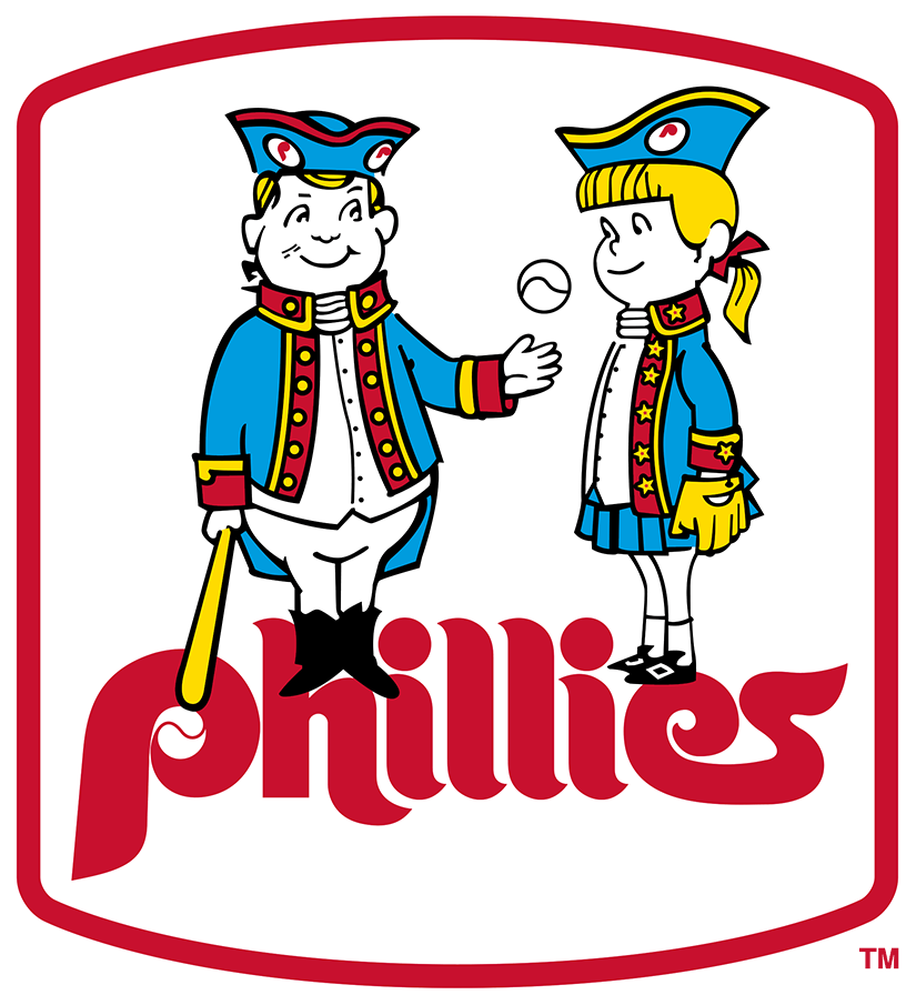
The prior logo stayed with the brand for twenty years. This logo went back to its intricate ways displaying two figures tossing a baseball between them. These two figures are two children who have a deep affinity for the sport and after this logo was released, the two children were named Phil and Phyllis, a play on Phillies.
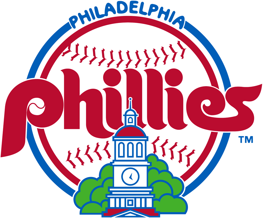
1984 – 1991: The twelfth version of the Phillies logo
This logo iteration returned to its simpler roots. Saying adieu to Phil and Phyllis, this design shows the team’s name clearly with a new icon. This icon features a large baseball, the focal point of the logo, and included one of the most visited Philadelphia landmarks beneath it. The color scheme returned to red, white, and blue – the three colors that are the epitome of an all-American team.
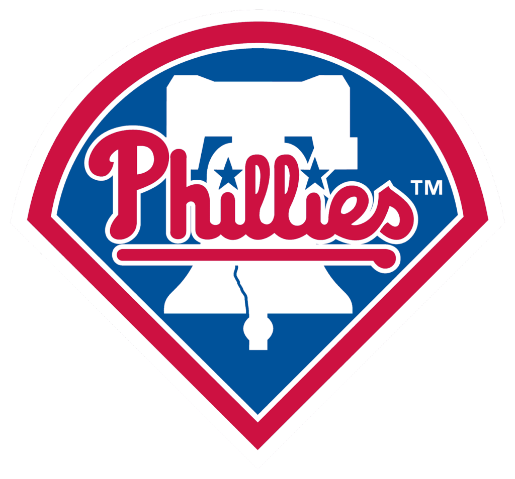
1992 – 2018: The thirteenth version of the Phillies logo
This logo was the face of the team for more than a decade and was seen on the jerseys and more. This logo design forms a baseball plate. This symbol includes an outline of the Liberty Bell, Philadelphia’s iconic landmark, and the Phillies name is displayed in a script font across the logo. The colors are still red, white, and blue which have become the official colors of the brand.
2019 – Today: The fourteenth (and current) version of the Phillies logo
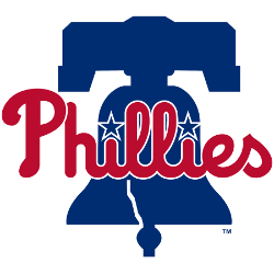
The current Phillies logo you find today is this one. This logo design removes the shape outline and focused on the bell and team name. The Liberty Bell is still prevalent, with its iconic crack showcased as well.
The Phillies wordmark is like the prior version and the same color scheme is used in this logo. The two dots on the “I’s” are stars, a feature you’ll find in logo versions prior.
The Phillies logo font:
The font associated with the Phillies’ logo is the font that is used to write out the “Phillies” name. This font is unique to the team and mimics a cursive, handwritten script. Adding more uniqueness to the font are two stars that serve as the dots above the “I’s.”
The Phillies’ logo color:
While the logo for the Phillies has introduced a variety of colors over the years, there have been three colors that kept resurfacing and three colors that have been the primary colors associated with the team – red, white, and blue.
These colors are as American as it gets and likely symbolize America’s favorite sport. Other teams beyond the Phillies have used these colors and because of that, these colors have been associated not only with this team but also with the sport. These colors are nostalgic to loyal fans who went to games with their parents and are now bringing their children to games.
The Phillies’ logo symbols:
As we mentioned and showcased above, the Phillies’ logo has had its share of symbols and emblems throughout history.
Focusing on the most recent (and current) logo, you’ll find one key symbol included in this design, and that symbol is one of Philadelphia’s landmarks, the Liberty Bell.
This Bell design mimics the Bell you would see in Philadelphia, crack, and all. Since “Philadelphia” isn’t included in the Phillies logo, this symbol helps to show where the team is located.
The Philadelphia Phillies Today
The Phillies today are still the same Phillies team fans loved decades ago (with the same Phillie Phanatic mascot), except now the team has a few more wins under its belt. The team still competes in the East Division of the MLB and its home field has been Citizens Bank Park since 2004.
At the start of this article, we noted that one of the “accolades” the Phillies have received is losing 10,000 games but since 2007, the Phillies have made strides towards breaking this losing streak.
The Phillies began to win several East Division titles (from 2007-2011) and made it to the World Series again in 2008.
After this World Series appearance and period of wins, the team failed to win titles again, until Rob Tomson came on as the manager of the team in 2022. That year, the Phillies were coached back to success, entering the playoffs as a wild card team, winning the National League Championship, and going on to play the returning World Series champions, the Houston Astros, in the 2022 World Series.
Unfortunately, they were unable to come out on top and lost the Series in game six. With a new year of baseball upon us, it’ll be exciting to sit back and watch what this team can do over the season.
Lessons Learned from the Philadelphia Phillies
The biggest lesson we can take away from the Phillies logo is that it’s important to tie your logo back to your brand. The Phillies logo never says “Philadelphia” on it. The city of Philadelphia is conveyed through the Phillies’ name and the symbol of the Liberty Bell.
This logo feels like home to the people of Philadelphia and this intentional design choice not only made the logo stand out, but it makes it work for the team. Along those same lines, the colors tie back to the brand. The colors red, white, and blue, were chosen to represent America’s favorite pastime.
Like the Phillies tied its logo back to its brand, you can do the same with your company. Think about what messages you want to convey, without explicitly designing it verbatim into your logo. If you want to learn more about what has worked for other companies, read more at Logo Design Magazine!


