

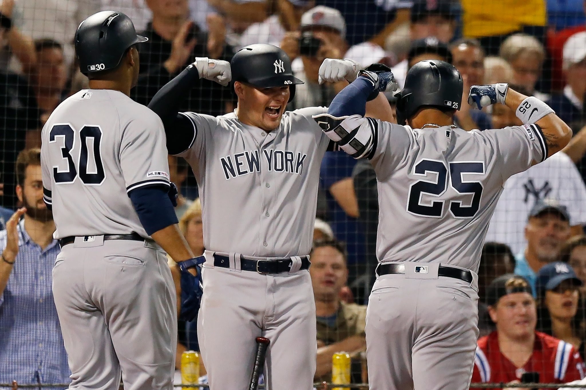
Did you know that the Yankees are the only baseball team that doesn’t use the names of their players on their uniforms?
Regardless of where the famous team plays, whether home or away games, the Yankees keep the tradition of not including names on their player’s uniforms.
The legendary NY baseball team has a visual identity that has quickly made the team memorable and iconic. The team is known for their many wins and their famous team players that make them not only a signature part of New York but of the country.
If you ask any New Yorker to describe this iconic logo to you then they instantly will be able to, knowing that the logo is a significant part of their state. They’re one of the most decorated teams in New York and are a team to be proud of.
Although we may be able to quickly identify the legendary logo, how many readers know where this famous logo came from and why it’s important today? The logo may be iconic today, but it wasn’t always how we see it at this time and it’s undergone a few changes to get to where it is. The logo is older than the team itself and is the visual brand for some of the world’s most extraordinary baseball players that have ever existed.
If you wish to learn more about this team and their iconic logo that has made such a drastic impact on the world of baseball, read on.
The Evolution Of The Yankees Logo
Within the 120 years of their existence, the Yankees have had quite an adventure with their visual identity. While some teams may have stayed consistent with their logos throughout the years, the Yankees are a team that has experimented throughout time to find the perfect visual identity for them and their team. It’s gone from merely one letter that identifies the team to initials and then to a symbol that we’ve come to associate with the famous team and what they do.
Let’s take a look into what these logos have symbolized and how they’ve changed throughout the years.

1901 – 1902: Simple Beginnings
Although the logo is now a complex, identifiable logo it didn’t start that way. The very first Yankees logo was a simple one-letter logo. For the first two seasons, the team was called the Baltimore Orioles so the original logo created back in 1901 was a simple orange ‘O’ with a black circle in the middle. This logo was simple, professional, and a classic, but it only lasted for a year before the team decided that a change was needed.

1902: The Second Letter
This time, the team opted for a letter again, this time using B for Baltimore City. The blue block letter signified the city as well as the team name. Although this logo was classic and fresh, it only lasted for a year before the team changed their logo for the second time in under five years.
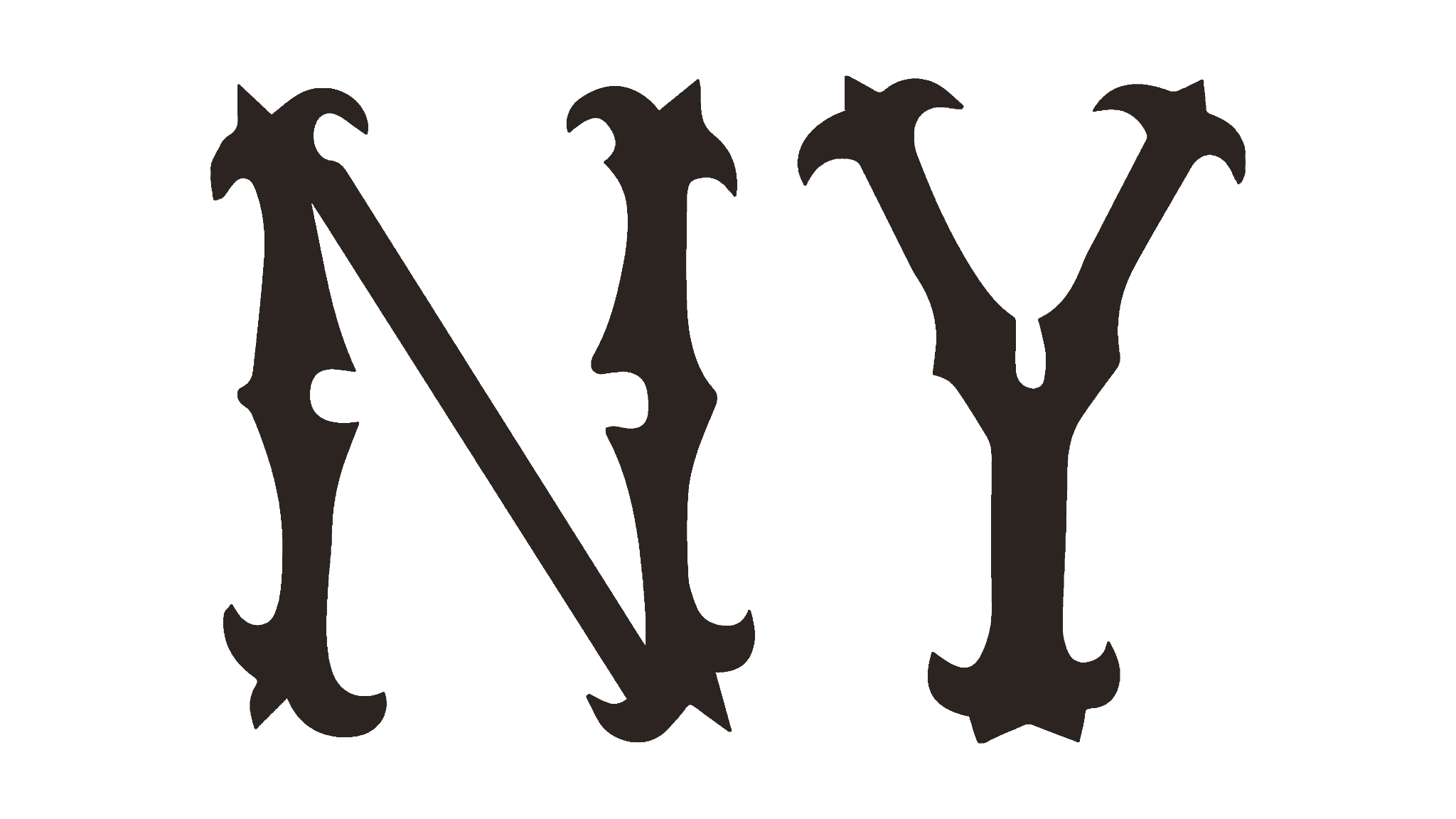
1903: New York
The team was renamed the New York Highlanders and as a result, the logo was updated to include ‘NY’ in old English lettering. The logo was black and clean, just the two letters are simply shown as an abbreviation of the city name. This logo only lasted a year as well before it was due for an update.
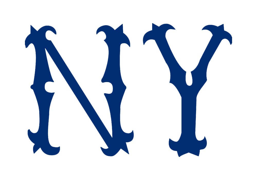
1904: The Blue New York Logo
A year later and the logo was updated from the black logo to a blue logo. The letters and the initial design stayed the same, with the color being the only major update to the design. This kept the logo still recognizable, but it made it appear loyal and gave it some life.
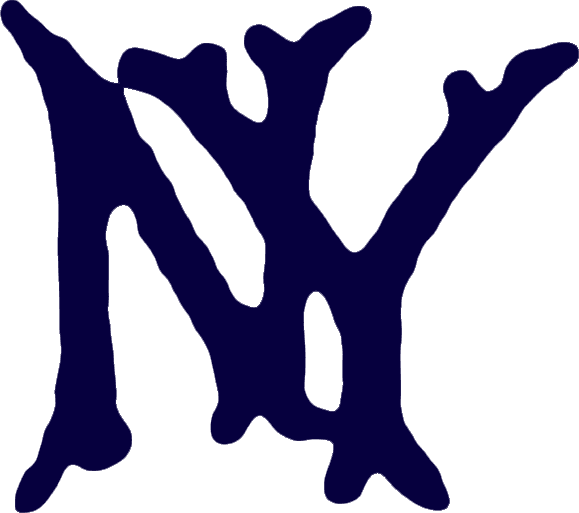
1905: Interlocking Letters For The Logo
The team’s fifth logo design was interesting, introducing a new concept that gave the logo a unique look. The team opted to include interlocking letters in the logo, but not how we see them used today. The letters overlapped each other, still in the same font but the color was updated to a darker blue. However, this logo had smoother edges and stood out against the white background with a darker color choice.
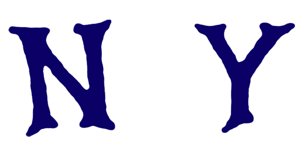
1906: The Letters Are Detached
A year later and the team decided that the letters would be further apart, this time in a lighter color. The smooth edges and traditional font were the same as this logo but there was a large space between the letters and a lighter blue was used.

1907: A Minor Change
Although the letters were kept in the same position and the traditional N and Y were kept, the color turned back to the dark blue that was used previously. Everything else was kept the same as it was before, with the color change being the only thing updated about the logo.
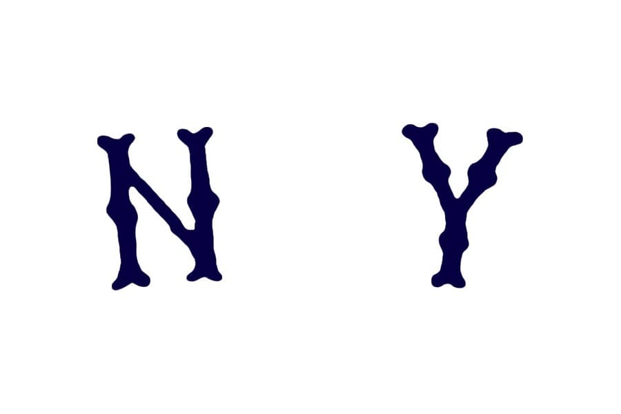
1908: Font Change
The following year the logo was updated to include a new font that resembled bones. The letters were thicker but the position and the symbols themselves were kept the same.

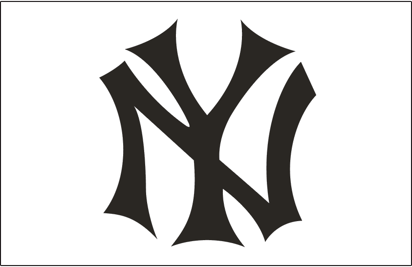
1909 – 1912: The New Blue Logo
A year later and the Yankees produced yet another iconic and symbolic logo that would not be forgotten soon. This was the very first logo with stylized interlocking NY. This logo was created by Louis Tiffany. This logo was attractive and gave the team a more appealing look. It looked professional and unique. This logo lasted three years and was what many people associated with the team.
1913 – 1914: The Brown Logo
1913 marked the time when the team became known as the New York Yankees and the logo was tweaked slightly to honor the new team name and what it signified. The same design was kept, but the font and color were changed.

1915 – 1946: A Legendary Logo
After going through a series of changes since it first formed, the team finally settled on a logo that stayed with them for decades. This time the font and initial design were kept the same but the difference was in the color. The main color was dark blue again, this time the iconic logo staying with the team for 30 years!
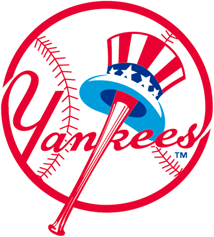
1947 – 1967: An Entirely New Logo
30 years later and the team was ready for an entirely new logo, starting from scratch this time. American sports artist Henry Alonzo Keller designed the circular logo that featured the Uncle Sam hat, a wordmark, and a baseball bat. The wordmark was created as a true piece of beauty, seemly incorporated into the baseball and the red bat creating the line of the ‘K’. The Uncle Sam hat is a national personification of the USA and was symbolic to fans around the country.

1968 – Present: What We See Today
In 1968 the logo got an update that gave it some personality and tweaked a few details about the logo. The logo was refined, with the colors both brightened and darkened and the logo modernized. This version is what we still see today and what we’re familiar with and see on uniforms today. The beauty and detail of this logo are what have made it as famous as it is to this day.
What We Can Learn From The Yankees Logo
With a logo as famous and as well known as the Yankees, there’s a lot that we can learn in regards to graphic design and elements of a good logo. The Yankees logo illustrates to us what crucial elements should be included in a logo and why they’re important. Here are just a few of the many reasons why the logo works for the team and what makes it unique.
It’s Visually Appealing
Let’s be honest; you need a logo to truly look good for it to work for any franchise. Regardless of what it stands for or what the company or team the logo is for, it’s useless if it isn’t attractive. You want something that will look good on uniforms and branding for teams and that will be endearing to fans.
It Stays With People
A logo mustn’t be only identifiable to people, but it also has to stay with them. The Yankees are a prime example of a team that has managed to create a memorable logo that stays with people and isn’t easy to forget.
It’s Simple
A big mistake that a lot of designers will make when they’re creating logos is that they add too much to it. With logos, less is more and graphic designers must understand this when they’re designing logos. The Yankees logo works for the team because it’s easy on the eyes and there aren’t too many elements included on it.

Image sourced here
The History Of The Team
The New York Yankees are known as one of the world’s oldest baseball teams and one of the country’s most decorated teams. They’re a major baseball club that plays in the major league and has made a huge impact on not only baseball but our country in general. Their story is one of the heroes rising and one that shaped the future of baseball with a rough start that developed into a strong team that we know today. `
The Yankees first began their career in 1901 as the Orioles. They completed their first two seasons as a team in Baltimore, Maryland before the struggling team was bought by Frank Farrell and Bill Devery. From there the team was taken to New York where they earned their name New York Highlanders. The team originally was taken to one of the highest points, Hilltop Park.
During this period local sportswriters often referred to the team as “Yankees” or “Yanks” since they were in the American League. In 1913 the team was officially renamed the New York Yankees, a name which we identify the famous baseball team as today. Throughout time the team has had quite a few different nicknames that they’ve been identified as, but their official name has always remained the Yankees.
The team gained quite a few valuable players from the Boston Red Sox, one, in particular, being the legendary Babe Ruth and they played at the Polo Grounds grounds until 1922. After receiving their new famous player the team was quick to get their own Yankee Stadium and when they played their first game in the new stadium Babe Ruth hit a home run. During this time the team flourished and with a new manager and a strong lineup they were back better than before.
The league won 12 consecutive World Series games and was quickly becoming one of the strongest in the league. However, Babe Ruth retired from the team and they needed a new strong face. This face was Joe DiMaggio, one of the team’s greatest players. From 1936 – 1939 the team won four World Series titles. The league was earning its title as America’s strongest baseball league, but it couldn’t last for long.

But with the attack of Pearl Harbor in 1941, the team lost multiple players. Many of the team’s top players went off to serve in the military including Joe DiMaggio. Despite this they still had a stretch of five consecutive World Series title wins under their new manager and although they had a rough couple of years they were quickly climbing the ladder back to victory.
However, when the team was bought in 1964 by CBS they saw a massive decline in wins. As their star players retired they were unable to replace them and it wasn’t looking promising for the team. Later on, the team got a new owner and they were rocky with their wins. They had losses and wins until the 1990s and 2000s when things started to look up for the team. They won the World Series again and they were quickly becoming known as a top American team again.
They’ve continued their success and to this day they’re regarded as one of the top teams in the history of baseball clubs. They’re valued at over $2 billion and are known as one of America’s top dedicated teams that have written baseball history with their wins and determination.
Summing Up The Yankees Logo
The Yankees are a baseball team that has a legendary visual identity and a strong history behind it. They’re one of the most successful and famous baseball leagues in all of history and have worked hard to earn the title as one of the country’s most determined leagues, with famous players like Babe Ruth having played for the team. As you can imagine with any sports team, the Yankees have had far from a smooth ride. But despite their losses and despite their uphill battle, they’ve shown us what’s possible with determination and a will to continue going forward to victory.


