
Known for its fresh, healthy ingredients and the speed at which it delivers fresh sandwiches, Subway is a fast food chain that has exploded with international success. Subway initially opened in Connecticut and, from then on out, was an instant success with a wide demographic of consumers.
However, although many people enjoy the bite of a sandwich occasionally, they don’t know that the company’s iconic logo has been instrumental to the chain’s success. Although there’s something to say about the menu and the brand’s reputation, we can be sure that it wouldn’t be as recognizable and iconic as we see today without the legendary logo that we now associate with the company. Let’s look at the history of the Subway logo and the brand itself.
1965––1968: The First Logo
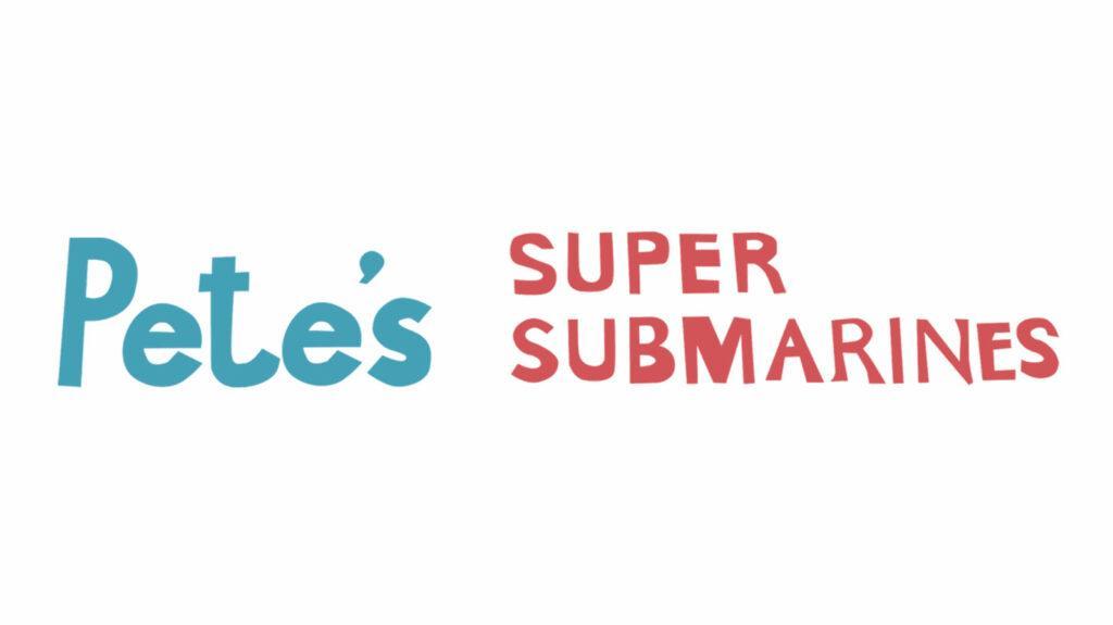
The first logo for the chain emerged in 1965 and stayed with the company for three years. This wordmark featured a banner with light blue and red lettering on a white background. The left part of the word mark showed “Pete’s” in a bold blue sans-serif font, and the second part of the name was red. The right part of the name was shown in two levels, with “Super” on the top and “Submarines” on the bottom. Both words were in red. The font was an all-capitalized handwritten one with distinct edges and was clean and classic.
1968––1970: A Shortened Name
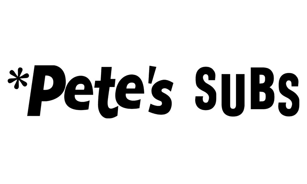
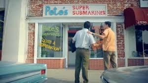
The first logo lasted only three years before the company decided it was time to change. At this point, they had opted to shorten the name, so although the logo was still a wordmark, the name and color choices had changed. The wordmark now showed the name “Pete’s Subs” with an asterisk to the left of the first word. The design was now entirely black and used a playful font with uneven letters. The first part of the name had the first letter capitalized and the rest in lowercase, while the second part had the word entirely capitalized.
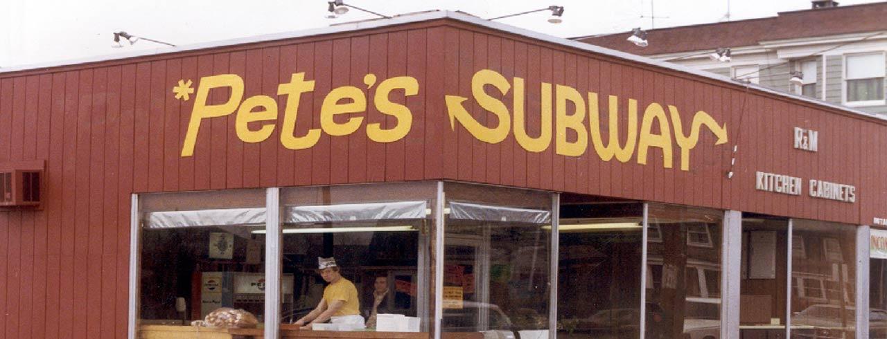
1970––1972: Subway is Introduced
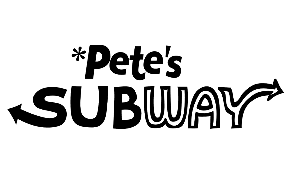
The second logo was redesigned in only two years and didn’t last as long as the first. The name we now associate with the brand, “Subway,” was introduced at this point. However, the company still kept the first part of its original name, “Pete’s,” as part of the name. The first part of the logo stayed entirely the same, even with the asterisk left next to the word, but the second part had changed. This time, “Subway” was written in all capitals, with the first part of the word in black and the second part in white with a place outline. There were two arrows in the word, one shooting out of the left of the S and the second to the right of the Y. The logo was traditional in how the company had always kept it while subtly introducing the new part of the name cohesively.
1972––1973: Yellow Comes into the logo
In 1972, the company shortened the name to be rebranded as “Subway.” This time, the company opted to create a stylized yellow wordmark that showed the company name in a classy, sleek, and modern sans-serif font. Trails of the “S” and “Y” were still curved, with the thin and elegant arrowheads coming out. This new logo differed from the previous ones by becoming more modern and appearing sleek and classy for the first time. The yellow was an easy indicator of the brand and stood out from the completion. However, the logo only stayed with the company for a year before they decided it was time for yet another change.
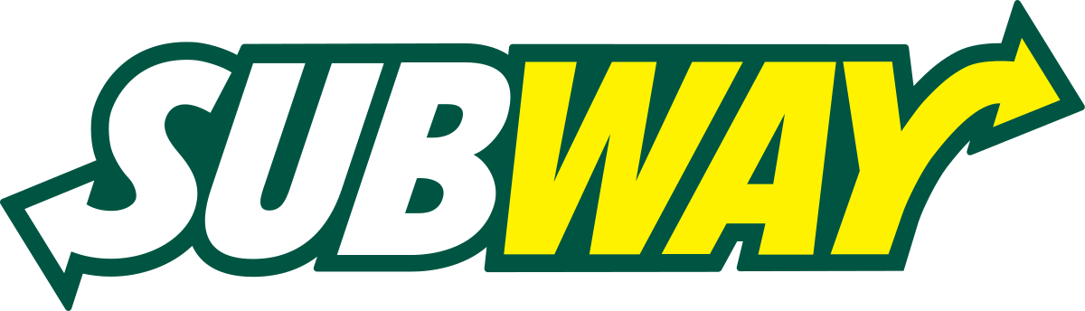
1973––2002: A Change in Color
1973 saw a color change, and although the company name was the same, it was now shown in a long black oval with the name in half white and half yellow. The wordmark design had the letters thickened and was now chunkier, with the colors conveying that the name had two parts. The logo was simplistic yet stylish with the addition of black, creating a cohesive design that stood out and was different from the first versions.
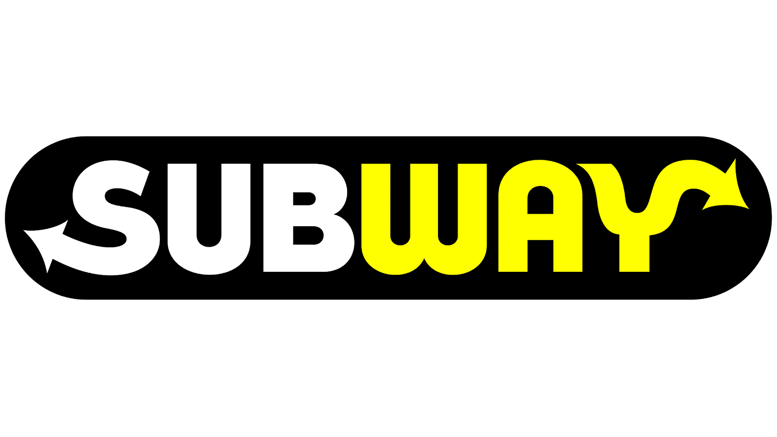
2002––2016: The Oval is Removed
The logo had yet another redesign in 2002 that changed the typeface of the design. It now featured an italic iced sans-serif font with the letters all glued next to each other so they were closely touching. The company name was the same, but the colors had changed, and the lines had thickened again. This time, the first part of the name was in white and the second in yellow, with a thin dark green outline around it all. It looked confident and stylish with the outline, and now it was less enclosed with the oval removed.
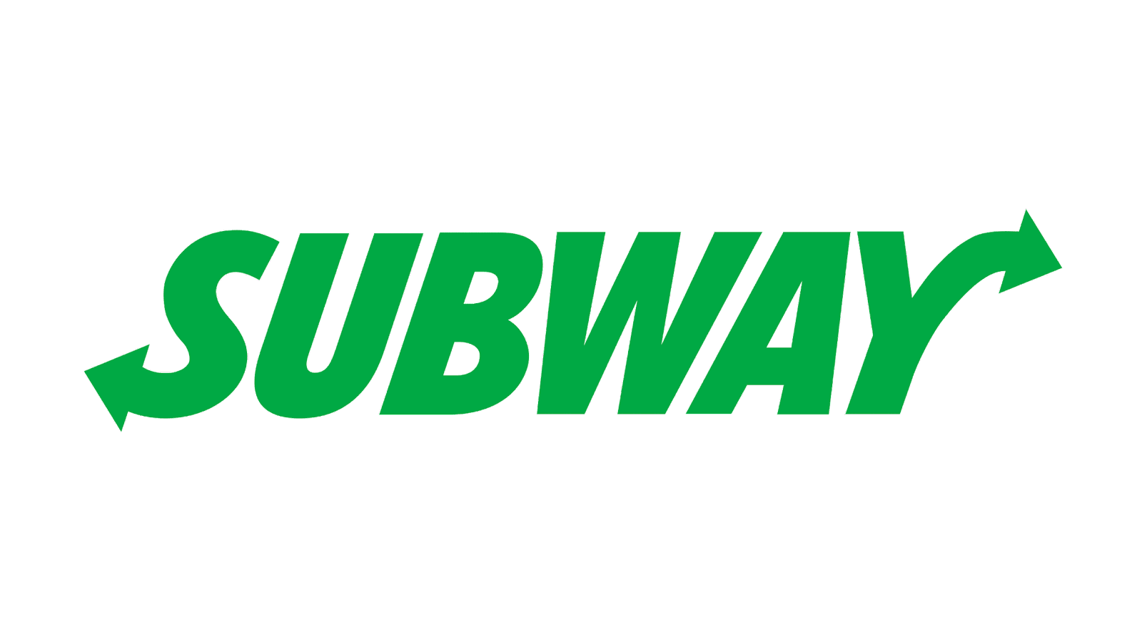
2015––2016: All Green
A new version of the logo was created for the company in 2015, featuring the same typeface logo with the same style as the previous one but in a different color. The lettering was entirely green on a white background this time, and the lines were thinner. There was a little space between the letters, but it was all one cohesive color. The logo was bright and happy, evoking a happy emotion that the other logos hadn’t presented as much.
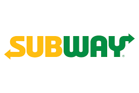
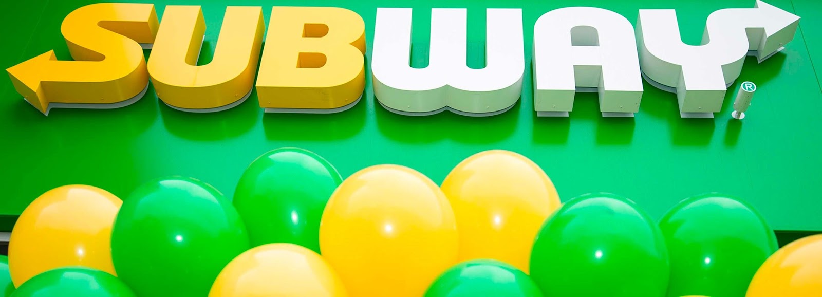
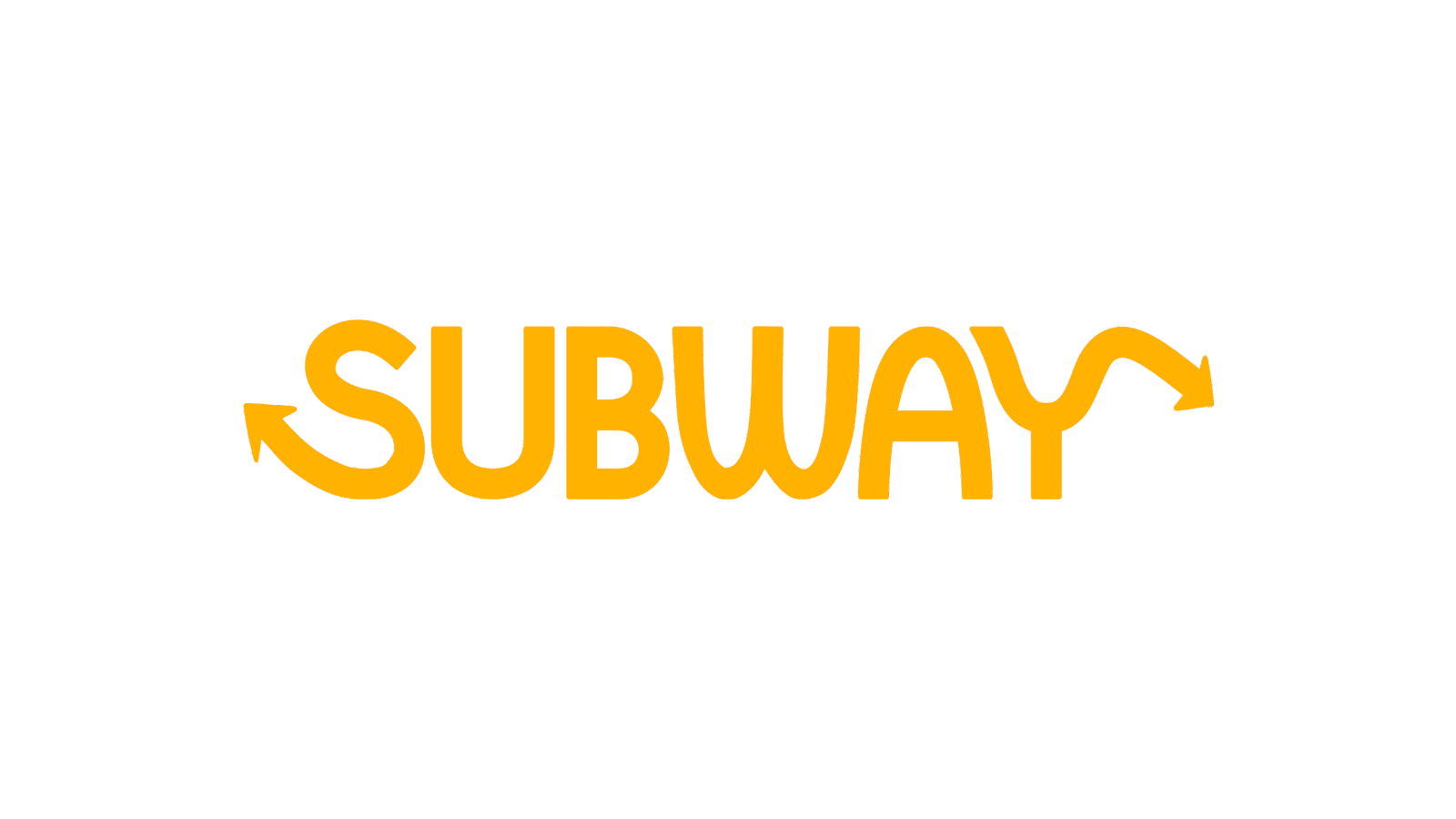
2016––Present: The Logo We See Today
The logo we see today and associated with the brand was created in 2016. This logo was a modern version of all the previous logos, combining all the best elements to build the company’s signature emblem. With this logo, the arrows became a bit larger and sharper. The design was bolder and sleeker and demonstrated a more confident look for the brand overall. This is the logo we now associate with the brand, and it is recognizable to millions around the globe when they see the icon.
Elements Of The Subway Logo
The Colors
The logo colors are primarily green and yellow, which are specific color choices to convey a message to the audience. The yellow in the logo symbolizes joy and the sun, creating a bright and energetic aspect of the logo.
The green color is naturally associated with health and nature, which is the perfect color choice for a brand that is focusing on conveying that they offer healthy and fresh items. When you look at these colors, it’s clear that each aspect of the design, down to the individual colors, has a purpose.
The Font
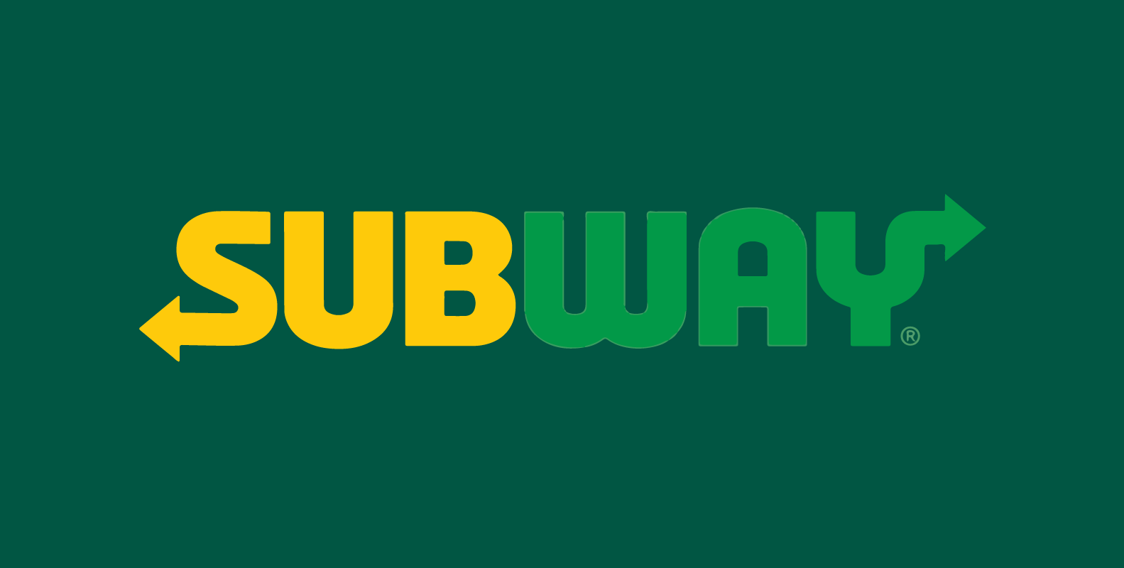
Since its first creation, the logo has gone through numerous fonts to get to the one it uses today. The font the logo uses is distinguishable and has curvy thick lines.
The font matches the company’s brand, ensuring the personality shines through. The font is a critical aspect of the brand, ensuring that down to the letter, the design is cohesive and purposeful.
Why The Arrows
The two arrows are a vital aspect of the Subway logo that stands out and is one of the most iconic areas of the emblem.
The Subway logo has hidden meanings that are more than simply promoting the company. The two arrows at the ends of the S and Y serve more of a purpose than just being a fancy addition–they encourage a hidden meaning for the logo. These arrows serve two purposes; one is to convey motion and movement, which is to reach their target audience.
Subway is focused on reaching an audience who wants to choose a healthier fast food option. Their second purpose is to convey speed and signify to customers that they can get their food from the restaurant quickly, allowing them to get in and out with their food in only a few minutes.
The History of Subway
The story of Subway starts in 1965 when a man named Fred Deluca, seventeen at the time, asked his friend for advice on how he thought he should pay for his college tuition. Dr. Peter Buck was a nuclear physicist, so Deluca assumed he would have some good advice on how to tackle the burden student loans can become.
Turns out that Dr. Buck offered him valuable advice that would more than pay for his student loans. The Dr. offered him the idea of starting a submarine sandwich shop and even invested $1,000. They became business partners and opened their first sandwich shop in Bridgeport, Connecticut, in August 1965.
At their first shop, they focused on serving fresh sandwiches that had high-quality ingredients and were affordable. Their primary focus was serving sandwiches to the locals of the community, so their prices and food options were tailored to them.
Deluca and Dr. Buck opened sixteen submarine sandwich shops in nine years, all expanding throughout Connecticut. However, they wanted to expand further and reach a wider audience. This is why they began franchising, expanding Subway into a business model that signaled immense growth. From then on, Subway made history, opening restaurants all around the globe.
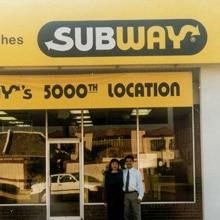
Today, we see that Subway has become one of the largest restaurant chains worldwide and is easily recognized by millions. Subway has more than 37,000 restaurants in more than 100 countries and is still focused on its signature goal of providing fresh ingredients to customers. However, today, Subway is more than merely offering sandwiches. Now Subway has dessert items, salads, and wraps added to their ever-growing menu, but they’re still primarily known for their iconic, fresh, healthy sandwiches.
Conclusion
Overall, Subway is a famous fast-food chain that is well-known around the world for its healthy and fresh sandwiches. However, the restaurant is well known and renowned due to the iconic logo that has become the emblem associated with the brand.
The logo has changed throughout the years to develop into the iconic one we now envision when we think of Subway and its sandwiches. Above, we looked at the logo throughout the years and the franchise’s history.
It’s clear that with the company’s logo and history, Subway is famous and has continued to grow to expand to where we see it today.


