

We’re all familiar with the entertainment company NBC’s signature logo; it’s a classic that has become recognizable on thousands of American’s tv screens. Although we’re all mostly familiar with the iconic legendary peacock logo, NBC didn’t always have the colorful logo that they do now. In fact, spanning over the decades that the company’s been around, the logo has undergone a lot of changes.
- The start of the NBC logo and why it is such an iconic design
- The NBC logo though history and its evolution
- Why changes were made to the logo and what it looks like today
The first logo rolled out in 1943, a dramatic black and white logo displayed with ‘NBC’ on the microphone. The logo included a background of lightning bolts and, surprisingly enough, the first logo stayed with the company for eleven years. With the initial logo as the face of their company, the company met success with the radio and started building their TV network platform.

The next logo change was to a xylophone, included with it a mallet and the company name. This logo included colors, red, green, and blue; colors that are still used in today’s logo. With this logo came a peaked interest in TV and a time when TV in color was on a high. This was not only when the peacock colors first initiated, but it was also when, due to the time period, the company decided to incorporate more, bright colors into their logo.

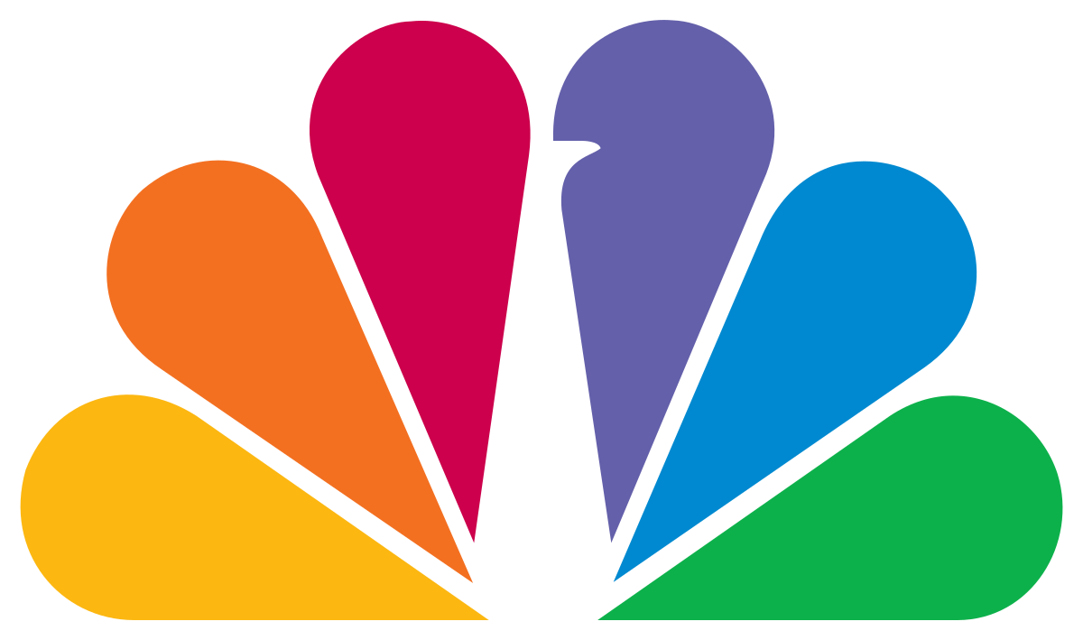
Director of Design at NBC, John J. Graham, was the first to design the original peacock. The logo featured eleven feathers displayed on a proud peacock. There were drops of color on the end of each feather to give a graphical representation of real-life peacock feathers. There were also feet given to the peacock, although surprisingly enough the peacock with so much character was never named.

1959 is when the Snake first made its appearance on the network’s channels. The proud peacock logo would appear on screens at the beginning of network shows and at the end, NBC would show the black snake; the letter ‘N’, which the other two letters sprung from. This aspect of the company was with a part of the times and grew on their audience.

In 1975 the peacock was temporarily removed from the company and instead replaced with blue, white, and red ‘N’. This logo cost NBC a large sum, although they didn’t use it long. In 1980 the peacock came back, this time to be combined with a revised version of the company’s ‘N’ logo, the familiar peacock displayed in front of the ‘N’.

In 1986, the background for the peacock was removed and the feathers were refined, leaving a simplified version of the logo. Beneath the colorful peacock, ‘NBC’ was written in a chunky black font. With the revised peacock above it and fewer colors than before including, the logo was cleaner and more modern.
2010’s redesign saw a complete removal of the letters and the logo had only a minor touch up. There were some gradient shades included and a few white elements were replaced with grey. Although this change wasn’t major, it shows us that NBC’s logo was constantly changing and being updated throughout the years to reach the final result.

2013 is the network’s most recent logo design change to date and is the same iconic log that we still see to this day. It’s clear to see that, in comparison to where the logo started with the dazzling black and white microphone, the logo was then created into what we see today. As with any great logo, this logo has evolved and undergone many changes, both minor and major to get to the logo that we see today.


