
Netflix’s wildly popular Stranger Things is more than a TV show. The show’s unique style and heavy nostalgia factor made it a pop culture phenomenon. It’s an homage to 80s adventure movies, an intriguing sci-fi epic, and a monstrous horror story all in one. And so, its distinctive logo is widely recognized and beloved. It’s been printed on all sorts of merchandise and parodied in countless ways.
But how was this compelling logo design conceived? What makes it so perfect for the show’s identity and fandom? And what can business owners learn from the “Stranger Things” logo for their own branding?
Capturing 80s Nostalgia in a Wordmark
Today’s logos tend to use sleek, minimalist typography. Decades have proven the appeal of modern typefaces such as Myriad, Futura, Avenir, and Helvetica. The late 1970s and early 80s, though, were an era of typographic experimentation. For better or worse, graphic designers were playing with kerning, gradients, color-blocking, drop shadows, angled baselines, and distorted typefaces. This hailed the era of wordmarks as the primary form of corporate logo (see IBM, FedEx, Google, etc.), and branding designers began to move away from the pictographic/emblem style of old-school logos (such as McDonald’s, Shell, and Stella Artois).
This was also a transformative age for film and television, when new concepts, cinematographic styles, and special effects made them more immersive than ever before. Shows started being heavily marketed. So, they all needed a distinctive brand identity — and that started with the unique way their titles were designed.
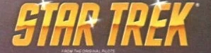
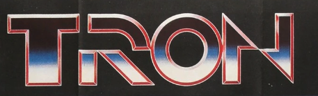
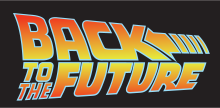
Typefaces were blocky and bold, with a heavy use of gradients and horizontal lines to represent dynamism and innovation. This was especially noticeable in the era’s sci-fi classics.

Influences on the “Stranger Things” logo


The show’s producers, the Duffer Brothers, collaborated closely with the aptly-named production studio Imaginary Forces. They wanted to honor the seminal books and films in the genre while evoking nostalgia among viewers.
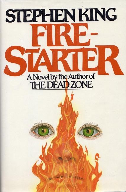
According to chief designer Jacob Boghosian, the logo design team at the Contend agency drew upon the typography used on the covers for various Stephen King novels. One key influence was likely Different Seasons, the anthology in which “Stand By Me” first appeared. As Stranger Things shares themes of childhood friendship and personal growth, that’s a fitting homage.
In both the author’s name and the book title, the first and last letters of one line of text are significantly larger, extending past the baseline to intersect with the other line.
They also cited Alien’s opening title sequence as an influence. While the typeface is fairly standard (Helvetica Black), the letters are gradually assembled, but with extremely high kerning and against a tense soundtrack. The simplicity combined with this in a disjointed fashion made the sequence iconic.


The Stranger Things title sequence inverts this. The wordmark assembles slowly, but with the entire letters disjointedly drifting together. The overall tone is similarly tense and mysterious, like the Alien opening sequence.
The Stranger Things wordmarks for later seasons make good use of gradients, as discussed further below. Here, gradients are more than a stylistic choice: they symbolize the blurred lines among the characters’ shifting realities. The dramatic typeface is bordered by thick horizontal bars, in tune with the era’s style. The famous logo for Steven Spielberg’s Amblin Entertainment includes this motif alongside the iconic shot from Spielberg’s seminal film E.T., to which Stranger Things pays homage.

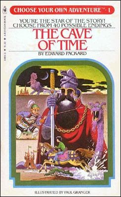
Unlike many wordmarks of the era, the Stranger Things logo does use a serif typeface rather than a sans-serif. This works well for the visual tone of the show, though. The wordmark features the classic ITC Benguiat typeface. As we’ll discuss further in the next section, the typeface’s angled crossbars and sharp serifs give it a sense of intrigue. Benguiat is also a historically excellent choice as it was frequently used throughout the 80s, including album covers and, appropriately, the Choose Your Own Adventure books.
The contour stylization (leaving the outline of the characters with negative space inside) is also unusual for the 80s, but hearkens further back to the 70s (see the famous Star Wars logo) as well as classic thrillers such as Vertigo.

One of the Stranger Things wordmark’s most distinctive aspects is the disproportionate letter sizing in the top line of text. As mentioned, the extended “S” and “R” dropping below the baseline was inspired by Stephen King book covers. However, this technique has also been used in another iconic adventure story. It gives a balanced yet dynamic look to the logo while helping integrate the words into a cohesive title.
Analyzing the Stranger Things Logo
The wordmark for Stranger Things features the ITC Benguiat typeface. For the first season, this was stylized as empty contours of brilliant red text.
First, the curved serifs end in sharp points that evoke a sense of danger. The crossbars and counters are all slightly angled, with some strokes (such as in the “A”) also curving dramatically. One interesting detail is that the serifs are pointed at the bottom of the characters and squared at the interior terminals.
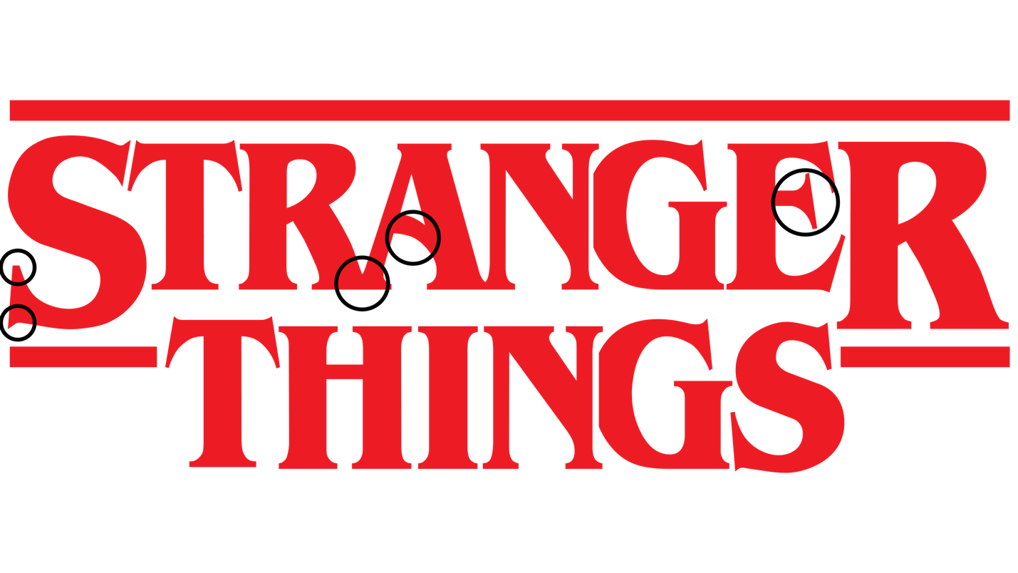
Meanwhile, the extended top bars and close spacing bring the letters close together. This creates a sophisticated aesthetic and also reflects the show’s themes of connectivity. The kerning is so tight that the letters actually bleed into each and some points, symbolizing the blurred lines of reality portrayed on the show.
A dramatic horizontal line, also a contour, borders the top of the wordmark for dramatic effect. Rather than adding an identical border on the bottom, though, chief designer Jacob Boghosian placed it below the word “Stranger” so that “Things” would interrupt the line. It’s a perfect symbol of Season 1’s storyline, in which young Will Byers crosses into an alternate dimension called “The Upside Down.”
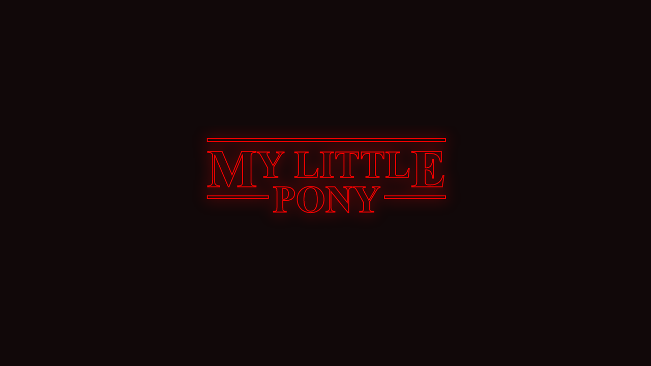
To enhance this sense of disruption, the “S” and the “R” in “Stranger” are significantly larger than the other letters, dropping below the baseline to meet the broken bar. This detail has become one of the logo’s most distinctive elements, as shown in these parodies:
Evolution of the Stranger Things Logo
After season 1, the Stranger Things wordmark began incorporating numerals to denote the current season. Each number is rendered as a large design behind the wordmark, sharing its dramatic serifs and sharp angles.
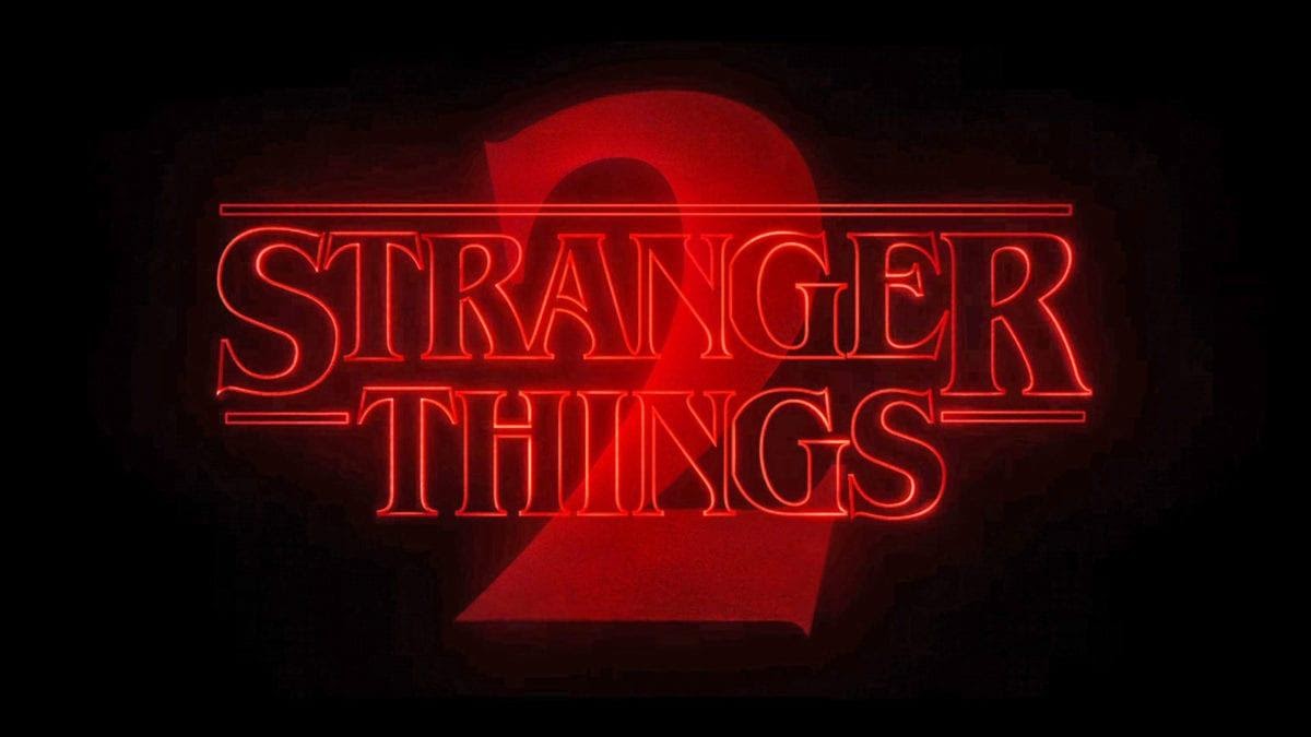
Stranger Things 2 Logo
Season 2’s logo retains the contour, but a red fog surrounds the wordmark, and an orange glow expands from the center point. This aesthetic reflects the blurring lines between our world and the Upside Down, as well as an increasing emphasis on the supernatural. The enormous “2” extends both above and below the text. Its deep red gradient adds a sense of danger.

Stranger Things 3 Logo
For Season 3, Stranger Things’ logo design team abandoned the negative space in the contours. The letters and horizontal bars are now black with a red outline, perfectly reflecting how the show’s mythology has filled in. The gradient of the numeral “3” has become more dramatic, with the interior a brilliant red fading into a deep crimson. A faint red glow emits from the center point. This wordmark is much bolder to symbolize this season’s intricate, tragic storyline and heightened sci-fi violence.
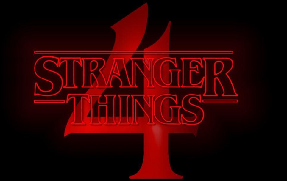
Stranger Things 4 logo
Season 4 is scheduled to be released in May 2022, and if its wordmark is any indication, we’ll be seeing a return to the show’s initial themes. The wordmark has faded the black letters to a translucent grey, highlighting the original contour stylization.
The numeral is also a brighter red, signifying a change in the show’s tone. But what’s most interesting is how Benguiat’s “4” was modified for the logo. Its sweeping strokes, the alternating beveled and tapered serifs, and extended crossbar make the “4” exceptionally dramatic. It almost looks like intersecting jagged roads — which may play into this season’s storyline!
What Makes the Stranger Things Logo So Effective?
Humans are highly visual creatures. We store and recall pictures much more effectively than other forms of information. That’s partly because of “dual coding,” which means our brains process visual information as both an image and a description of that image. That’s one reason that wordmarks are much more memorable than simply seeing a word written. The pictographic elements boost our memory recall.
We also associate images with particular events and experiences. Logos are crucial to brand recognition and reputability because — if done well — consumers associate those pictures with memories. Apple’s logo isn’t just a bitten fruit — it’s a visual reminder of how we felt when we got our shiny new laptop. Disney’s logo isn’t just a castle — it’s something we saw throughout our childhood, so it brings up fond memories.
Stranger Things viewers who remember those classic 80s movies and Stephen King novels subconsciously recognize the typographic elements of similar logos. Imagine if the logo looked like this:
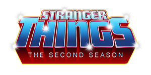
This is also an 80s-style logo, but it’s much more reminiscent of video games, Transformers toys, and other action-driven pop culture. While this fan art is an intriguing experiment in retro design, it would not have suited Stranger Things’ mysterious tone and themes of friendship and discovery.
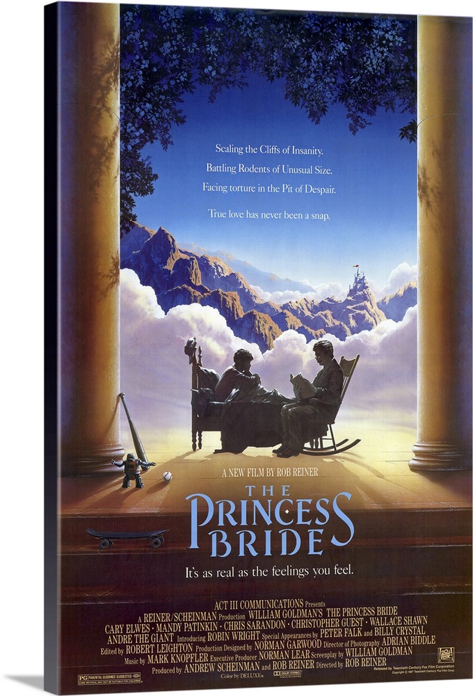
The Stranger Things wordmark draws upon a variety of sci-fi and adventure movies that create nostalgia in viewers’ minds. They recall the thrill of Hitchcock films, the fright of Alien, and the magical quest of The Princess Bride. Our sense memory is a powerful trigger, priming us to perceive new information a certain way. So, from those opening credits, people are immediately captivated by the show — and the logo becomes a shared symbol of the fandom.
For younger viewers who may not recognize those historical elements, the wordmark is still impactful thanks to its aesthetic. The combination of dramatic angles, negative space, and disproportionate lettering evoke feelings of mystery. In short, the logo design itself is strange, which makes it ideal for a show that celebrates strangeness!
Wrapping Up
Stranger Things’ wordmark is definitely one of the most iconic logos of recent pop culture. Just as it hearkens back to the classic films of the 20th century, it will probably inspire other sci-fi thrillers and adventure stories. From a design perspective, it is truly a testament to the power of creative typography. The design team also did an excellent job of creating a logo that could be subtly customized for each season while maintaining continuity.
As a marketing strategy, it’s hard to rival this wordmark’s branding potential. Even without reading the words, people will instantly recognize this wordmark. It encapsulates the show’s distinctive aesthetic and tone. Plus, it doubles as an eye-catching logo that’s perfect for merchandise!
Both fans and casual viewers love the Stranger Things logo, and it’s no surprise why. Few other wordmarks so succinctly combine pop culture homage and the psychological effects of typography. One thing is certain: this logo will be studied and emulated for years to come.
If you’re hoping to create your own ultra-memorable logo for your brand, take a page out of Imaginary Forces’ playbook. Play with typography rather than using out-of-the-box fonts. Identify what will resonate with your target audience and tap into their sense memory. Remember, the best logos evoke feelings and memories rather than simply symbolizing your business! For example, the Stranger Things logo contains zero imagery from the show itself. Rather, it subtly establishes a visual tone with only slight symbolism (e.g. the interrupted horizontal bars and overlapping serifs).
As we’ve seen from popular logos such as Apple’s and Nike’s, the best logo designs are ultimately expressive more than descriptive. That’s why creative use of typography can go such a long way! With the right stylization, you don’t even need any pictorial elements.


