- Warner Bros Updated Their Iconic Logo
- Only 11% of People Like The Redesigned Logo
- We’re Still Hearing More About The Updated Logo
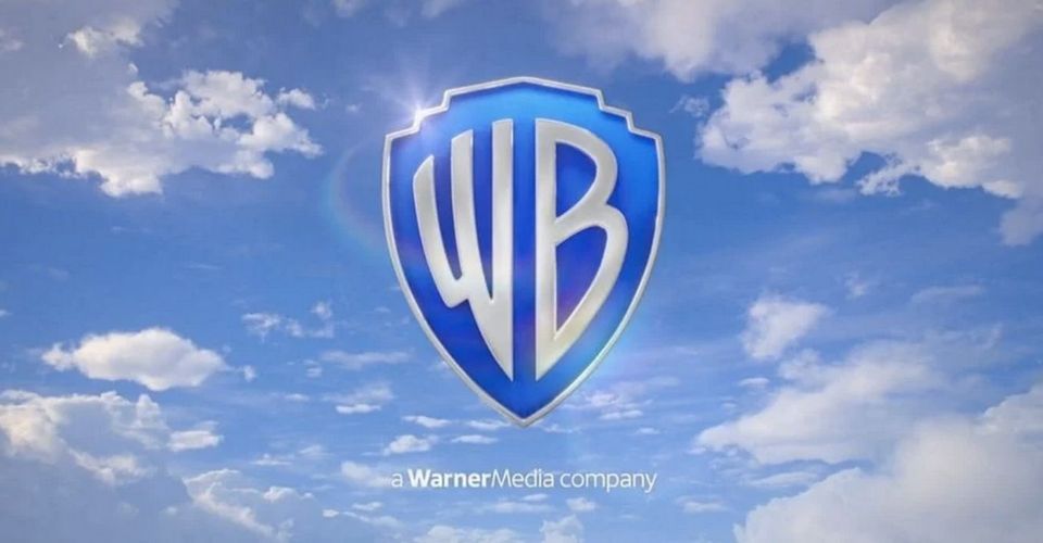
The new Warner Bros updated animated logo made its debut during the opening of HBO Max Original film Locked Down and it isn’t what we expected. The logo has been modernized and is very different from the original one. While the original logo has undergone many changes, the 1984 logo is the one that nearly all of us remember and associate with the famous media company.
Image source here
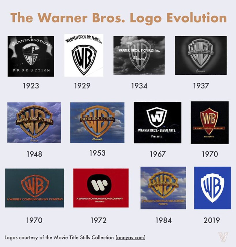
Image source here.
The first mention of the new logo was back in 2019 when the company announced that they were working with Pentagram to make the logo more modern and to have a more streamlined look in anticipation of the company’s 100th anniversary in 2023. While the original logo features the iconic gold outlined shield with “Warner Bros Pictures”, the new logo excludes the words.
The logo was designed by Pentagram, one of the world’s largest design firms. The original logo has undergone quite a few rounds of changes since the 1920s, but none that have included such a modern and new look to it. The gold shield is now blue and the logo has adapted a flat look.
“As we approached our centennial, we thought it was the right time to take a good look at our brand, what it stands for and the values it represents,” Ann Sarnoff, Warner Bros. CEO said. “We know that a strong brand gives us not just a road map but a sense of purpose. It puts our feelings of pride into words. And it helps us communicate who we are to our employees, our creative and business partners, and our fans around the world.”
After its debut, the news of the logo has quickly spread around the internet and the media has quickly taken to commenting on the logo. Many are surprised at the redesign and say that they prefer the old logo. According to a recent survey by Visual Objects, only 11% percent of people like the redesigned logo.
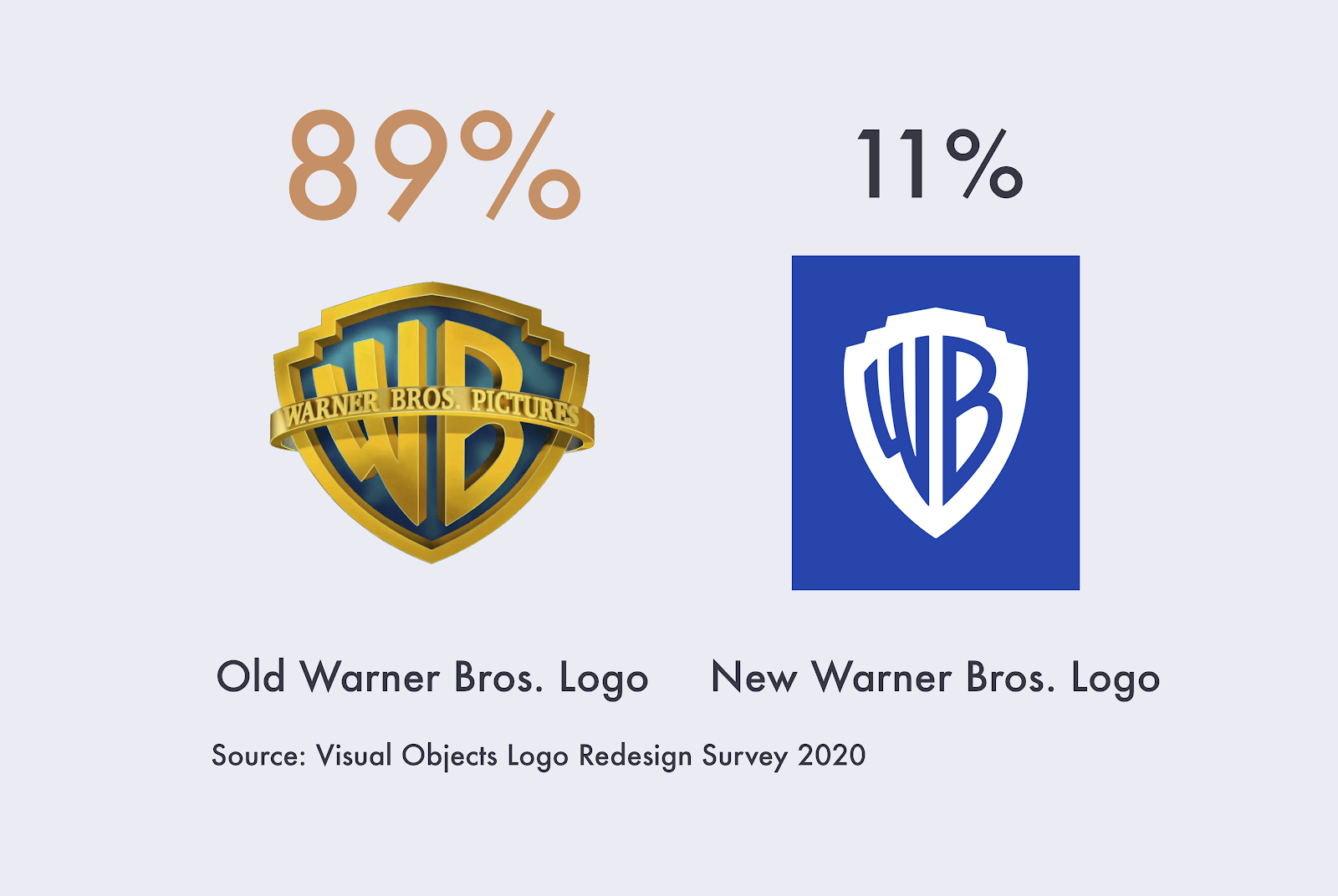
Image source here.
Out of the 1,001 US residents that Visual Objects asked, roughly 89% said that they preferred the old logo. For many, the original Warner Bros logo is what they associate the entertainment company with and it holds nostalgia for many. For whatever the reasoning, Warner Bros’ new logo redesign doesn’t seem to be too popular with their audience.
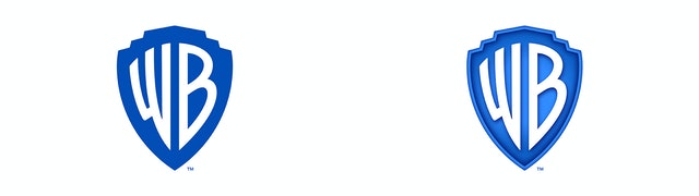
Image source here
Since the Warner Bros logo is still new, there are new thoughts and opinions coming out on the logo daily. Although not what we were expecting and a change from their past logos, especially the iconic gold shield that is most often associated with the company, the logo redesign was a much-needed change and brings a new look to the company.